Zadbaj o dobrą organizację dzięki kolekcji
Zapisuj i kategoryzuj treści zgodnie ze swoimi preferencjami.
Komponent Dialog wyświetla komunikaty w oknie lub prosi użytkownika o wprowadzenie danych w warstwie nad główną treścią aplikacji. Wyświetla interfejs, który przerywa użytkownikowi wykonywane czynności, aby przyciągnąć jego uwagę.
Oto niektóre przypadki użycia okna:
potwierdzanie działania użytkownika, np. podczas usuwania pliku;
Prośba o dane wejściowe użytkownika, np. w aplikacji z listą zadań.
Wyświetlanie listy opcji do wyboru przez użytkownika, np. wybór kraju podczas konfigurowania profilu.
Rysunek 1. Przykład okna z tekstem i ikonami.
Okno dialogowe alertu
Kompozycja AlertDialog udostępnia wygodny interfejs API do tworzenia okna dialogowego z motywem Material Design. AlertDialog ma określone parametry do obsługi poszczególnych elementów okna. Obejmują one:
title: tekst, który pojawia się u góry okna.
text: Tekst, który pojawia się na środku okna.
icon: grafika, która pojawia się u góry okna dialogowego.
onDismissRequest: funkcja wywoływana, gdy użytkownik zamknie okno, np. klikając poza nim.
dismissButton: komponent, który służy jako przycisk zamykania.
confirmButton: komponent, który służy jako przycisk potwierdzenia.
W przykładzie poniżej zaimplementowano 2 przyciski w oknie alertu: jeden zamyka okno, a drugi potwierdza żądanie.
Ta implementacja oznacza funkcję kompozycyjną nadrzędną, która przekazuje argumenty do funkcji kompozycyjnej podrzędnej w ten sposób:
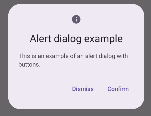
@ComposablefunDialogExamples(){// ...valopenAlertDialog=remember{mutableStateOf(false)}// ...when{// ...openAlertDialog.value->{AlertDialogExample(onDismissRequest={openAlertDialog.value=false},onConfirmation={openAlertDialog.value=falseprintln("Confirmation registered")// Add logic here to handle confirmation.},dialogTitle="Alert dialog example",dialogText="This is an example of an alert dialog with buttons.",icon=Icons.Default.Info)}}}}
Dialog to podstawowy komponent, który nie zapewnia żadnych stylów ani predefiniowanych miejsc na treści. Jest to stosunkowo prosty kontener, który należy wypełnić kontenerem takim jak Card. Oto niektóre z kluczowych parametrów okna:
onDismissRequest: funkcja lambda wywoływana, gdy użytkownik zamknie okno.
properties: instancja DialogProperties, która zapewnia dodatkowy zakres dostosowywania.
wewnętrzny kontener.
Podstawowy przykład
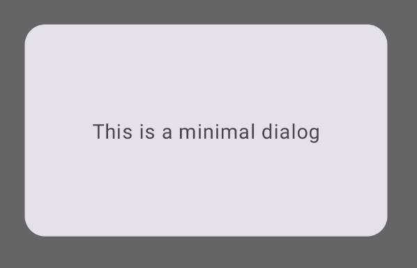
Poniższy przykład to podstawowa implementacja funkcji kompozycyjnej Dialog. Pamiętaj, że jako kontenera dodatkowego używa Card. Bez Card komponent Text
wyświetlałby się samodzielnie nad główną treścią aplikacji.
@ComposablefunMinimalDialog(onDismissRequest:()->Unit){Dialog(onDismissRequest={onDismissRequest()}){Card(modifier=Modifier.fillMaxWidth().height(200.dp).padding(16.dp),shape=RoundedCornerShape(16.dp),){Text(text="This is a minimal dialog",modifier=Modifier.fillMaxSize().wrapContentSize(Alignment.Center),textAlign=TextAlign.Center,)}}}
Ta implementacja wygląda tak: Pamiętaj, że gdy okno jest otwarte, główna treść aplikacji pod nim jest przyciemniona i szara:
Rysunek 3. Minimalne okno dialogowe.
Przykład zaawansowany
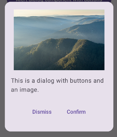
Poniżej znajdziesz bardziej zaawansowaną implementację funkcji kompozycyjnej Dialog. W tym przypadku komponent ręcznie implementuje interfejs podobny do AlertDialogw przykładzie powyżej.
@ComposablefunDialogWithImage(onDismissRequest:()->Unit,onConfirmation:()->Unit,painter:Painter,imageDescription:String,){Dialog(onDismissRequest={onDismissRequest()}){// Draw a rectangle shape with rounded corners inside the dialogCard(modifier=Modifier.fillMaxWidth().height(375.dp).padding(16.dp),shape=RoundedCornerShape(16.dp),){Column(modifier=Modifier.fillMaxSize(),verticalArrangement=Arrangement.Center,horizontalAlignment=Alignment.CenterHorizontally,){Image(painter=painter,contentDescription=imageDescription,contentScale=ContentScale.Fit,modifier=Modifier.height(160.dp))Text(text="This is a dialog with buttons and an image.",modifier=Modifier.padding(16.dp),)Row(modifier=Modifier.fillMaxWidth(),horizontalArrangement=Arrangement.Center,){TextButton(onClick={onDismissRequest()},modifier=Modifier.padding(8.dp),){Text("Dismiss")}TextButton(onClick={onConfirmation()},modifier=Modifier.padding(8.dp),){Text("Confirm")}}}}}}
Treść strony i umieszczone na niej fragmenty kodu podlegają licencjom opisanym w Licencji na treści. Java i OpenJDK są znakami towarowymi lub zastrzeżonymi znakami towarowymi należącymi do firmy Oracle lub jej podmiotów stowarzyszonych.
Ostatnia aktualizacja: 2025-08-28 UTC.
[[["Łatwo zrozumieć","easyToUnderstand","thumb-up"],["Rozwiązało to mój problem","solvedMyProblem","thumb-up"],["Inne","otherUp","thumb-up"]],[["Brak potrzebnych mi informacji","missingTheInformationINeed","thumb-down"],["Zbyt skomplikowane / zbyt wiele czynności do wykonania","tooComplicatedTooManySteps","thumb-down"],["Nieaktualne treści","outOfDate","thumb-down"],["Problem z tłumaczeniem","translationIssue","thumb-down"],["Problem z przykładami/kodem","samplesCodeIssue","thumb-down"],["Inne","otherDown","thumb-down"]],["Ostatnia aktualizacja: 2025-08-28 UTC."],[],[],null,["The [`Dialog`](/reference/kotlin/androidx/compose/ui/window/package-summary#Dialog(kotlin.Function0,androidx.compose.ui.window.DialogProperties,kotlin.Function0)) component displays dialog messages or requests user input on a\nlayer above the main app content. It creates an interruptive UI experience to\ncapture user attention.\n\nAmong the use cases for a dialog are the following:\n\n- Confirming user action, such as when deleting a file.\n- Requesting user input, such as in a to-do list app.\n- Presenting a list of options for user selection, like choosing a country in a profile setup.\n\n**Figure 1.** An example of a dialog populated with text and icons.\n\nAlert dialog\n\nThe [`AlertDialog`](/reference/kotlin/androidx/compose/material3/package-summary#AlertDialog(kotlin.Function0,kotlin.Function0,androidx.compose.ui.Modifier,kotlin.Function0,kotlin.Function0,kotlin.Function0,kotlin.Function0,androidx.compose.ui.graphics.Shape,androidx.compose.ui.graphics.Color,androidx.compose.ui.graphics.Color,androidx.compose.ui.graphics.Color,androidx.compose.ui.graphics.Color,androidx.compose.ui.unit.Dp,androidx.compose.ui.window.DialogProperties)) composable provides a convenient API for creating a\nMaterial Design themed dialog. `AlertDialog` has specific parameters for\nhandling particular elements of the dialog. Among them are the following:\n\n- `title`: The text that appears along the top of the dialog.\n- `text`: The text that appears centered within the dialog.\n- `icon`: The graphic that appears at the top of the dialog.\n- `onDismissRequest`: The function called when the user dismisses the dialog, such as by tapping outside of it.\n- `dismissButton`: A composable that serves as the dismiss button.\n- `confirmButton`: A composable that serves as the confirm button.\n\nThe following example implements two buttons in an alert dialog, one that\ndismisses the dialog, and another that confirms its request.\n\n\n```kotlin\n@Composable\nfun AlertDialogExample(\n onDismissRequest: () -\u003e Unit,\n onConfirmation: () -\u003e Unit,\n dialogTitle: String,\n dialogText: String,\n icon: ImageVector,\n) {\n AlertDialog(\n icon = {\n Icon(icon, contentDescription = \"Example Icon\")\n },\n title = {\n Text(text = dialogTitle)\n },\n text = {\n Text(text = dialogText)\n },\n onDismissRequest = {\n onDismissRequest()\n },\n confirmButton = {\n TextButton(\n onClick = {\n onConfirmation()\n }\n ) {\n Text(\"Confirm\")\n }\n },\n dismissButton = {\n TextButton(\n onClick = {\n onDismissRequest()\n }\n ) {\n Text(\"Dismiss\")\n }\n }\n )\n}https://github.com/android/snippets/blob/7a0ebbee11495f628cf9d574f6b6069c2867232a/compose/snippets/src/main/java/com/example/compose/snippets/components/Dialog.kt#L222-L262\n```\n\n\u003cbr /\u003e\n\nThis implementation implies a parent composable that passes arguments to the\nchild composable in this way:\n\n\n```kotlin\n@Composable\nfun DialogExamples() {\n // ...\n val openAlertDialog = remember { mutableStateOf(false) }\n\n // ...\n when {\n // ...\n openAlertDialog.value -\u003e {\n AlertDialogExample(\n onDismissRequest = { openAlertDialog.value = false },\n onConfirmation = {\n openAlertDialog.value = false\n println(\"Confirmation registered\") // Add logic here to handle confirmation.\n },\n dialogTitle = \"Alert dialog example\",\n dialogText = \"This is an example of an alert dialog with buttons.\",\n icon = Icons.Default.Info\n )\n }\n }\n }\n}https://github.com/android/snippets/blob/7a0ebbee11495f628cf9d574f6b6069c2867232a/compose/snippets/src/main/java/com/example/compose/snippets/components/Dialog.kt#L59-L137\n```\n\n\u003cbr /\u003e\n\nThis implementation appears as follows:\n**Figure 2.** An alert dialog with buttons. **Note:** When the user clicks either of the buttons, the dialog closes. When the user clicks confirm, it calls a function that also handles the confirmation. In this example, those functions are `onDismissRequest()` and `onConfirmRequest()`.\n| **Note:** In cases where your dialog requires a more complex set of buttons, you may benefit from using the `Dialog` composable and populating it in a more freeform manner.\n\nDialog composable\n\n[`Dialog`](/reference/kotlin/androidx/compose/ui/window/package-summary#Dialog(kotlin.Function0,androidx.compose.ui.window.DialogProperties,kotlin.Function0)) is a basic composable that doesn't provide any styling or\npredefined slots for content. It is a relatively straightforward container that\nyou should populate with a container such as `Card`. The following are some of\nthe key parameters of a dialog:\n\n- **`onDismissRequest`**: The lambda called when the user closes the dialog.\n- **`properties`** : An instance of [`DialogProperties`](/reference/kotlin/androidx/compose/ui/window/DialogProperties) that provides some additional scope for customization.\n\n| **Caution:** Unlike the example of `AlertDialog` in the preceding section, you need to manually specify the size and shape of `Dialog`. You also need to provide an inner container.\n\nBasic example\n\nThe following example is a basic implementation of the `Dialog` composable. Note\nthat it uses a `Card` as the secondary container. Without the `Card`, the `Text`\ncomponent would appear alone above the main app content.\n\n\n```kotlin\n@Composable\nfun MinimalDialog(onDismissRequest: () -\u003e Unit) {\n Dialog(onDismissRequest = { onDismissRequest() }) {\n Card(\n modifier = Modifier\n .fillMaxWidth()\n .height(200.dp)\n .padding(16.dp),\n shape = RoundedCornerShape(16.dp),\n ) {\n Text(\n text = \"This is a minimal dialog\",\n modifier = Modifier\n .fillMaxSize()\n .wrapContentSize(Alignment.Center),\n textAlign = TextAlign.Center,\n )\n }\n }\n}https://github.com/android/snippets/blob/7a0ebbee11495f628cf9d574f6b6069c2867232a/compose/snippets/src/main/java/com/example/compose/snippets/components/Dialog.kt#L141-L160\n```\n\n\u003cbr /\u003e\n\nThis implementation appears as follows. Note that when the dialog is open, the\nmain app content beneath it appears darkened and grayed out:\n**Figure 3.** Minimal dialog.\n\nAdvanced example\n\nThe following is a more advanced implemented of the `Dialog` composable. In this\ncase, the component manually implements a similar interface to the `AlertDialog`\nexample above.\n| **Caution:** If you only need to display a two-button dialog as in this example, you should use `AlertDialog` and its more convenient API. However, if you want to create a more complex dialog, perhaps with forms and multiple buttons, you should use `Dialog` with custom content, as in the following example.\n\n\n```kotlin\n@Composable\nfun DialogWithImage(\n onDismissRequest: () -\u003e Unit,\n onConfirmation: () -\u003e Unit,\n painter: Painter,\n imageDescription: String,\n) {\n Dialog(onDismissRequest = { onDismissRequest() }) {\n // Draw a rectangle shape with rounded corners inside the dialog\n Card(\n modifier = Modifier\n .fillMaxWidth()\n .height(375.dp)\n .padding(16.dp),\n shape = RoundedCornerShape(16.dp),\n ) {\n Column(\n modifier = Modifier\n .fillMaxSize(),\n verticalArrangement = Arrangement.Center,\n horizontalAlignment = Alignment.CenterHorizontally,\n ) {\n Image(\n painter = painter,\n contentDescription = imageDescription,\n contentScale = ContentScale.Fit,\n modifier = Modifier\n .height(160.dp)\n )\n Text(\n text = \"This is a dialog with buttons and an image.\",\n modifier = Modifier.padding(16.dp),\n )\n Row(\n modifier = Modifier\n .fillMaxWidth(),\n horizontalArrangement = Arrangement.Center,\n ) {\n TextButton(\n onClick = { onDismissRequest() },\n modifier = Modifier.padding(8.dp),\n ) {\n Text(\"Dismiss\")\n }\n TextButton(\n onClick = { onConfirmation() },\n modifier = Modifier.padding(8.dp),\n ) {\n Text(\"Confirm\")\n }\n }\n }\n }\n }\n}https://github.com/android/snippets/blob/7a0ebbee11495f628cf9d574f6b6069c2867232a/compose/snippets/src/main/java/com/example/compose/snippets/components/Dialog.kt#L164-L218\n```\n\n\u003cbr /\u003e\n\nThis implementation appears as follows:\n**Figure 4.** A dialog that includes an image.\n\nAdditional resources\n\n- [Material UI docs](https://m3.material.io/components/dialogs/overview)"]]