Mit Sammlungen den Überblick behalten
Sie können Inhalte basierend auf Ihren Einstellungen speichern und kategorisieren.
In der Komponente Dialog werden Dialogmeldungen angezeigt oder Nutzereingaben auf einer Ebene über dem Hauptinhalt der App angefordert. Dadurch wird die Aufmerksamkeit der Nutzer auf die Benutzeroberfläche gelenkt.
Zu den Anwendungsfällen für einen Dialog gehören:
Bestätigung einer Nutzeraktion, z. B. beim Löschen einer Datei.
Anfordern von Nutzereingaben, z. B. in einer To-do-Liste-App.
Eine Liste mit Optionen zur Auswahl für den Nutzer, z. B. die Auswahl eines Landes bei der Einrichtung eines Profils.
Abbildung 1: Beispiel für ein Dialogfeld mit Text und Symbolen.
Dialogfeld einer Benachrichtigung
Das AlertDialog-Composable bietet eine praktische API zum Erstellen eines Dialogfelds mit Material Design-Thema. AlertDialog hat spezifische Parameter für die Verarbeitung bestimmter Elemente des Dialogs. Dazu gehören:
title: Der Text, der oben im Dialogfeld angezeigt wird.
text: Der Text, der zentriert im Dialogfeld angezeigt wird.
icon: Die Grafik, die oben im Dialogfeld angezeigt wird.
onDismissRequest: Die Funktion, die aufgerufen wird, wenn der Nutzer das Dialogfeld schließt, z. B. durch Tippen außerhalb des Dialogfelds.
dismissButton: Eine zusammensetzbare Funktion, die als Schließen-Schaltfläche dient.
confirmButton: Eine zusammensetzbare Funktion, die als Bestätigungsschaltfläche dient.
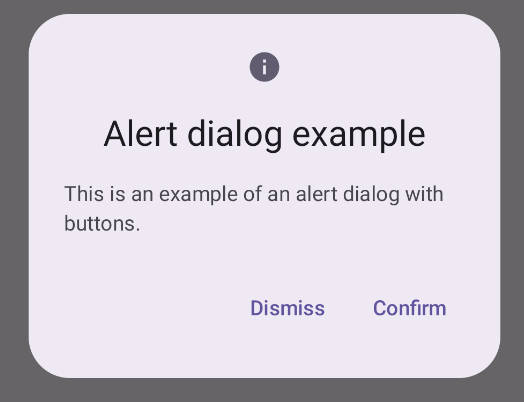
Im folgenden Beispiel werden zwei Schaltflächen in einem Benachrichtigungsdialogfeld implementiert: eine zum Schließen des Dialogfelds und eine zum Bestätigen der Anfrage.
Diese Implementierung setzt eine übergeordnete Composable voraus, die Argumente auf diese Weise an die untergeordnete Composable übergibt:
@ComposablefunDialogExamples(){// ...valopenAlertDialog=remember{mutableStateOf(false)}// ...when{// ...openAlertDialog.value->{AlertDialogExample(onDismissRequest={openAlertDialog.value=false},onConfirmation={openAlertDialog.value=falseprintln("Confirmation registered")// Add logic here to handle confirmation.},dialogTitle="Alert dialog example",dialogText="This is an example of an alert dialog with buttons.",icon=Icons.Default.Info)}}}}
Abbildung 2: Ein Benachrichtigungsdialogfeld mit Schaltflächen.
Composable für Dialogfelder
Dialog ist eine einfache zusammensetzbare Funktion, die kein Styling oder vordefinierte Slots für Inhalte bietet. Es handelt sich um einen relativ einfachen Container, den Sie mit einem Container wie Card füllen sollten. Im Folgenden finden Sie einige der wichtigsten Parameter eines Dialogs:
onDismissRequest: Die Lambda-Funktion, die aufgerufen wird, wenn der Nutzer das Dialogfeld schließt.
properties: Eine Instanz von DialogProperties, die zusätzlichen Spielraum für Anpassungen bietet.
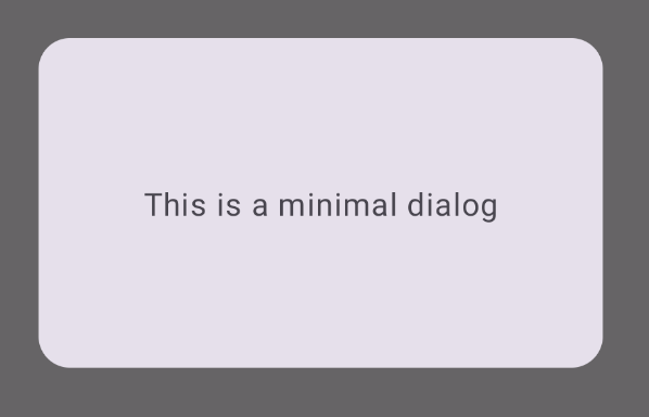
angeben.
Einfaches Beispiel
Das folgende Beispiel zeigt eine einfache Implementierung der zusammensetzbaren Funktion Dialog. Als sekundärer Container wird ein Card verwendet. Ohne Card würde die Komponente Text allein über dem Hauptinhalt der App angezeigt.
@ComposablefunMinimalDialog(onDismissRequest:()->Unit){Dialog(onDismissRequest={onDismissRequest()}){Card(modifier=Modifier.fillMaxWidth().height(200.dp).padding(16.dp),shape=RoundedCornerShape(16.dp),){Text(text="This is a minimal dialog",modifier=Modifier.fillMaxSize().wrapContentSize(Alignment.Center),textAlign=TextAlign.Center,)}}}
Diese Implementierung sieht so aus: Wenn das Dialogfeld geöffnet ist, werden die darunter liegenden Hauptinhalte der App abgedunkelt und ausgegraut dargestellt:
Abbildung 3: Minimaler Dialog.
Erweitertes Beispiel
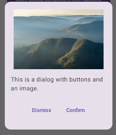
Im Folgenden finden Sie eine erweiterte Implementierung der zusammensetzbaren Funktion Dialog. In diesem Fall implementiert die Komponente manuell eine ähnliche Schnittstelle wie im AlertDialog-Beispiel oben.
@ComposablefunDialogWithImage(onDismissRequest:()->Unit,onConfirmation:()->Unit,painter:Painter,imageDescription:String,){Dialog(onDismissRequest={onDismissRequest()}){// Draw a rectangle shape with rounded corners inside the dialogCard(modifier=Modifier.fillMaxWidth().height(375.dp).padding(16.dp),shape=RoundedCornerShape(16.dp),){Column(modifier=Modifier.fillMaxSize(),verticalArrangement=Arrangement.Center,horizontalAlignment=Alignment.CenterHorizontally,){Image(painter=painter,contentDescription=imageDescription,contentScale=ContentScale.Fit,modifier=Modifier.height(160.dp))Text(text="This is a dialog with buttons and an image.",modifier=Modifier.padding(16.dp),)Row(modifier=Modifier.fillMaxWidth(),horizontalArrangement=Arrangement.Center,){TextButton(onClick={onDismissRequest()},modifier=Modifier.padding(8.dp),){Text("Dismiss")}TextButton(onClick={onConfirmation()},modifier=Modifier.padding(8.dp),){Text("Confirm")}}}}}}
Alle Inhalte und Codebeispiele auf dieser Seite unterliegen den Lizenzen wie im Abschnitt Inhaltslizenz beschrieben. Java und OpenJDK sind Marken oder eingetragene Marken von Oracle und/oder seinen Tochtergesellschaften.
Zuletzt aktualisiert: 2025-08-27 (UTC).
[[["Leicht verständlich","easyToUnderstand","thumb-up"],["Mein Problem wurde gelöst","solvedMyProblem","thumb-up"],["Sonstiges","otherUp","thumb-up"]],[["Benötigte Informationen nicht gefunden","missingTheInformationINeed","thumb-down"],["Zu umständlich/zu viele Schritte","tooComplicatedTooManySteps","thumb-down"],["Nicht mehr aktuell","outOfDate","thumb-down"],["Problem mit der Übersetzung","translationIssue","thumb-down"],["Problem mit Beispielen/Code","samplesCodeIssue","thumb-down"],["Sonstiges","otherDown","thumb-down"]],["Zuletzt aktualisiert: 2025-08-27 (UTC)."],[],[],null,["The [`Dialog`](/reference/kotlin/androidx/compose/ui/window/package-summary#Dialog(kotlin.Function0,androidx.compose.ui.window.DialogProperties,kotlin.Function0)) component displays dialog messages or requests user input on a\nlayer above the main app content. It creates an interruptive UI experience to\ncapture user attention.\n\nAmong the use cases for a dialog are the following:\n\n- Confirming user action, such as when deleting a file.\n- Requesting user input, such as in a to-do list app.\n- Presenting a list of options for user selection, like choosing a country in a profile setup.\n\n**Figure 1.** An example of a dialog populated with text and icons.\n\nAlert dialog\n\nThe [`AlertDialog`](/reference/kotlin/androidx/compose/material3/package-summary#AlertDialog(kotlin.Function0,kotlin.Function0,androidx.compose.ui.Modifier,kotlin.Function0,kotlin.Function0,kotlin.Function0,kotlin.Function0,androidx.compose.ui.graphics.Shape,androidx.compose.ui.graphics.Color,androidx.compose.ui.graphics.Color,androidx.compose.ui.graphics.Color,androidx.compose.ui.graphics.Color,androidx.compose.ui.unit.Dp,androidx.compose.ui.window.DialogProperties)) composable provides a convenient API for creating a\nMaterial Design themed dialog. `AlertDialog` has specific parameters for\nhandling particular elements of the dialog. Among them are the following:\n\n- `title`: The text that appears along the top of the dialog.\n- `text`: The text that appears centered within the dialog.\n- `icon`: The graphic that appears at the top of the dialog.\n- `onDismissRequest`: The function called when the user dismisses the dialog, such as by tapping outside of it.\n- `dismissButton`: A composable that serves as the dismiss button.\n- `confirmButton`: A composable that serves as the confirm button.\n\nThe following example implements two buttons in an alert dialog, one that\ndismisses the dialog, and another that confirms its request.\n\n\n```kotlin\n@Composable\nfun AlertDialogExample(\n onDismissRequest: () -\u003e Unit,\n onConfirmation: () -\u003e Unit,\n dialogTitle: String,\n dialogText: String,\n icon: ImageVector,\n) {\n AlertDialog(\n icon = {\n Icon(icon, contentDescription = \"Example Icon\")\n },\n title = {\n Text(text = dialogTitle)\n },\n text = {\n Text(text = dialogText)\n },\n onDismissRequest = {\n onDismissRequest()\n },\n confirmButton = {\n TextButton(\n onClick = {\n onConfirmation()\n }\n ) {\n Text(\"Confirm\")\n }\n },\n dismissButton = {\n TextButton(\n onClick = {\n onDismissRequest()\n }\n ) {\n Text(\"Dismiss\")\n }\n }\n )\n}https://github.com/android/snippets/blob/dd30aee903e8c247786c064faab1a9ca8d10b46e/compose/snippets/src/main/java/com/example/compose/snippets/components/Dialog.kt#L222-L262\n```\n\n\u003cbr /\u003e\n\nThis implementation implies a parent composable that passes arguments to the\nchild composable in this way:\n\n\n```kotlin\n@Composable\nfun DialogExamples() {\n // ...\n val openAlertDialog = remember { mutableStateOf(false) }\n\n // ...\n when {\n // ...\n openAlertDialog.value -\u003e {\n AlertDialogExample(\n onDismissRequest = { openAlertDialog.value = false },\n onConfirmation = {\n openAlertDialog.value = false\n println(\"Confirmation registered\") // Add logic here to handle confirmation.\n },\n dialogTitle = \"Alert dialog example\",\n dialogText = \"This is an example of an alert dialog with buttons.\",\n icon = Icons.Default.Info\n )\n }\n }\n }\n}https://github.com/android/snippets/blob/dd30aee903e8c247786c064faab1a9ca8d10b46e/compose/snippets/src/main/java/com/example/compose/snippets/components/Dialog.kt#L59-L137\n```\n\n\u003cbr /\u003e\n\nThis implementation appears as follows:\n**Figure 2.** An alert dialog with buttons. **Note:** When the user clicks either of the buttons, the dialog closes. When the user clicks confirm, it calls a function that also handles the confirmation. In this example, those functions are `onDismissRequest()` and `onConfirmRequest()`.\n| **Note:** In cases where your dialog requires a more complex set of buttons, you may benefit from using the `Dialog` composable and populating it in a more freeform manner.\n\nDialog composable\n\n[`Dialog`](/reference/kotlin/androidx/compose/ui/window/package-summary#Dialog(kotlin.Function0,androidx.compose.ui.window.DialogProperties,kotlin.Function0)) is a basic composable that doesn't provide any styling or\npredefined slots for content. It is a relatively straightforward container that\nyou should populate with a container such as `Card`. The following are some of\nthe key parameters of a dialog:\n\n- **`onDismissRequest`**: The lambda called when the user closes the dialog.\n- **`properties`** : An instance of [`DialogProperties`](/reference/kotlin/androidx/compose/ui/window/DialogProperties) that provides some additional scope for customization.\n\n| **Caution:** Unlike the example of `AlertDialog` in the preceding section, you need to manually specify the size and shape of `Dialog`. You also need to provide an inner container.\n\nBasic example\n\nThe following example is a basic implementation of the `Dialog` composable. Note\nthat it uses a `Card` as the secondary container. Without the `Card`, the `Text`\ncomponent would appear alone above the main app content.\n\n\n```kotlin\n@Composable\nfun MinimalDialog(onDismissRequest: () -\u003e Unit) {\n Dialog(onDismissRequest = { onDismissRequest() }) {\n Card(\n modifier = Modifier\n .fillMaxWidth()\n .height(200.dp)\n .padding(16.dp),\n shape = RoundedCornerShape(16.dp),\n ) {\n Text(\n text = \"This is a minimal dialog\",\n modifier = Modifier\n .fillMaxSize()\n .wrapContentSize(Alignment.Center),\n textAlign = TextAlign.Center,\n )\n }\n }\n}https://github.com/android/snippets/blob/dd30aee903e8c247786c064faab1a9ca8d10b46e/compose/snippets/src/main/java/com/example/compose/snippets/components/Dialog.kt#L141-L160\n```\n\n\u003cbr /\u003e\n\nThis implementation appears as follows. Note that when the dialog is open, the\nmain app content beneath it appears darkened and grayed out:\n**Figure 3.** Minimal dialog.\n\nAdvanced example\n\nThe following is a more advanced implemented of the `Dialog` composable. In this\ncase, the component manually implements a similar interface to the `AlertDialog`\nexample above.\n| **Caution:** If you only need to display a two-button dialog as in this example, you should use `AlertDialog` and its more convenient API. However, if you want to create a more complex dialog, perhaps with forms and multiple buttons, you should use `Dialog` with custom content, as in the following example.\n\n\n```kotlin\n@Composable\nfun DialogWithImage(\n onDismissRequest: () -\u003e Unit,\n onConfirmation: () -\u003e Unit,\n painter: Painter,\n imageDescription: String,\n) {\n Dialog(onDismissRequest = { onDismissRequest() }) {\n // Draw a rectangle shape with rounded corners inside the dialog\n Card(\n modifier = Modifier\n .fillMaxWidth()\n .height(375.dp)\n .padding(16.dp),\n shape = RoundedCornerShape(16.dp),\n ) {\n Column(\n modifier = Modifier\n .fillMaxSize(),\n verticalArrangement = Arrangement.Center,\n horizontalAlignment = Alignment.CenterHorizontally,\n ) {\n Image(\n painter = painter,\n contentDescription = imageDescription,\n contentScale = ContentScale.Fit,\n modifier = Modifier\n .height(160.dp)\n )\n Text(\n text = \"This is a dialog with buttons and an image.\",\n modifier = Modifier.padding(16.dp),\n )\n Row(\n modifier = Modifier\n .fillMaxWidth(),\n horizontalArrangement = Arrangement.Center,\n ) {\n TextButton(\n onClick = { onDismissRequest() },\n modifier = Modifier.padding(8.dp),\n ) {\n Text(\"Dismiss\")\n }\n TextButton(\n onClick = { onConfirmation() },\n modifier = Modifier.padding(8.dp),\n ) {\n Text(\"Confirm\")\n }\n }\n }\n }\n }\n}https://github.com/android/snippets/blob/dd30aee903e8c247786c064faab1a9ca8d10b46e/compose/snippets/src/main/java/com/example/compose/snippets/components/Dialog.kt#L164-L218\n```\n\n\u003cbr /\u003e\n\nThis implementation appears as follows:\n**Figure 4.** A dialog that includes an image.\n\nAdditional resources\n\n- [Material UI docs](https://m3.material.io/components/dialogs/overview)"]]