
רכיב Chip הוא רכיב קומפקטי ואינטראקטיבי בממשק המשתמש. הוא מייצג ישויות מורכבות כמו איש קשר או תג, לרוב עם סמל ותווית. אפשר לסמן אותו, לבטל אותו או ללחוץ עליו.
אלה ארבעת סוגי הצ'יפים והמקומות שבהם אפשר להשתמש בהם:
- עזרה: מדריכה את המשתמש במהלך משימה. לרוב מופיעה כרכיב זמני בממשק המשתמש בתגובה לקלט של המשתמש.
- סינון: מאפשר למשתמשים לצמצם את התוכן מתוך קבוצת אפשרויות. אפשר לבחור אותם או לבטל את הבחירה שלהם, ויכול להיות שיופיע בהם סמל של וי כשהם נבחרים.
- קלט: מייצג מידע שהמשתמשים סיפקו, כמו בחירות בתפריט. הם יכולים להכיל סמל וטקסט, ולספק X להסרה.
- הצעה: המלצות שמוצגות למשתמש על סמך הפעילות או הקלט האחרונים שלו. בדרך כלל מופיעים מתחת לשדה להזנת קלט כדי להנחות את המשתמש לבצע פעולות.

פלטפורמת ה-API
יש ארבעה קומפוזיציות שמתאימות לארבעת הסוגים של הצ'יפים. בקטעים הבאים מפורטים הקומפוזיציות האלה וההבדלים ביניהן. עם זאת, יש להם את אותם פרמטרים:
-
label: המחרוזת שמופיעה בצ'יפ. -
icon: הסמל שמוצג בתחילת הצ'יפ. לחלק מהקומפוזבילים הספציפיים יש פרמטרים נפרדים שלleadingIconושלtrailingIcon. -
onClick: פונקציית ה-lambda שהצ'יפ מפעיל כשהמשתמש לוחץ עליו.
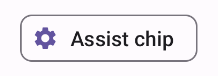
צ'יפ של Assist
רכיב ה-AssistChip מאפשר ליצור בקלות צ'יפ עזרה שמכוון את המשתמש לכיוון מסוים. אחד המאפיינים הייחודיים שלו הוא הפרמטר leadingIcon שמאפשר להציג סמל בצד ימין של הצ'יפ. בדוגמה הבאה אפשר לראות איך מטמיעים את התכונה:
@Composable fun AssistChipExample() { AssistChip( onClick = { Log.d("Assist chip", "hello world") }, label = { Text("Assist chip") }, leadingIcon = { Icon( Icons.Filled.Settings, contentDescription = "Localized description", Modifier.size(AssistChipDefaults.IconSize) ) } ) }
ההטמעה הזו נראית כך.
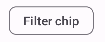
סמל מסנן
רכיב ה-Composable FilterChip מחייב מעקב אחרי מצב הצ'יפ – אם הוא נבחר או לא. בדוגמה הבאה אפשר לראות איך להציג סמל מוביל עם סימן וי רק כשהמשתמש בוחר את הצ'יפ:
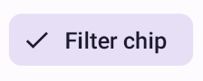
@Composable fun FilterChipExample() { var selected by remember { mutableStateOf(false) } FilterChip( onClick = { selected = !selected }, label = { Text("Filter chip") }, selected = selected, leadingIcon = if (selected) { { Icon( imageVector = Icons.Filled.Done, contentDescription = "Done icon", modifier = Modifier.size(FilterChipDefaults.IconSize) ) } } else { null }, ) }
היישום הזה נראה כך כשהוא לא נבחר:
וכך היא נראית כשבוחרים בה:
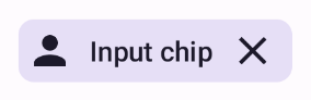
צ'יפ קלט
אפשר להשתמש ברכיב הקומפוזבילי InputChip כדי ליצור צ'יפים שנוצרים כתוצאה מאינטראקציה של משתמשים. לדוגמה, בלקוח אימייל, כשמשתמש כותב אימייל, צ'יפ קלט יכול לייצג איש קשר שהמשתמש הוסיף לשדה 'אל:'.
ההטמעה הבאה מדגימה צ'יפ קלט שכבר נמצא במצב נבחר. המשתמש יכול לבטל את הצ'יפ בלחיצה עליו.
@Composable fun InputChipExample( text: String, onDismiss: () -> Unit, ) { var enabled by remember { mutableStateOf(true) } if (!enabled) return InputChip( onClick = { onDismiss() enabled = !enabled }, label = { Text(text) }, selected = enabled, avatar = { Icon( Icons.Filled.Person, contentDescription = "Localized description", Modifier.size(InputChipDefaults.AvatarSize) ) }, trailingIcon = { Icon( Icons.Default.Close, contentDescription = "Localized description", Modifier.size(InputChipDefaults.AvatarSize) ) }, ) }
ההטמעה הזו נראית כך.
הצעות קשורות
רכיב ה-SuggestionChip הוא הרכיב הבסיסי ביותר מבין הרכיבים שמופיעים בדף הזה, גם בהגדרת ה-API שלו וגם בתרחישי השימוש הנפוצים שלו. צ'יפים של הצעות מציגים רמזים שנוצרו באופן דינמי. לדוגמה, באפליקציית צ'אט מבוססת-AI, אפשר להשתמש בצ'יפים של הצעות כדי להציג תשובות אפשריות להודעה האחרונה.
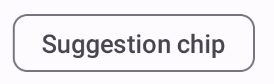
כדאי לעיין בהטמעה הזו של SuggestionChip:
@Composable fun SuggestionChipExample() { SuggestionChip( onClick = { Log.d("Suggestion chip", "hello world") }, label = { Text("Suggestion chip") } ) }
ההטמעה הזו נראית כך:
צ'יפ מובלט
כל הדוגמאות במסמך הזה משתמשות בקומפוזבילים הבסיסיים שיוצרים מראה שטוח. אם רוצים ליצור צ'יפ עם מראה מובלט, צריך להשתמש באחד משלושת הקומפוזבילים הבאים: