
Компонент Chip — это компактный интерактивный элемент пользовательского интерфейса. Он представляет собой сложные сущности, такие как контакт или тег, часто с иконкой и подписью. Он может быть отмеченным, закрываемым или кликабельным.
Существует четыре типа микросхем и области их применения, как указано ниже:
- Assist : Направляет пользователя во время выполнения задачи. Часто появляется в виде временного элемента пользовательского интерфейса в ответ на ввод пользователя.
- Фильтр : Позволяет пользователям уточнять содержимое, выбирая из набора параметров. Фильтры можно выбирать или отменять выбор, при выборе может отображаться значок галочки.
- Ввод : Представляет собой предоставленную пользователем информацию, например, выбранные пункты меню. Может содержать значок и текст, а также отметку «X» для удаления.
- Предложение : Предоставляет пользователю рекомендации на основе его недавней активности или ввода данных. Обычно отображается под полем ввода, чтобы подсказать пользователю, какие действия предпринять.

Поверхность API
Существует четыре составных элемента, соответствующих четырем типам микросхем. В следующих разделах подробно описаны эти составные элементы и их различия. Однако они имеют следующие общие параметры:
-
label: строка, отображаемая на микросхеме. -
icon: Значок, отображаемый в начале микросхемы. Некоторые из отдельных компонентов имеют отдельные параметрыleadingIconиtrailingIcon. -
onClick: Лямбда-функция, которую вызывает чип при нажатии пользователем.
Вспомогательный чип
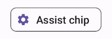
Компонент AssistChip предоставляет простой способ создания вспомогательного чипа, который направляет пользователя в определенном направлении. Одной из отличительных особенностей является параметр leadingIcon , позволяющий отображать значок в левой части чипа. Следующий пример демонстрирует, как это можно реализовать:
@Composable fun AssistChipExample() { AssistChip( onClick = { Log.d("Assist chip", "hello world") }, label = { Text("Assist chip") }, leadingIcon = { Icon( Icons.Filled.Settings, contentDescription = "Localized description", Modifier.size(AssistChipDefaults.IconSize) ) } ) }
Данная реализация выглядит следующим образом.
Фильтрующий чип
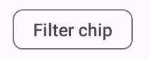
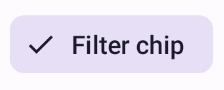
Компонент FilterChip требует отслеживания того, выбран ли данный чип. В следующем примере показано, как можно отображать значок галочки в начале строки только тогда, когда пользователь выбрал чип:
@Composable fun FilterChipExample() { var selected by remember { mutableStateOf(false) } FilterChip( onClick = { selected = !selected }, label = { Text("Filter chip") }, selected = selected, leadingIcon = if (selected) { { Icon( imageVector = Icons.Filled.Done, contentDescription = "Done icon", modifier = Modifier.size(FilterChipDefaults.IconSize) ) } } else { null }, ) }
При отсутствии предварительного выбора данная реализация выглядит следующим образом:
При выборе отображается следующим образом:
Входной чип
Вы можете использовать компонент InputChip для создания чипов, которые формируются в результате взаимодействия пользователя. Например, в почтовом клиенте, когда пользователь пишет электронное письмо, чип InputChip может представлять контакт, добавленный пользователем в поле "Кому:".
Следующая реализация демонстрирует входной чип, который уже находится в выбранном состоянии. Пользователь закрывает чип, нажав на него.
@Composable fun InputChipExample( text: String, onDismiss: () -> Unit, ) { var enabled by remember { mutableStateOf(true) } if (!enabled) return InputChip( onClick = { onDismiss() enabled = !enabled }, label = { Text(text) }, selected = enabled, avatar = { Icon( Icons.Filled.Person, contentDescription = "Localized description", Modifier.size(InputChipDefaults.AvatarSize) ) }, trailingIcon = { Icon( Icons.Default.Close, contentDescription = "Localized description", Modifier.size(InputChipDefaults.AvatarSize) ) }, ) }
Данная реализация выглядит следующим образом.

Чип для предложений
Компонент SuggestionChip является самым простым из перечисленных на этой странице, как по определению API, так и по распространенным сценариям использования. Компоненты SuggestionChip предоставляют динамически генерируемые подсказки. Например, в приложении для чата с искусственным интеллектом вы можете использовать компоненты SuggestionChip для отображения возможных ответов на последнее сообщение.
Рассмотрим следующую реализацию SuggestionChip :
@Composable fun SuggestionChipExample() { SuggestionChip( onClick = { Log.d("Suggestion chip", "hello world") }, label = { Text("Suggestion chip") } ) }
Данная реализация выглядит следующим образом:

Повышенный чип
Все примеры в этом документе используют базовые компоненты, имеющие плоскую поверхность. Если вам нужен чип с выпуклой поверхностью, используйте один из трех следующих компонентов: