
Komponent Chip to kompaktowy, interaktywny element interfejsu. Reprezentuje złożone elementy, takie jak kontakt lub tag, często z ikoną i etykietą. Może być możliwe zaznaczenie, zamknięcie lub kliknięcie.
Oto 4 rodzaje elementów i miejsca, w których możesz ich używać:
- Asystowanie: prowadzi użytkownika podczas wykonywania zadania. Często pojawia się jako tymczasowy element interfejsu w odpowiedzi na działanie użytkownika.
- Filtruj: umożliwia użytkownikom zawężanie treści za pomocą zestawu opcji. Można je zaznaczać i odznaczać. Po zaznaczeniu może pojawić się ikona znacznika wyboru.
- Dane wejściowe: reprezentują informacje przekazywane przez użytkownika, np. wybory w menu. Mogą zawierać ikonę i tekst oraz przycisk X do usuwania.
- Sugestia: wyświetla użytkownikowi rekomendacje na podstawie jego ostatniej aktywności lub wprowadzonych danych. Zwykle pojawiają się pod polem wprowadzania, aby zachęcić użytkownika do działania.

Powierzchnia interfejsu API
Istnieją 4 funkcje kompozycyjne odpowiadające 4 typom elementów. W kolejnych sekcjach znajdziesz szczegółowe informacje o tych funkcjach kompozycyjnych i różnicach między nimi. Mają jednak te same parametry:
label: ciąg znaków, który pojawia się na chipie.icon: ikona wyświetlana na początku elementu. Niektóre z tych funkcji mają oddzielne parametryleadingIconitrailingIcon.onClick: funkcja lambda, którą wywołuje komponent, gdy użytkownik go naciśnie.
Element pomocy
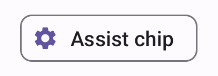
Kompozycja AssistChip zapewnia prosty sposób tworzenia komponentu pomocy, który zachęca użytkownika do podjęcia określonego działania. Jedną z wyróżniających go cech jest parametr leadingIcon, który umożliwia wyświetlanie ikony po lewej stronie elementu. Poniższy przykład pokazuje, jak możesz to zrobić:
@Composable fun AssistChipExample() { AssistChip( onClick = { Log.d("Assist chip", "hello world") }, label = { Text("Assist chip") }, leadingIcon = { Icon( Icons.Filled.Settings, contentDescription = "Localized description", Modifier.size(AssistChipDefaults.IconSize) ) } ) }
Ta implementacja wygląda tak:
Ikona filtra
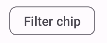
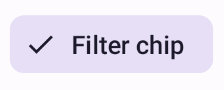
Funkcja FilterChip wymaga śledzenia, czy element jest wybrany. Poniższy przykład pokazuje, jak wyświetlać ikonę zaznaczenia tylko wtedy, gdy użytkownik wybierze element:
@Composable fun FilterChipExample() { var selected by remember { mutableStateOf(false) } FilterChip( onClick = { selected = !selected }, label = { Text("Filter chip") }, selected = selected, leadingIcon = if (selected) { { Icon( imageVector = Icons.Filled.Done, contentDescription = "Done icon", modifier = Modifier.size(FilterChipDefaults.IconSize) ) } } else { null }, ) }
Gdy ta implementacja nie jest wybrana, wygląda tak:
Po wybraniu wygląda tak:
Element wprowadzania
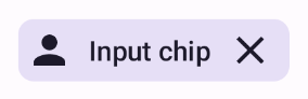
Za pomocą funkcji kompozycyjnej InputChip możesz tworzyć komponenty, które są wynikiem interakcji użytkownika. Na przykład w programie poczty e-mail podczas pisania wiadomości przez użytkownika element wejściowy może reprezentować kontakt dodany przez użytkownika do pola „Do:”.
Poniższa implementacja pokazuje element wejściowy, który jest już w stanie wybranym. Użytkownik zamyka element, gdy go naciśnie.
@Composable fun InputChipExample( text: String, onDismiss: () -> Unit, ) { var enabled by remember { mutableStateOf(true) } if (!enabled) return InputChip( onClick = { onDismiss() enabled = !enabled }, label = { Text(text) }, selected = enabled, avatar = { Icon( Icons.Filled.Person, contentDescription = "Localized description", Modifier.size(InputChipDefaults.AvatarSize) ) }, trailingIcon = { Icon( Icons.Default.Close, contentDescription = "Localized description", Modifier.size(InputChipDefaults.AvatarSize) ) }, ) }
Ta implementacja wygląda tak:
Element z sugestią
Funkcja kompozycyjna SuggestionChip jest najbardziej podstawową z funkcji kompozycyjnych wymienionych na tej stronie, zarówno pod względem definicji interfejsu API, jak i częstych przypadków użycia. Chip z sugestią zawiera dynamicznie generowane wskazówki. Na przykład w aplikacji do czatowania z AI możesz używać sugestii, aby wyświetlać możliwe odpowiedzi na ostatnią wiadomość.
Rozważ tę implementację funkcji SuggestionChip:
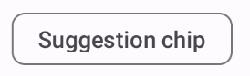
@Composable fun SuggestionChipExample() { SuggestionChip( onClick = { Log.d("Suggestion chip", "hello world") }, label = { Text("Suggestion chip") } ) }
Ta implementacja wygląda tak:
Podniesiony element
Wszystkie przykłady w tym dokumencie korzystają z podstawowych funkcji kompozycyjnych, które mają płaski wygląd. Jeśli chcesz, aby element miał podniesiony wygląd, użyj jednego z tych 3 komponentów: