
Chip 구성요소는 콤팩트한 대화형 UI 요소입니다. 연락처나 태그와 같은 복잡한 항목을 나타내며, 아이콘과 라벨이 함께 표시되는 경우가 많습니다. 확인 가능하거나, 닫을 수 있거나, 클릭 가능할 수 있습니다.
다음은 네 가지 유형의 칩과 칩을 사용할 수 있는 위치입니다.
- 지원: 작업을 수행하는 동안 사용자를 안내합니다. 사용자 입력에 대한 응답으로 임시 UI 요소로 표시되는 경우가 많습니다.
- 필터: 사용자가 옵션 집합에서 콘텐츠를 세부적으로 조정할 수 있습니다. 선택하거나 선택 해제할 수 있으며 선택 시 체크표시 아이콘이 포함될 수 있습니다.
- 입력: 메뉴의 선택과 같은 사용자 제공 정보를 나타냅니다. 아이콘과 텍스트를 포함할 수 있으며 삭제를 위한 X를 제공할 수 있습니다.
- 추천: 최근 활동 또는 입력을 기반으로 사용자에게 추천을 제공합니다. 일반적으로 입력 필드 아래에 표시되어 사용자 작업을 유도합니다.

API 노출 영역
칩의 네 가지 유형에 해당하는 네 가지 컴포저블이 있습니다. 다음 섹션에서는 이러한 컴포저블과 차이점을 자세히 설명합니다. 하지만 다음 매개변수는 공유합니다.
label: 칩에 표시되는 문자열입니다.icon: 칩 시작 부분에 표시되는 아이콘입니다. 일부 특정 컴포저블에는 별도의leadingIcon및trailingIcon매개변수가 있습니다.onClick: 사용자가 칩을 누를 때 칩이 호출하는 람다입니다.
지원 칩
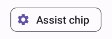
AssistChip 컴포저블은 사용자를 특정 방향으로 유도하는 지원 칩을 만드는 간단한 방법을 제공합니다. 한 가지 특징은 칩의 왼쪽에 아이콘을 표시할 수 있는 leadingIcon 매개변수입니다. 다음 예에서는 구현 방법을 보여줍니다.
@Composable fun AssistChipExample() { AssistChip( onClick = { Log.d("Assist chip", "hello world") }, label = { Text("Assist chip") }, leadingIcon = { Icon( Icons.Filled.Settings, contentDescription = "Localized description", Modifier.size(AssistChipDefaults.IconSize) ) } ) }
이 구현은 다음과 같습니다.
필터 칩
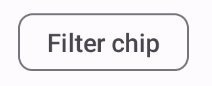
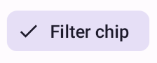
FilterChip 컴포저블을 사용하려면 칩이 선택되었는지 여부를 추적해야 합니다. 다음 예에서는 사용자가 칩을 선택한 경우에만 선행 선택된 아이콘을 표시하는 방법을 보여줍니다.
@Composable fun FilterChipExample() { var selected by remember { mutableStateOf(false) } FilterChip( onClick = { selected = !selected }, label = { Text("Filter chip") }, selected = selected, leadingIcon = if (selected) { { Icon( imageVector = Icons.Filled.Done, contentDescription = "Done icon", modifier = Modifier.size(FilterChipDefaults.IconSize) ) } } else { null }, ) }
이 구현은 선택하지 않은 경우 다음과 같이 표시됩니다.
선택하면 다음과 같이 표시됩니다.
입력 칩
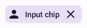
InputChip 컴포저블을 사용하여 사용자 상호작용으로 생성되는 칩을 만들 수 있습니다. 예를 들어 이메일 클라이언트에서 사용자가 이메일을 작성할 때 입력 칩은 사용자가 '받는 사람' 필드에 추가한 연락처를 나타낼 수 있습니다.
다음 구현은 이미 선택된 상태인 입력 칩을 보여줍니다. 사용자가 칩을 누르면 칩이 닫힙니다.
@Composable fun InputChipExample( text: String, onDismiss: () -> Unit, ) { var enabled by remember { mutableStateOf(true) } if (!enabled) return InputChip( onClick = { onDismiss() enabled = !enabled }, label = { Text(text) }, selected = enabled, avatar = { Icon( Icons.Filled.Person, contentDescription = "Localized description", Modifier.size(InputChipDefaults.AvatarSize) ) }, trailingIcon = { Icon( Icons.Default.Close, contentDescription = "Localized description", Modifier.size(InputChipDefaults.AvatarSize) ) }, ) }
이 구현은 다음과 같습니다.
추천 칩
SuggestionChip 컴포저블은 API 정의와 일반적인 사용 사례 모두에서 이 페이지에 나열된 컴포저블 중 가장 기본적인 컴포저블입니다. 추천 칩은 동적으로 생성된 힌트를 표시합니다. 예를 들어 AI 채팅 앱에서 추천 칩을 사용하여 가장 최근 메시지에 대한 가능한 대답을 표시할 수 있습니다.
다음 SuggestionChip 구현을 고려해 보세요.
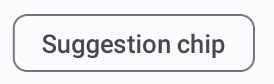
@Composable fun SuggestionChipExample() { SuggestionChip( onClick = { Log.d("Suggestion chip", "hello world") }, label = { Text("Suggestion chip") } ) }
이 구현은 다음과 같이 표시됩니다.
높임 칩
이 문서의 모든 예시에서는 평면적인 모양을 사용하는 기본 컴포저블을 사용합니다. 높은 모양의 칩을 원하는 경우 다음 세 가지 컴포저블 중 하나를 사용하세요.