체크박스를 사용하면 사용자가 목록에서 하나 이상의 항목을 선택할 수 있습니다. 체크박스를 사용하여 사용자가 다음 작업을 할 수 있도록 할 수 있습니다.
- 항목을 사용 설정 또는 사용 중지합니다.
- 목록에서 여러 옵션 중에서 선택합니다.
- 동의 또는 수락을 나타냅니다.
분석
체크박스는 다음 요소로 구성됩니다.
- 상자: 체크박스의 컨테이너입니다.
- 체크: 체크박스가 선택되었는지 여부를 보여주는 시각적 표시기입니다.
- 라벨: 체크박스를 설명하는 텍스트입니다.
상태
체크박스는 다음 세 가지 상태 중 하나일 수 있습니다.
- 선택되지 않음: 체크박스가 선택되지 않았습니다. 상자가 비어 있습니다.
- 불확실: 체크박스가 불확실한 상태입니다. 상자에는 대시가 포함되어 있습니다.
- 선택됨: 체크박스가 선택되어 있습니다. 상자에 체크표시가 포함되어 있습니다.
다음 이미지는 체크박스의 세 가지 상태를 보여줍니다.

구현
Checkbox 컴포저블을 사용하여 앱에 체크박스를 만들 수 있습니다. 몇 가지 주요 매개변수를 염두에 두어야 합니다.
checked: 체크박스가 선택되었는지 선택 해제되었는지를 캡처하는 불리언입니다.onCheckedChange(): 사용자가 체크박스를 탭할 때 앱이 호출하는 함수입니다.
다음 스니펫은 Checkbox 컴포저블을 사용하는 방법을 보여줍니다.
@Composable fun CheckboxMinimalExample() { var checked by remember { mutableStateOf(true) } Row( verticalAlignment = Alignment.CenterVertically, ) { Text( "Minimal checkbox" ) Checkbox( checked = checked, onCheckedChange = { checked = it } ) } Text( if (checked) "Checkbox is checked" else "Checkbox is unchecked" ) }
설명
이 코드는 처음에 선택되지 않은 체크박스를 만듭니다. 사용자가 체크박스를 클릭하면 onCheckedChange 람다가 checked 상태를 업데이트합니다.
결과
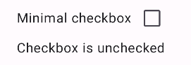
이 예시에서는 선택되지 않은 경우 다음 구성요소를 생성합니다.
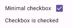
체크박스를 선택하면 다음과 같이 표시됩니다.
고급 예시
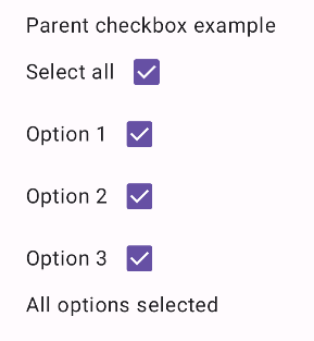
다음은 앱에서 체크박스를 구현하는 방법을 보여주는 더 복잡한 예입니다. 이 스니펫에는 상위 체크박스와 일련의 하위 체크박스가 있습니다. 사용자가 상위 체크박스를 탭하면 앱은 모든 하위 체크박스를 선택합니다.
@Composable fun CheckboxParentExample() { // Initialize states for the child checkboxes val childCheckedStates = remember { mutableStateListOf(false, false, false) } // Compute the parent state based on children's states val parentState = when { childCheckedStates.all { it } -> ToggleableState.On childCheckedStates.none { it } -> ToggleableState.Off else -> ToggleableState.Indeterminate } Column { // Parent TriStateCheckbox Row( verticalAlignment = Alignment.CenterVertically, ) { Text("Select all") TriStateCheckbox( state = parentState, onClick = { // Determine new state based on current state val newState = parentState != ToggleableState.On childCheckedStates.forEachIndexed { index, _ -> childCheckedStates[index] = newState } } ) } // Child Checkboxes childCheckedStates.forEachIndexed { index, checked -> Row( verticalAlignment = Alignment.CenterVertically, ) { Text("Option ${index + 1}") Checkbox( checked = checked, onCheckedChange = { isChecked -> // Update the individual child state childCheckedStates[index] = isChecked } ) } } } if (childCheckedStates.all { it }) { Text("All options selected") } }
설명
이 예에서 유의해야 할 사항은 다음과 같습니다.
- 상태 관리:
childCheckedStates:mutableStateOf()를 사용하여 각 하위 체크박스의 선택 상태를 추적하는 불리언 목록입니다.parentState: 값이 하위 체크박스의 상태에서 파생되는ToggleableState입니다.
- UI 구성요소:
TriStateCheckbox: 불확정으로 설정할 수 있는state매개변수가 있으므로 상위 체크박스에 필요합니다.Checkbox: 상태가childCheckedStates의 해당 요소에 연결된 각 하위 체크박스에 사용됩니다.Text: 라벨과 메시지 ('모두 선택', '옵션 X', '모든 옵션 선택됨')을 표시합니다.
- 논리:
- 상위 체크박스의
onClick는 모든 하위 체크박스를 현재 상위 상태의 반대로 업데이트합니다. - 각 하위 체크박스의
onCheckedChange는childCheckedStates목록에서 해당 상태를 업데이트합니다. - 모든 하위 체크박스가 선택되면 코드에 '
All options selected'이 표시됩니다.
- 상위 체크박스의
결과
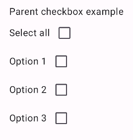
이 예시에서는 모든 체크박스가 선택 해제되면 다음 구성요소를 생성합니다.
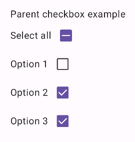
마찬가지로 사용자가 모두 선택을 탭하는 등 모든 옵션을 선택하면 구성요소가 다음과 같이 표시됩니다.
옵션이 하나만 선택된 경우 상위 체크박스에 불확정 상태가 표시됩니다.