کادرهای انتخاب به کاربران اجازه میدهند یک یا چند مورد را از یک لیست انتخاب کنند. میتوانید از یک کادر انتخاب برای انجام موارد زیر توسط کاربر استفاده کنید:
- یک مورد را روشن یا خاموش کنید.
- از بین چندین گزینه در یک لیست انتخاب کنید.
- موافقت یا پذیرش را نشان دهید.
آناتومی
یک کادر انتخاب از عناصر زیر تشکیل شده است:
- جعبه : این ظرف برای کادر انتخاب است.
- بررسی : این نشانگر بصری است که نشان میدهد کادر انتخاب انتخاب شده است یا خیر.
- برچسب : این متنی است که کادر انتخاب را توصیف میکند.
ایالتها
یک چکباکس میتواند در یکی از سه حالت زیر باشد:
- انتخاب نشده : کادر انتخاب انتخاب نشده است. کادر خالی است.
- نامشخص : کادر انتخاب در حالت نامشخص است. کادر حاوی خط تیره است.
- انتخابشده : کادر انتخاب انتخاب شده است. کادر حاوی یک علامت تیک است.
تصویر زیر سه حالت یک چک باکس را نشان میدهد.

پیادهسازی
شما میتوانید از Checkbox composable برای ایجاد یک چکباکس در برنامه خود استفاده کنید. فقط چند پارامتر کلیدی وجود دارد که باید در نظر داشته باشید:
-
checked: مقدار بولی که مشخص میکند کادر انتخاب علامت زده شده است یا خیر. -
onCheckedChange(): تابعی که برنامه هنگام لمس کادر انتخاب توسط کاربر، فراخوانی میکند.
قطعه کد زیر نحوه استفاده از Checkbox composable را نشان میدهد:
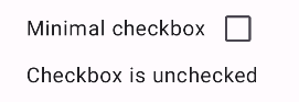
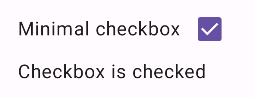
@Composable fun CheckboxMinimalExample() { var checked by remember { mutableStateOf(true) } Row( verticalAlignment = Alignment.CenterVertically, ) { Text( "Minimal checkbox" ) Checkbox( checked = checked, onCheckedChange = { checked = it } ) } Text( if (checked) "Checkbox is checked" else "Checkbox is unchecked" ) }
توضیح
این کد یک کادر انتخاب ایجاد میکند که در ابتدا علامتگذاری نشده است. وقتی کاربر روی کادر انتخاب کلیک میکند، لامبدا onCheckedChange حالت checked را بهروزرسانی میکند.
نتیجه
این مثال وقتی تیک آن برداشته شود، کامپوننت زیر را تولید میکند:
و اینگونه است که همان کادر انتخاب هنگام علامت زدن ظاهر میشود:
مثال پیشرفته
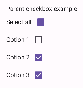
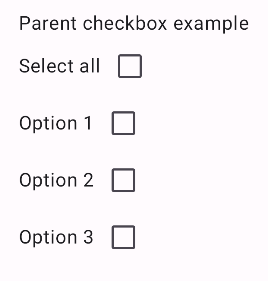
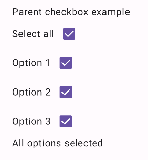
در ادامه مثال پیچیدهتری از نحوه پیادهسازی چکباکسها در برنامهتان آمده است. در این قطعه کد، یک چکباکس والد و مجموعهای از چکباکسهای فرزند وجود دارد. وقتی کاربر روی چکباکس والد ضربه میزند، برنامه همه چکباکسهای فرزند را تیک میزند.
@Composable fun CheckboxParentExample() { // Initialize states for the child checkboxes val childCheckedStates = remember { mutableStateListOf(false, false, false) } // Compute the parent state based on children's states val parentState = when { childCheckedStates.all { it } -> ToggleableState.On childCheckedStates.none { it } -> ToggleableState.Off else -> ToggleableState.Indeterminate } Column { // Parent TriStateCheckbox Row( verticalAlignment = Alignment.CenterVertically, ) { Text("Select all") TriStateCheckbox( state = parentState, onClick = { // Determine new state based on current state val newState = parentState != ToggleableState.On childCheckedStates.forEachIndexed { index, _ -> childCheckedStates[index] = newState } } ) } // Child Checkboxes childCheckedStates.forEachIndexed { index, checked -> Row( verticalAlignment = Alignment.CenterVertically, ) { Text("Option ${index + 1}") Checkbox( checked = checked, onCheckedChange = { isChecked -> // Update the individual child state childCheckedStates[index] = isChecked } ) } } } if (childCheckedStates.all { it }) { Text("All options selected") } }
توضیح
نکات زیر را باید از این مثال متوجه شوید:
- مدیریت ایالتی :
-
childCheckedStates: فهرستی از مقادیر بولی که با استفاده ازmutableStateOf()برای ردیابی وضعیت تیک خوردهی هر چکباکس فرزند استفاده میشوند. -
parentState: یکToggleableStateکه مقدار آن از وضعیت چکباکسهای فرزند گرفته میشود.
-
- اجزای رابط کاربری :
-
TriStateCheckbox: برای چکباکس والد ضروری است زیرا دارای پارامترstateاست که به شما امکان میدهد آن را روی مقدار نامشخص تنظیم کنید. -
Checkbox: برای هر کادر انتخاب فرزند که وضعیت آن به عنصر مربوطه درchildCheckedStatesلینک شده است، استفاده میشود. -
Text: برچسبها و پیامها را نمایش میدهد ("انتخاب همه"، "گزینه X"، "همه گزینهها انتخاب شدند").
-
- منطق :
-
onClickمربوط به چکباکس والد، وضعیت تمام چکباکسهای فرزند را برعکس وضعیت فعلی والد بهروزرسانی میکند. -
onCheckedChangeمربوط به هر چکباکس فرزند، وضعیت متناظر آن را در لیستchildCheckedStatesبهروزرسانی میکند. - وقتی همه کادرهای انتخاب فرزند علامت زده شوند، کد عبارت «
All options selected» را نمایش میدهد.
-
نتیجه
این مثال وقتی همه کادرهای انتخاب علامت زده نشده باشند، کامپوننت زیر را تولید میکند.
به همین ترتیب، وقتی همه گزینهها علامت زده شدهاند، وقتی کاربر روی «انتخاب همه» ضربه میزند، کامپوننت به این شکل ظاهر میشود:
وقتی فقط یک گزینه علامت زده شده باشد، کادر انتخاب والد، حالت نامشخص را نمایش میدهد: