চেকবক্স ব্যবহারকারীদের তালিকা থেকে এক বা একাধিক আইটেম নির্বাচন করতে দেয়। ব্যবহারকারীকে নিম্নলিখিত কাজগুলি করতে দেওয়ার জন্য আপনি একটি চেকবক্স ব্যবহার করতে পারেন:
- কোনও আইটেম চালু বা বন্ধ করুন।
- একটি তালিকার একাধিক বিকল্প থেকে নির্বাচন করুন।
- সম্মতি বা গ্রহণযোগ্যতা নির্দেশ করুন।
অ্যানাটমি
একটি চেকবক্সে নিম্নলিখিত উপাদানগুলি থাকে:
- বক্স : এটি চেকবক্সের জন্য ধারক।
- চেক : এটি একটি ভিজ্যুয়াল সূচক যা দেখায় যে চেকবক্সটি নির্বাচিত কিনা।
- লেবেল : এটি সেই লেখা যা চেকবক্সটি বর্ণনা করে।
রাজ্যসমূহ
একটি চেকবক্স তিনটি অবস্থার যেকোনো একটিতে থাকতে পারে:
- অনির্বাচিত : চেকবক্সটি নির্বাচিত হয়নি। বাক্সটি খালি।
- অনির্দিষ্ট : চেকবক্সটি অনির্দিষ্ট অবস্থায় আছে। বাক্সটিতে একটি ড্যাশ রয়েছে।
- নির্বাচিত : চেকবক্সটি নির্বাচিত হয়েছে। বাক্সটিতে একটি চেকমার্ক রয়েছে।
নিচের ছবিটি একটি চেকবক্সের তিনটি অবস্থা প্রদর্শন করে।

বাস্তবায়ন
আপনার অ্যাপে একটি চেকবক্স তৈরি করতে আপনি Checkbox কম্পোজেবল ব্যবহার করতে পারেন। মনে রাখার জন্য কেবল কয়েকটি মূল পরামিতি রয়েছে:
-
checked: বুলিয়ান যা চেকবক্সটি চেক করা আছে নাকি আনচেক করা নেই তা ক্যাপচার করে। -
onCheckedChange(): ব্যবহারকারী যখন চেকবক্সে ট্যাপ করে তখন অ্যাপটি যে ফাংশনটি কল করে।
নিম্নলিখিত স্নিপেটটি Checkbox কম্পোজেবল কীভাবে ব্যবহার করবেন তা দেখায়:
@Composable fun CheckboxMinimalExample() { var checked by remember { mutableStateOf(true) } Row( verticalAlignment = Alignment.CenterVertically, ) { Text( "Minimal checkbox" ) Checkbox( checked = checked, onCheckedChange = { checked = it } ) } Text( if (checked) "Checkbox is checked" else "Checkbox is unchecked" ) }
ব্যাখ্যা
এই কোডটি একটি চেকবক্স তৈরি করে যা প্রাথমিকভাবে আনচেক করা থাকে। ব্যবহারকারী যখন চেকবক্সে ক্লিক করেন, তখন onCheckedChange ল্যাম্বডা checked অবস্থা আপডেট করে।
ফলাফল
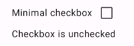
এই উদাহরণটি চেক না করলে নিম্নলিখিত উপাদানটি তৈরি করে:
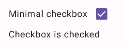
এবং চেক করা হলে একই চেকবক্সটি এভাবেই প্রদর্শিত হয়:
উন্নত উদাহরণ
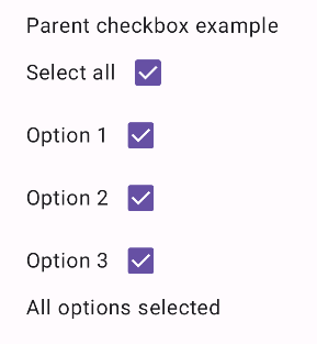
আপনার অ্যাপে চেকবক্সগুলি কীভাবে প্রয়োগ করতে পারেন তার একটি আরও জটিল উদাহরণ নিচে দেওয়া হল। এই স্নিপেটে, একটি প্যারেন্ট চেকবক্স এবং একাধিক চাইল্ড চেকবক্স রয়েছে। ব্যবহারকারী যখন প্যারেন্ট চেকবক্সে ট্যাপ করেন, তখন অ্যাপটি সমস্ত চাইল্ড চেকবক্স পরীক্ষা করে।
@Composable fun CheckboxParentExample() { // Initialize states for the child checkboxes val childCheckedStates = remember { mutableStateListOf(false, false, false) } // Compute the parent state based on children's states val parentState = when { childCheckedStates.all { it } -> ToggleableState.On childCheckedStates.none { it } -> ToggleableState.Off else -> ToggleableState.Indeterminate } Column { // Parent TriStateCheckbox Row( verticalAlignment = Alignment.CenterVertically, ) { Text("Select all") TriStateCheckbox( state = parentState, onClick = { // Determine new state based on current state val newState = parentState != ToggleableState.On childCheckedStates.forEachIndexed { index, _ -> childCheckedStates[index] = newState } } ) } // Child Checkboxes childCheckedStates.forEachIndexed { index, checked -> Row( verticalAlignment = Alignment.CenterVertically, ) { Text("Option ${index + 1}") Checkbox( checked = checked, onCheckedChange = { isChecked -> // Update the individual child state childCheckedStates[index] = isChecked } ) } } } if (childCheckedStates.all { it }) { Text("All options selected") } }
ব্যাখ্যা
এই উদাহরণ থেকে আপনার কয়েকটি বিষয় মনে রাখা উচিত:
- রাষ্ট্র ব্যবস্থাপনা :
-
childCheckedStates: প্রতিটি চাইল্ড চেকবক্সের চেক করা অবস্থা ট্র্যাক করার জন্যmutableStateOf()ব্যবহার করে বুলিয়ানদের একটি তালিকা। -
parentState: একটিToggleableStateযার মান চাইল্ড চেকবক্সের অবস্থা থেকে প্রাপ্ত।
-
- UI উপাদান :
-
TriStateCheckbox: প্যারেন্ট চেকবক্সের জন্য এটি প্রয়োজনীয় কারণ এতে একটিstateপ্যারামিটার রয়েছে যা আপনাকে এটিকে অনির্দিষ্টে সেট করতে দেয়। -
Checkbox: প্রতিটি চাইল্ড চেকবক্সের জন্য ব্যবহৃত হয় যার অবস্থাchildCheckedStatesএর সংশ্লিষ্ট উপাদানের সাথে সংযুক্ত থাকে। -
Text: লেবেল এবং বার্তা প্রদর্শন করে ("সব নির্বাচন করুন", "বিকল্প X", "সকল বিকল্প নির্বাচিত")।
-
- যুক্তি :
- প্যারেন্ট চেকবক্সের
onClickসমস্ত চাইল্ড চেকবক্সকে বর্তমান প্যারেন্ট স্টেটের বিপরীতে আপডেট করে। - প্রতিটি চাইল্ড চেকবক্সের
onCheckedChangechildCheckedStatesতালিকার সংশ্লিষ্ট অবস্থা আপডেট করে। - সমস্ত চাইল্ড চেকবক্স চেক করা হলে কোডটি "
All options selected" প্রদর্শন করে।
- প্যারেন্ট চেকবক্সের
ফলাফল
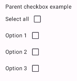
সমস্ত চেকবক্স আনচেক করা হলে এই উদাহরণটি নিম্নলিখিত উপাদানটি তৈরি করে।
একইভাবে, সমস্ত বিকল্প চেক করা হলে উপাদানটি এভাবেই প্রদর্শিত হয়, যেমন ব্যবহারকারী যখন সমস্ত নির্বাচন করুন ট্যাপ করেন:
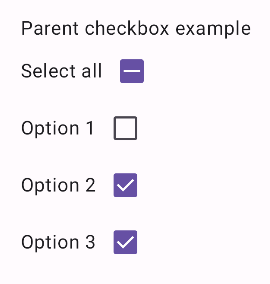
যখন শুধুমাত্র একটি বিকল্প চেক করা হয় তখন প্যারেন্ট চেকবক্সটি অনির্দিষ্ট অবস্থা প্রদর্শন করে: