Sử dụng bộ sưu tập để sắp xếp ngăn nắp các trang
Lưu và phân loại nội dung dựa trên lựa chọn ưu tiên của bạn.
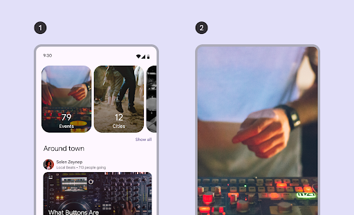
Băng chuyền hiển thị một danh sách các mục có thể cuộn, tự động điều chỉnh dựa trên kích thước cửa sổ. Sử dụng băng chuyền để giới thiệu một bộ sưu tập nội dung có liên quan.
Các mục trong băng chuyền nhấn mạnh hình ảnh, nhưng cũng có thể chứa văn bản ngắn thích ứng với kích thước của mục.
Có 4 bố cục băng chuyền phù hợp với nhiều trường hợp sử dụng:
Nhiều kích thước: Bao gồm các mặt hàng có nhiều kích thước. Nên dùng để duyệt qua nhiều mục cùng lúc, chẳng hạn như ảnh.
Uncontained (Không có vùng chứa): Chứa các mục có một kích thước và trôi qua cạnh của màn hình. Bạn có thể tuỳ chỉnh để hiện thêm văn bản hoặc giao diện người dùng khác ở phía trên hoặc phía dưới mỗi mục.
Hero: Làm nổi bật một hình ảnh lớn để tập trung vào và cung cấp thông tin sơ lược về nội dung tiếp theo bằng một mục nhỏ. Nên dùng để làm nổi bật nội dung mà bạn muốn nhấn mạnh, chẳng hạn như hình thu nhỏ của phim hoặc chương trình.
Toàn màn hình: Hiển thị từng mục lớn tràn viền và cuộn theo chiều dọc. Phù hợp với nội dung có chiều cao lớn hơn chiều rộng.
Hình 1. Các loại băng chuyền không có đường viền (1) và toàn màn hình (2).
Trang này hướng dẫn bạn cách triển khai bố cục băng chuyền không có vùng chứa và duyệt qua nhiều nội dung. Hãy xem Nguyên tắc về băng chuyền Material 3 để biết thêm thông tin về các loại bố cục.
state: Một thực thể CarouselState quản lý chỉ mục mục hiện tại và vị trí cuộn. Tạo trạng thái này bằng cách sử dụng rememberCarouselState { itemCount }, trong đó itemCount là tổng số mục trong băng chuyền.
itemSpacing: Xác định khoảng trống giữa các mục liền kề trong băng chuyền.
contentPadding: Áp dụng khoảng đệm xung quanh vùng nội dung của băng chuyền. Sử dụng thuộc tính này để thêm khoảng cách trước mục đầu tiên hoặc sau mục cuối cùng, hoặc để cung cấp lề cho các mục trong vùng có thể di chuyển.
content: Một hàm có khả năng kết hợp nhận được một chỉ mục số nguyên. Sử dụng lambda này để xác định giao diện người dùng cho từng mục trong băng chuyền dựa trên chỉ mục của mục đó.
Các thành phần kết hợp này khác nhau ở cách chúng chỉ định kích thước của mục:
itemWidth (đối với HorizontalUncontainedCarousel): Chỉ định chiều rộng chính xác cho từng mục trong băng chuyền không có vùng chứa.
preferredItemWidth (cho HorizontalMultiBrowseCarousel): Đề xuất chiều rộng lý tưởng cho các mục trong băng chuyền duyệt qua nhiều nội dung, cho phép thành phần hiển thị nhiều mục nếu có đủ không gian.
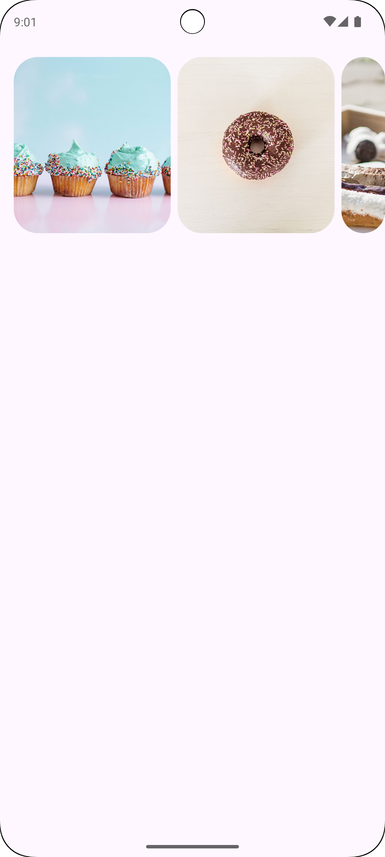
Ví dụ: Băng chuyền duyệt qua nhiều nội dung
Đoạn mã này triển khai một băng chuyền duyệt qua nhiều nội dung:
Xác định một lớp dữ liệu CarouselItem, giúp cấu trúc dữ liệu cho từng phần tử trong băng chuyền.
Tạo và ghi nhớ một List gồm các đối tượng CarouselItem được điền sẵn bằng các tài nguyên và nội dung mô tả hình ảnh.
Sử dụng thành phần kết hợp HorizontalMultiBrowseCarousel, được thiết kế để hiển thị nhiều mục trong một băng chuyền.
Trạng thái của băng chuyền được khởi chạy bằng rememberCarouselState, được cung cấp tổng số mục.
Các mục có preferredItemWidth (ở đây là 186.dp), cho biết chiều rộng tối ưu cho từng mục. Băng chuyền sử dụng thông tin này để xác định số lượng mục có thể vừa với màn hình cùng một lúc.
Tham số itemSpacing sẽ thêm một khoảng trống nhỏ giữa các mục.
Lambda theo sau của HorizontalMultiBrowseCarousel sẽ lặp lại thông qua CarouselItems. Trong mỗi lần lặp, hàm này sẽ truy xuất mục tại chỉ mục i và hiển thị một thành phần kết hợp Image cho mục đó.
Modifier.maskClip(MaterialTheme.shapes.extraLarge) áp dụng một mặt nạ hình dạng xác định trước cho từng hình ảnh, giúp hình ảnh có các góc bo tròn.
contentDescription cung cấp nội dung mô tả hỗ trợ tiếp cận cho hình ảnh.
Kết quả
Hình ảnh sau đây cho thấy kết quả từ đoạn mã trước:
Hình 2. Băng chuyền duyệt qua nhiều nội dung, trong đó mục cuối cùng bị cắt.
Ví dụ: Băng chuyền không có vùng chứa
Đoạn mã sau đây triển khai một băng chuyền không có vùng chứa:
Thành phần kết hợp HorizontalUncontainedCarousel tạo bố cục băng chuyền.
Tham số itemWidth đặt chiều rộng cố định cho từng mục trong băng chuyền.
Kết quả
Hình ảnh sau đây cho thấy kết quả từ đoạn mã trước:
Hình 3. Một băng chuyền không có vùng chứa, trong đó mục cuối cùng trong băng chuyền không bị cắt.
Nội dung và mã mẫu trên trang này phải tuân thủ các giấy phép như mô tả trong phần Giấy phép nội dung. Java và OpenJDK là nhãn hiệu hoặc nhãn hiệu đã đăng ký của Oracle và/hoặc đơn vị liên kết của Oracle.
Cập nhật lần gần đây nhất: 2025-08-27 UTC.
[[["Dễ hiểu","easyToUnderstand","thumb-up"],["Giúp tôi giải quyết được vấn đề","solvedMyProblem","thumb-up"],["Khác","otherUp","thumb-up"]],[["Thiếu thông tin tôi cần","missingTheInformationINeed","thumb-down"],["Quá phức tạp/quá nhiều bước","tooComplicatedTooManySteps","thumb-down"],["Đã lỗi thời","outOfDate","thumb-down"],["Vấn đề về bản dịch","translationIssue","thumb-down"],["Vấn đề về mẫu/mã","samplesCodeIssue","thumb-down"],["Khác","otherDown","thumb-down"]],["Cập nhật lần gần đây nhất: 2025-08-27 UTC."],[],[],null,["A carousel displays a scrollable list of items that adapt dynamically based on\nwindow size. Use carousels to showcase a collection of related content.\nCarousel items emphasize visuals, but can also contain brief text that adapts to\nthe item size.\n\nThere are four carousel layouts available to suit different use cases:\n\n- **Multi-browse**: Includes differently sized items. Recommended for browsing many items at once, like photos.\n- **Uncontained**: Contains items that are a single size and flow past the edge of the screen. Can be customized to show more text or other UI above or below each item.\n- **Hero**: Highlights one large image to focus on and provides a peek of what's next with a small item. Recommended for spotlighting content that you want to emphasize, like movie or show thumbnails.\n- **Full-screen**: Shows one edge-to-edge large item at a time and scrolls vertically. Recommended for content that is taller than it is wide.\n\n**Figure 1.** Uncontained (1) and full-screen (2) carousel types.\n\nThis page shows you how to implement the multi-browse and uncontained carousel\nlayouts. See the [Carousel Material 3 guidelines](https://m3.material.io/components/carousel/overview) for\nmore information about the layout types.\n\nAPI surface\n\nTo implement multi-browse and uncontained carousels, use the\n[`HorizontalMultiBrowseCarousel`](/reference/kotlin/androidx/compose/material3/carousel/package-summary#HorizontalMultiBrowseCarousel(androidx.compose.material3.carousel.CarouselState,androidx.compose.ui.unit.Dp,androidx.compose.ui.Modifier,androidx.compose.ui.unit.Dp,androidx.compose.foundation.gestures.TargetedFlingBehavior,androidx.compose.ui.unit.Dp,androidx.compose.ui.unit.Dp,androidx.compose.foundation.layout.PaddingValues,kotlin.Function2)) and [`HorizontalUncontainedCarousel`](/reference/kotlin/androidx/compose/material3/carousel/package-summary#HorizontalUncontainedCarousel(androidx.compose.material3.carousel.CarouselState,androidx.compose.ui.unit.Dp,androidx.compose.ui.Modifier,androidx.compose.ui.unit.Dp,androidx.compose.foundation.gestures.TargetedFlingBehavior,androidx.compose.foundation.layout.PaddingValues,kotlin.Function2))\ncomposables. These composables share the following key parameters:\n\n- `state`: A `CarouselState` instance that manages the current item index and scroll position. Create this state using `rememberCarouselState { itemCount }`, where `itemCount` is the total number of items in the carousel.\n- `itemSpacing`: Defines the amount of empty space between adjacent items in the carousel.\n- `contentPadding`: Applies padding around the content area of the carousel. Use this to add space before the first item or after the last item, or to provide margins for the items within the scrollable region.\n- `content`: A composable function that receives an integer index. Use this lambda to define the UI for each item in the carousel based on its index.\n\nThese composables differ in how they specify item sizing:\n\n- `itemWidth` (for `HorizontalUncontainedCarousel`): Specifies the exact width for each item in an uncontained carousel.\n- `preferredItemWidth` (for `HorizontalMultiBrowseCarousel`): Suggests the ideal width for items in a multi-browse carousel, letting the component display multiple items if space permits.\n\nExample: Multi-browse carousel\n\nThis snippet implements a multi-browse carousel:\n\n\n```kotlin\n@Composable\nfun CarouselExample_MultiBrowse() {\n data class CarouselItem(\n val id: Int,\n @DrawableRes val imageResId: Int,\n val contentDescription: String\n )\n\n val items = remember {\n listOf(\n CarouselItem(0, R.drawable.cupcake, \"cupcake\"),\n CarouselItem(1, R.drawable.donut, \"donut\"),\n CarouselItem(2, R.drawable.eclair, \"eclair\"),\n CarouselItem(3, R.drawable.froyo, \"froyo\"),\n CarouselItem(4, R.drawable.gingerbread, \"gingerbread\"),\n )\n }\n\n HorizontalMultiBrowseCarousel(\n state = rememberCarouselState { items.count() },\n modifier = Modifier\n .fillMaxWidth()\n .wrapContentHeight()\n .padding(top = 16.dp, bottom = 16.dp),\n preferredItemWidth = 186.dp,\n itemSpacing = 8.dp,\n contentPadding = PaddingValues(horizontal = 16.dp)\n ) { i -\u003e\n val item = items[i]\n Image(\n modifier = Modifier\n .height(205.dp)\n .maskClip(MaterialTheme.shapes.extraLarge),\n painter = painterResource(id = item.imageResId),\n contentDescription = item.contentDescription,\n contentScale = ContentScale.Crop\n )\n }\n}https://github.com/android/snippets/blob/7a0ebbee11495f628cf9d574f6b6069c2867232a/compose/snippets/src/main/java/com/example/compose/snippets/components/Carousel.kt#L44-L82\n```\n\n\u003cbr /\u003e\n\nKey points about the code\n\n- Defines a `CarouselItem` data class, which structures the data for each element in the carousel.\n- Creates and remembers a `List` of `CarouselItem` objects that are populated with image resources and descriptions.\n- Uses the `HorizontalMultiBrowseCarousel` composable, which is designed for displaying multiple items in a carousel.\n - The carousel's state is initialized using `rememberCarouselState`, which is given the total count of items.\n - Items have a `preferredItemWidth` (here, `186.dp`), which suggests an optimal width for each item. The carousel uses this to determine how many items can fit on the screen at once.\n - The `itemSpacing` parameter adds a small gap between items.\n - The trailing lambda of `HorizontalMultiBrowseCarousel` iterates through the `CarouselItems`. In each iteration, it retrieves the item at index `i` and renders an `Image` composable for it.\n - `Modifier.maskClip(MaterialTheme.shapes.extraLarge)` applies a predefined shape mask to each image, giving it rounded corners.\n - `contentDescription` provides an accessibility description for the image.\n\nResult\n\nThe following image shows the result from the preceding snippet:\n**Figure 2.** A multi-browse carousel, with the last item clipped.\n\nExample: Uncontained carousel\n\nThe following snippet implements an uncontained carousel:\n\n\n```kotlin\n@Composable\nfun CarouselExample() {\n data class CarouselItem(\n val id: Int,\n @DrawableRes val imageResId: Int,\n val contentDescription: String\n )\n\n val carouselItems = remember {\n listOf(\n CarouselItem(0, R.drawable.cupcake, \"cupcake\"),\n CarouselItem(1, R.drawable.donut, \"donut\"),\n CarouselItem(2, R.drawable.eclair, \"eclair\"),\n CarouselItem(3, R.drawable.froyo, \"froyo\"),\n CarouselItem(4, R.drawable.gingerbread, \"gingerbread\"),\n )\n }\n\n HorizontalUncontainedCarousel(\n state = rememberCarouselState { carouselItems.count() },\n modifier = Modifier\n .fillMaxWidth()\n .wrapContentHeight()\n .padding(top = 16.dp, bottom = 16.dp),\n itemWidth = 186.dp,\n itemSpacing = 8.dp,\n contentPadding = PaddingValues(horizontal = 16.dp)\n ) { i -\u003e\n val item = carouselItems[i]\n Image(\n modifier = Modifier\n .height(205.dp)\n .maskClip(MaterialTheme.shapes.extraLarge),\n painter = painterResource(id = item.imageResId),\n contentDescription = item.contentDescription,\n contentScale = ContentScale.Crop\n )\n }\n}https://github.com/android/snippets/blob/7a0ebbee11495f628cf9d574f6b6069c2867232a/compose/snippets/src/main/java/com/example/compose/snippets/components/Carousel.kt#L88-L126\n```\n\n\u003cbr /\u003e\n\nKey points about the code\n\n- The `HorizontalUncontainedCarousel` composable creates the carousel layout.\n - The `itemWidth` parameter sets a fixed width for each item in the carousel.\n\nResult\n\nThe following image shows the result from the preceding snippet:\n**Figure 3.** An uncontained carousel, where the last item in the carousel is not clipped."]]