Zadbaj o dobrą organizację dzięki kolekcji
Zapisuj i kategoryzuj treści zgodnie ze swoimi preferencjami.
Karuzela wyświetla przewijaną listę elementów, które dynamicznie dostosowują się do rozmiaru okna. Używaj karuzel, aby prezentować kolekcję powiązanych treści.
Elementy karuzeli zawierają przede wszystkim treści wizualne, ale mogą też zawierać krótki tekst, który dostosowuje się do rozmiaru elementu.
Dostępne są 4 układy karuzeli, które pasują do różnych przypadków użycia:
Wielokrotne przeglądanie: obejmuje produkty o różnych rozmiarach. Zalecany do przeglądania wielu elementów naraz, np. zdjęć.
Nieograniczony: zawiera elementy o jednym rozmiarze, które wykraczają poza krawędź ekranu. Można go dostosować, aby wyświetlać więcej tekstu lub innych elementów interfejsu nad lub pod każdym elementem.
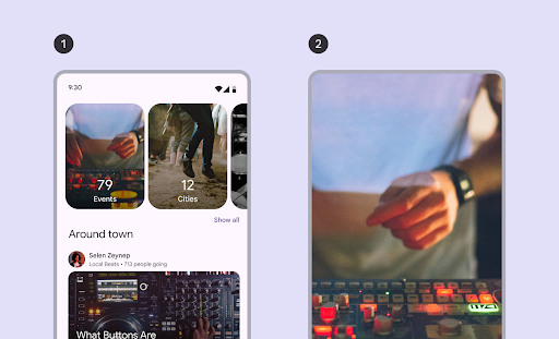
Główny: wyróżnia jeden duży obraz, na którym można się skupić, i pokazuje mały element, który zapowiada, co będzie dalej. Zalecany do wyróżniania treści, na których chcesz się skupić, np. miniatur filmów lub programów.
Pełny ekran: wyświetla po jednym dużym elemencie od krawędzi do krawędzi i przewija się w pionie. Zalecany w przypadku treści, które są wyższe niż szersze.
Rysunek 1. Typy karuzeli: bez kontenera (1) i pełnoekranowa (2).
Na tej stronie dowiesz się, jak wdrożyć układy karuzeli z wieloma przeglądarkami i bez kontenera. Więcej informacji o typach układu znajdziesz w wytycznych dotyczących karuzeli w Material 3.
state: instancja CarouselState, która zarządza bieżącym indeksem elementu i pozycją przewijania. Utwórz ten stan za pomocą kodu rememberCarouselState { itemCount }, gdzie itemCount to łączna liczba elementów w karuzeli.
itemSpacing: określa ilość pustego miejsca między sąsiednimi elementami w karuzeli.
contentPadding: stosuje dopełnienie wokół obszaru treści karuzeli. Użyj tego, aby dodać odstęp przed pierwszym lub po ostatnim elementem albo aby zapewnić marginesy dla elementów w obszarze przewijania.
content: funkcja typu „composable”, która przyjmuje indeks liczby całkowitej. Użyj tej funkcji lambda, aby zdefiniować interfejs każdego elementu w karuzeli na podstawie jego indeksu.
Te funkcje kompozycyjne różnią się sposobem określania rozmiaru elementu:
itemWidth (w przypadku HorizontalUncontainedCarousel): określa dokładną szerokość każdego elementu w nieograniczonym karuzeli.
preferredItemWidth (w przypadku HorizontalMultiBrowseCarousel): sugeruje idealną szerokość elementów w karuzeli z wieloma kartami, dzięki czemu komponent może wyświetlać wiele elementów, jeśli jest na to miejsce.
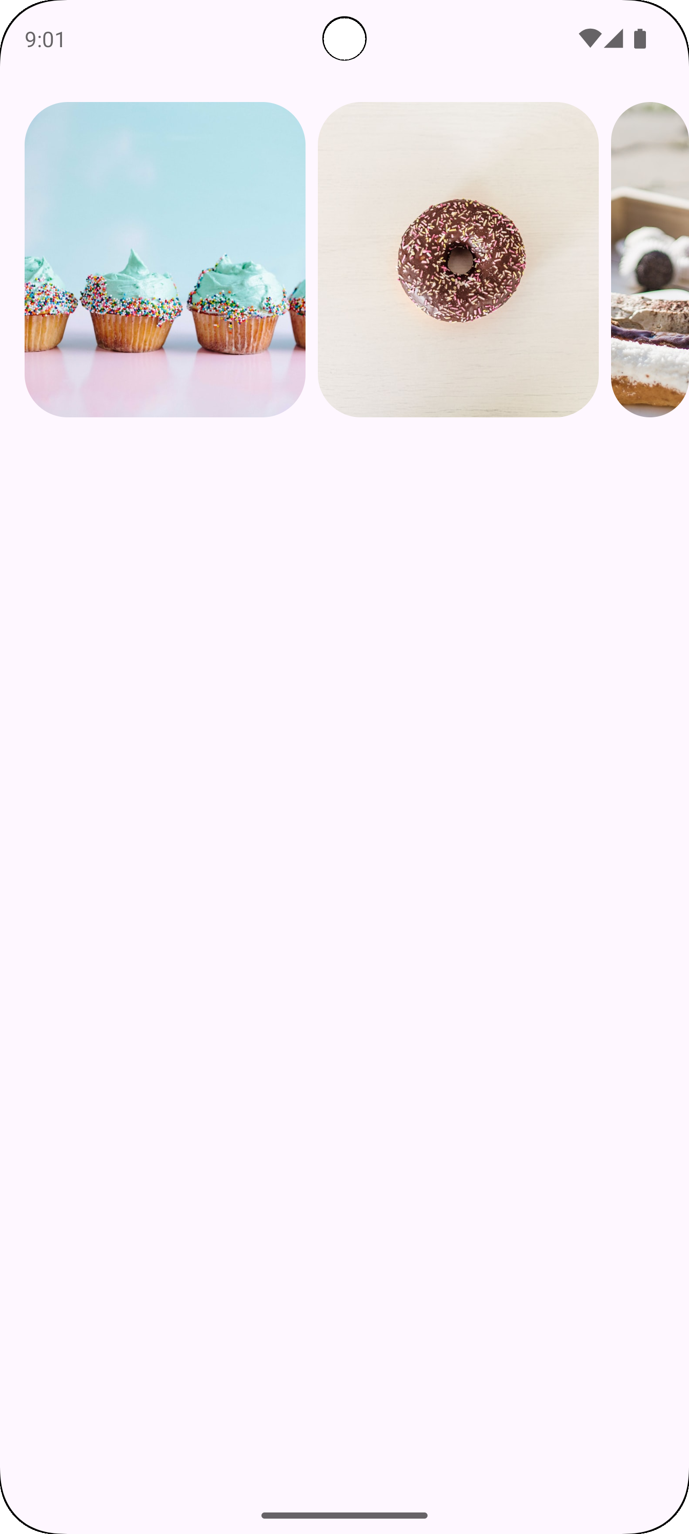
Przykład: karuzela z wieloma przeglądarkami
Ten fragment kodu implementuje karuzelę z wieloma przeglądarkami:
Definiuje CarouselItem klasę danych, która strukturyzuje dane każdego elementu w karuzeli.
Tworzy i zapamiętuje List obiektów CarouselItem, które są wypełnione zasobami obrazów i opisami.
Używa komponentu HorizontalMultiBrowseCarousel, który jest przeznaczony do wyświetlania wielu elementów w karuzeli.
Stan karuzeli jest inicjowany za pomocą zmiennej rememberCarouselState, której przypisywana jest łączna liczba elementów.
Elementy mają atrybut preferredItemWidth (w tym przypadku 186.dp), który sugeruje optymalną szerokość każdego elementu. Karuzela używa tego parametru do określania, ile elementów może się zmieścić na ekranie jednocześnie.
Parametr itemSpacing dodaje niewielką przerwę między elementami.
Ostatnie wyrażenie lambda HorizontalMultiBrowseCarousel iteruje po CarouselItems. W każdej iteracji pobiera element o indeksie i i renderuje dla niego funkcję kompozycyjną Image.
Modifier.maskClip(MaterialTheme.shapes.extraLarge) stosuje do każdego obrazu gotową maskę kształtu, nadając mu zaokrąglone rogi.
contentDescription podaje opis obrazu obsługujący ułatwienia dostępu.
Wynik
Na ilustracji poniżej widać wynik działania powyższego fragmentu kodu:
Rysunek 2. Karuzela z wieloma przeglądarkami, z ostatnim elementem przyciętym.
Przykład: nieograniczony karuzela
Poniższy fragment kodu implementuje karuzelę bez kontenera:
Kompozycja HorizontalUncontainedCarousel tworzy układ karuzeli.
Parametr itemWidth ustawia stałą szerokość każdego elementu w karuzeli.
Wynik
Na ilustracji poniżej widać wynik działania powyższego fragmentu kodu:
Rysunek 3. Nieograniczona karuzela, w której ostatni element nie jest przycięty.
Treść strony i umieszczone na niej fragmenty kodu podlegają licencjom opisanym w Licencji na treści. Java i OpenJDK są znakami towarowymi lub zastrzeżonymi znakami towarowymi należącymi do firmy Oracle lub jej podmiotów stowarzyszonych.
Ostatnia aktualizacja: 2025-08-28 UTC.
[[["Łatwo zrozumieć","easyToUnderstand","thumb-up"],["Rozwiązało to mój problem","solvedMyProblem","thumb-up"],["Inne","otherUp","thumb-up"]],[["Brak potrzebnych mi informacji","missingTheInformationINeed","thumb-down"],["Zbyt skomplikowane / zbyt wiele czynności do wykonania","tooComplicatedTooManySteps","thumb-down"],["Nieaktualne treści","outOfDate","thumb-down"],["Problem z tłumaczeniem","translationIssue","thumb-down"],["Problem z przykładami/kodem","samplesCodeIssue","thumb-down"],["Inne","otherDown","thumb-down"]],["Ostatnia aktualizacja: 2025-08-28 UTC."],[],[],null,["A carousel displays a scrollable list of items that adapt dynamically based on\nwindow size. Use carousels to showcase a collection of related content.\nCarousel items emphasize visuals, but can also contain brief text that adapts to\nthe item size.\n\nThere are four carousel layouts available to suit different use cases:\n\n- **Multi-browse**: Includes differently sized items. Recommended for browsing many items at once, like photos.\n- **Uncontained**: Contains items that are a single size and flow past the edge of the screen. Can be customized to show more text or other UI above or below each item.\n- **Hero**: Highlights one large image to focus on and provides a peek of what's next with a small item. Recommended for spotlighting content that you want to emphasize, like movie or show thumbnails.\n- **Full-screen**: Shows one edge-to-edge large item at a time and scrolls vertically. Recommended for content that is taller than it is wide.\n\n**Figure 1.** Uncontained (1) and full-screen (2) carousel types.\n\nThis page shows you how to implement the multi-browse and uncontained carousel\nlayouts. See the [Carousel Material 3 guidelines](https://m3.material.io/components/carousel/overview) for\nmore information about the layout types.\n\nAPI surface\n\nTo implement multi-browse and uncontained carousels, use the\n[`HorizontalMultiBrowseCarousel`](/reference/kotlin/androidx/compose/material3/carousel/package-summary#HorizontalMultiBrowseCarousel(androidx.compose.material3.carousel.CarouselState,androidx.compose.ui.unit.Dp,androidx.compose.ui.Modifier,androidx.compose.ui.unit.Dp,androidx.compose.foundation.gestures.TargetedFlingBehavior,androidx.compose.ui.unit.Dp,androidx.compose.ui.unit.Dp,androidx.compose.foundation.layout.PaddingValues,kotlin.Function2)) and [`HorizontalUncontainedCarousel`](/reference/kotlin/androidx/compose/material3/carousel/package-summary#HorizontalUncontainedCarousel(androidx.compose.material3.carousel.CarouselState,androidx.compose.ui.unit.Dp,androidx.compose.ui.Modifier,androidx.compose.ui.unit.Dp,androidx.compose.foundation.gestures.TargetedFlingBehavior,androidx.compose.foundation.layout.PaddingValues,kotlin.Function2))\ncomposables. These composables share the following key parameters:\n\n- `state`: A `CarouselState` instance that manages the current item index and scroll position. Create this state using `rememberCarouselState { itemCount }`, where `itemCount` is the total number of items in the carousel.\n- `itemSpacing`: Defines the amount of empty space between adjacent items in the carousel.\n- `contentPadding`: Applies padding around the content area of the carousel. Use this to add space before the first item or after the last item, or to provide margins for the items within the scrollable region.\n- `content`: A composable function that receives an integer index. Use this lambda to define the UI for each item in the carousel based on its index.\n\nThese composables differ in how they specify item sizing:\n\n- `itemWidth` (for `HorizontalUncontainedCarousel`): Specifies the exact width for each item in an uncontained carousel.\n- `preferredItemWidth` (for `HorizontalMultiBrowseCarousel`): Suggests the ideal width for items in a multi-browse carousel, letting the component display multiple items if space permits.\n\nExample: Multi-browse carousel\n\nThis snippet implements a multi-browse carousel:\n\n\n```kotlin\n@Composable\nfun CarouselExample_MultiBrowse() {\n data class CarouselItem(\n val id: Int,\n @DrawableRes val imageResId: Int,\n val contentDescription: String\n )\n\n val items = remember {\n listOf(\n CarouselItem(0, R.drawable.cupcake, \"cupcake\"),\n CarouselItem(1, R.drawable.donut, \"donut\"),\n CarouselItem(2, R.drawable.eclair, \"eclair\"),\n CarouselItem(3, R.drawable.froyo, \"froyo\"),\n CarouselItem(4, R.drawable.gingerbread, \"gingerbread\"),\n )\n }\n\n HorizontalMultiBrowseCarousel(\n state = rememberCarouselState { items.count() },\n modifier = Modifier\n .fillMaxWidth()\n .wrapContentHeight()\n .padding(top = 16.dp, bottom = 16.dp),\n preferredItemWidth = 186.dp,\n itemSpacing = 8.dp,\n contentPadding = PaddingValues(horizontal = 16.dp)\n ) { i -\u003e\n val item = items[i]\n Image(\n modifier = Modifier\n .height(205.dp)\n .maskClip(MaterialTheme.shapes.extraLarge),\n painter = painterResource(id = item.imageResId),\n contentDescription = item.contentDescription,\n contentScale = ContentScale.Crop\n )\n }\n}https://github.com/android/snippets/blob/7a0ebbee11495f628cf9d574f6b6069c2867232a/compose/snippets/src/main/java/com/example/compose/snippets/components/Carousel.kt#L44-L82\n```\n\n\u003cbr /\u003e\n\nKey points about the code\n\n- Defines a `CarouselItem` data class, which structures the data for each element in the carousel.\n- Creates and remembers a `List` of `CarouselItem` objects that are populated with image resources and descriptions.\n- Uses the `HorizontalMultiBrowseCarousel` composable, which is designed for displaying multiple items in a carousel.\n - The carousel's state is initialized using `rememberCarouselState`, which is given the total count of items.\n - Items have a `preferredItemWidth` (here, `186.dp`), which suggests an optimal width for each item. The carousel uses this to determine how many items can fit on the screen at once.\n - The `itemSpacing` parameter adds a small gap between items.\n - The trailing lambda of `HorizontalMultiBrowseCarousel` iterates through the `CarouselItems`. In each iteration, it retrieves the item at index `i` and renders an `Image` composable for it.\n - `Modifier.maskClip(MaterialTheme.shapes.extraLarge)` applies a predefined shape mask to each image, giving it rounded corners.\n - `contentDescription` provides an accessibility description for the image.\n\nResult\n\nThe following image shows the result from the preceding snippet:\n**Figure 2.** A multi-browse carousel, with the last item clipped.\n\nExample: Uncontained carousel\n\nThe following snippet implements an uncontained carousel:\n\n\n```kotlin\n@Composable\nfun CarouselExample() {\n data class CarouselItem(\n val id: Int,\n @DrawableRes val imageResId: Int,\n val contentDescription: String\n )\n\n val carouselItems = remember {\n listOf(\n CarouselItem(0, R.drawable.cupcake, \"cupcake\"),\n CarouselItem(1, R.drawable.donut, \"donut\"),\n CarouselItem(2, R.drawable.eclair, \"eclair\"),\n CarouselItem(3, R.drawable.froyo, \"froyo\"),\n CarouselItem(4, R.drawable.gingerbread, \"gingerbread\"),\n )\n }\n\n HorizontalUncontainedCarousel(\n state = rememberCarouselState { carouselItems.count() },\n modifier = Modifier\n .fillMaxWidth()\n .wrapContentHeight()\n .padding(top = 16.dp, bottom = 16.dp),\n itemWidth = 186.dp,\n itemSpacing = 8.dp,\n contentPadding = PaddingValues(horizontal = 16.dp)\n ) { i -\u003e\n val item = carouselItems[i]\n Image(\n modifier = Modifier\n .height(205.dp)\n .maskClip(MaterialTheme.shapes.extraLarge),\n painter = painterResource(id = item.imageResId),\n contentDescription = item.contentDescription,\n contentScale = ContentScale.Crop\n )\n }\n}https://github.com/android/snippets/blob/7a0ebbee11495f628cf9d574f6b6069c2867232a/compose/snippets/src/main/java/com/example/compose/snippets/components/Carousel.kt#L88-L126\n```\n\n\u003cbr /\u003e\n\nKey points about the code\n\n- The `HorizontalUncontainedCarousel` composable creates the carousel layout.\n - The `itemWidth` parameter sets a fixed width for each item in the carousel.\n\nResult\n\nThe following image shows the result from the preceding snippet:\n**Figure 3.** An uncontained carousel, where the last item in the carousel is not clipped."]]