קרוסלה מציגה רשימה של פריטים שאפשר לגלול ביניהם, והיא מותאמת באופן דינמי לגודל החלון. אפשר להשתמש בקרוסלות כדי להציג אוסף של תכנים קשורים. פריטים בקרוסלה מדגישים את הרכיבים הוויזואליים, אבל יכולים לכלול גם טקסט קצר שמותאם לגודל הפריט.
יש ארבע פריסות של קרוסלה שמתאימות לתרחישי שימוש שונים:
- קנייה בכמה מידות: כולל פריטים במידות שונות. מומלץ כשרוצים לעיין בהרבה פריטים בבת אחת, כמו תמונות.
- לא מוכל: מכיל פריטים בגודל אחד שמוצגים מעבר לקצה המסך. אפשר להתאים אישית את התצוגה כדי להציג יותר טקסט או רכיבי ממשק משתמש אחרים מעל כל פריט או מתחתיו.
- תמונה ראשית (Hero): תמונה גדולה אחת שמוצגת במרכז, ופריט קטן שמאפשר לראות מה יהיה בהמשך. מומלץ להשתמש בפורמט הזה כדי להבליט תוכן שרוצים להדגיש, כמו תמונות ממוזערות של סרטים או תוכניות.
- מסך מלא: מוצג פריט גדול אחד מקצה לקצה בכל פעם, והגלילה היא אנכית. מומלץ לתוכן שהוא גבוה יותר מאשר רחב.
בדף הזה מוסבר איך להטמיע את פריסות הקרוסלה של multi-browse ו-uncontained. מידע נוסף על סוגי הפריסות מופיע בהנחיות לשימוש בקרוסלה ב-Material 3.
פלטפורמת ה-API
כדי להטמיע קרוסלות עם אפשרות להצגת כמה פריטים בבת אחת וקרוסלות לא מוגבלות, משתמשים בקומפוזיציות HorizontalMultiBrowseCarousel ו-HorizontalUncontainedCarousel. לרכיבים הניתנים להרכבה האלה יש את אותם פרמטרים מרכזיים:
-
state: מופעCarouselStateשמנהל את האינדקס של הפריט הנוכחי ואת מיקום הגלילה. יוצרים את המצב הזה באמצעותrememberCarouselState { itemCount }, כאשרitemCountהוא המספר הכולל של הפריטים בקרוסלה. -
itemSpacing: מגדיר את כמות השטח הריק בין פריטים סמוכים בקרוסלה. -
contentPadding: מוסיף ריווח מסביב לאזור התוכן של הקרוסלה. משתמשים בזה כדי להוסיף רווח לפני הפריט הראשון או אחרי הפריט האחרון, או כדי לספק שוליים לפריטים באזור שאפשר לגלול בו. -
content: פונקציה הניתנת להגדרה שמקבלת אינדקס של מספר שלם. משתמשים בפונקציית ה-lambda הזו כדי להגדיר את ממשק המשתמש של כל פריט בקרוסלה על סמך האינדקס שלו.
הפונקציות האלה שונות זו מזו באופן שבו הן מציינות את גודל הפריט:
-
itemWidth(עבורHorizontalUncontainedCarousel): מציין את הרוחב המדויק של כל פריט בקרוסלה לא מוגבלת. -
preferredItemWidth(בשבילHorizontalMultiBrowseCarousel): מציע את הרוחב האידיאלי לפריטים בקרוסלה עם כמה פריטים, ומאפשר לרכיב להציג כמה פריטים אם יש מספיק מקום.
דוגמה: קרוסלה עם כמה מוצרים
בקטע הקוד הזה מוטמעת קרוסלה עם כמה מוצרים:
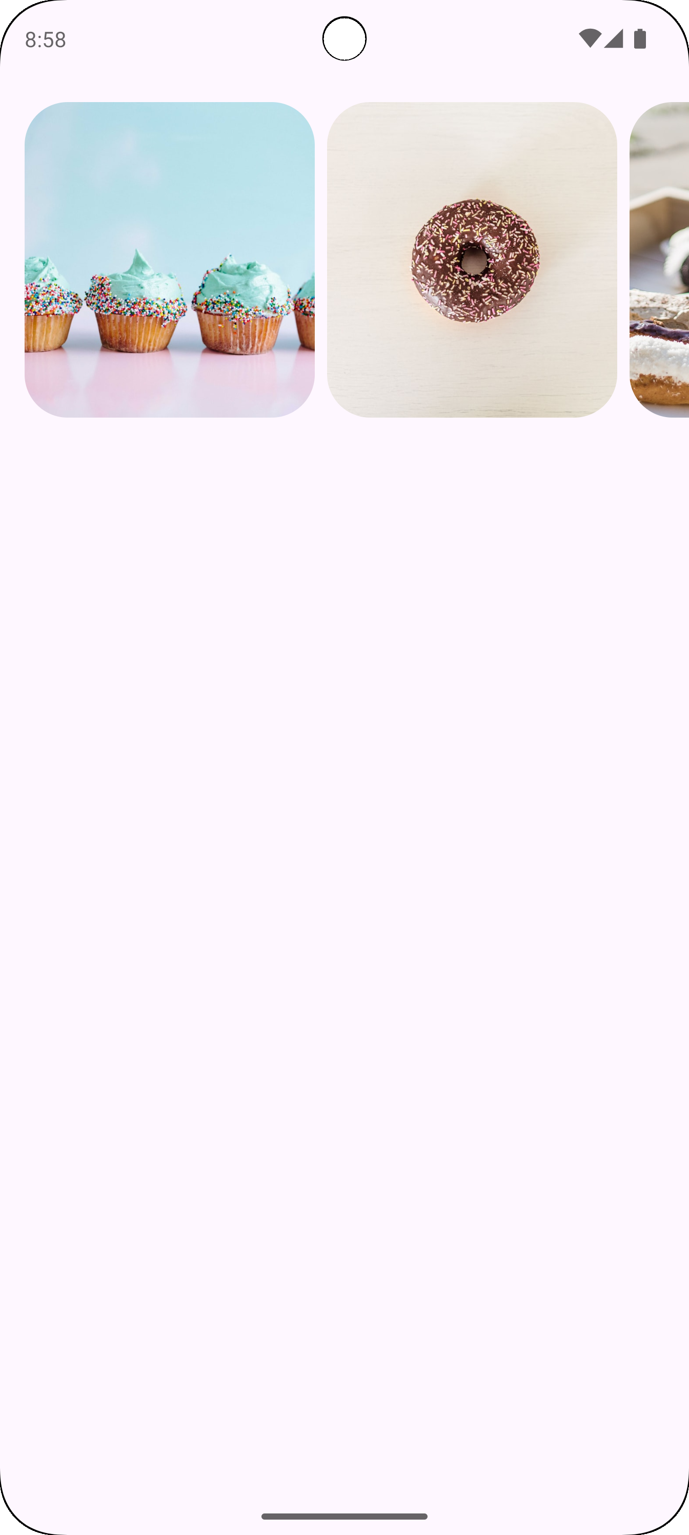
@Composable fun CarouselExample_MultiBrowse() { data class CarouselItem( val id: Int, @DrawableRes val imageResId: Int, val contentDescription: String ) val items = remember { listOf( CarouselItem(0, R.drawable.cupcake, "cupcake"), CarouselItem(1, R.drawable.donut, "donut"), CarouselItem(2, R.drawable.eclair, "eclair"), CarouselItem(3, R.drawable.froyo, "froyo"), CarouselItem(4, R.drawable.gingerbread, "gingerbread"), ) } HorizontalMultiBrowseCarousel( state = rememberCarouselState { items.count() }, modifier = Modifier .fillMaxWidth() .wrapContentHeight() .padding(top = 16.dp, bottom = 16.dp), preferredItemWidth = 186.dp, itemSpacing = 8.dp, contentPadding = PaddingValues(horizontal = 16.dp) ) { i -> val item = items[i] Image( modifier = Modifier .height(205.dp) .maskClip(MaterialTheme.shapes.extraLarge), painter = painterResource(id = item.imageResId), contentDescription = item.contentDescription, contentScale = ContentScale.Crop ) } }
מידע חשוב על הקוד
- המאפיין מגדיר מחלקה של נתונים
CarouselItem, שמבנה את הנתונים של כל רכיב בקרוסלה. - יוצרת ומאחסנת
ListשלCarouselItemאובייקטים שמכילים משאבי תמונות ותיאורים. - הקומפוזבל
HorizontalMultiBrowseCarouselמיועד להצגת כמה פריטים בקרוסלה.- המצב של הקרוסלה מאותחל באמצעות
rememberCarouselState, שמקבל את המספר הכולל של הפריטים. - לפריטים יש מאפיין
preferredItemWidth(כאן,186.dp), שמציין רוחב אופטימלי לכל פריט. הקרוסלה משתמשת בערך הזה כדי לקבוע כמה פריטים יכולים להיכנס למסך בו-זמנית. - הפרמטר
itemSpacingמוסיף רווח קטן בין הפריטים. - ה-lambda האחרון של
HorizontalMultiBrowseCarouselחוזר על עצמו ב-CarouselItems. בכל איטרציה, הפונקציה מאחזרת את הפריט באינדקסiומציגה את הרכיבImage. -
Modifier.maskClip(MaterialTheme.shapes.extraLarge)מחיל מסכת צורה מוגדרת מראש על כל תמונה, וכך יוצר פינות מעוגלות. -
contentDescriptionמספק תיאור נגישות לתמונה.
- המצב של הקרוסלה מאותחל באמצעות
התוצאה
בתמונה הבאה מוצגת התוצאה של קטע הקוד הקודם:

דוגמה: קרוסלה לא מוגבלת
בקטע הקוד הבא מוטמע קרוסלה לא מוגבלת:
@Composable fun CarouselExample() { data class CarouselItem( val id: Int, @DrawableRes val imageResId: Int, val contentDescription: String ) val carouselItems = remember { listOf( CarouselItem(0, R.drawable.cupcake, "cupcake"), CarouselItem(1, R.drawable.donut, "donut"), CarouselItem(2, R.drawable.eclair, "eclair"), CarouselItem(3, R.drawable.froyo, "froyo"), CarouselItem(4, R.drawable.gingerbread, "gingerbread"), ) } HorizontalUncontainedCarousel( state = rememberCarouselState { carouselItems.count() }, modifier = Modifier .fillMaxWidth() .wrapContentHeight() .padding(top = 16.dp, bottom = 16.dp), itemWidth = 186.dp, itemSpacing = 8.dp, contentPadding = PaddingValues(horizontal = 16.dp) ) { i -> val item = carouselItems[i] Image( modifier = Modifier .height(205.dp) .maskClip(MaterialTheme.shapes.extraLarge), painter = painterResource(id = item.imageResId), contentDescription = item.contentDescription, contentScale = ContentScale.Crop ) } }
מידע חשוב על הקוד
- רכיב ה-
HorizontalUncontainedCarouselיוצר את פריסת הקרוסלה.- הפרמטר
itemWidthמגדיר רוחב קבוע לכל פריט בקרוסלה.
- הפרמטר
התוצאה
בתמונה הבאה מוצגת התוצאה של קטע הקוד הקודם: