
تعمل الدالة المركّبة Card كحاوية التصميم المتعدد الأبعاد لواجهة المستخدم.
تعرض البطاقات عادةً جزءًا واحدًا متماسكًا من المحتوى. في ما يلي أمثلة على المواضع التي يمكنك فيها استخدام بطاقة:
- منتج في تطبيق تسوّق
- خبر في تطبيق إخباري
- رسالة في تطبيق مراسلة
إنّ التركيز على عرض جزء واحد من المحتوى هو ما يميّز Card عن الحاويات الأخرى. على سبيل المثال، يوفّر Scaffold بنية عامة لشاشة كاملة. تكون البطاقة عادةً عنصرًا أصغر في واجهة المستخدم داخل تنسيق أكبر، بينما يوفّر مكوّن التنسيق، مثل Column أو Row، واجهة برمجة تطبيقات أبسط وأكثر عمومية.

التنفيذ الأساسي
تعمل Card بشكل مشابه جدًا للحاويات الأخرى في Compose. يمكنك تحديد محتواها من خلال استدعاء دوال مركّبة أخرى بداخلها. على سبيل المثال، لنلقِ نظرة على كيفية احتواء Card على استدعاء لـ Text في المثال البسيط التالي:
@Composable
fun CardMinimalExample() {
    Card() {
        Text(text = "Hello, world!")
    }
}
عمليات التنفيذ المتقدّمة
يمكنك الاطّلاع على مرجع تعريف واجهة برمجة التطبيقات لـ Card. تحدّد واجهة برمجة التطبيقات عدة مَعلمات تتيح لك تخصيص مظهر المكوّن وسلوكه.
في ما يلي بعض المَعلمات الرئيسية التي يجب ملاحظتها:
elevation: يضيف ظلًا إلى المكوّن يجعله يبدو مرتفعًا فوق الخلفية.colors: يستخدم النوعCardColorsلضبط اللون التلقائي لكل من الحاوية وأي عناصر فرعية.enabled: إذا مرّرت القيمةfalseلهذه المَعلمة، ستظهر البطاقة على أنّها غير مفعّلة ولن تستجيب لبيانات أدخلها المستخدم.onClick: عادةً، لا تقبلCardأحداث النقر. لذلك، فإنّ أهم عملية تحميل زائدة يجب ملاحظتها هي تلك التي تحدّد مَعلمةonClick. عليك استخدام عملية التحميل الزائدة هذه إذا كنت تريد أن يستجيب تنفيذCardلعمليات الضغط من المستخدم.
يوضّح المثال التالي كيفية استخدام هذه المَعلمات، بالإضافة إلى مَعلمات شائعة أخرى مثل shape وmodifier.
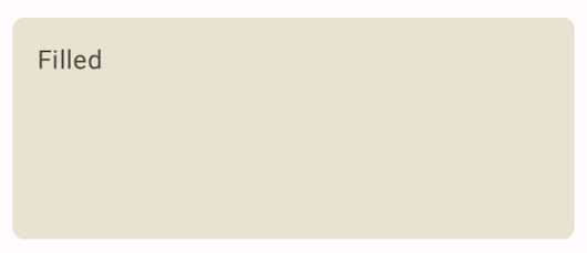
بطاقة معبّأة
في ما يلي مثال على كيفية تنفيذ بطاقة معبّأة.
الأهم هنا هو استخدام السمة colors لتغيير اللون المعبّأ.
@Composable fun FilledCardExample() { Card( colors = CardDefaults.cardColors( containerColor = MaterialTheme.colorScheme.surfaceVariant, ), modifier = Modifier .size(width = 240.dp, height = 100.dp) ) { Text( text = "Filled", modifier = Modifier .padding(16.dp), textAlign = TextAlign.Center, ) } }
يظهر هذا التنفيذ على النحو التالي:
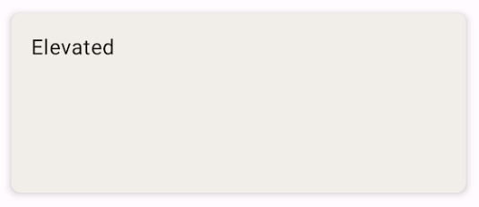
بطاقة مرتفعة
يوضّح المقتطف التالي كيفية تنفيذ بطاقة مرتفعة. استخدِم الدالة المركّبة المخصّصة
ElevatedCard.
يمكنك استخدام السمة elevation للتحكّم في مظهر الارتفاع والظل الناتج.
@Composable fun ElevatedCardExample() { ElevatedCard( elevation = CardDefaults.cardElevation( defaultElevation = 6.dp ), modifier = Modifier .size(width = 240.dp, height = 100.dp) ) { Text( text = "Elevated", modifier = Modifier .padding(16.dp), textAlign = TextAlign.Center, ) } }
يظهر هذا التنفيذ على النحو التالي:
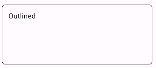
بطاقة محدّدة
في ما يلي مثال على بطاقة محدّدة. استخدِم الدالة المركّبة المخصّصة
OutlinedCard.
@Composable fun OutlinedCardExample() { OutlinedCard( colors = CardDefaults.cardColors( containerColor = MaterialTheme.colorScheme.surface, ), border = BorderStroke(1.dp, Color.Black), modifier = Modifier .size(width = 240.dp, height = 100.dp) ) { Text( text = "Outlined", modifier = Modifier .padding(16.dp), textAlign = TextAlign.Center, ) } }
يظهر هذا التنفيذ على النحو التالي:
القيود
لا تتضمّن البطاقات إجراءات التمرير أو الإغلاق، ولكن يمكن دمجها في دوال مركّبة توفّر هذه الميزات. على سبيل المثال، لتنفيذ ميزة التمرير السريع للإغلاق على بطاقة، يمكنك دمجها مع الدالة المركّبة SwipeToDismiss. للدمج
مع التمرير، استخدِم معدِّلات التمرير مثل verticalScroll. لمزيد من المعلومات، يمكنك الاطّلاع على مستندات التمرير.