
Card ترکیبی به عنوان یک ظرف طراحی متریال برای رابط کاربری شما عمل میکند. کارتها معمولاً یک محتوای منسجم را ارائه میدهند. در زیر چند نمونه از مواردی که میتوانید از کارت استفاده کنید، آورده شده است:
- یک محصول در یک اپلیکیشن خرید.
- یک خبر در یک اپلیکیشن خبری.
- پیامی در یک برنامه ارتباطی.
تمرکز بر نمایش یک محتوای واحد است که Card از سایر کانتینرها متمایز میکند. برای مثال، Scaffold ساختار کلی را برای کل صفحه نمایش فراهم میکند. Card عموماً یک عنصر رابط کاربری کوچکتر در یک طرحبندی بزرگتر است، در حالی که یک کامپوننت طرحبندی مانند Column یا Row یک API سادهتر و عمومیتر ارائه میدهد.

پیادهسازی اولیه
Card بسیار شبیه سایر کانتینرها در Compose رفتار میکند. شما محتوای آن را با فراخوانی سایر کامپوننتهای درون آن اعلام میکنید. برای مثال، در مثال مینیمال زیر، نحوه فراخوانی Text توسط Card را در نظر بگیرید:
@Composable
fun CardMinimalExample() {
    Card() {
        Text(text = "Hello, world!")
    }
}
پیادهسازیهای پیشرفته
برای تعریف API مربوط به Card به مرجع مراجعه کنید. این API چندین پارامتر تعریف میکند که به شما امکان میدهد ظاهر و رفتار کامپوننت را سفارشی کنید.
برخی از پارامترهای کلیدی که باید به آنها توجه کرد عبارتند از:
-
elevation: سایهای به کامپوننت اضافه میکند که باعث میشود بالاتر از پسزمینه به نظر برسد. -
colors: از نوعCardColorsبرای تنظیم رنگ پیشفرض هم برای ظرف و هم برای فرزندان استفاده میکند. -
enabled: اگر برای این پارامترfalseرا وارد کنید، کارت به صورت غیرفعال (disabled) نمایش داده میشود و به ورودی کاربر پاسخ نمیدهد. -
onClick: معمولاً، یکCardرویدادهای کلیک را نمیپذیرد. به همین دلیل، سربارگذاری اولیهای که باید به آن توجه کنید، سربارگذاریای است که پارامترonClickرا تعریف میکند. اگر میخواهید پیادهسازیCardشما به کلیکهای کاربر پاسخ دهد، باید از این سربارگذاری استفاده کنید.
مثال زیر نحوه استفاده از این پارامترها و همچنین سایر پارامترهای رایج مانند shape و modifier را نشان میدهد.
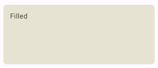
کارت پر شده
در ادامه مثالی از نحوه پیادهسازی یک کارت پر شده ارائه شده است.
نکتهی کلیدی در اینجا استفاده از ویژگی colors برای تغییر رنگ پر شده است.
@Composable fun FilledCardExample() { Card( colors = CardDefaults.cardColors( containerColor = MaterialTheme.colorScheme.surfaceVariant, ), modifier = Modifier .size(width = 240.dp, height = 100.dp) ) { Text( text = "Filled", modifier = Modifier .padding(16.dp), textAlign = TextAlign.Center, ) } }
این پیادهسازی به صورت زیر ظاهر میشود:
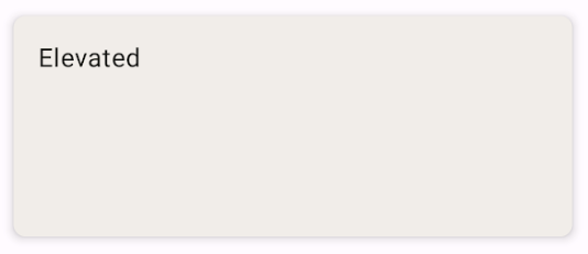
کارت مرتفع
قطعه کد زیر نحوه پیادهسازی یک کارت ارتقا یافته را نشان میدهد. از ترکیببندی اختصاصی ElevatedCard استفاده کنید.
شما میتوانید از ویژگی elevation برای کنترل ظاهر ارتفاع و سایه حاصل از آن استفاده کنید.
@Composable fun ElevatedCardExample() { ElevatedCard( elevation = CardDefaults.cardElevation( defaultElevation = 6.dp ), modifier = Modifier .size(width = 240.dp, height = 100.dp) ) { Text( text = "Elevated", modifier = Modifier .padding(16.dp), textAlign = TextAlign.Center, ) } }
این پیادهسازی به صورت زیر ظاهر میشود:
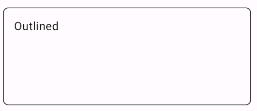
کارت طرحدار
در زیر مثالی از یک کارت outline آمده است. از OutlinedCard قابل ترکیب اختصاصی استفاده کنید.
@Composable fun OutlinedCardExample() { OutlinedCard( colors = CardDefaults.cardColors( containerColor = MaterialTheme.colorScheme.surface, ), border = BorderStroke(1.dp, Color.Black), modifier = Modifier .size(width = 240.dp, height = 100.dp) ) { Text( text = "Outlined", modifier = Modifier .padding(16.dp), textAlign = TextAlign.Center, ) } }
این پیادهسازی به صورت زیر ظاهر میشود:
محدودیتها
کارتها ذاتاً دارای عملکردهای اسکرول یا رد کردن نیستند، اما میتوانند در کامپوننتهای ارائه دهنده این ویژگیها ادغام شوند. به عنوان مثال، برای پیادهسازی کشیدن انگشت برای رد کردن روی یک کارت، آن را با کامپوننت SwipeToDismiss ادغام کنید. برای ادغام با اسکرول، از اصلاحکنندههای اسکرول مانند verticalScroll استفاده کنید. برای اطلاعات بیشتر به مستندات اسکرول مراجعه کنید.