Nút là thành phần cơ bản cho phép người dùng kích hoạt một thao tác đã xác định. Có 5 loại nút. Bảng này mô tả hình thức của từng loại trong số 5 loại nút, cũng như vị trí bạn nên sử dụng chúng:
| Loại | Diện mạo | Mục đích |
|---|---|---|
| Lấp đầy (filled) | Nền đồng nhất với văn bản có độ tương phản cao. | Nút nhấn mạnh. Đây là những thao tác chính trong một ứng dụng, chẳng hạn như "gửi" và "lưu". Hiệu ứng đổ bóng làm nổi bật tầm quan trọng của nút. |
| Tô màu nền theo sắc độ | Màu nền thay đổi cho phù hợp với vùng hiển thị. | Cũng dành cho các hành động chính hoặc quan trọng. Nút có tông màu được tô đầy mang lại trọng số trực quan cao hơn và phù hợp với các chức năng như "thêm vào giỏ hàng" và "Đăng nhập". |
| Hơi cao | Nổi bật nhờ có bóng. | Có mục đích tương tự như nút có tông màu. Tăng độ nâng để nút xuất hiện nổi bật hơn nữa. |
| Đường viền (outlined) | Có đường viền không có màu nền. | Nút nhấn trung bình, chứa các thao tác quan trọng nhưng không phải là thao tác chính. Các nút này kết hợp tốt với các nút khác để biểu thị hành động phụ, thay thế như "Huỷ" hoặc "Quay lại". |
| Văn bản | Hiển thị văn bản không có nền hoặc đường viền. | Nút có độ nhấn mạnh thấp, phù hợp với các hành động ít quan trọng hơn, chẳng hạn như đường liên kết điều hướng hoặc các chức năng phụ như "Tìm hiểu thêm" hoặc "Xem chi tiết". |
Hình ảnh này minh hoạ 5 loại nút trong Material Design:

Nền tảng API
onClick- Hàm mà hệ thống gọi khi người dùng nhấn vào nút.
enabled- Khi
false, tham số này khiến nút xuất hiện ở trạng thái không dùng được và không hoạt động. colors- Một thực thể của
ButtonColorsxác định màu sắc được dùng trong nút. contentPadding- Khoảng đệm trong nút.
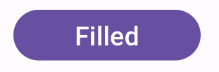
Nút được tô màu nền
Thành phần nút được tô màu nền sử dụng thành phần kết hợp cơ bản Button. Theo mặc định, hình này được tô bằng một màu đồng nhất. Đoạn mã này cho biết cách triển khai thành phần:
@Composable fun FilledButtonExample(onClick: () -> Unit) { Button(onClick = { onClick() }) { Text("Filled") } }
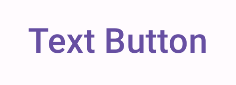
Phương thức triển khai có dạng như sau:
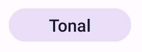
Nút được tô màu nền theo tông màu
Thành phần nút được tô màu sử dụng thành phần kết hợp FilledTonalButton.
Theo mặc định, nút này sẽ có màu sắc theo tông.
Đoạn mã này cho biết cách triển khai thành phần:
@Composable fun FilledTonalButtonExample(onClick: () -> Unit) { FilledTonalButton(onClick = { onClick() }) { Text("Tonal") } }
Phương thức triển khai có dạng như sau:
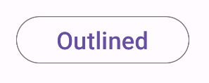
Nút có đường viền
Thành phần nút có đường viền sử dụng thành phần kết hợp OutlinedButton. Theo mặc định, đường viền sẽ xuất hiện.
Đoạn mã này cho biết cách triển khai thành phần:
@Composable fun OutlinedButtonExample(onClick: () -> Unit) { OutlinedButton(onClick = { onClick() }) { Text("Outlined") } }
Phương thức triển khai có dạng như sau:
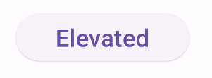
Nút lồi
Thành phần nút có độ nâng sử dụng thành phần kết hợp ElevatedButton. Theo mặc định, nút này có một bóng đại diện cho hiệu ứng độ cao. Đây là một nút được tô màu nền có bóng đổ.
Đoạn mã này cho biết cách triển khai thành phần:
@Composable fun ElevatedButtonExample(onClick: () -> Unit) { ElevatedButton(onClick = { onClick() }) { Text("Elevated") } }
Phương thức triển khai có dạng như sau:
Nút văn bản
Thành phần nút văn bản sử dụng thành phần kết hợp TextButton. Nút này chỉ xuất hiện dưới dạng văn bản cho đến khi được nhấn. Theo mặc định, hình này không có đường viền hoặc màu tô đồng nhất.
Đoạn mã này cho biết cách triển khai thành phần:
@Composable fun TextButtonExample(onClick: () -> Unit) { TextButton( onClick = { onClick() } ) { Text("Text Button") } }
Phương thức triển khai có dạng như sau: