Przyciski to podstawowe komponenty, które umożliwiają użytkownikowi uruchomienie zdefiniowanego działania. Istnieje 5 rodzajów przycisków. W tej tabeli opisujemy wygląd każdego z 5 rodzajów przycisków oraz miejsca, w których należy ich używać:
| Typ | Wygląd | Cel |
|---|---|---|
| Wypełniony | Jednolite tło z kontrastującym tekstem. | Przyciski o wysokim poziomie ważności. Są one przeznaczone do głównych działań w aplikacji, takich jak „prześlij” i „zapisz”. Efekt cienia podkreśla znaczenie przycisku. |
| Wypełniony tonalny | Kolor tła zmienia się w zależności od powierzchni. | Dotyczy to też działań głównych lub istotnych. Wypełnione przyciski tonalne mają większą wagę wizualną i są odpowiednie w przypadku funkcji takich jak „Dodaj do koszyka” czy „Zaloguj się”. |
| Wysoka | Wyróżnia się cieniem. | Pełnią podobną funkcję jak przyciski tonalne. Zwiększ poziom, aby przycisk był jeszcze bardziej widoczny. |
| Kontur | Ma ramkę bez wypełnienia. | Przyciski o średnim znaczeniu, które zawierają ważne, ale nie główne działania. Dobrze komponują się z innymi przyciskami, wskazując alternatywne działania dodatkowe, takie jak „Anuluj” lub „Wstecz”. |
| Tekst | Wyświetla tekst bez tła i obramowania. | Przyciski o mniejszym znaczeniu, idealne w przypadku mniej istotnych działań, takich jak linki nawigacyjne lub funkcje dodatkowe, np. „Więcej informacji” lub „Wyświetl szczegóły”. |
Ilustracja przedstawiająca 5 rodzajów przycisków w Material Design:

Powierzchnia interfejsu API
onClick- Funkcja wywoływana przez system, gdy użytkownik naciśnie przycisk.
enabled- Gdy
false, ten parametr sprawia, że przycisk jest niedostępny i nieaktywny. colors- Instancja
ButtonColors, która określa kolory użyte w przycisku. contentPadding- Dopełnienie w przycisku.
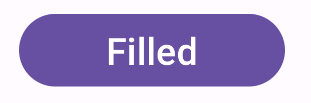
Wypełniony przycisk
Komponent wypełnionego przycisku korzysta z podstawowego komponentu Button. Domyślnie jest wypełniony jednolitym kolorem. Fragment kodu pokazuje, jak wdrożyć komponent:
@Composable fun FilledButtonExample(onClick: () -> Unit) { Button(onClick = { onClick() }) { Text("Filled") } }
Implementacja wygląda tak:
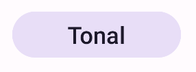
Wypełniony przycisk tonalny
Komponent wypełnionego przycisku tonalnego korzysta z komponentu FilledTonalButton.
Domyślnie jest wypełniony kolorem tonalnym.
Fragment kodu pokazuje, jak wdrożyć komponent:
@Composable fun FilledTonalButtonExample(onClick: () -> Unit) { FilledTonalButton(onClick = { onClick() }) { Text("Tonal") } }
Implementacja wygląda tak:
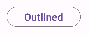
Przycisk z konturem
Komponent przycisku z obramowaniem korzysta z komponentu OutlinedButton. Domyślnie jest on otoczony konturem.
Fragment kodu pokazuje, jak wdrożyć komponent:
@Composable fun OutlinedButtonExample(onClick: () -> Unit) { OutlinedButton(onClick = { onClick() }) { Text("Outlined") } }
Implementacja wygląda tak:
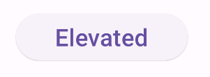
Przycisk podniesiony
Komponent podniesionego przycisku korzysta z komponentu ElevatedButton. Domyślnie ma cień, który reprezentuje efekt wysokości. Jest to wypełniony przycisk z cieniem.
Fragment kodu pokazuje, jak wdrożyć komponent:
@Composable fun ElevatedButtonExample(onClick: () -> Unit) { ElevatedButton(onClick = { onClick() }) { Text("Elevated") } }
Implementacja wygląda tak:
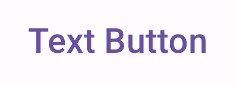
Przycisk tekstowy
Komponent przycisku tekstowego korzysta z komponentu TextButton. Do momentu naciśnięcia przycisku wyświetla się tylko tekst. Domyślnie nie ma wypełnienia ani obrysu.
Fragment kodu pokazuje, jak wdrożyć komponent:
@Composable fun TextButtonExample(onClick: () -> Unit) { TextButton( onClick = { onClick() } ) { Text("Text Button") } }
Implementacja wygląda tak: