Tombol adalah komponen dasar yang memungkinkan pengguna memicu tindakan yang ditentukan. Ada lima jenis tombol. Tabel ini menjelaskan tampilan setiap jenis tombol dari lima jenis tombol, serta tempat Anda harus menggunakannya:
| Jenis | Tampilan | Tujuan |
|---|---|---|
| Terisi | Latar belakang solid dengan teks yang kontras. | Tombol penekanan tinggi. Tindakan ini adalah untuk tindakan utama dalam aplikasi, seperti "kirim" dan "simpan". Efek bayangan menyoroti pentingnya tombol. |
| Tone penuh | Warna latar belakang bervariasi agar sesuai dengan permukaan. | Juga untuk tindakan utama atau penting. Tombol tonal yang diisi memberikan bobot visual yang lebih besar dan sesuai untuk fungsi seperti "tambahkan ke keranjang" dan "Login". |
| Panas | Tampil berbeda dengan memiliki bayangan. | Memiliki tujuan yang sama dengan tombol tonal. Tingkatkan elevasi untuk membuat tombol muncul lebih jelas. |
| Tergarisbatasi | Menampilkan batas tanpa pengisian. | Tombol penekanan sedang, yang berisi tindakan yang penting tetapi bukan utama. Tombol ini cocok dipasangkan dengan tombol lain untuk menunjukkan tindakan kedua dan alternatif seperti "Batal" atau "Kembali". |
| Teks | Menampilkan teks tanpa latar belakang atau batas. | Tombol dengan penekanan rendah, ideal untuk tindakan yang kurang penting seperti link navigasi, atau fungsi sekunder seperti "Pelajari Lebih Lanjut" atau "Lihat detail". |
Gambar ini menunjukkan lima jenis tombol dalam Desain Material:

Platform API
onClick- Fungsi yang dipanggil sistem saat pengguna menekan tombol.
enabled- Jika
false, parameter ini membuat tombol tampak tidak tersedia dan tidak aktif. colors- Instance
ButtonColorsyang menentukan warna yang digunakan dalam tombol. contentPadding- Padding di dalam tombol.
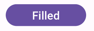
Tombol terisi
Komponen tombol terisi menggunakan composable Button dasar. Secara default, diisi dengan warna solid. Cuplikan ini menunjukkan cara menerapkan komponen:
@Composable fun FilledButtonExample(onClick: () -> Unit) { Button(onClick = { onClick() }) { Text("Filled") } }
Penerapan ini akan terlihat seperti yang ditunjukkan:
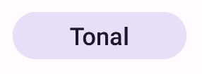
Tombol tonal terisi
Komponen tombol tonal yang diisi menggunakan composable FilledTonalButton.
Secara default, diisi dengan warna tonal.
Cuplikan ini menunjukkan cara menerapkan komponen:
@Composable fun FilledTonalButtonExample(onClick: () -> Unit) { FilledTonalButton(onClick = { onClick() }) { Text("Tonal") } }
Penerapan ini akan terlihat seperti yang ditunjukkan:
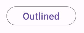
Tombol bergaris tepi
Komponen tombol bergaris menggunakan composable OutlinedButton. Secara default, batasnya
ditampilkan dengan garis luar.
Cuplikan ini menunjukkan cara menerapkan komponen:
@Composable fun OutlinedButtonExample(onClick: () -> Unit) { OutlinedButton(onClick = { onClick() }) { Text("Outlined") } }
Penerapan ini akan terlihat seperti yang ditunjukkan:
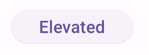
Tombol timbul
Komponen tombol yang ditinggikan menggunakan composable ElevatedButton. Secara default, kartu memiliki bayangan yang menunjukkan efek ketinggian. Tombol ini adalah tombol terisi penuh
yang menyertakan bayangan.
Cuplikan ini menunjukkan cara menerapkan komponen:
@Composable fun ElevatedButtonExample(onClick: () -> Unit) { ElevatedButton(onClick = { onClick() }) { Text("Elevated") } }
Penerapan ini akan terlihat seperti yang ditunjukkan:
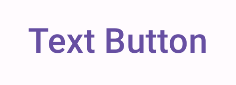
Tombol teks
Komponen tombol teks menggunakan composable TextButton. Tombol ini muncul sebagai
hanya teks hingga ditekan. Secara default, tidak memiliki warna solid atau garis batas.
Cuplikan ini menunjukkan cara menerapkan komponen:
@Composable fun TextButtonExample(onClick: () -> Unit) { TextButton( onClick = { onClick() } ) { Text("Text Button") } }
Penerapan ini akan terlihat seperti yang ditunjukkan: