כפתורים הם רכיבים בסיסיים שמאפשרים למשתמש להפעיל פעולה מוגדרת. יש חמישה סוגים של כפתורים. בטבלה הבאה מתואר המראה של כל אחד מחמשת סוגי הכפתורים ואיפה כדאי להשתמש בהם:
| סוג | מראה | מטרה |
|---|---|---|
| מלא | רקע אחיד עם טקסט בניגודיות. | כפתורים מודגשים. מיועדים לפעולות ראשיות באפליקציה, כמו "שליחה" ו"שמירה". אפקט הצל מדגיש את חשיבות הכפתור. |
| מלא בצבע אחד | צבע הרקע משתנה בהתאם למשטח. | גם לפעולות ראשיות או חשובות. כפתורים מלאים בצבע אחד מספקים משקל חזותי גדול יותר ומתאימים לפונקציות כמו "הוספה לעגלת הקניות" ו"כניסה". |
| מובלט | בולט כי יש לו צל. | משרתים מטרה דומה לכפתורים מלאים בצבע אחד. כדי שהכפתור יבלוט עוד יותר, מגדילים את הגובה. |
| עם קווי מתאר | כולל גבול ללא מילוי. | כפתורים עם הדגשה בינונית, שמבצעים פעולות חשובות אבל לא מרכזיות. משתלבים היטב עם כפתורים אחרים כדי לציין פעולות חלופיות משניות כמו "ביטול" או "הקודם". |
| טקסט | הצגת טקסט ללא רקע או גבול. | כפתורים עם הדגשה נמוכה, שמתאימים לפעולות פחות קריטיות כמו קישורי ניווט או פונקציות משניות כמו "מידע נוסף" או "לפרטים". |
בתמונה הזו מוצגים חמישה סוגים של כפתורים ב-Material Design:

פלטפורמת ה-API
onClick- הפונקציה שהמערכת קוראת לה כשהמשתמש לוחץ על הכפתור.
enabled- אם הערך הוא
false, הפרמטר הזה גורם לכך שהכפתור יופיע כלא זמין ולא פעיל. colors- מופע של
ButtonColorsשקובע את הצבעים שבכפתור. contentPadding- המרווח הפנימי בתוך הכפתור.
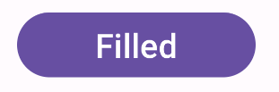
כפתור מלא
רכיב הכפתור המלא משתמש בקוד Button קומפוזבילי בסיסי. כברירת מחדל, הוא מלא בצבע אחיד. בקטע הקוד הבא אפשר לראות איך מטמיעים את הרכיב:
@Composable fun FilledButtonExample(onClick: () -> Unit) { Button(onClick = { onClick() }) { Text("Filled") } }
ההטמעה הזו נראית כך:
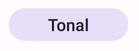
כפתור מלא בצבע אחד
רכיב הכפתור המלא בצבע אחד משתמש בקוד FilledTonalButton קומפזבילי.
כברירת מחדל, הוא מלא בצבע אחד.
בקטע הקוד הבא אפשר לראות איך מטמיעים את הרכיב:
@Composable fun FilledTonalButtonExample(onClick: () -> Unit) { FilledTonalButton(onClick = { onClick() }) { Text("Tonal") } }
ההטמעה הזו נראית כך:
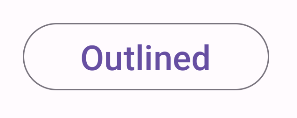
כפתור עם מתאר
רכיב הכפתור עם מתאר משתמש בקוד OutlinedButton קומפוזבילי. הוא מופיע עם קו מתאר כברירת מחדל.
בקטע הקוד הבא אפשר לראות איך מטמיעים את הרכיב:
@Composable fun OutlinedButtonExample(onClick: () -> Unit) { OutlinedButton(onClick = { onClick() }) { Text("Outlined") } }
ההטמעה הזו נראית כך:
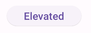
כפתור מובלט
רכיב הכפתור המובלט משתמש בקוד ElevatedButton קומפוזבילי. כברירת מחדל, יש לו צל שמעניק את אפקט הגובה. זהו כפתור מלא
עם צל.
בקטע הקוד הבא אפשר לראות איך מטמיעים את הרכיב:
@Composable fun ElevatedButtonExample(onClick: () -> Unit) { ElevatedButton(onClick = { onClick() }) { Text("Elevated") } }
ההטמעה הזו נראית כך:
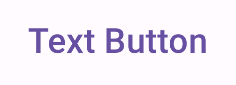
כפתור טקסט
רכיב כפתור הטקסט משתמש בקוד TextButton קומפוזבילי. הוא מופיע כטקסט בלבד עד שלוחצים עליו. כברירת מחדל, אין לו מילוי או קו מתאר.
בקטע הקוד הבא אפשר לראות איך מטמיעים את הרכיב:
@Composable fun TextButtonExample(onClick: () -> Unit) { TextButton( onClick = { onClick() } ) { Text("Text Button") } }
ההטמעה הזו נראית כך: