دکمهها اجزای اساسی هستند که به کاربر اجازه میدهند یک عمل تعریفشده را انجام دهد. پنج نوع دکمه وجود دارد. این جدول ظاهر هر یک از این پنج نوع دکمه و همچنین محل استفاده از آنها را شرح میدهد:
| نوع | ظاهر | هدف |
|---|---|---|
| پر شده | پسزمینهی یکدست با متن متضاد. | دکمههای با تأکید بالا. این دکمهها برای اقدامات اصلی در یک برنامه مانند «ارسال» و «ذخیره» هستند. جلوه سایه، اهمیت دکمه را برجسته میکند. |
| تونال پر شده | رنگ پس زمینه برای مطابقت با سطح تغییر میکند. | همچنین برای اقدامات اصلی یا مهم. دکمههای توپر وزن بصری بیشتری دارند و برای عملکردهایی مانند «افزودن به سبد خرید» و «ورود» مناسب هستند. |
| مرتفع | با داشتن سایه متمایز میشود. | هدف مشابهی با دکمههای رنگی دارد. برای برجستهتر نشان دادن دکمه، ارتفاع آن را افزایش دهید. |
| تشریح شده | دارای حاشیهای بدون پر کردن است. | دکمههای با تأکید متوسط، شامل اقداماتی هستند که مهم هستند اما اصلی نیستند. آنها به خوبی با دکمههای دیگر جفت میشوند تا اقدامات ثانویه و جایگزین مانند «لغو» یا «بازگشت» را نشان دهند. |
| متن | متن را بدون پسزمینه یا حاشیه نمایش میدهد. | دکمههای کماهمیتتر، ایدهآل برای اقدامات کماهمیتتر مانند لینکهای ناوبری یا عملکردهای ثانویه مانند «بیشتر بدانید» یا «مشاهده جزئیات». |
این تصویر پنج نوع دکمه در طراحی متریال را نشان میدهد:

سطح API
-
onClick - تابعی که سیستم هنگام فشردن دکمه توسط کاربر فراخوانی میکند.
-
enabled - وقتی این پارامتر
false، دکمه در دسترس و غیرفعال به نظر میرسد. -
colors - یک نمونه از
ButtonColorsکه رنگهای استفاده شده در دکمه را تعیین میکند. -
contentPadding - فاصلهی بین دکمهها (padding)
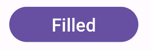
دکمه پر شده
کامپوننت دکمهی پر شده از کامپوننت پایهی Button استفاده میکند. به طور پیشفرض با یک رنگ ثابت پر شده است. قطعه کد زیر نحوهی پیادهسازی این کامپوننت را نشان میدهد:
@Composable fun FilledButtonExample(onClick: () -> Unit) { Button(onClick = { onClick() }) { Text("Filled") } }
این پیادهسازی به صورت زیر نمایش داده میشود:
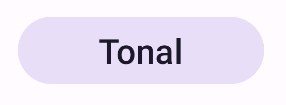
دکمه تُن رنگ پر شده
کامپوننت دکمه با تُن رنگیِ پر شده از ترکیبپذیر FilledTonalButton استفاده میکند. این کامپوننت به طور پیشفرض با یک رنگ تُن رنگی پر شده است.
قطعه کد زیر نحوه پیادهسازی این کامپوننت را نشان میدهد:
@Composable fun FilledTonalButtonExample(onClick: () -> Unit) { FilledTonalButton(onClick = { onClick() }) { Text("Tonal") } }
این پیادهسازی به صورت زیر نمایش داده میشود:
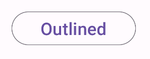
دکمهی خطخورده
کامپوننت دکمه outline از ترکیببندی OutlinedButton استفاده میکند. به طور پیشفرض با یک outline ظاهر میشود.
قطعه کد زیر نحوه پیادهسازی این کامپوننت را نشان میدهد:
@Composable fun OutlinedButtonExample(onClick: () -> Unit) { OutlinedButton(onClick = { onClick() }) { Text("Outlined") } }
این پیادهسازی به صورت زیر نمایش داده میشود:
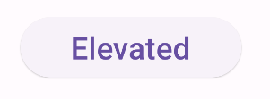
دکمه مرتفع
کامپوننت دکمهی مرتفع از ترکیببندی ElevatedButton استفاده میکند. این کامپوننت دارای سایهای است که به طور پیشفرض جلوهی ارتفاع را نشان میدهد. این یک دکمهی توپر است که شامل سایه نیز میشود.
قطعه کد زیر نحوه پیادهسازی این کامپوننت را نشان میدهد:
@Composable fun ElevatedButtonExample(onClick: () -> Unit) { ElevatedButton(onClick = { onClick() }) { Text("Elevated") } }
این پیادهسازی به صورت زیر نمایش داده میشود:
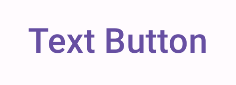
دکمه متنی
کامپوننت دکمه متنی از ترکیبپذیر TextButton استفاده میکند. تا زمانی که فشرده نشود، فقط به صورت متن نمایش داده میشود. به طور پیشفرض، هیچ رنگ یا طرح کلی مشخصی ندارد.
قطعه کد زیر نحوه پیادهسازی این کامپوننت را نشان میدهد:
@Composable fun TextButtonExample(onClick: () -> Unit) { TextButton( onClick = { onClick() } ) { Text("Text Button") } }
این پیادهسازی به صورت زیر نمایش داده میشود: