বোতাম হল মৌলিক উপাদান যা ব্যবহারকারীকে একটি নির্দিষ্ট ক্রিয়া শুরু করতে সাহায্য করে। পাঁচ ধরণের বোতাম রয়েছে। এই টেবিলে পাঁচ ধরণের বোতামের প্রতিটির চেহারা বর্ণনা করা হয়েছে, সেইসাথে কোথায় সেগুলি ব্যবহার করা উচিত:
| আদর্শ | চেহারা | উদ্দেশ্য |
|---|---|---|
| ভরা | বিপরীত লেখা সহ শক্ত পটভূমি। | উচ্চ-জোর দেওয়া বোতাম। এগুলি কোনও অ্যাপ্লিকেশনের প্রাথমিক ক্রিয়াগুলির জন্য, যেমন "জমা দিন" এবং "সংরক্ষণ করুন"। ছায়া প্রভাব বোতামটির গুরুত্ব তুলে ধরে। |
| ভরা টোনাল | পৃষ্ঠের সাথে মেলে পটভূমির রঙ পরিবর্তিত হয়। | প্রাথমিক বা গুরুত্বপূর্ণ ক্রিয়াকলাপের জন্যও। ভরাট টোনাল বোতামগুলি আরও ভিজ্যুয়াল ওজন প্রদান করে এবং "কার্টে যোগ করুন" এবং "সাইন ইন করুন" এর মতো ফাংশনগুলিকে উপযুক্ত করে। |
| উঁচু | ছায়া থাকার মাধ্যমে আলাদা হয়ে ওঠে। | টোনাল বোতামের মতোই এটি কাজ করে। বোতামটিকে আরও স্পষ্টভাবে দেখানোর জন্য উচ্চতা বাড়ান। |
| রূপরেখাযুক্ত | ভরাট ছাড়াই একটি বর্ডার বৈশিষ্ট্যযুক্ত। | মাঝারি জোরের বোতাম, যেখানে গুরুত্বপূর্ণ কিন্তু প্রাথমিক নয় এমন ক্রিয়া থাকে। "বাতিল করুন" বা "ফিরে যান" এর মতো বিকল্প, গৌণ ক্রিয়াগুলি নির্দেশ করার জন্য এগুলি অন্যান্য বোতামগুলির সাথে ভালভাবে মিলিত হয়। |
| টেক্সট | কোন পটভূমি বা সীমানা ছাড়াই টেক্সট প্রদর্শন করে। | কম জোর দেওয়া বোতাম, নেভিগেশনাল লিঙ্কের মতো কম গুরুত্বপূর্ণ অ্যাকশন বা "আরও জানুন" বা "বিস্তারিত দেখুন" এর মতো সেকেন্ডারি ফাংশনের জন্য আদর্শ। |
এই ছবিটি ম্যাটেরিয়াল ডিজাইনে পাঁচ ধরণের বোতাম প্রদর্শন করে:

এপিআই সারফেস
-
onClick - ব্যবহারকারী যখন বোতাম টিপে তখন সিস্টেম যে ফাংশনটি কল করে।
-
enabled - যখন
false, তখন এই প্যারামিটারটি বোতামটিকে অনুপলব্ধ এবং নিষ্ক্রিয় দেখায়। -
colors -
ButtonColorsএকটি উদাহরণ যা বোতামে ব্যবহৃত রঙ নির্ধারণ করে। -
contentPadding - বোতামের ভেতরে প্যাডিং।
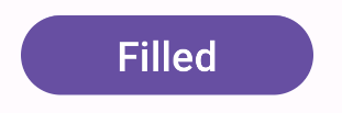
ভরাট বোতাম
ভরা বোতাম কম্পোনেন্টটি বেসিক Button কম্পোজেবল ব্যবহার করে। এটি ডিফল্টরূপে একটি সলিড রঙ দিয়ে ভরা থাকে। স্নিপেটটি দেখায় কিভাবে কম্পোনেন্টটি বাস্তবায়ন করতে হয়:
@Composable fun FilledButtonExample(onClick: () -> Unit) { Button(onClick = { onClick() }) { Text("Filled") } }
এই বাস্তবায়নটি দেখানো হয়েছে:
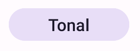
ভরা টোনাল বোতাম
ভরা টোনাল বোতাম কম্পোনেন্টটি FilledTonalButton কম্পোজেবল ব্যবহার করে। এটি ডিফল্টরূপে একটি টোনাল রঙ দিয়ে পূর্ণ থাকে।
স্নিপেটটি দেখায় কিভাবে কম্পোনেন্টটি বাস্তবায়ন করতে হয়:
@Composable fun FilledTonalButtonExample(onClick: () -> Unit) { FilledTonalButton(onClick = { onClick() }) { Text("Tonal") } }
এই বাস্তবায়নটি দেখানো হয়েছে:
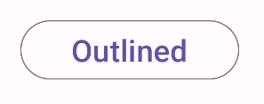
রূপরেখাযুক্ত বোতাম
আউটলাইন করা বোতাম কম্পোনেন্টটি OutlinedButton কম্পোজেবল ব্যবহার করে। এটি ডিফল্টরূপে একটি আউটলাইন সহ প্রদর্শিত হয়।
স্নিপেটটি দেখায় কিভাবে কম্পোনেন্টটি বাস্তবায়ন করতে হয়:
@Composable fun OutlinedButtonExample(onClick: () -> Unit) { OutlinedButton(onClick = { onClick() }) { Text("Outlined") } }
এই বাস্তবায়নটি দেখানো হয়েছে:
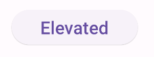
উঁচু বোতাম
এলিভেটেড বোতাম কম্পোনেন্টটি ElevatedButton কম্পোজেবল ব্যবহার করে। এটিতে একটি ছায়া রয়েছে যা ডিফল্টভাবে এলিভেশন প্রভাবকে প্রতিনিধিত্ব করে। এটি একটি ভরাট বোতাম যার মধ্যে একটি ছায়া রয়েছে।
স্নিপেটটি দেখায় কিভাবে কম্পোনেন্টটি বাস্তবায়ন করতে হয়:
@Composable fun ElevatedButtonExample(onClick: () -> Unit) { ElevatedButton(onClick = { onClick() }) { Text("Elevated") } }
এই বাস্তবায়নটি দেখানো হয়েছে:
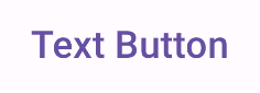
টেক্সট বোতাম
টেক্সট বোতাম কম্পোনেন্টটি TextButton কম্পোজেবল ব্যবহার করে। চাপ না দেওয়া পর্যন্ত এটি কেবল টেক্সট হিসেবে দেখায়। ডিফল্টভাবে এতে কোনও সলিড ফিল বা আউটলাইন থাকে না।
স্নিপেটটি দেখায় কিভাবে কম্পোনেন্টটি বাস্তবায়ন করতে হয়:
@Composable fun TextButtonExample(onClick: () -> Unit) { TextButton( onClick = { onClick() } ) { Text("Text Button") } }
এই বাস্তবায়নটি দেখানো হয়েছে: