Sử dụng bộ sưu tập để sắp xếp ngăn nắp các trang
Lưu và phân loại nội dung dựa trên lựa chọn ưu tiên của bạn.
Sử dụng huy hiệu để hiển thị một phần tử trực quan nhỏ nhằm biểu thị trạng thái hoặc giá trị bằng số trên một thành phần kết hợp khác. Sau đây là một số trường hợp phổ biến mà bạn có thể sử dụng huy hiệu:
Thông báo: Hiển thị số lượng thông báo chưa đọc trên biểu tượng ứng dụng hoặc chuông thông báo.
Tin nhắn: Cho biết tin nhắn mới hoặc chưa đọc trong một ứng dụng trò chuyện.
Thông tin cập nhật về trạng thái: Cho biết trạng thái của một việc cần làm, chẳng hạn như "đã hoàn thành", "đang tiến hành" hoặc "thất bại".
Số lượng trong giỏ hàng: Hiển thị số lượng mặt hàng trong giỏ hàng của người dùng.
Nội dung mới: Làm nổi bật nội dung hoặc tính năng mới mà người dùng có thể sử dụng.
Hình 1. Ví dụ về huy hiệu
Nền tảng API
Sử dụng thành phần kết hợp BadgedBox để triển khai huy hiệu trong ứng dụng của bạn. Đây là một vùng chứa. Bạn kiểm soát giao diện của nó bằng 2 tham số chính sau:
content: Nội dung có khả năng kết hợp mà BadgedBox chứa. Thường là Icon.
badge: Thành phần kết hợp xuất hiện dưới dạng huy hiệu trên nội dung.
Thông thường là thành phần kết hợp Badge chuyên dụng.
Ví dụ cơ bản
Đoạn mã này cho thấy cách triển khai cơ bản của BadgedBox:
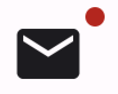
Đối số cho tham số badge của BadgedBox là Badge.
Vì Badge không có đối số riêng, nên ứng dụng sẽ hiển thị huy hiệu mặc định (một vòng tròn nhỏ màu đỏ).
Icon đóng vai trò là đối số cho tham số content của BadgedBox. Đây là biểu tượng mà huy hiệu xuất hiện bên trên. Trong trường hợp này, đó là biểu tượng thư.
Đây là cách văn bản xuất hiện:
Hình 2. Phương thức triển khai huy hiệu tối giản.
Ví dụ chi tiết
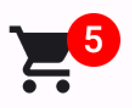
Đoạn mã sau đây minh hoạ cách bạn có thể hiển thị các giá trị trong huy hiệu để phản hồi các hành động của người dùng.
Nội dung và mã mẫu trên trang này phải tuân thủ các giấy phép như mô tả trong phần Giấy phép nội dung. Java và OpenJDK là nhãn hiệu hoặc nhãn hiệu đã đăng ký của Oracle và/hoặc đơn vị liên kết của Oracle.
Cập nhật lần gần đây nhất: 2025-08-28 UTC.
[[["Dễ hiểu","easyToUnderstand","thumb-up"],["Giúp tôi giải quyết được vấn đề","solvedMyProblem","thumb-up"],["Khác","otherUp","thumb-up"]],[["Thiếu thông tin tôi cần","missingTheInformationINeed","thumb-down"],["Quá phức tạp/quá nhiều bước","tooComplicatedTooManySteps","thumb-down"],["Đã lỗi thời","outOfDate","thumb-down"],["Vấn đề về bản dịch","translationIssue","thumb-down"],["Vấn đề về mẫu/mã","samplesCodeIssue","thumb-down"],["Khác","otherDown","thumb-down"]],["Cập nhật lần gần đây nhất: 2025-08-28 UTC."],[],[],null,["Use a [badge](https://m3.material.io/components/badges/overview) to display a small visual element to denote status\nor a numeric value on another composable. Here are a few common scenarios where\nyou might use a badge:\n\n- **Notifications**: Display the number of unread notifications on an app icon or notification bell.\n- **Messages**: Indicate new or unread messages within a chat application.\n- **Status updates**: Show the status of a task, such as \"complete,\" \"in progress,\" or \"failed.\"\n- **Cart quantity**: Display the number of items in a user's shopping cart.\n- **New content**: Highlight new content or features available to the user.\n\n**Figure 1.** Badge examples\n\nAPI surface\n\nUse the [`BadgedBox`](/reference/kotlin/androidx/compose/material3/package-summary#BadgedBox(kotlin.Function1,androidx.compose.ui.Modifier,kotlin.Function1)) composable to implement badges in your application. It\nis ultimately a container. You control its appearance with these two main\nparameters:\n\n- `content`: The composable content that the `BadgedBox` contains. Typically `Icon`.\n- `badge`: The composable that appears as the badge over the content. Typically the dedicated [`Badge`](/reference/kotlin/androidx/compose/material3/package-summary#Badge(androidx.compose.ui.Modifier,androidx.compose.ui.graphics.Color,androidx.compose.ui.graphics.Color,kotlin.Function1)) composable.\n\nBasic example\n\nThis code snippet shows a basic implementation of `BadgedBox`:\n\n\n```kotlin\n@Composable\nfun BadgeExample() {\n BadgedBox(\n badge = {\n Badge()\n }\n ) {\n Icon(\n imageVector = Icons.Filled.Mail,\n contentDescription = \"Email\"\n )\n }\n}https://github.com/android/snippets/blob/7a0ebbee11495f628cf9d574f6b6069c2867232a/compose/snippets/src/main/java/com/example/compose/snippets/components/Badges.kt#L62-L74\n```\n\n\u003cbr /\u003e\n\nThis example displays a badge that overlaps the provided `Icon` composable. Note\nthe following in the code:\n\n- [`BadgedBox`](/reference/kotlin/androidx/compose/material3/package-summary#BadgedBox(kotlin.Function1,androidx.compose.ui.Modifier,kotlin.Function1)) serves as the overall container.\n- The argument for the `badge` parameter of `BadgedBox` is [`Badge`](/reference/kotlin/androidx/compose/material3/package-summary#Badge(androidx.compose.ui.Modifier,androidx.compose.ui.graphics.Color,androidx.compose.ui.graphics.Color,kotlin.Function1)). Because `Badge` has no arguments of its own, the app displays the default badge, which is a small red circle.\n- `Icon` serves as the argument for the `content` parameter of `BadgedBox`. It is the icon over which the badge appears. In this case, it is a mail icon.\n\nThis is how it appears:\n**Figure 2.** A minimal badge implementation. **Important:** You can pass any composable to the `BadgedBox` composable's content slot. You could therefore create a badge that displays on a `Button`, an `Image`, or any other composable.\n\nDetailed example\n\nThe following snippet demonstrates how you can display values in the badge that\nrespond to user actions.\n\n\n```kotlin\n@Composable\nfun BadgeInteractiveExample() {\n var itemCount by remember { mutableStateOf(0) }\n\n Column(\n verticalArrangement = Arrangement.spacedBy(16.dp)\n ) {\n BadgedBox(\n badge = {\n if (itemCount \u003e 0) {\n Badge(\n containerColor = Color.Red,\n contentColor = Color.White\n ) {\n Text(\"$itemCount\")\n }\n }\n }\n ) {\n Icon(\n imageVector = Icons.Filled.ShoppingCart,\n contentDescription = \"Shopping cart\",\n )\n }\n Button(onClick = { itemCount++ }) {\n Text(\"Add item\")\n }\n }\n}https://github.com/android/snippets/blob/7a0ebbee11495f628cf9d574f6b6069c2867232a/compose/snippets/src/main/java/com/example/compose/snippets/components/Badges.kt#L79-L107\n```\n\n\u003cbr /\u003e\n\nThis example implements a shopping cart icon with a badge that displays the\nnumber of items in the user's cart.\n\n- The [`BadgedBox`](/reference/kotlin/androidx/compose/material3/package-summary#BadgedBox(kotlin.Function1,androidx.compose.ui.Modifier,kotlin.Function1)) displays only when the item count is over 0.\n- The arguments for `containerColor` and `contentColor` control the appearance of the badge.\n- The `Text` composable for the content slot of [`Badge`](/reference/kotlin/androidx/compose/material3/package-summary#Badge(androidx.compose.ui.Modifier,androidx.compose.ui.graphics.Color,androidx.compose.ui.graphics.Color,kotlin.Function1)) appears within the badge. In this case, it displays the number of items in the cart.\n\nThis implementation appears as follows:\n**Figure 3.** A badge that displays the number of items in a shopping cart.\n\nAdditional resources\n\n- [Material 3 - Badges](https://m3.material.io/components/badges/overview)\n- [`BadgedBox`](/reference/kotlin/androidx/compose/material3/package-summary#BadgedBox(kotlin.Function1,androidx.compose.ui.Modifier,kotlin.Function1))\n- [`Badge`](/reference/kotlin/androidx/compose/material3/package-summary#Badge(androidx.compose.ui.Modifier,androidx.compose.ui.graphics.Color,androidx.compose.ui.graphics.Color,kotlin.Function1))"]]