すべての人にとっての資産の鍵 | Futubull はアクセシビリティの高いユーザー エクスペリエンスを提供
コレクションでコンテンツを整理
必要に応じて、コンテンツの保存と分類を行います。
資産管理アプリのユーザーの多くが当然だと思っている標準の Red Up Green Down カラーパターンは、色覚障害のあるユーザーや色覚障がいのあるユーザーにとって非常に問題となる可能性があります。Futubull のチームは、ユーザーのニーズを受け入れて、誰もが富の鍵を把握できるように具体的な改善に取り組んでいます。
Futubull は、広範な投資情報、分析、意思決定のサービス、無料のトレーニング コンテンツ、活発な資産管理チャット コミュニティを提供することで、世界中の 1,900 万人以上のユーザーにより良い取引体験を生み出しています。また、活気に満ちた資産管理チャット コミュニティも提供しています。Futull は現在、Android、iOS、Windows、Mac、タブレット(iPadOS、ChromeOS)、ウェブブラウザ、および Futull のあらゆる機能、および車載アプリに適したユーザー補助機能を備えています。
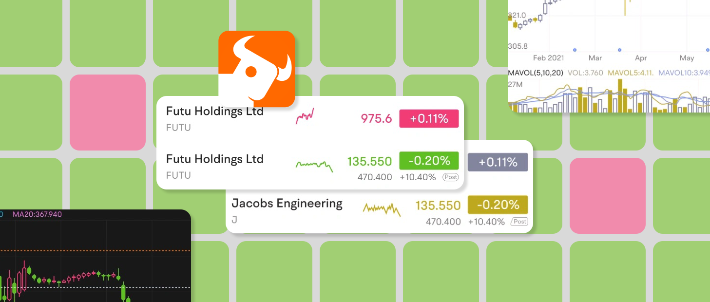
「赤と緑のダウン」は投資アプリでよく使われるカラーパターンです。このカラーパターンは投資の上下方向への動きが大事です。しかし、このカラーパターンが広く使われると、投資家は赤緑の失明や色覚の欠陥に苦しむ投資家が苦しむことになります。これらの投資家と同様に、
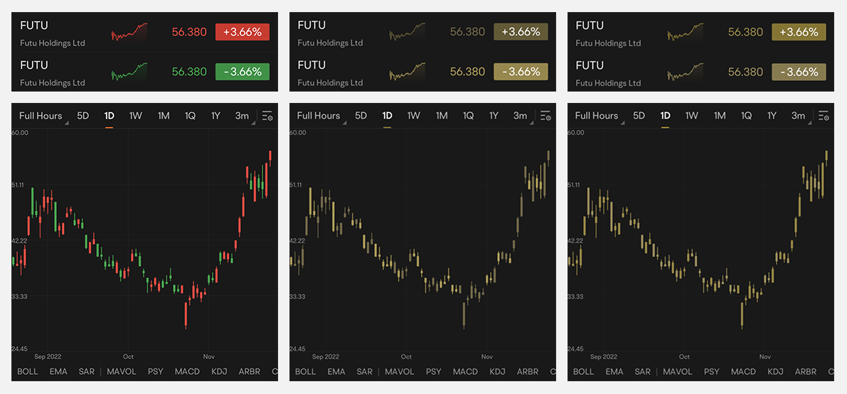
△ 赤色 上 緑 下 のカラーパターン。正常な視力のユーザー(左)、1 型 2 色覚のユーザー(中央)、2 型 2 色覚のユーザー(右)
赤と緑の異なるシェード
Futubull アプリの赤と緑のカラーパレットは、元々は正常な色覚のユーザー向けに設計されているため、色覚障がいのあるユーザーはアプリを使用する際に、記号やデータを解釈して価格の上下変動を識別するなど、多大な労力を費やす必要があります。このようなカラーパターンは、ユーザーにとって非常に不便です。
生存に関するバイアスにより、赤緑覚醒の人口の割合は、多くの人々が考えているよりも高くなる可能性があります。統計によると、色覚異常(色覚異常)は、男性の約 5%~ 8%、女性の 0.5% です。Futubull の 1,900 万人という巨大なユーザーベースを考慮すると、これは決して珍しいものではありません。
Google は常にユーザーの声を重視しており、さまざまなチャネルを通じて、色覚障がいによって問題があることに気付きました。赤緑の色覚障がいを持つ投資家は、赤と緑の違いがわからず、投資の過程で確実に速度が低下します。そのため、ユーザーの視覚要素に合わせて色覚の視覚要素に合わせて最適化された新しいカラーパターンを導入しました。—— Futubull アプリ ユーザー エクスペリエンス ディレクター Garit 氏
ユーザー補助機能のカラーパターンを設計するにあたり、チームは Google のユーザー補助検証ツールを使用して既存のアプリを評価しました。このアプリはページを記録し、インターフェースの各要素をキャプチャして、フォントサイズ、タップ ターゲットのサイズ、色のコントラストなどの改善案を提示します。この入力はチームにとって非常に役に立ちました。
- ユーザー補助検証ツール
https://developer.android.google.cn/guide/topics/ui/accessibility/testing#accessibility- Scanner
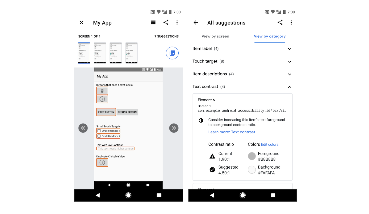
△ ユーザー補助検証ツールにより、コントロールや要素ごとにユーザー補助の最適化が提案されるため、デベロッパーにとっては参考になります
ユーザー補助機能のカラーパレットを完成させる過程で、色覚障がいのあるユーザーに対するアンケートも実施しました。これらのユーザーには、公式チャンネルを通じて連絡があり、ユーザー補助のカラーパターンをテストするよう依頼されました。そのうえで、ユーザー エクスペリエンスに関する詳細なフィードバックと最適化のアドバイスを提供してください。このフィードバックに基づいて、全体的な改善計画を策定しました。
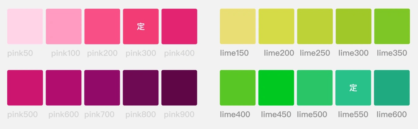
新しいピンク - 緑の配色は、同じツートーン システムを維持しつつ、正常視、1 型 2 色覚、2 型 2 色覚に関するユーザー補助検証ツールで推奨されている
色コントラストに関する推奨事項 を厳密に遵守し、正常な視力の人と赤緑色の色覚を持つ人の視覚体験を考慮に入れています。
- マテリアル デザイン: 色とコントラスト
https://m3.material.io/foundations/accessible-design/overview
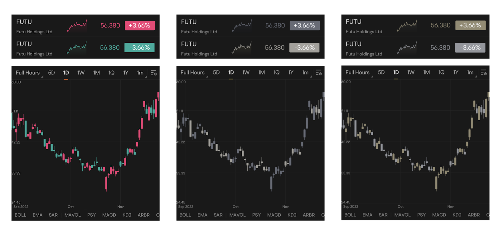
△(左)正常な色覚のユーザーの(左)、1 型 2 色覚のユーザーのユーザー(中央)、2 型 2 色覚のユーザー(右)のピンクと緑の配色パターン
誰もが利用しやすいエクスペリエンスとは
Google のチームには、色覚障害のあるメンバーを含め、現在 1,000 人以上が参加しています。使いやすい環境を作ることは、ユーザーの皆様にサービスを提供するだけでなく、Google 自身を助けるものでもあります。
—— Futubull Android R&D エンジニア Zed 氏
新しいカラーパレットを決定した後、チームは社内プロダクト チームおよび研究開発チームと連携して一連の内部テストを実施し、新機能をリリースするまでに一連の内部テストを実施しました。チームメンバーの評価のまとめ、セルフテスト、テスト エンジニアの協力により、新たに導入したカラーパレットは、色覚に障がいを持つさまざまなユーザーの操作性に 5 日間で対応できることを確認しました。
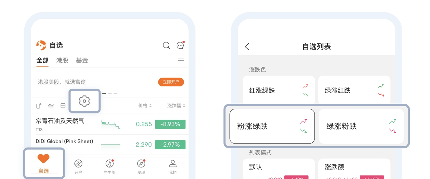
△ カラーパターンの切り替えもとても簡単です。アプリのホームページで、見たいものリストの設定アイコンをタップします。
しかし、これは Futubull のユーザー補助の改善計画の一部にすぎません。
赤 - 緑のスペクトルを超えた新たな一歩
Futubull の商品の研究開発理念は、一人で投資をより簡単にすることです。この目標は、Google のすべてのユーザーにあてはまります。
—— Futubull アプリ ユーザー エクスペリエンス ディレクター Garit 氏
また、アクセシビリティを考慮したカラーパレットを用意することで、視覚障がい者に対するユーザーの共感も高まりました。そこで、赤緑の視覚障がいを持つユーザーのニーズに合わせてピンク/緑の配色を考案した後、中空色と上向きのキャンドルを中心とした白色のキャンドル セットと、白色のキャンドルが見分けやすい白色のキャンドル セットを開発しました。
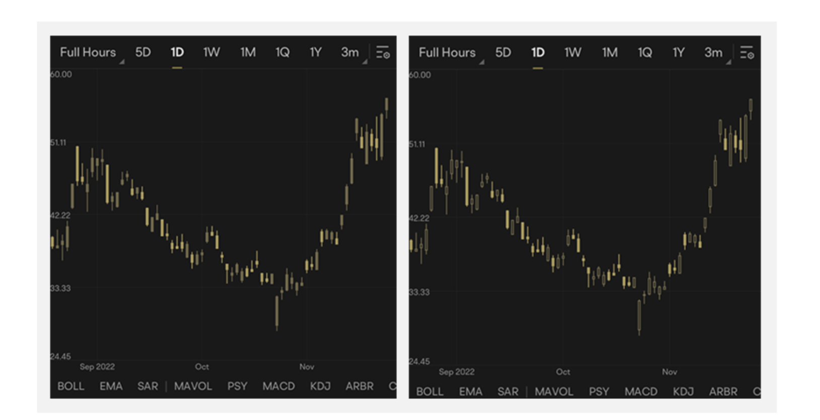
△ 固いキャンドル(左)と中が空洞のキャンドル(右)。どちらのスクリーンショットも、1 型 2 色覚のユーザーのディスプレイがどのように表示されるかを示しています
視力が弱いために文字が読みにくい方のために、テキストのサイズを大きくできるフォントサイズ設定機能も提供しています。アプリの特定のセクションや機能に特定のフォントサイズが必要なユーザー向けに、ローカライズした調整のオプションも検討しました。
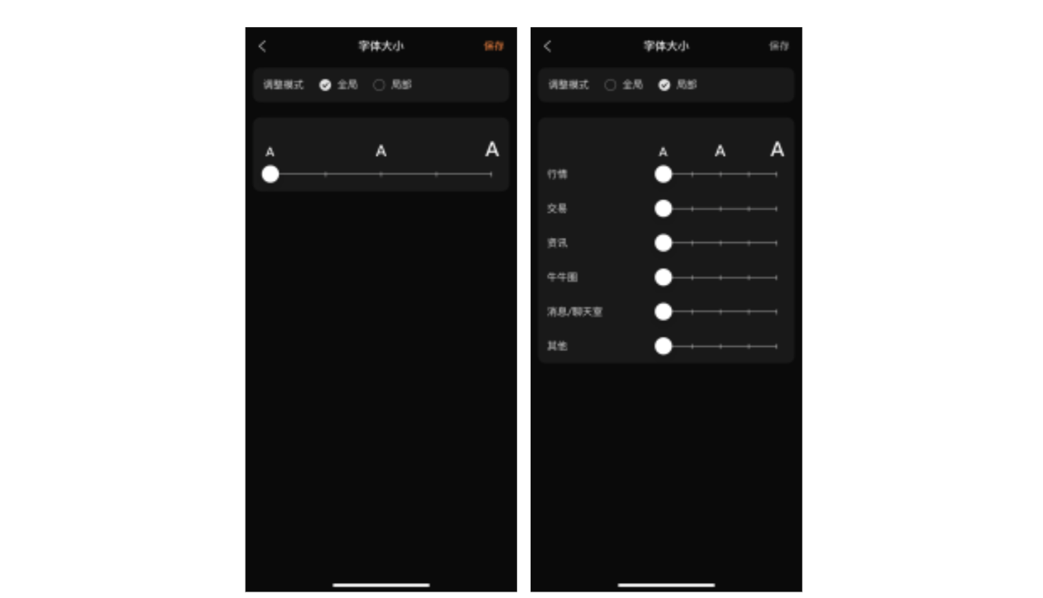
△ フォントサイズを調整するためのローカライズ オプションとグローバル オプションも用意されており、ユーザーは必要に応じてこれらを選択できます
Google のチームは、ユーザー補助機能に関する取り組みを少しずつ増やしています。ユーザー補助エクスペリエンスのフォローアップを行う専任のプロダクト マネージャーを設けています。プロダクト マネージャーは、優れたユーザー エクスペリエンスを妨げる可能性のあるアプリ ジャーニーを特定し、最適化を調整します。
—— Futubull アプリ ユーザー エクスペリエンス ディレクター Garit 氏
財産への鍵を皆に届ける
今年 6 月 16 日、Futubull の新しい使いやすいカラーパレットが正式にリリースされ、好評を得ました。
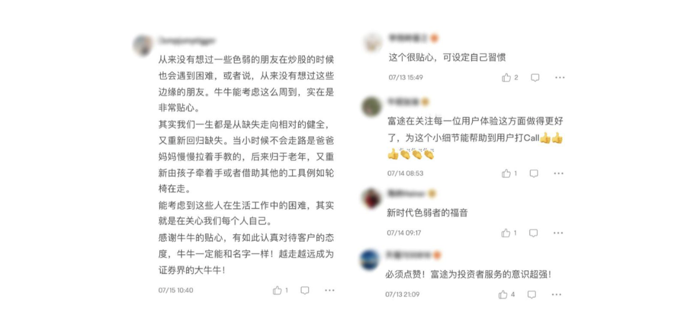
△ 好意的なクチコミは期待どおりでしたが、意外な数の肯定的なフィードバックがありました
これにより、サービスのユーザー補助機能をさらに改善するというチームの自信が高まったことは間違いありません。たとえば、現在は Android デバイスと iOS デバイスからアクセスできるカラーパレットを、
ウェブ ブラウザや PC プラットフォームに拡大する予定です。また、目の不自由なユーザー向けにテキスト読み上げ機能も開発中です。これらの機能を実装することで、より多くのユーザーが Futubull をスムーズに使用できるようになります。
- Lighthouse を使用してウェブ クライアントのユーザー補助機能を確認する
https://developer.chrome.com/docs/lighthouse/overview/
一人ではなく、より簡単に投資できるようになります。Futubull のチームは、各ユーザーのニーズにタイムリーに対応し、富の鍵を自分の手で把握できるように具体的なアクションでユーザーをサポートしています。
また、より多くのデベロッパー様がプロダクトを積極的に改善し、より利用しやすい環境を作り、より多くのユーザーを受け入れ、より大きな成功への道を開くことを楽しみにしています。
このページのコンテンツやコードサンプルは、コンテンツ ライセンスに記載のライセンスに従います。Java および OpenJDK は Oracle および関連会社の商標または登録商標です。
最終更新日 2023-01-11 UTC。
[[["わかりやすい","easyToUnderstand","thumb-up"],["問題の解決に役立った","solvedMyProblem","thumb-up"],["その他","otherUp","thumb-up"]],[["必要な情報がない","missingTheInformationINeed","thumb-down"],["複雑すぎる / 手順が多すぎる","tooComplicatedTooManySteps","thumb-down"],["最新ではない","outOfDate","thumb-down"],["翻訳に関する問題","translationIssue","thumb-down"],["サンプル / コードに問題がある","samplesCodeIssue","thumb-down"],["その他","otherDown","thumb-down"]],["最終更新日 2023-01-11 UTC。"],[],[],null,["# The Key to Wealth for Everyone | Futubull Delivers an Accessible User Experience\n\nThe standard Red Up Green Down color scheme that many wealth management app users take for granted can be very problematic for colorblind users and those with color vision deficiency.The Futubull team is embracing users' needs by making concrete improvements so that everyone can grasp the key to wealth.\n\n\n*Futubull creates a better trading experience for more than 19 million users worldwide, by offering extensive investment information/analysis/decision-making services and free-for-life training content, in addition to a vibrant wealth management chat community.The Futubull app is currently compatible with Android, iOS, Windows, Macs, tablets (iPadOS and ChromeOS), Web browsers, and Tencent in-vehicle apps, as well as offering comprehensive API functionality.The Futubull team is committed to providing warm service to every customer, which naturally includes users with differing accessibility needs.*\n\nRed Up Green Down (or vice versa) is the most common color scheme used in investment apps, where every upward and downward price movement of an investment is a big deal for users.But the widespread use of this color scheme is leaving investors who suffer from red-green color blindness/color vision deficiency in the dark.Like any investors, these users work hard to accumulate funds and carefully research wealth management product combinations in an effort to grasp the key to wealth, but when they open the trading page, they find it impossible to identify upward and downward price movements, because they have difficulty distinguishing red from green.\n\n\u003cbr /\u003e\n\n\n*△ The Red Up Green Down color scheme, as seen by users with normal vision (left), users with protanopia (center), and users with deuteranopia (right)*\n\n\u003cbr /\u003e\n\nDifferent Shades of Red and Green\n---------------------------------\n\nThe red and green color palette used in the Futubull app was originally designed for users with normal color vision, so those with a color vision impairment need to expend a lot of extra effort when using the app, such as by interpreting symbols or data to identify upward and downward price movements. Such a color scheme is very inconvenient for these users.\n\nDue to survivorship bias, the proportion of the population with red-green color blindness may be higher than many people realize. According to statistics, around 5%--8% of men and 0.5% of women have a color vision deficiency (i.e., color blindness).This is not an insignificant proportion when you consider Futubull's huge user base of 19 million people. \n\n*We have always valued the voices of our users and have learned through various channels that some of them are having troubles because of color vision impairment..Investors with red-green color blindness cannot perceive the difference between red and green, will definitely be slowed down during investment process.To this end, we have introduced a new color scheme, optimized for color vision impairments, that encompasses all visual elements of the app, enabling users to adjust the display according to their needs.\n------ Garit, Futubull App User Experience Director*\n\n\u003cbr /\u003e\n\n\nIn designing an accessible color scheme, the team evaluated existing apps using Google's [Accessibility Scanner](https://developer.android.google.cn/guide/topics/ui/accessibility/) app, which can record pages, capturing each element of the interface and providing suggestions for improvement such as font size, touch target size, color contrast, and so on. This input was immensely helpful for the team.\n\n- Accessibility Scanner \n https://developer.android.google.cn/guide/topics/ui/accessibility/testing#accessibility-scanner\n\n\n*△ Accessibility Scanner gives accessibility optimization suggestions for each control/element, which is a good reference for developers*\n\nIn the process of finalizing the accessible color palette, the team also surveyed users with color vision impairments, who were contacted through official channels and asked to test accessible color schemes, then provide detailed feedback on their experience, as well as suggestions for optimization. Based on this feedback, the team formulated an overall improvement plan.\n\n\u003cbr /\u003e\n\n\n*△ The new red and green.*\n\nThe new pink-green scheme retains the same two-tone system while strictly adhering to the [color contrast recommendations](https://m3.material.io/foundations/accessible-design/overview) provided by Accessibility Scanner for normal vision, protanopia, and deuteranopia, thereby taking into consideration the visual experience of both users with normal vision and those with red-green color blindness.\n\n\u003cbr /\u003e\n\n- Material Design: Color and Contrast \n https://m3.material.io/foundations/accessible-design/overview\n\n\n*△ (Left) The pink-green color scheme, as seen by users with normal color vision (left), users with protanopia (center), and users with deuteranopia (right)*\n\n\u003cbr /\u003e\n\nAn Accessible Experience is a Team Effort\n-----------------------------------------\n\n\n*Our team currently numbers over 1,000 people, including colorblind members.Creating an accessible experience is not only serving our users, but also helping ourselves.\n------ Zed, Futubull Android R\\&D Engineer*\n\n\u003cbr /\u003e\n\n\nAfter determining the new accessible color palette, the team subjected it to a series of internal tests in conjunction with the internal product and R\\&D teams, before the new features were launched.By collating the evaluation of team members, self-testing, and with the help of test engineers, the team ensured that the newly introduced color palette could meet the experience of a much wider range of users with color vision deficiency.It only took the team just 15 man-days to go live with the new color scheme.\n\n\n*△ Switching color schemes is also very easy. Simply tap the Watchlist Settings icon on the app's home page*\n\nBut, this is only part of Futubull's product accessibility improvement plan.\n\n\u003cbr /\u003e\n\nAnother Step Beyond the Red-Green Spectrum\n------------------------------------------\n\n\n*Futubull's product research and development philosophy is to make investing easier and not alone.That goal is applied to all of our users.\n------ Garit, Futubull App User Experience Director*\n\n\u003cbr /\u003e\n\nThe process of creating an accessible color palette also gave the team greater empathy with users who have different visual abilities.So, after devising the pink-green color scheme to meet the needs of users with red-green color vision deficiency/color blindness, the team then proceeded to develop a hollow candlestick design that uses hollow and solid candles to indicate upward and downward price movements respectively, thereby convincing a wider range of visually impaired groups.Even in the design of some of the app's main activity pages, blue and orange colors that can be differentiated by colorblind users are used as much as possible.\n\n\n*△ Solid candles (left) and hollow candles (right).Both screenshots demonstrate how the display appears to users with protanopia*\n\nFor people who have difficulty reading text due to poor eyesight, the team also provided a font size setting function, which enables users to increase the size of text to facilitate reading.For users who require a certain font size for specific sections/functions of the app, the team also considerately provided the option of localized adjustment.\n\n\u003cbr /\u003e\n\n\n*△ There are also localized and global options for font size adjustment, which users can select as needed*\n\n\n*Our team is still progressively learning more about accessibility. We have a product manager dedicated to following up on accessibility experiences,who identifies app journeys that may constitute barriers to a good user experience, then coordinates their optimization.*\n\n*------ Garit, Futubull App User Experience Director*\n\n\u003cbr /\u003e\n\nHanding Everyone the Key to Wealth\n----------------------------------\n\nOn June 16 this year, Futubull's new accessible color palette was officially launched to rave reviews.\n\n\n*△ Although good reviews were expected, the amount of positive feedback was surprising*\n\nThis undoubtedly strengthened the team's confidence to further improve the product's accessibility. For example, the team is planning to expand the accessible color palette from Android and iOS devices to [Web](https://developer.chrome.com/docs/lighthouse/overview/) browsers and PC platforms. A text-to-speech function is also being developed for vision impaired users.With the implementation of these accessible features, more users will be able to use Futubull smoothly.\n\n\u003cbr /\u003e\n\n- Use of Lighthouse to check the web client accessibility experience \n https://developer.chrome.com/docs/lighthouse/overview/\n\nMaking investing easier and not alone. The Futubull team supports each of its users with concrete actions, letting them know that their needs will be responded to in a timely manner so that they can grasp the key to wealth with their own hands.\n\nWe also look forward to more developers actively improving their products to [create a more accessible experience](https://mp.weixin.qq.com/s/9oL9XW2K3TJLkr-w08hRJg), embrace more users, and thereby pave the way to greater success."]]