
Google Photos is the home for your memories, and their development team believes people should be able to enjoy those memories across all devices. To make sure the app’s features worked well across Android tablet, foldable, and ChromeOS devices, they invested in developing responsive layouts across all screens.
What they did
The Google Photos development team thought through how to modify their layout for large screens. They leaned on usability best practices and research to determine how they wanted to modify their layouts for large screens. First they improved the grid layout by reducing the density when screens increase beyond 600dp for tablets, and 1008 dp for laptops. This made it easier for users to view and scroll through their photos on the larger form factor.
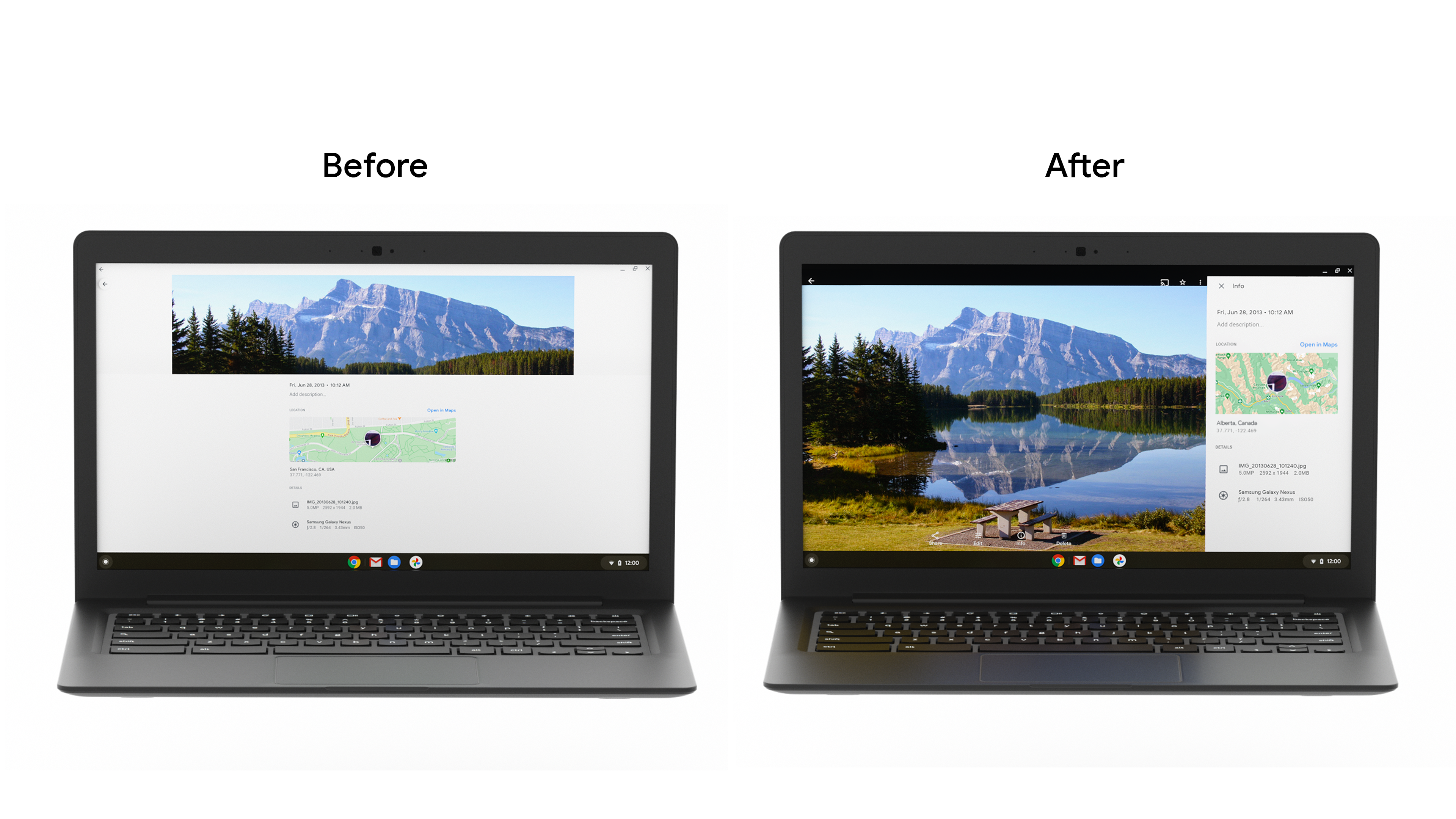
Then they replaced the info panel bottom drawer with a sidebar. Since tablets and desktop screens are often used in landscape, this approach change reduces stretching across wider screens and provides better ergonomics for the way tablet users hold devices. They also improved the bottom sheet dialog, and added snackbars to display user messages easier on large screens.
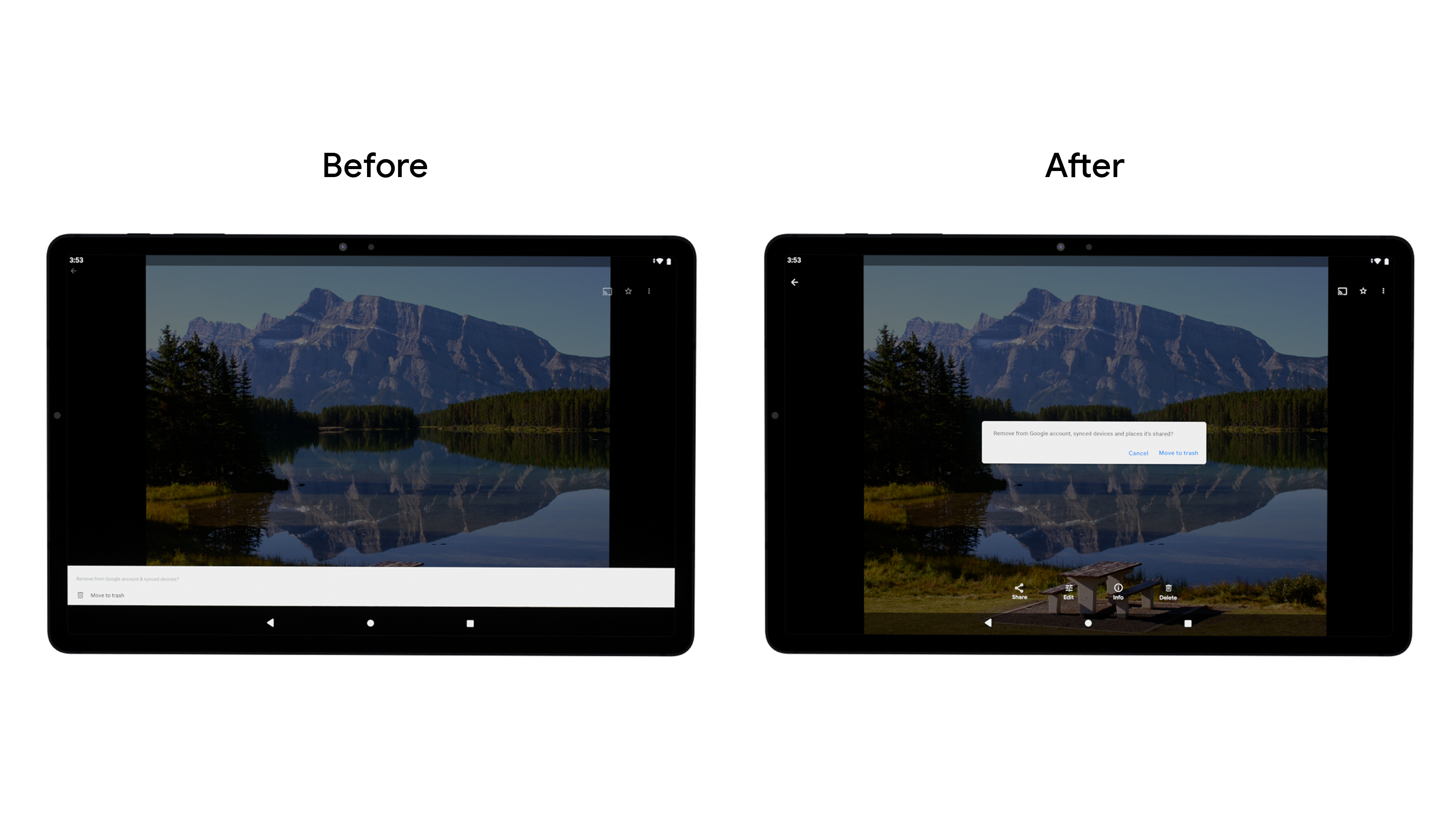
They changed the navigation component from a bottom bar to a vertical rail, to make it easier for users to navigate and complete tasks. While Google Photos built this within their own codebase, developers can build this using the new Navigation rail material component to improve ergonomics, reduce stretching, and increase the screen real estate for vertical scrolling apps.
The development team also made grid resizing dynamic to streamline transitioning between different postures and screen sizes, and improved the support they provide for accessories such as keyboards and stylus pens. Given the growth we’ve seen amongst consumers using ChromeOS devices for productivity, it is increasingly important to ensure apps support a variety of input methods, including keyboard, mouse, and touch.
Results
The team rolled out these changes through an A/B test, and noticed an overall increase in DAU for key product features on large screens, with Archive seeing as much as a 53% usage increase. The Google Photos team will continue investing in improving the user experience across all screen sizes to ensure a great experience on all devices.
Get Started
Learn more about how you can get started with optimizing your app for larger screens.