
Compose의 애니메이션
애니메이션은 현대 모바일 앱에서 원활하고 이해하기 쉬운 사용자 환경을 실현하는 데 필수적입니다.
애니메이션 수정자 및 컴포저블
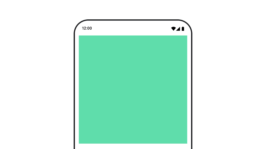
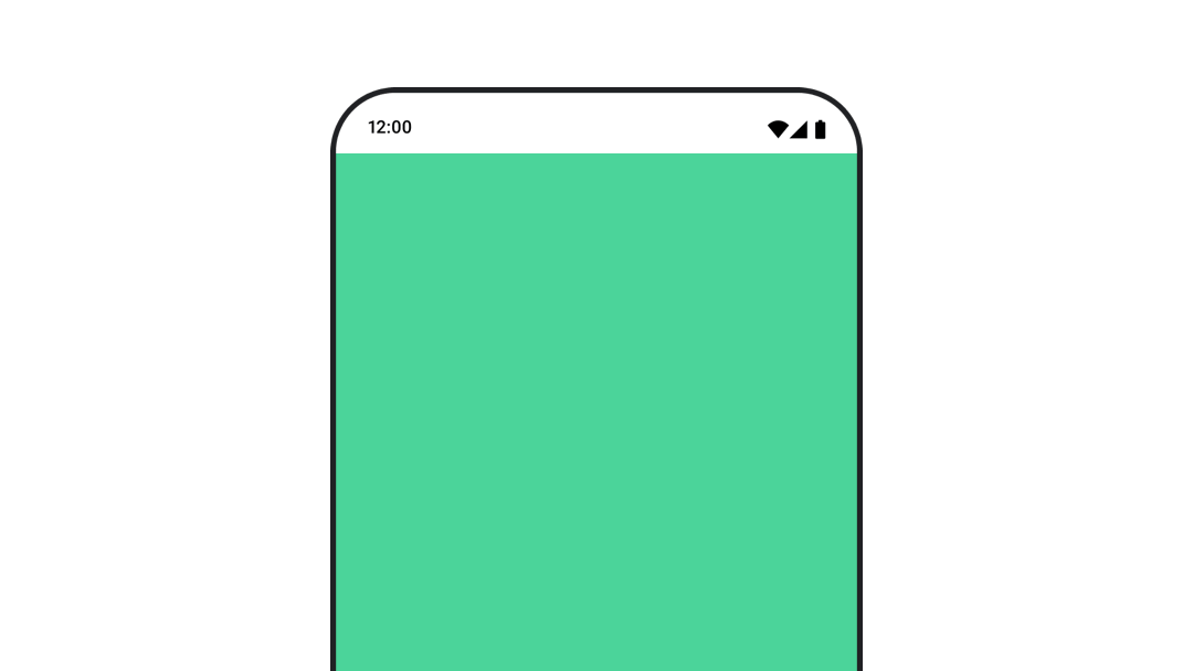
나타남과 사라짐 애니메이션
AnimatedVisibility 컴포저블을 사용하면 콘텐츠를 쉽게 숨기거나 표시할 수 있습니다.

콘텐츠 크기 변경 애니메이션 처리
animateContentSize()를 사용하여 자동 크기 변경 애니메이션을 구현합니다.
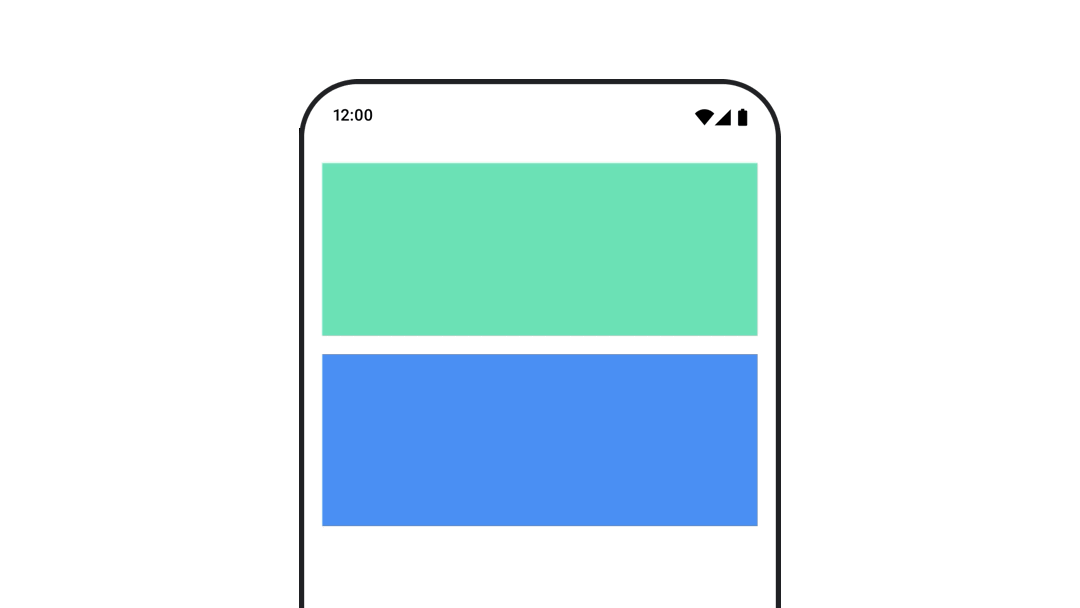
여러 컴포저블 간 애니메이션
AnimatedContent를 사용하여 콘텐츠가 다른 컴포저블 간에 애니메이션을 적용합니다.
가치 기반 애니메이션
단일 값에 애니메이션 적용
animate*AsState 함수를 사용하여 불투명도와 같은 개별 속성에 애니메이션을 적용합니다.

여러 값을 함께 애니메이션 처리
Transition를 사용하여 한 번에 여러 값에 애니메이션을 적용합니다.
무기한으로 속성 애니메이션 처리
InfiniteTransition를 사용하여 속성에 지속적으로 애니메이션을 적용합니다.
애니메이션 맞춤설정
애니메이션 재생 시간, 이징 곡선, 스프링 구성을 맞춤설정하는 방법을 알아보세요.
애니메이션 테스트
애니메이션 테스트를 작성하는 방법을 알아봅니다.
Android 스튜디오 도구
Android 스튜디오에서 애니메이션을 미리 보는 방법을 모두 알아보세요.