
Compose でのアニメーション
最新のモバイルアプリでスムーズでわかりやすいユーザー エクスペリエンスを実現するには、アニメーションが不可欠です。
アニメーションの修飾子とコンポーザブル
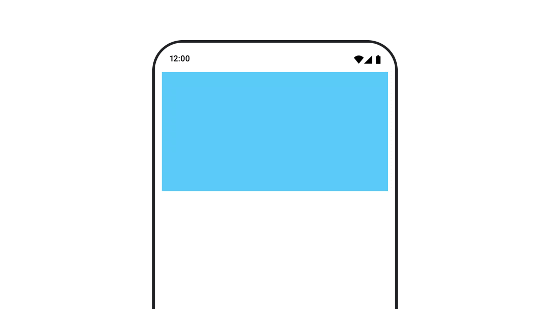
表示と消失をアニメーション化する
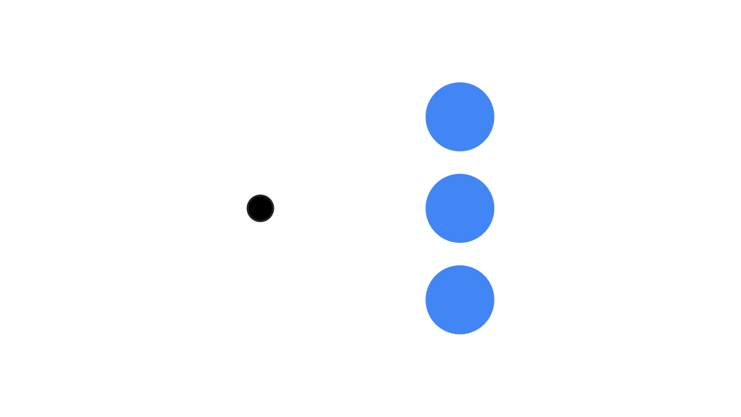
AnimatedVisibility コンポーザブルを使用すると、コンテンツの表示と非表示を簡単に切り替えることができます。
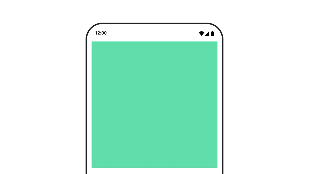
コンテンツ サイズの変更をアニメーション化する
自動サイズ変更アニメーションを実現するには、
animateContentSize() を使用します。
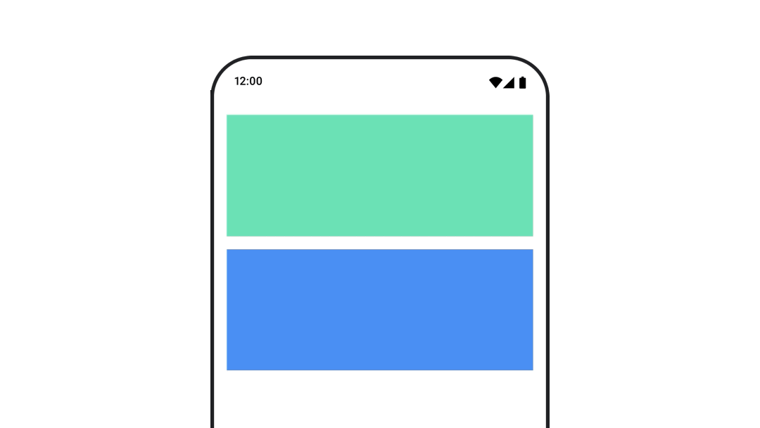
異なるコンポーザブル間でアニメーション化する
AnimatedContent を使用して、コンテンツの異なるコンポーザブル間をアニメーション化します。
価値ベースのアニメーション
単一の値をアニメーション化する
不透明度などの個々のプロパティをアニメーション化するには、
animate*AsState 関数を使用します。
複数の値をまとめてアニメーション化する
Transition を使用して、複数の値を一度にアニメーション化します。
プロパティを無期限にアニメーション化する
InfiniteTransition を使用して、プロパティを継続的にアニメーション化します。
アニメーションをカスタマイズする
アニメーションの持続時間、イージング カーブ、スプリングの設定をカスタマイズする方法について説明します。
アニメーションをテストする
アニメーションのテストを作成する方法を学習します。
Android Studio のツール
Android Studio でアニメーションをプレビューする方法について説明します。