
Compose 中的動畫
動畫是現代行動應用程式中不可或缺的元素,能夠提供流暢且明瞭的使用者體驗。
動畫修飾符和可組合函式
以動畫呈現外觀和消失
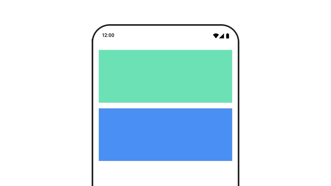
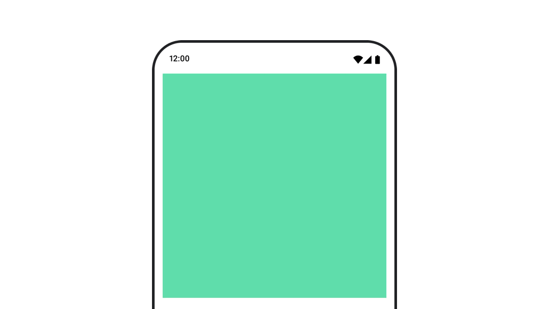
AnimatedVisibility 可組合項可讓您輕鬆隱藏或顯示內容。
以動畫呈現內容大小變更
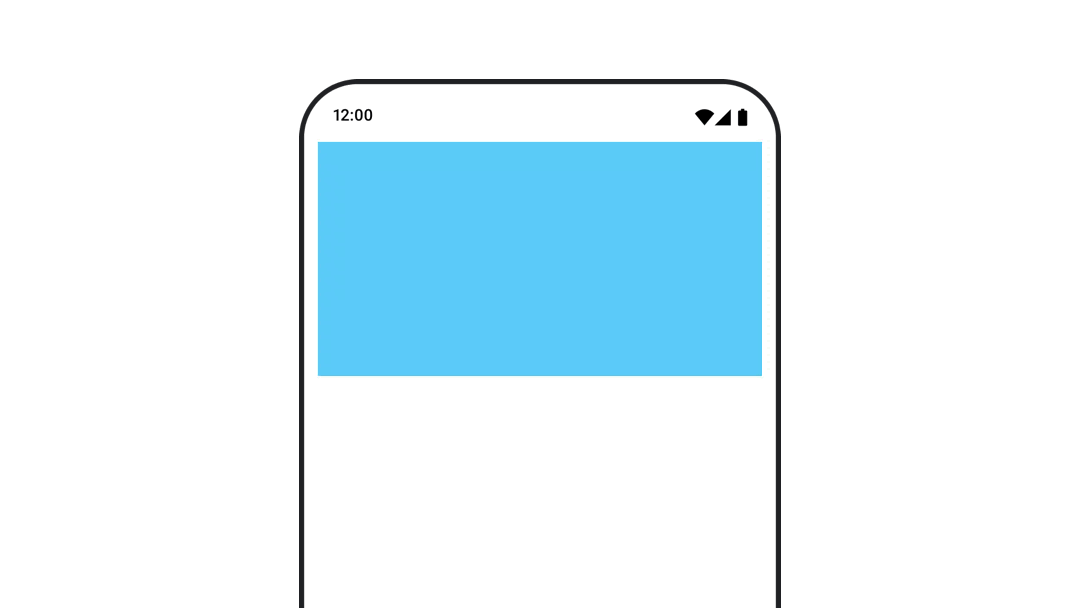
使用
animateContentSize() 可自動調整大小變更的動畫。
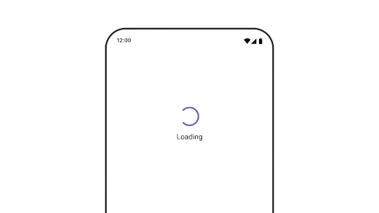
在不同可組合項之間進行動畫
使用
AnimatedContent 在含有不同內容的可組合項之間建立動畫。
以價值為準的動畫
為單一值製作動畫
使用
animate*AsState 函式為個別屬性 (例如不透明度) 製作動畫。
為多個值製作動畫
使用
Transition 即可一次為多個值製作動畫。
無限期為屬性建立動畫效果
使用
InfiniteTransition 持續為屬性製作動畫。