
เลย์เอาต์ Canonical เป็นเลย์เอาต์ที่ได้รับการพิสูจน์แล้วว่ามีความหลากหลายและมอบประสบการณ์การใช้งานที่ดีที่สุดแก่ผู้ใช้ในอุปกรณ์หลากหลายรูปแบบ
เลย์เอาต์ Canonical รองรับโทรศัพท์ที่มีหน้าจอขนาดเล็ก รวมถึงแท็บเล็ต อุปกรณ์แบบพับได้ และอุปกรณ์ ChromeOS เลย์เอาต์เหล่านี้ได้มาจากคำแนะนำของ Material Design จึงมีความสวยงาม และใช้งานได้จริง
เฟรมเวิร์ก Android มีคอมโพเนนต์เฉพาะที่ทำให้การติดตั้งใช้งานเลย์เอาต์เป็นเรื่องง่ายและเชื่อถือได้
เลย์เอาต์ Canonical สร้าง UI ที่น่าสนใจและช่วยเพิ่มประสิทธิภาพ ซึ่งเป็นรากฐานของแอปที่ยอดเยี่ยม
หากคุณคุ้นเคยกับเลย์เอาต์ Canonical ของแอปแบบปรับขนาดได้อยู่แล้ว แต่ยังไม่คุ้นเคย ให้แน่ใจว่าจะใช้ Android API ใด ให้ข้ามไปที่การมีผลบังคับใช้ เพื่อช่วยในการพิจารณาว่าเลย์เอาต์ใดเหมาะกับกรณีการใช้งานของแอป
รายละเอียดรายการ
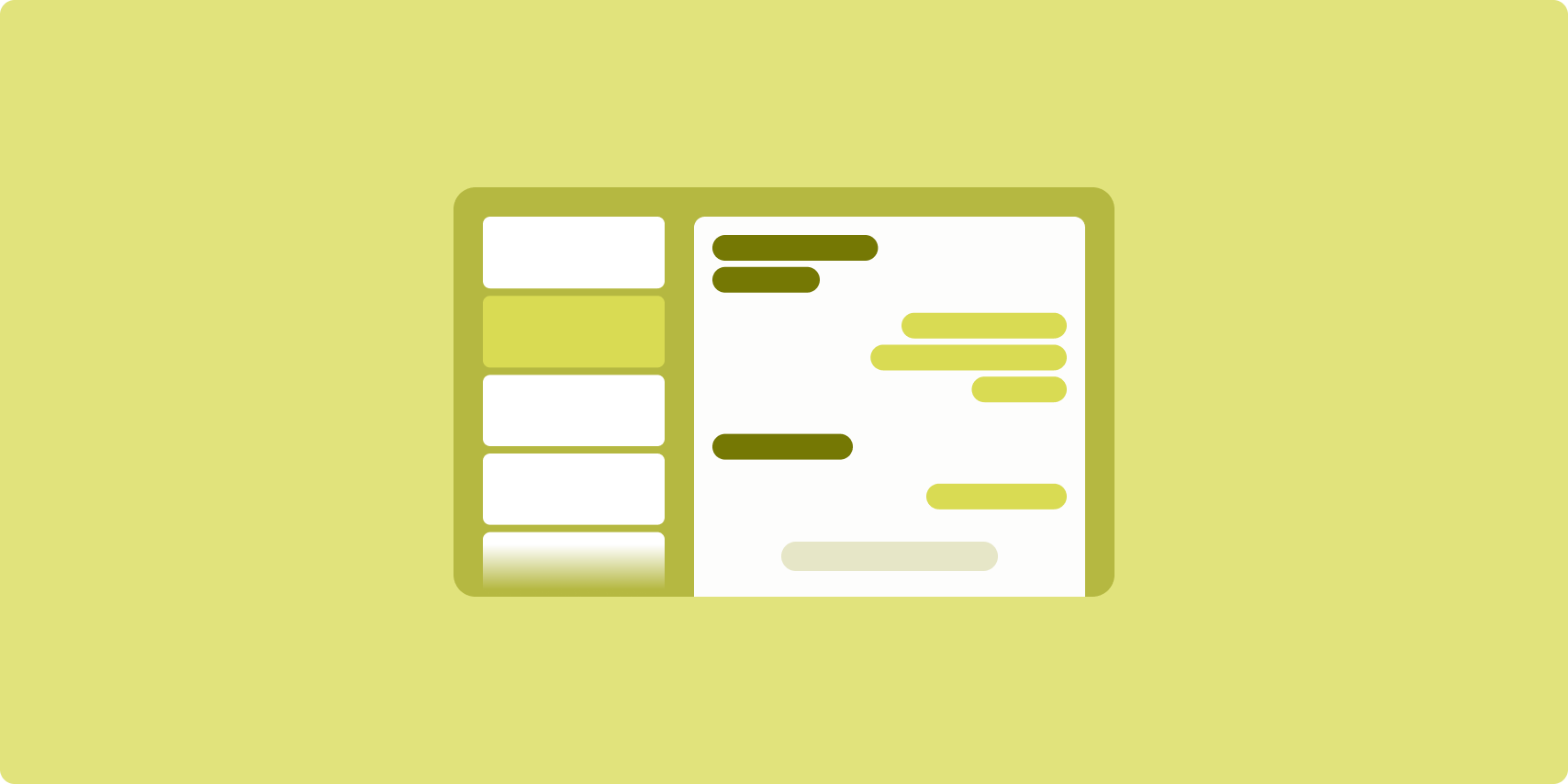
เลย์เอาต์รายละเอียดรายการช่วยให้ผู้ใช้สำรวจรายการที่มีคำอธิบาย ข้อมูลอธิบาย หรือข้อมูลเสริมอื่นๆ ซึ่งก็คือรายละเอียดรายการ
เลย์เอาต์จะแบ่งหน้าต่างแอปออกเป็น 2 บานหน้าต่างที่อยู่เคียงข้างกัน โดยบานหน้าต่างหนึ่งสำหรับรายการและอีกบานหน้าต่างหนึ่งสำหรับรายละเอียด ผู้ใช้เลือกรายการจากรายการเพื่อแสดงรายละเอียดรายการ ดีปลิงก์ในรายละเอียดจะแสดงเนื้อหาเพิ่มเติมในบานหน้าต่างรายละเอียด
จอแสดงผลที่มีความกว้างแบบขยาย (ดู ใช้คลาสขนาดหน้าต่าง) จะแสดงทั้ง รายการและรายละเอียดพร้อมกัน การเลือกรายการในรายการจะอัปเดตบานหน้าต่างรายละเอียดเพื่อแสดงเนื้อหาที่เกี่ยวข้องกับรายการที่เลือก
จอแสดงผลที่มีความกว้างปานกลางและแบบกะทัดรัดจะแสดงรายการหรือรายละเอียดอย่างใดอย่างหนึ่ง ทั้งนี้ขึ้นอยู่กับการโต้ตอบของผู้ใช้กับแอป เมื่อแสดงเฉพาะรายการ การเลือกรายการจะแสดงรายละเอียดแทนรายการ เมื่อแสดงเฉพาะรายละเอียด การกดปุ่มย้อนกลับจะแสดงรายการอีกครั้ง
การเปลี่ยนแปลงการกำหนดค่า เช่น การเปลี่ยนแปลงการวางแนวอุปกรณ์หรือการเปลี่ยนแปลงขนาดหน้าต่างแอป อาจเปลี่ยนคลาสขนาดหน้าต่างของจอแสดงผล เลย์เอาต์รายละเอียดรายการจะตอบสนองตามนั้น โดยรักษาสถานะของแอปไว้ดังนี้
- หากจอแสดงผลที่มีความกว้างแบบขยายซึ่งแสดงทั้งบานหน้าต่างรายการและรายละเอียดแคบลงเป็นปานกลางหรือกะทัดรัด บานหน้าต่างรายละเอียดจะยังคงแสดงอยู่และบานหน้าต่างรายการจะซ่อนอยู่
- หากจอแสดงผลที่มีความกว้างปานกลางหรือแบบกะทัดรัดแสดงเฉพาะบานหน้าต่างรายละเอียดและคลาสขนาดหน้าต่างขยายเป็นแบบขยาย รายการและรายละเอียดจะแสดงพร้อมกัน และรายการจะระบุว่ามีการเลือกรายการที่สอดคล้องกับเนื้อหาในบานหน้าต่างรายละเอียด
- หากจอแสดงผลที่มีความกว้างปานกลางหรือแบบกะทัดรัดแสดงเฉพาะบานหน้าต่างรายการและขยายเป็นแบบขยาย รายการและบานหน้าต่างรายละเอียดตัวยึดตำแหน่งจะแสดงพร้อมกัน
เลย์เอาต์รายละเอียดรายการเหมาะอย่างยิ่งสำหรับแอปรับส่งข้อความ, โปรแกรมจัดการรายชื่อติดต่อ, เบราว์เซอร์สื่อ แบบอินเทอร์แอกทีฟ หรือแอปใดก็ตามที่จัดระเบียบเนื้อหาเป็นรายการ ที่แสดงข้อมูลเพิ่มเติมได้
การใช้งาน
คุณสร้างเลย์เอาต์รายการแบบละเอียดได้โดยใช้เทคโนโลยีที่หลากหลาย ซึ่งรวมถึงการเขียน มุมมอง และการฝังกิจกรรม (สําหรับแอปเดิม) ดูส่วนความเกี่ยวข้องเพื่อดูว่าเทคโนโลยีใดเหมาะกับแอปของคุณมากที่สุด
ไลบรารี SlidingPaneLayout ออกแบบมาเพื่อใช้งานเลย์เอาต์รายการแบบละเอียดตามมุมมองหรือฟragment
ขั้นแรก ให้ประกาศ SlidingPaneLayout เป็นองค์ประกอบรูทของเลย์เอาต์ XML
ถัดไป ให้เพิ่มองค์ประกอบย่อย 2 รายการ ซึ่งอาจเป็นมุมมองหรือข้อมูลโค้ดที่แสดงรายการและเนื้อหารายละเอียด
ใช้วิธีการสื่อสารเพื่อส่งผ่านข้อมูลระหว่างมุมมองหรือส่วนย่อยของรายละเอียดรายการ แนะนำให้ใช้ ViewModel เนื่องจากความสามารถในการจัดเก็บตรรกะทางธุรกิจและการผ่านการเปลี่ยนแปลงการกำหนดค่า
SlidingPaneLayout จะกำหนดโดยอัตโนมัติว่าจะแสดงรายการและรายละเอียดร่วมกันหรือแยกกัน ในหน้าต่างที่มีพื้นที่แนวนอนเพียงพอที่จะแสดงทั้งรายการและรายละเอียด รายการและรายละเอียดจะปรากฏอยู่เคียงข้างกัน ในหน้าต่างที่มีพื้นที่ไม่เพียงพอ ระบบจะแสดงรายการหรือรายละเอียดโดยขึ้นอยู่กับการโต้ตอบของผู้ใช้กับแอป
ดูตัวอย่างการใช้งานได้ที่ตัวอย่างรายละเอียดรายการที่มีแผงเลื่อน
การฝังกิจกรรม
ใช้การฝังกิจกรรมเพื่อเปิดใช้แอปแบบหลายกิจกรรมเดิมให้แสดงกิจกรรม 2 รายการควบคู่กันในหน้าจอเดียวกันหรือซ้อนกัน (ซ้อนทับกัน) หากแอปใช้รายการและรายละเอียดของเลย์เอาต์รายการแบบมีรายละเอียดในกิจกรรมแยกต่างหาก การฝังกิจกรรมจะช่วยให้คุณสร้างเลย์เอาต์รายการแบบมีรายละเอียดได้ด้วยการแยกโค้ดใหม่เพียงเล็กน้อยหรือไม่ต้องแยกเลย
ใช้การฝังกิจกรรมโดยระบุการแยกหน้าต่างงานโดยใช้ไฟล์การกำหนดค่า XML การแยกจะกําหนดกิจกรรมหลัก ซึ่งจะเริ่มต้นการแยก และกิจกรรมรอง ระบุความกว้างในการแสดงผลขั้นต่ำสำหรับการแยกโดยใช้จุดหยุดพักของ Window Size Class เมื่อความกว้างของการแสดงผลต่ำกว่าจุดหยุดขั้นต่ำ กิจกรรมจะแสดงซ้อนทับกัน เช่น หากความกว้างขั้นต่ำของการแสดงผลคือ 600dp กิจกรรมจะแสดงโดยซ้อนทับอีกรายการหนึ่งบนจอแสดงผลแบบกะทัดรัด แต่จะแสดงคู่กันบนจอแสดงผลขนาดกลางและที่ขยาย
การฝังกิจกรรมใช้ได้ใน Android 12L (API ระดับ 32) ขึ้นไป แต่อาจใช้ได้ใน API ระดับต่ำกว่าด้วยหากผู้ผลิตอุปกรณ์นำมาใช้งาน เมื่อการฝังกิจกรรมไม่พร้อมใช้งานในอุปกรณ์ ลักษณะการทำงานสำรองจะส่งผลให้กิจกรรมรายการหรือกิจกรรมแบบละเอียดครอบครองหน้าต่างแอปทั้งหน้าต่างโดยอิงตามการโต้ตอบของผู้ใช้กับแอป
โปรดดูข้อมูลเพิ่มเติมที่การฝังกิจกรรม
ดูตัวอย่างการใช้งานได้ที่ตัวอย่างรายละเอียดรายการที่มีการฝังกิจกรรม
ฟีด
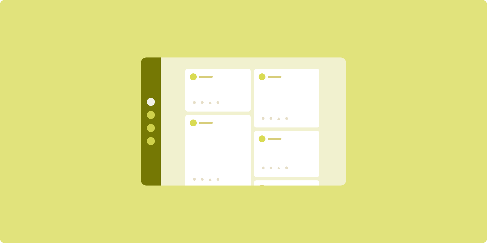
เลย์เอาต์ฟีดจะจัดเรียงองค์ประกอบเนื้อหาที่เทียบเท่ากันในตารางกริดที่กำหนดค่าได้เพื่อให้ดูเนื้อหาจำนวนมากได้อย่างรวดเร็วและสะดวก
ขนาดและตำแหน่งจะกำหนดความสัมพันธ์ระหว่างองค์ประกอบเนื้อหา
ระบบจะสร้างกลุ่มเนื้อหาโดยทำให้องค์ประกอบมีขนาดเท่ากันและวางไว้ด้วยกัน การทำให้องค์ประกอบมีขนาดใหญ่กว่าองค์ประกอบที่อยู่ใกล้เคียงจะดึงดูดความสนใจไปยังองค์ประกอบนั้น
การ์ดและรายการเป็นคอมโพเนนต์ทั่วไปของเลย์เอาต์ฟีด
เลย์เอาต์ฟีดรองรับจอแสดงผลเกือบทุกขนาด เนื่องจากตารางกริดสามารถปรับจากคอลัมน์เดียวแบบเลื่อนได้เป็นฟีดเนื้อหาแบบเลื่อนได้หลายคอลัมน์
ฟีดเหมาะอย่างยิ่งสำหรับแอปข่าวและแอปโซเชียลมีเดีย
การใช้งาน
RecyclerView จะแสดงผลรายการจำนวนมากในคอลัมน์เดียวได้อย่างมีประสิทธิภาพ GridLayoutManager จะจัดวางรายการเป็นตารางกริดเพื่อให้กำหนดค่าขนาดและระยะเวลาของรายการได้
กำหนดค่าคอลัมน์ตารางกริดตามขนาดของพื้นที่แสดงผลที่มีอยู่เพื่อกำหนดความกว้างขั้นต่ำที่อนุญาตสำหรับรายการ
คุณลบล้างกลยุทธ์ระยะเวลาเริ่มต้นของ GridLayoutManager ได้ 1 ช่วงต่อรายการโดยการสร้าง SpanSizeLookup ที่กำหนดเอง ปรับระยะเพื่อเน้นรายการบางรายการมากกว่ารายการอื่นๆ
ในจอแสดงผลขนาดกะทัดรัดที่มีพื้นที่เพียงพอสำหรับคอลัมน์เดียวเท่านั้น ให้ใช้ LinearLayoutManager แทน GridLayoutManager
ดูตัวอย่างการใช้งานได้ที่ตัวอย่างฟีดที่มียอดดู
บานหน้าต่างรอง

เลย์เอาต์บานหน้าต่างรองจะจัดระเบียบเนื้อหาแอปเป็นพื้นที่แสดงผลหลักและพื้นที่แสดงผลรอง
พื้นที่แสดงผลหลักจะครอบครองพื้นที่ส่วนใหญ่ของหน้าต่างแอป (โดยปกติประมาณ 2 ใน 3) และมีเนื้อหาหลัก พื้นที่แสดงผลรองคือบานหน้าต่างที่ใช้พื้นที่ส่วนที่เหลือของหน้าต่างแอปและแสดงเนื้อหาที่รองรับเนื้อหาหลัก
เลย์เอาต์บานหน้าต่างรองทำงานได้ดีบนจอแสดงผลที่มีความกว้างแบบขยาย (ดู ใช้คลาสขนาดหน้าต่าง) ในแนวนอน จอแสดงผลที่มีความกว้างปานกลางหรือแบบกะทัดรัดรองรับการแสดงทั้งพื้นที่แสดงผลหลักและรอง หากเนื้อหาสามารถปรับให้เข้ากับพื้นที่แสดงผลที่แคบลงได้ หรือหากเนื้อหาเพิ่มเติมสามารถซ่อนไว้ในชีตด้านล่างหรือด้านข้างที่เข้าถึงได้โดยใช้การควบคุม เช่น เมนูหรือปุ่ม
เลย์เอาต์บานหน้าต่างรองแตกต่างจากเลย์เอาต์รายละเอียดรายการในความสัมพันธ์ของเนื้อหาหลักและเนื้อหารอง เนื้อหาในบานหน้าต่างรองจะมีความหมายก็ต่อเมื่อมีความสัมพันธ์กับเนื้อหาหลักเท่านั้น เช่น หน้าต่างเครื่องมือบานหน้าต่างรองจะไม่มีความเกี่ยวข้องในตัวของมันเอง อย่างไรก็ตาม เนื้อหาเสริมในบานหน้าต่างรายละเอียดของเลย์เอาต์รายละเอียดรายการจะมีความหมายแม้ว่าจะไม่มีเนื้อหาหลักก็ตาม เช่น คำอธิบายผลิตภัณฑ์จากรายการผลิตภัณฑ์
กรณีการใช้งานสำหรับบานหน้าต่างรองมีดังนี้
- แอปเพิ่มประสิทธิภาพ: เอกสารหรือสเปรดชีตพร้อมความคิดเห็นของผู้ตรวจสอบ ในบานหน้าต่างรอง
- แอปสื่อ: วิดีโอสตรีมมิงและรายการวิดีโอที่เกี่ยวข้อง ในบานหน้าต่างรอง หรือการแสดงอัลบั้มเพลงพร้อมเพลย์ลิสต์
- เครื่องมือและการตั้งค่า: เครื่องมือแก้ไขสื่อพร้อมจานสี เอฟเฟกต์ และการตั้งค่าอื่นๆ ในบานหน้าต่างรอง
การใช้งาน
เลย์เอาต์แผงสนับสนุนจะใช้เลย์เอาต์ตัวช่วย เช่น LinearLayout หรือ ConstraintLayout สร้างคลาสขนาดหน้าต่าง
ซึ่งแบ่งพื้นที่แสดงผลแนวนอนที่มีอยู่สำหรับแอป
3 หมวดหมู่ ได้แก่ กะทัดรัด (< 600dp), ปานกลาง (>= 600dp) และขยาย
(>= 840dp)
สำหรับคลาสขนาดหน้าต่างแต่ละระดับ ให้กำหนดเลย์เอาต์ดังนี้
- กะทัดรัด: ในโฟลเดอร์ทรัพยากรของแอป
layoutให้วางเนื้อหาที่แสดงผลแผงสนับสนุนใต้เนื้อหาหลักหรือภายในชีตด้านล่าง - กลาง: ในโฟลเดอร์
layout-w600dpให้ใส่เนื้อหาในแผงสนับสนุนซึ่งส่งผลให้เนื้อหาหลักและแผงสนับสนุนแสดงผลควบคู่กัน โดยแบ่งพื้นที่ในแนวนอนอย่างเท่าๆ กัน - ขยาย: ในโฟลเดอร์
layout-w840dpให้ใส่เนื้อหาในแผงสนับสนุนซึ่งส่งผลให้เนื้อหาหลักและแผงสนับสนุนแสดงผลควบคู่กัน แต่แผงสนับสนุนจะใช้พื้นที่แนวนอนเพียง 30% เท่านั้น ส่วนที่เหลือ 70% จะเป็นพื้นที่สำหรับเนื้อหาหลัก
ใช้ ViewModel สำหรับการสื่อสารระหว่างเนื้อหาหลักกับ
แผงสนับสนุน ไม่ว่าจะใช้มุมมอง ส่วนย่อย หรือชุดค่าผสม
สำหรับตัวอย่างการใช้งาน โปรดดูตัวอย่างต่อไปนี้
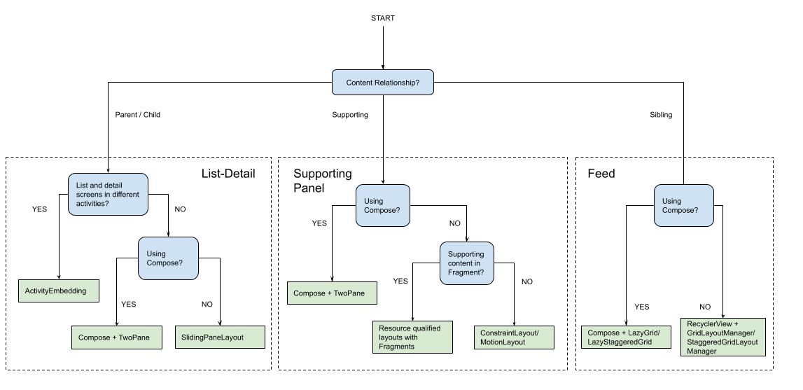
การบังคับใช้
เลย์เอาต์ตามรูปแบบบัญญัติสร้างการนำเสนอเนื้อหาหลากหลายรูปแบบเพื่อให้เข้าถึงได้ง่ายและเจาะลึก ใช้โฟลว์ชาร์ตต่อไปนี้เพื่อกำหนดเลย์เอาต์และกลยุทธ์การใช้งานที่เหมาะกับกรณีการใช้งานของแอปมากที่สุด
โปรดดูตัวอย่างเลย์เอาต์ Canonical ที่ใช้ในแอปประเภทต่างๆ ในแกลเลอรีหน้าจอขนาดใหญ่
แหล่งข้อมูลเพิ่มเติม
- Material Design — เลย์เอาต์ Canonical