
Canonical layouts are proven, versatile layouts that provide an optimal user experience on a variety of form factors.
The canonical layouts support small screen phones as well as tablets, foldables, and ChromeOS devices. Derived from Material Design guidance, the layouts are aesthetic as well as functional.
The Android framework includes specialized components that make implementation of the layouts straightforward and reliable.
The canonical layouts create engaging, productivity‑enhancing UIs that form the foundation of great apps.
List-detail

The list-detail layout enables users to explore lists of items that have descriptive, explanatory, or other supplementary information—the item detail.
The layout divides the app window into two side-by-side panes: one for the list, one for the detail. Users select items from the list to display the item detail. Deep links in the detail reveal additional content in the detail pane.
Expanded-width displays (see Use window size classes) accommodate both the list and detail at the same time. Selection of a list item updates the detail pane to show the related content for the selected item.
Medium- and compact-width displays show either the list or the detail, depending on user interaction with the app. When just the list is visible, selection of a list item displays the detail in place of the list. When just the detail is visible, pressing the back button redisplays the list.
Configuration changes such as device orientation changes or app window size changes can change the display's window size class. A list‑detail layout responds accordingly, preserving app state:
- If an expanded-width display showing both the list and detail panes narrows to medium or compact, the detail pane remains visible and the list pane is hidden
- If a medium- or compact-width display has just the detail pane visible and the window size class widens to expanded, the list and detail are shown together, and the list indicates that the item corresponding to the content in the detail pane is selected
- If a medium- or compact-width display has just the list pane visible and widens to expanded, the list and a placeholder detail pane are shown together
List-detail is ideal for messaging apps, contact managers, file browsers, or any app where the content can be organized as a list of items that reveal additional information.
Implementation
The declarative paradigm of Compose supports window size class logic that determines whether to show the list and detail panes at the same time (when the width window size class is expanded) or just the list or detail pane (when the width window size class is medium or compact).
To ensure unidirectional data flow, hoist all state, including current window size class and detail of the selected list item (if any), so all composables have access to the data and can render correctly.
When showing just the detail pane on small window sizes, add a BackHandler
to remove the detail pane and display just the list pane. The BackHandler is
not part of the overall app navigation since the handler is dependent on the
window size class and selected detail state.
For an example implementation, see the List-detail with Compose sample.
Feed
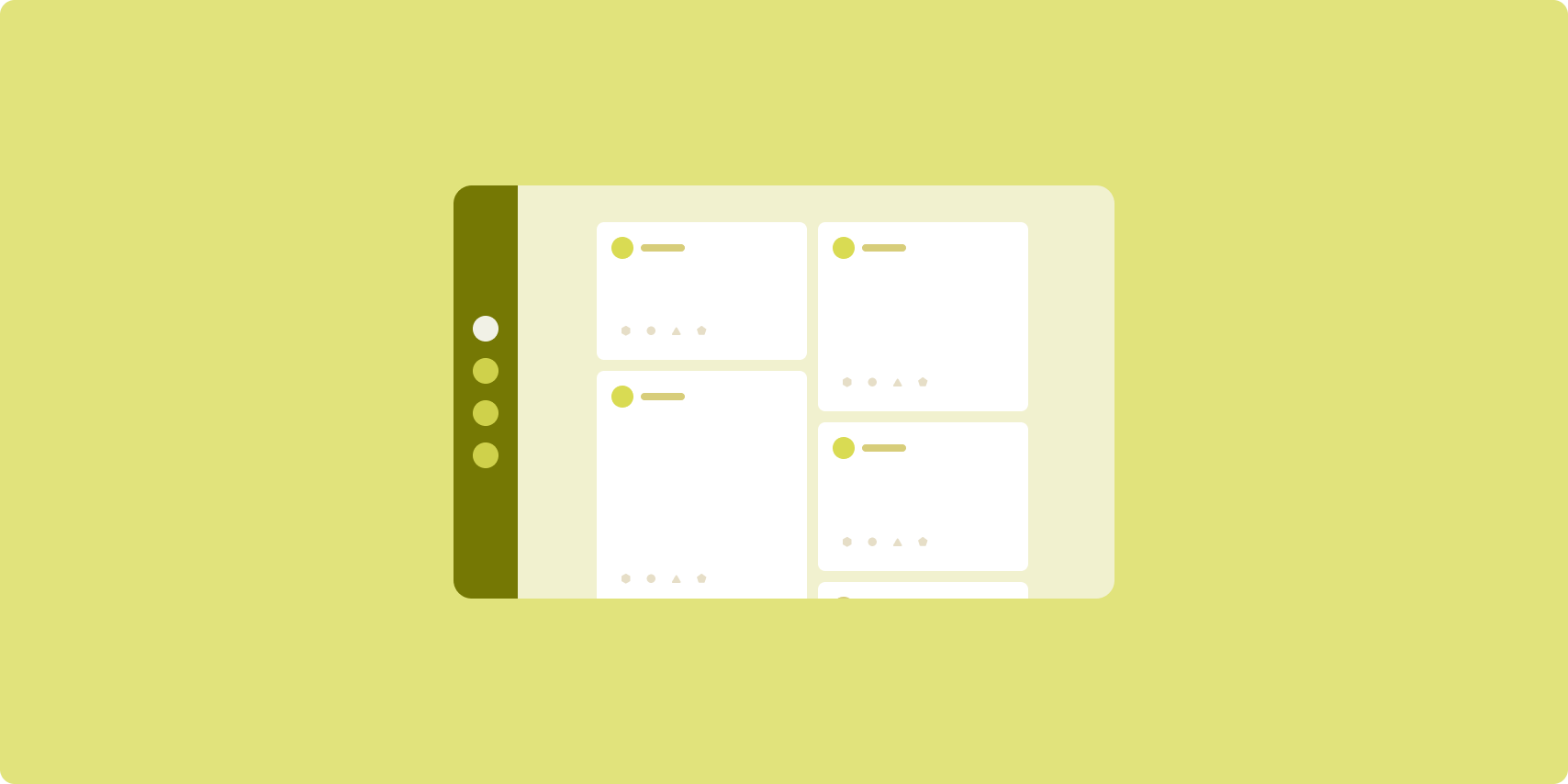
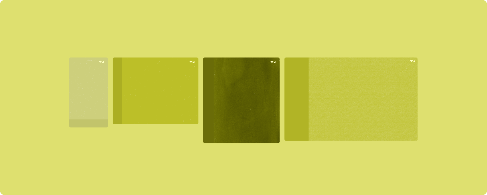
A feed layout arranges equivalent content elements in a configurable grid for quick, convenient viewing of a large amount of content.
Size and position establish relationships among the content elements.
Content groups are created by making elements the same size and positioning them together. Attention is drawn to elements by making them larger than nearby elements.
Cards and lists are common components of feed layouts.
A feed layout supports displays of almost any size because the grid can adapt from a single, scrolling column to a multi‑column scrolling feed of content.
Feeds are especially well suited for news and social media apps.
Implementation
Nguồn cấp dữ liệu bao gồm một lượng lớn thành phần nội dung trong một vùng chứa cuộn theo chiều dọc được đặt trong lưới. Danh sách tải từng phần (lazy list) thể hiện hiệu quả một lượng lớn các mục trong cột hoặc hàng. Lưới lazy kết xuất các mục trong lưới, hỗ trợ cấu hình của kích thước và khoảng (span) của mục.
Hãy định cấu hình các cột của bố cục lưới dựa trên phần hiển thị sẵn có để đặt chiều rộng tối thiểu cho phép cho các mục trong lưới. Khi xác định các mục trong lưới, hãy điều chỉnh khoảng cột để làm một số mục nổi bật hơn so với các mục khác.
Đối với tiêu đề, phần phân chia hoặc các mục khác được thiết kế để chiếm toàn bộ chiều rộng của nguồn cấp dữ liệu, hãy sử dụng maxLineSpan để chiếm toàn bộ chiều rộng của bố cục.
Trên màn hình có chiều rộng nhỏ gọn không đủ không gian để trình bày nhiều cột, LazyVerticalGrid sẽ hoạt động giống như LazyColumn.
Hãy xem mẫu Nguồn cấp dữ liệu với Compose để tham khảo ví dụ về cách triển khai.
Supporting pane

Supporting pane layout organizes app content into primary and secondary display areas.
The primary display area occupies the majority of the app window (typically about two thirds) and contains the main content. The secondary display area is a pane that takes up the remainder of the app window and presents content that supports the main content.
Supporting pane layouts work well on expanded-width displays (see Use window size classes) in landscape orientation. Medium- or compact‑width displays support showing both the primary and secondary display areas if the content is adaptable to narrower display spaces, or if the additional content can be initially hidden in a bottom or side sheet accessible by means of a control such as a menu or button.
A supporting pane layout differs from a list‑detail layout in the relationship of the primary and secondary content. Secondary pane content is meaningful only in relation to the primary content; for example, a supporting pane tool window is irrelevant by itself. The supplementary content in the detail pane of a list‑detail layout, however, is meaningful even without the primary content, for example, the description of a product from a product listing.
Use cases for supporting pane include:
- Productivity apps: A document or spreadsheet accompanied by reviewer comments in a supporting pane
- Media apps: A streaming video complemented by a list of related videos in a supporting pane, or the depiction of an album of music supplemented with a playlist
- Search and reference apps: A query input form with results in a supporting pane
Implementation
Compose hỗ trợ logic lớp kích thước cửa sổ, cho phép bạn xác định xem có hiển thị cả nội dung chính và nội dung chi tiết cùng lúc hay không hoặc đặt nội dung chi tiết ở một vị trí thay thế.
Hãy chuyển trạng thái lên trên, bao gồm cả lớp kích thước cửa sổ hiện tại và thông tin liên quan đến dữ liệu trong nội dung chính và nội dung chi tiết.
Đối với màn hình có chiều rộng nhỏ gọn, hãy đặt nội dung chi tiết bên dưới nội dung chính hoặc vào một trang ở dưới cùng. Đối với màn hình có chiều rộng trung bình và mở rộng, hãy đặt nội dung chi tiết bên cạnh nội dung chính, với kích thước phù hợp dựa trên nội dung và không gian có sẵn. Đối với màn hình có chiều rộng trung bình, hãy chia đều không gian hiển thị giữa nội dung chính và nội dung chi tiết. Đối với màn hình có chiều rộng mở rộng, hãy cung cấp 70% không gian cho nội dung chính, 30% cho nội dung bổ trợ.
Để tham khảo ví dụ về cách triển khai, hãy xem mẫu Ngăn hỗ trợ với Compose.
Additional resources
- Material Design — Canonical layouts