
แม้ว่า Material จะเป็นระบบการออกแบบที่เราแนะนำและ Jetpack Compose จะมาพร้อมกับการติดตั้งใช้งาน Material แต่คุณก็ไม่จำเป็นต้องใช้ Material สร้างขึ้นจาก API สาธารณะทั้งหมด คุณจึงสร้างระบบการออกแบบของคุณเองในลักษณะเดียวกันได้
คุณอาจใช้วิธีการต่อไปนี้
- ขยาย
MaterialThemeด้วยค่าการจัดธีมเพิ่มเติม - แทนที่ระบบ Material อย่างน้อย 1 ระบบ -
Colors,TypographyหรือShapes- ด้วยการติดตั้งใช้งานที่กำหนดเองในขณะที่ยังคงใช้ระบบอื่นๆ - ใช้ระบบการออกแบบที่กำหนดเองอย่างเต็มรูปแบบเพื่อแทนที่
MaterialTheme
นอกจากนี้ คุณอาจต้องการใช้คอมโพเนนต์ Material ต่อไปกับระบบการออกแบบที่กำหนดเอง คุณทำได้ แต่ต้องคำนึงถึงสิ่งต่างๆ เพื่อให้เหมาะกับแนวทางที่คุณเลือกใช้
ดูข้อมูลเพิ่มเติมเกี่ยวกับโครงสร้างและ API ระดับล่างที่ใช้โดย MaterialTheme
และระบบการออกแบบที่กำหนดเองได้ในคู่มือโครงสร้างของธีมใน Compose
ขยายการกำหนดธีม Material
Compose Material มีลักษณะคล้ายกับ การกำหนดธีม Material เพื่อให้ทำตามหลักเกณฑ์ของ Material ได้อย่างตรงไปตรงมาและปลอดภัยต่อประเภท อย่างไรก็ตาม คุณสามารถขยายชุดสี ชุดตัวอักษร และชุดรูปร่างได้โดยใช้ ค่าเพิ่มเติม แนวทางที่ง่ายที่สุดคือการเพิ่มพร็อพเพอร์ตี้ส่วนขยาย ดังนี้
// Use with MaterialTheme.colorScheme.snackbarAction val ColorScheme.snackbarAction: Color @Composable get() = if (isSystemInDarkTheme()) Red300 else Red700 // Use with MaterialTheme.typography.textFieldInput val Typography.textFieldInput: TextStyle get() = TextStyle(/* ... */) // Use with MaterialTheme.shapes.card val Shapes.card: Shape get() = RoundedCornerShape(size = 20.dp)
ซึ่งจะช่วยให้สอดคล้องกับ API การใช้งาน MaterialTheme ตัวอย่างของค่านี้ที่กำหนดโดย Compose เองคือ
surfaceColorAtElevation
ซึ่งกำหนดสีพื้นผิวที่ควรใช้ตาม
ระดับความสูง
อีกวิธีหนึ่งคือการกำหนดธีมแบบขยายที่ "ครอบคลุม" MaterialTheme และ
ค่าของธีม
สมมติว่าคุณต้องการเพิ่มสีอีก 2 สี ได้แก่ caution และ onCaution ซึ่งเป็นสีเหลืองที่ใช้สำหรับการดำเนินการที่มีความเสี่ยงปานกลาง ขณะเดียวกันก็ต้องการเก็บสี Material ที่มีอยู่ไว้
@Immutable data class ExtendedColors( val caution: Color, val onCaution: Color ) val LocalExtendedColors = staticCompositionLocalOf { ExtendedColors( caution = Color.Unspecified, onCaution = Color.Unspecified ) } @Composable fun ExtendedTheme( /* ... */ content: @Composable () -> Unit ) { val extendedColors = ExtendedColors( caution = Color(0xFFFFCC02), onCaution = Color(0xFF2C2D30) ) CompositionLocalProvider(LocalExtendedColors provides extendedColors) { MaterialTheme( /* colors = ..., typography = ..., shapes = ... */ content = content ) } } // Use with eg. ExtendedTheme.colors.caution object ExtendedTheme { val colors: ExtendedColors @Composable get() = LocalExtendedColors.current }
ซึ่งคล้ายกับ API การใช้งาน MaterialTheme นอกจากนี้ยังรองรับธีมหลายธีม
เนื่องจากคุณซ้อน ExtendedTheme ได้ในลักษณะเดียวกับ MaterialTheme
ใช้คอมโพเนนต์ Material
เมื่อขยายการกำหนดธีม Material ระบบจะยังคงค่า MaterialTheme ที่มีอยู่ และคอมโพเนนต์ Material จะยังคงมีค่าเริ่มต้นที่เหมาะสม
หากต้องการใช้ค่าที่ขยายในคอมโพเนนต์ ให้รวมค่าเหล่านั้นไว้ในฟังก์ชันที่ใช้ Compose ของคุณเอง โดยตั้งค่าที่คุณต้องการเปลี่ยนแปลงโดยตรง และแสดงค่าอื่นๆ เป็นพารามิเตอร์ไปยังฟังก์ชันที่ใช้ Compose ที่มีอยู่
@Composable fun ExtendedButton( onClick: () -> Unit, modifier: Modifier = Modifier, content: @Composable RowScope.() -> Unit ) { Button( colors = ButtonDefaults.buttonColors( containerColor = ExtendedTheme.colors.caution, contentColor = ExtendedTheme.colors.onCaution /* Other colors use values from MaterialTheme */ ), onClick = onClick, modifier = modifier, content = content ) }
จากนั้นคุณจะแทนที่การใช้งาน Button ด้วย ExtendedButton ในกรณีที่เหมาะสม
@Composable fun ExtendedApp() { ExtendedTheme { /*...*/ ExtendedButton(onClick = { /* ... */ }) { /* ... */ } } }
เปลี่ยนระบบย่อยของ Material
คุณอาจต้องการแทนที่ระบบอย่างน้อย 1 ระบบ เช่น Colors, Typography หรือ Shapes ด้วยการติดตั้งใช้งานที่กำหนดเอง ในขณะที่ยังคงใช้ระบบอื่นๆ ไว้แทนที่จะขยายการกำหนดธีม Material
สมมติว่าคุณต้องการแทนที่ระบบประเภทและรูปร่างในขณะที่ยังคงใช้ระบบสี ไว้ ให้ทำดังนี้
@Immutable data class ReplacementTypography( val body: TextStyle, val title: TextStyle ) @Immutable data class ReplacementShapes( val component: Shape, val surface: Shape ) val LocalReplacementTypography = staticCompositionLocalOf { ReplacementTypography( body = TextStyle.Default, title = TextStyle.Default ) } val LocalReplacementShapes = staticCompositionLocalOf { ReplacementShapes( component = RoundedCornerShape(ZeroCornerSize), surface = RoundedCornerShape(ZeroCornerSize) ) } @Composable fun ReplacementTheme( /* ... */ content: @Composable () -> Unit ) { val replacementTypography = ReplacementTypography( body = TextStyle(fontSize = 16.sp), title = TextStyle(fontSize = 32.sp) ) val replacementShapes = ReplacementShapes( component = RoundedCornerShape(percent = 50), surface = RoundedCornerShape(size = 40.dp) ) CompositionLocalProvider( LocalReplacementTypography provides replacementTypography, LocalReplacementShapes provides replacementShapes ) { MaterialTheme( /* colors = ... */ content = content ) } } // Use with eg. ReplacementTheme.typography.body object ReplacementTheme { val typography: ReplacementTypography @Composable get() = LocalReplacementTypography.current val shapes: ReplacementShapes @Composable get() = LocalReplacementShapes.current }
ใช้คอมโพเนนต์ Material
เมื่อมีการแทนที่ระบบของ MaterialTheme อย่างน้อย 1 ระบบ การใช้คอมโพเนนต์ Material ตามที่เป็นอยู่ อาจส่งผลให้ได้ค่าสี ประเภท หรือรูปร่างของ Material ที่ไม่ต้องการ
หากต้องการใช้ค่าแทนที่ในคอมโพเนนต์ ให้รวมค่าเหล่านั้นไว้ในฟังก์ชันที่ใช้ร่วมกันได้ของคุณเอง โดยการตั้งค่าโดยตรงสำหรับระบบที่เกี่ยวข้อง และ แสดงค่าอื่นๆ เป็นพารามิเตอร์ไปยังฟังก์ชันที่ใช้ร่วมกันได้ที่ประกอบอยู่
@Composable fun ReplacementButton( onClick: () -> Unit, modifier: Modifier = Modifier, content: @Composable RowScope.() -> Unit ) { Button( shape = ReplacementTheme.shapes.component, onClick = onClick, modifier = modifier, content = { ProvideTextStyle( value = ReplacementTheme.typography.body ) { content() } } ) }
จากนั้นคุณจะแทนที่การใช้งาน Button ด้วย ReplacementButton ในกรณีที่เหมาะสม
@Composable fun ReplacementApp() { ReplacementTheme { /*...*/ ReplacementButton(onClick = { /* ... */ }) { /* ... */ } } }
ใช้ระบบการออกแบบที่กำหนดเองทั้งหมด
คุณอาจต้องการแทนที่การกำหนดธีม Material ด้วยระบบการออกแบบที่กำหนดเองทั้งหมด
โปรดทราบว่า MaterialTheme มีระบบต่อไปนี้
Colors,TypographyและShapes: ระบบการกำหนดธีม MaterialTextSelectionColors: สีที่ใช้สำหรับการเลือกข้อความโดยTextและTextFieldRippleและRippleTheme: การใช้วัสดุของIndication
หากต้องการใช้คอมโพเนนต์ Material ต่อไป คุณต้องแทนที่ระบบบางส่วนเหล่านี้ในธีมที่กำหนดเอง หรือจัดการระบบในคอมโพเนนต์เพื่อหลีกเลี่ยงลักษณะการทำงานที่ไม่ต้องการ
อย่างไรก็ตาม ระบบการออกแบบไม่ได้จำกัดอยู่แค่แนวคิดที่ Material ใช้ คุณ สามารถแก้ไขระบบที่มีอยู่และนำระบบใหม่ทั้งหมดมาใช้ได้ โดยมีคลาส และประเภทใหม่ๆ เพื่อให้แนวคิดอื่นๆ เข้ากันได้กับธีม
ในโค้ดต่อไปนี้ เราจะสร้างระบบสีที่กำหนดเองซึ่งมีสีไล่ระดับ
(List<Color>) รวมถึงระบบแบบอักษร เปิดตัวระบบระดับความสูงใหม่
และยกเว้นระบบอื่นๆ ที่ MaterialTheme จัดให้
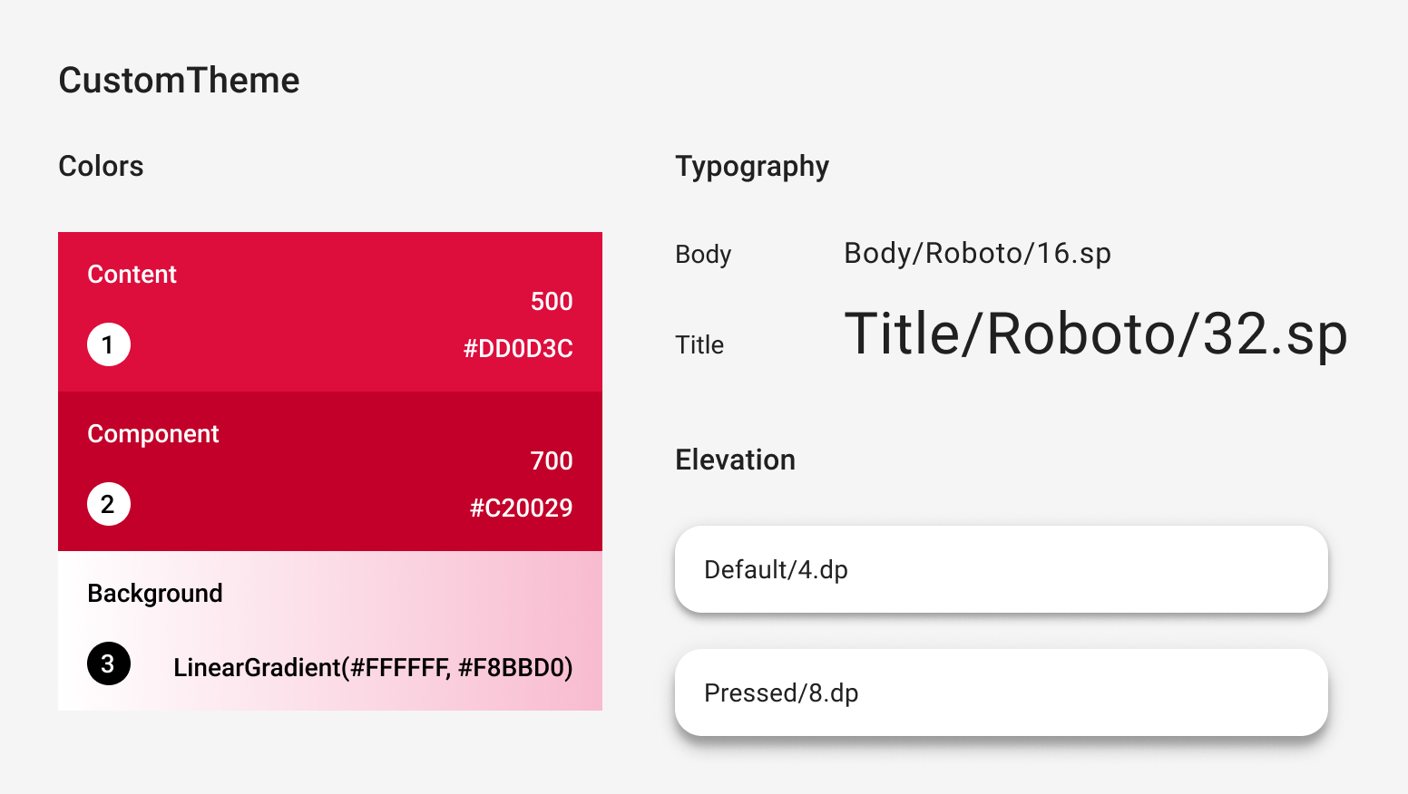
@Immutable data class CustomColors( val content: Color, val component: Color, val background: List<Color> ) @Immutable data class CustomTypography( val body: TextStyle, val title: TextStyle ) @Immutable data class CustomElevation( val default: Dp, val pressed: Dp ) val LocalCustomColors = staticCompositionLocalOf { CustomColors( content = Color.Unspecified, component = Color.Unspecified, background = emptyList() ) } val LocalCustomTypography = staticCompositionLocalOf { CustomTypography( body = TextStyle.Default, title = TextStyle.Default ) } val LocalCustomElevation = staticCompositionLocalOf { CustomElevation( default = Dp.Unspecified, pressed = Dp.Unspecified ) } @Composable fun CustomTheme( /* ... */ content: @Composable () -> Unit ) { val customColors = CustomColors( content = Color(0xFFDD0D3C), component = Color(0xFFC20029), background = listOf(Color.White, Color(0xFFF8BBD0)) ) val customTypography = CustomTypography( body = TextStyle(fontSize = 16.sp), title = TextStyle(fontSize = 32.sp) ) val customElevation = CustomElevation( default = 4.dp, pressed = 8.dp ) CompositionLocalProvider( LocalCustomColors provides customColors, LocalCustomTypography provides customTypography, LocalCustomElevation provides customElevation, content = content ) } // Use with eg. CustomTheme.elevation.small object CustomTheme { val colors: CustomColors @Composable get() = LocalCustomColors.current val typography: CustomTypography @Composable get() = LocalCustomTypography.current val elevation: CustomElevation @Composable get() = LocalCustomElevation.current }
ใช้คอมโพเนนต์ Material
เมื่อไม่มี MaterialTheme การใช้คอมโพเนนต์ Material ตามที่เป็นอยู่จะส่งผล
ให้ค่าสี ประเภท และรูปร่างของ Material ไม่เป็นไปตามที่ต้องการ รวมถึงลักษณะการทำงานของตัวบ่งชี้
หากต้องการใช้ค่าที่กำหนดเองในคอมโพเนนต์ ให้ห่อค่าเหล่านั้นในฟังก์ชันที่ประกอบกันได้ของคุณเอง โดยตั้งค่าสำหรับระบบที่เกี่ยวข้องโดยตรง และแสดงค่าอื่นๆ เป็นพารามิเตอร์ไปยัง Composable ที่มี
เราขอแนะนําให้คุณเข้าถึงค่าที่ตั้งไว้จากธีมที่กําหนดเอง
หรือหากธีมไม่มี Color, TextStyle, Shape หรือ
ระบบอื่นๆ คุณก็สามารถฮาร์ดโค้ดได้
@Composable fun CustomButton( onClick: () -> Unit, modifier: Modifier = Modifier, content: @Composable RowScope.() -> Unit ) { Button( colors = ButtonDefaults.buttonColors( containerColor = CustomTheme.colors.component, contentColor = CustomTheme.colors.content, disabledContainerColor = CustomTheme.colors.content .copy(alpha = 0.12f) .compositeOver(CustomTheme.colors.component), disabledContentColor = CustomTheme.colors.content .copy(alpha = 0.38f) ), shape = ButtonShape, elevation = ButtonDefaults.elevatedButtonElevation( defaultElevation = CustomTheme.elevation.default, pressedElevation = CustomTheme.elevation.pressed /* disabledElevation = 0.dp */ ), onClick = onClick, modifier = modifier, content = { ProvideTextStyle( value = CustomTheme.typography.body ) { content() } } ) } val ButtonShape = RoundedCornerShape(percent = 50)
หากคุณได้เปิดตัวประเภทคลาสใหม่ เช่น List<Color> เพื่อแสดง
การไล่ระดับสี คุณอาจต้องใช้คอมโพเนนต์ตั้งแต่ต้นแทน
การห่อหุ้ม ตัวอย่างเช่น ดู
JetsnackButton
จากตัวอย่าง Jetsnack
แนะนำสำหรับคุณ
- หมายเหตุ: ข้อความลิงก์จะแสดงเมื่อ JavaScript ปิดอยู่
- Material Design 3 ใน Compose
- ย้ายข้อมูลจาก Material 2 ไปยัง Material 3 ใน Compose
- องค์ประกอบของธีมใน Compose