
ใช้ปุ่มที่แบ่งกลุ่มเพื่อให้ผู้ใช้เลือกจากชุดตัวเลือกแบบเรียงข้างกัน ปุ่มที่แบ่งกลุ่มมี 2 ประเภท ได้แก่
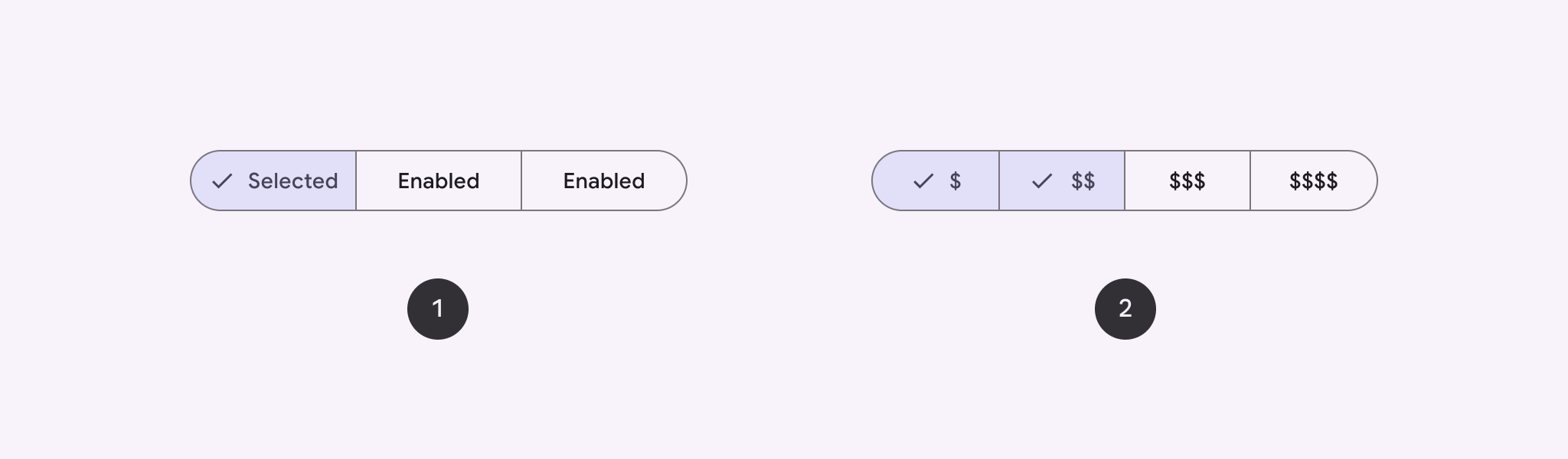
- ปุ่มเลือกรายการเดียว: ให้ผู้ใช้เลือกได้ 1 ตัวเลือก
- ปุ่มเลือกหลายรายการ: ช่วยให้ผู้ใช้เลือกได้ 2-5 รายการ หากต้องการตัวเลือกที่ซับซ้อนมากขึ้นหรือมีรายการมากกว่า 5 รายการ ให้ใช้ชิป
แพลตฟอร์ม API
ใช้เลย์เอาต์ SingleChoiceSegmentedButtonRow และ
MultiChoiceSegmentedButtonRow เพื่อสร้างปุ่มที่แบ่งกลุ่ม เลย์เอาต์เหล่านี้จะกำหนดตำแหน่งและขนาดของ SegmentedButtons อย่างถูกต้อง
และใช้พารามิเตอร์หลักต่อไปนี้ร่วมกัน
space: ปรับการทับซ้อนระหว่างปุ่มcontent: มีเนื้อหาของแถวปุ่มที่แบ่งกลุ่ม ซึ่งโดยปกติจะเป็นลำดับของSegmentedButton
สร้างปุ่มที่แบ่งกลุ่มแบบเลือกรายการเดียว
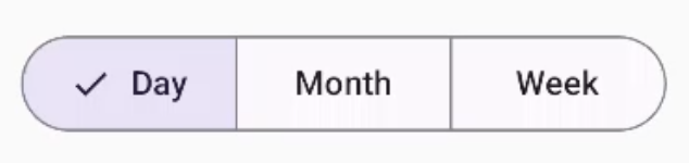
ตัวอย่างนี้แสดงวิธีสร้างปุ่มที่แบ่งกลุ่มแบบเลือกรายการเดียว
@Composable fun SingleChoiceSegmentedButton(modifier: Modifier = Modifier) { var selectedIndex by remember { mutableIntStateOf(0) } val options = listOf("Day", "Month", "Week") SingleChoiceSegmentedButtonRow { options.f>orEachIndexed { index, label - SegmentedButton( shape = SegmentedButtonDefaults.itemShape( index = index, count = options.size ), onClick = { selectedIndex = index }, selected = index == selectedIndex, label = { Text(label) } } } }SegmentedButton.kt
ประเด็นสำคัญเกี่ยวกับโค้ด
- เริ่มต้นตัวแปร
selectedIndexโดยใช้rememberและmutableIntStateOfเพื่อติดตามดัชนีปุ่มที่เลือก - กำหนดรายการ
optionsที่แสดงป้ายกำกับปุ่ม SingleChoiceSegmentedButtonRowให้คุณเลือกได้เพียงปุ่มเดียว- สร้าง
SegmentedButtonสำหรับแต่ละตัวเลือกภายในลูปforEachIndexedดังนี้shapeกำหนดรูปร่างของปุ่มตามดัชนีและจำนวนตัวเลือกทั้งหมดโดยใช้SegmentedButtonDefaults.itemShapeonClickอัปเดตselectedIndexด้วยดัชนีของปุ่มที่คลิกselectedจะตั้งค่าสถานะการเลือกของปุ่มตามselectedIndexlabelจะแสดงป้ายกำกับปุ่มโดยใช้ ComposableText
ผลลัพธ์
สร้างปุ่มที่แบ่งกลุ่มแบบเลือกหลายรายการ
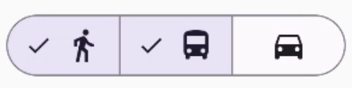
ตัวอย่างนี้แสดงวิธีสร้างปุ่มแบบหลายตัวเลือกที่แบ่งกลุ่มพร้อมไอคอนซึ่ง ช่วยให้ผู้ใช้เลือกได้หลายตัวเลือก
@Composable fun MultiChoiceSegmentedButton(modifier: Modifier = Modifier) { val selectedOptions = remember { mutableStateListOf(false, false, false) } val options = listOf("Walk", "Ride", "Drive") MultiChoiceSegmentedButtonRow { options.f>orEachIndexed { index, label - SegmentedButton( shape = SegmentedButtonDefaults.itemShape( index = index, count = options.size ), checked = selectedOptions[index], onCheckedChange = { selectedOptions[index] = !selectedOptions[index] }, icon = { SegmentedButtonDefaults.Icon(selectedOptions[index]) }, label = { when (label) { > "Walk" - Icon( imageVector = Icons.AutoMirrored.Filled.DirectionsWalk, contentDescription = "Directions Walk" > ) "Ride" - Icon( imageVector = Icons.Default.DirectionsBus, contentDescription = "Directions> Bus" ) "Drive" - Icon( imageVector = Icons.Default.DirectionsCar, contentDescription = "Directions Car" } } ) } } }SegmentedButton.kt
ประเด็นสำคัญเกี่ยวกับโค้ด
- โค้ดจะเริ่มต้นตัวแปร
selectedOptionsโดยใช้rememberและmutableStateListOfซึ่งจะติดตามสถานะที่เลือกของแต่ละปุ่ม - โค้ดใช้
MultiChoiceSegmentedButtonRowเพื่อเก็บปุ่ม - ภายในลูป
forEachIndexedโค้ดจะสร้างSegmentedButtonสำหรับ แต่ละตัวเลือกshapeจะกำหนดรูปร่างของปุ่มตามดัชนีและจำนวนตัวเลือกทั้งหมดcheckedจะตั้งค่าสถานะที่เลือกของปุ่มตามค่าที่เกี่ยวข้องในselectedOptionsonCheckedChangeจะสลับสถานะที่เลือกของรายการที่เกี่ยวข้อง ในselectedOptionsเมื่อมีการคลิกปุ่มiconจะแสดงไอคอนตามSegmentedButtonDefaults.Iconและสถานะที่เลือกของปุ่มlabelจะแสดงไอคอนที่สอดคล้องกับป้ายกำกับโดยใช้IconComposable ที่มีเวกเตอร์รูปภาพและคำอธิบายเนื้อหาที่เหมาะสม
ผลลัพธ์
แหล่งข้อมูลเพิ่มเติม
- Material 3: ปุ่มที่แบ่งกลุ่ม