 Google uses AI technology to translate content into your preferred language. AI translations can contain errors.
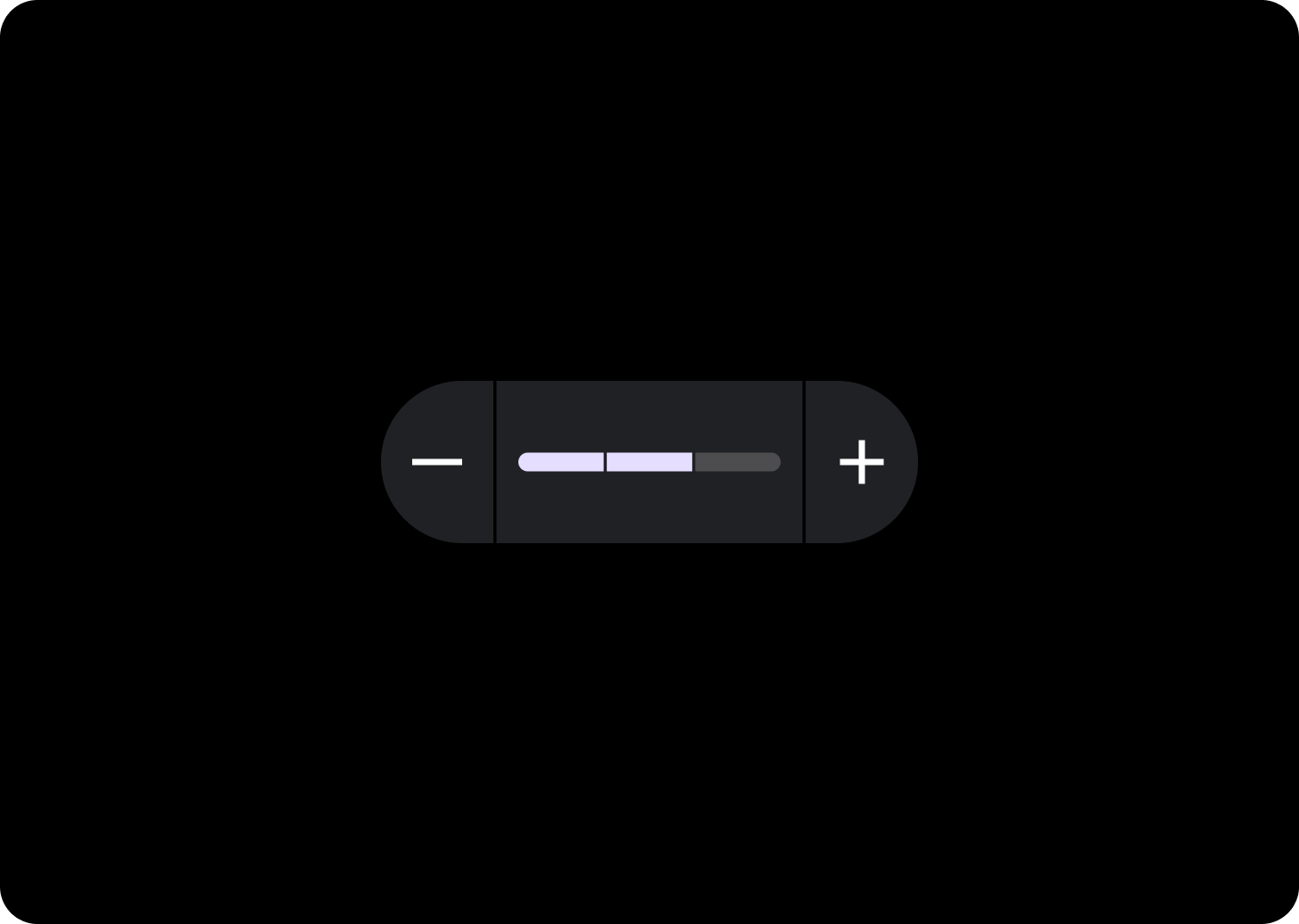
滑块
使用集合让一切井井有条
根据您的偏好保存内容并对其进行分类。
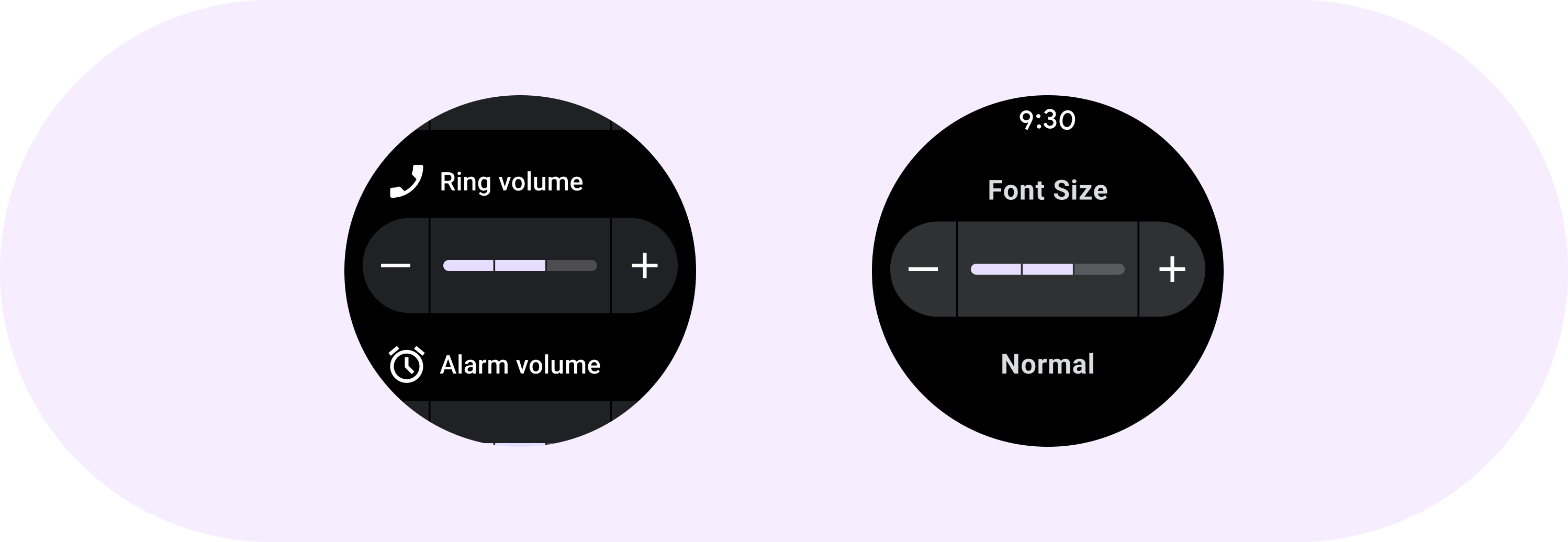
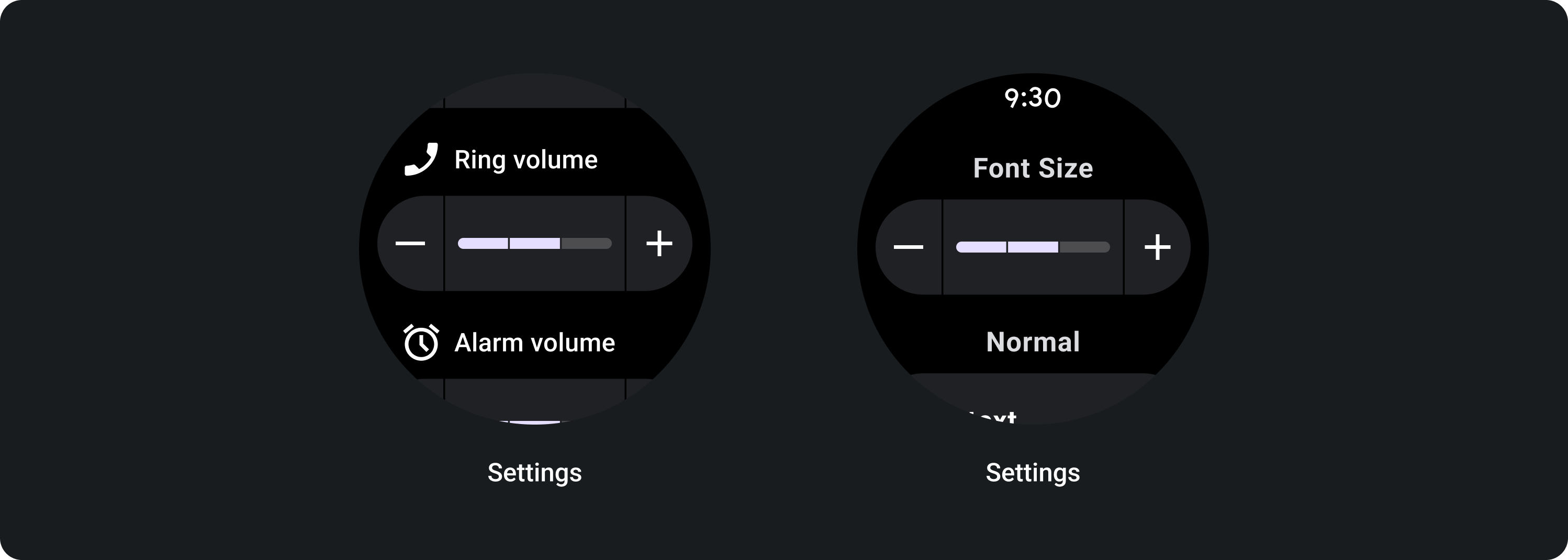
内嵌滑块可让用户从一系列值中进行选择。
使用内嵌滑块从范围中选择一个值,例如设置屏幕亮度或字体大小。使用滑块所做的更改会立即生效,用户可以继续进行调整,直到满意为止。如果无法立即调整,请勿使用滑块。
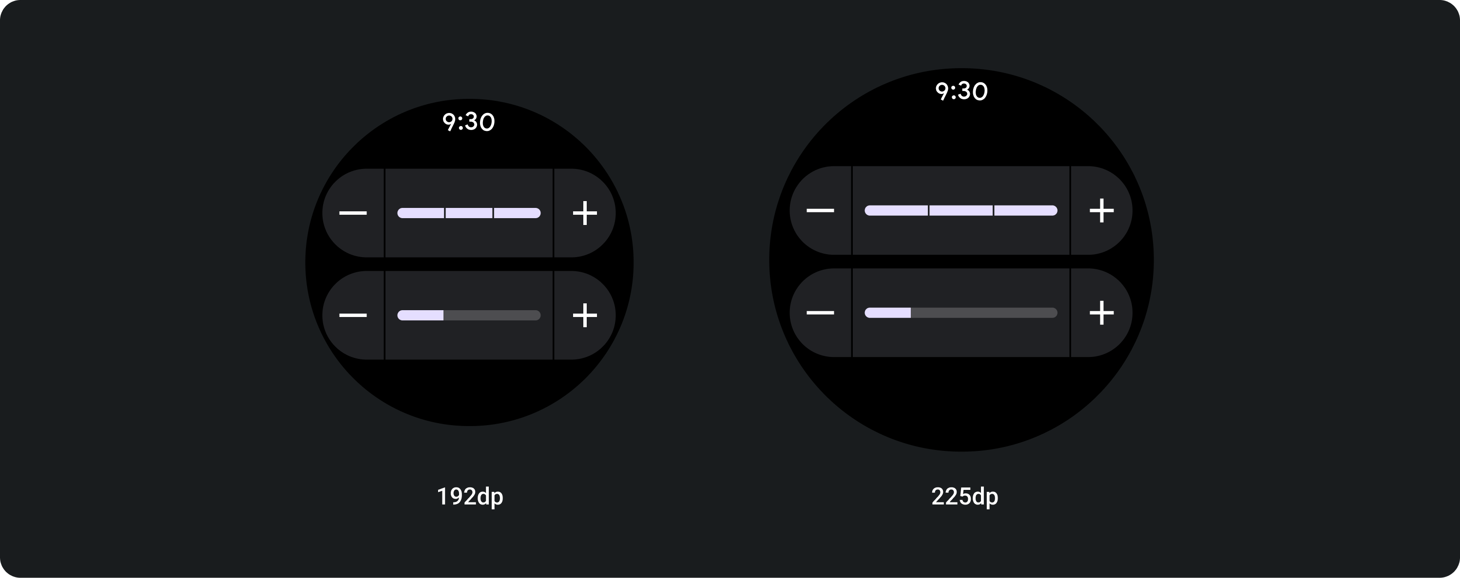
解剖学
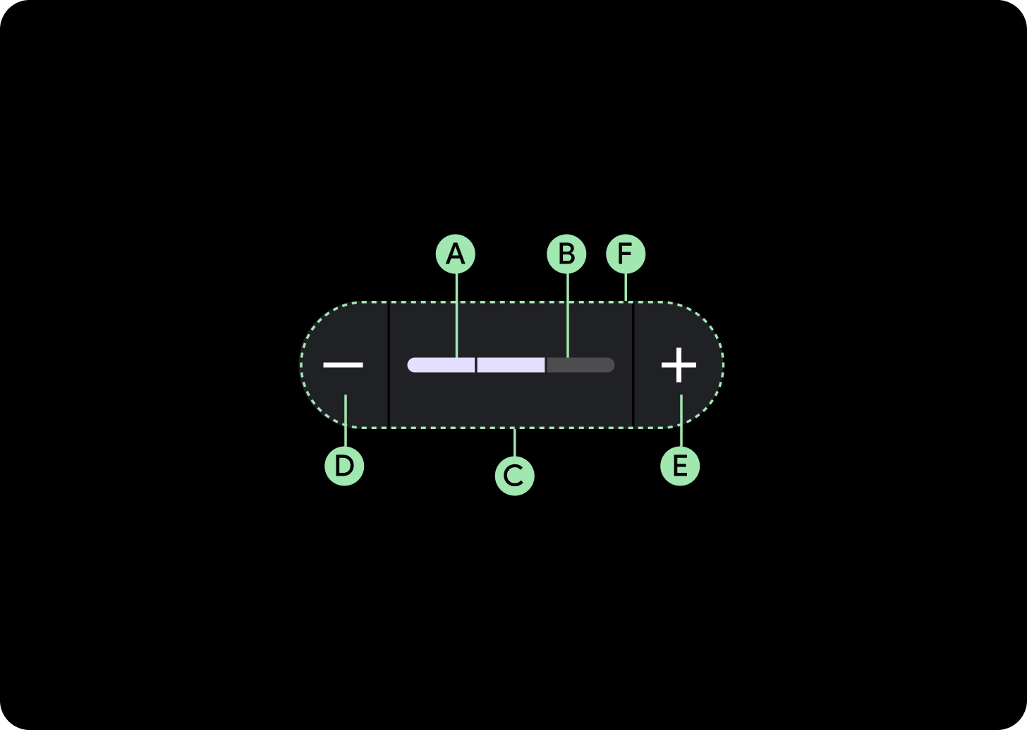
A. 进度条
B. 进度跟踪
C. 容器
D. 减少图标
E. “调高”图标
F. 分隔符
设计建议

分段滑块
如果值的范围介于 3 到 9 之间,请考虑使用分段滑块。如果范围大于 8,则分段会过小而无法显示。
使用方法
自适应布局
路段段会填满可用宽度,因此显示的时间会更长,具体取决于屏幕的尺寸。
填满可用宽度
在较大的屏幕上,滑块会拉伸以填充可用宽度。
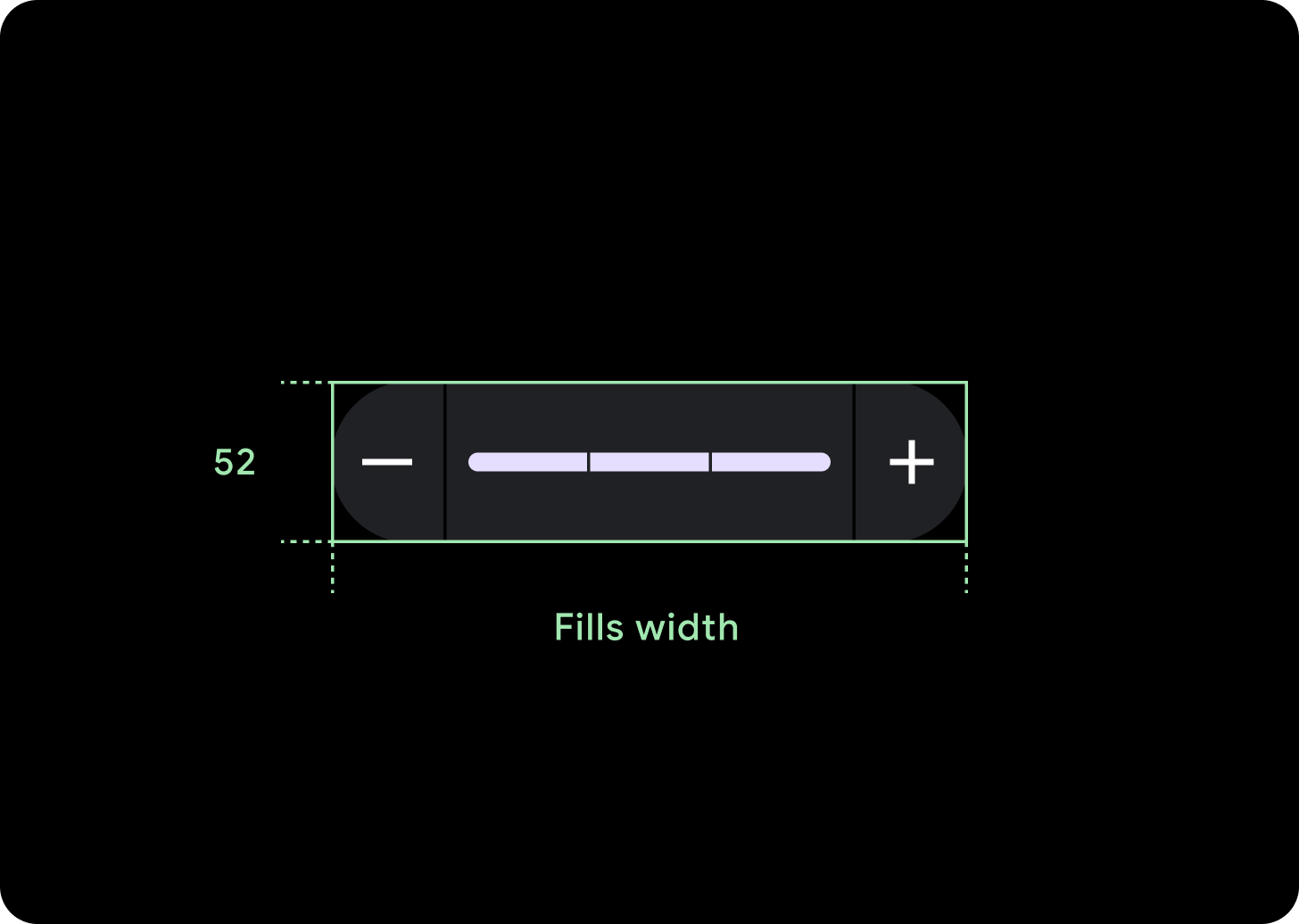
图标 (24 x 24 dp)
容器 (52 x XX dp)
本页面上的内容和代码示例受内容许可部分所述许可的限制。Java 和 OpenJDK 是 Oracle 和/或其关联公司的注册商标。
最后更新时间 (UTC):2025-07-27。
[[["易于理解","easyToUnderstand","thumb-up"],["解决了我的问题","solvedMyProblem","thumb-up"],["其他","otherUp","thumb-up"]],[["没有我需要的信息","missingTheInformationINeed","thumb-down"],["太复杂/步骤太多","tooComplicatedTooManySteps","thumb-down"],["内容需要更新","outOfDate","thumb-down"],["翻译问题","translationIssue","thumb-down"],["示例/代码问题","samplesCodeIssue","thumb-down"],["其他","otherDown","thumb-down"]],["最后更新时间 (UTC):2025-07-27。"],[],[]]
