
Many of the watches within the Wear OS ecosystem have different screen sizes. When designing for Wear OS, keep in mind that your app surfaces are displayed on these different screen sizes.
Principles
Keep the following principles in mind when designing for different devices.
Small first
Always design for the smallest supported round-screen emulator first: 192 dp. Then, optimize for larger devices.
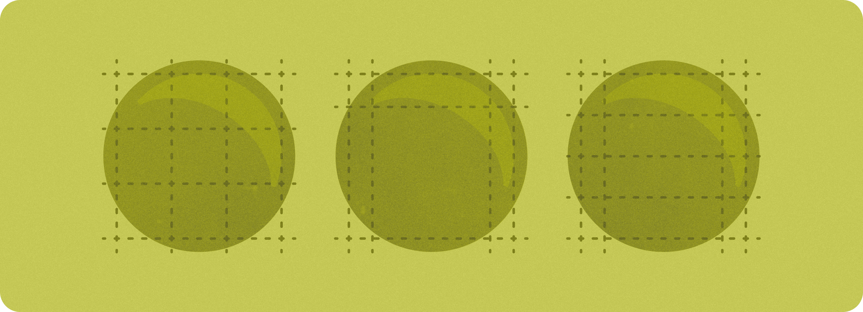
Design for scale
Define outer margins as percentages rather than absolute values, so that margins can scale proportionally on round screens and avoid clipping any UI elements.
Font size
The height of a UI element might change in a non-linear way, depending on font scaling and accessibility settings such as bold text.
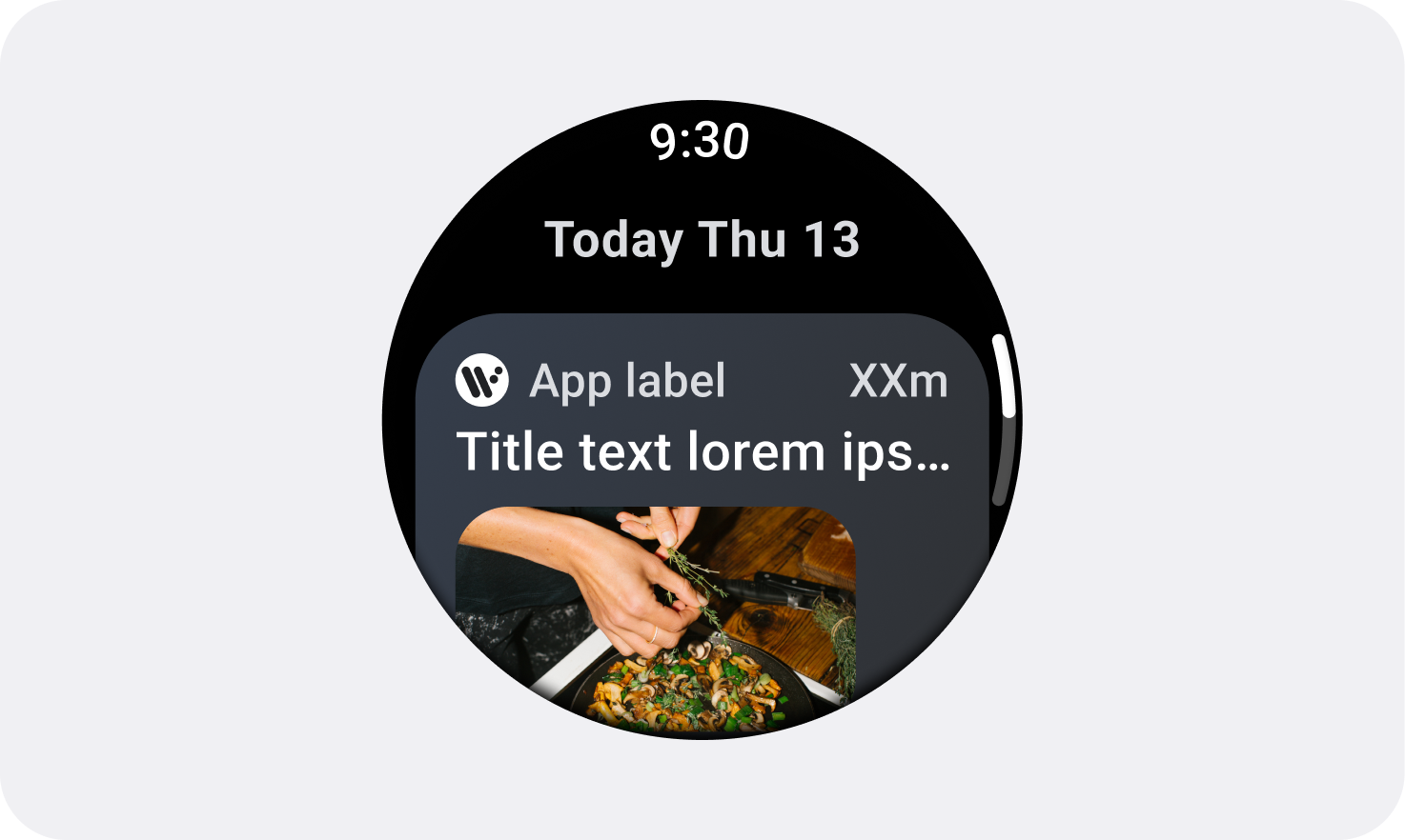
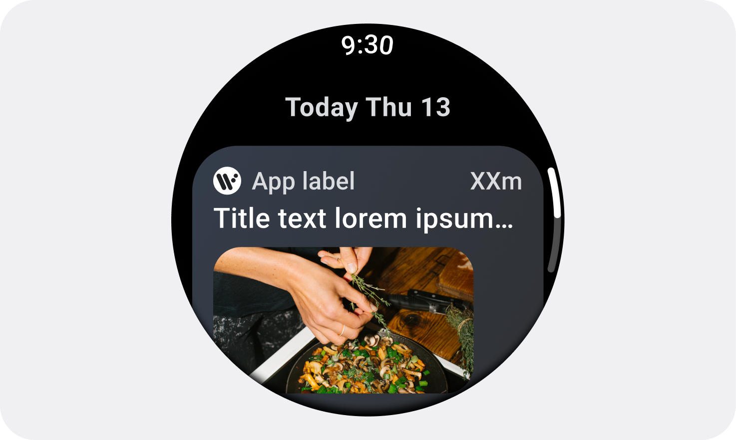
Examples of common screen sizes
The following screen sizes are particularly common choices for Wear OS devices. It's beneficial to use 225 dp as a breakpoint between smaller screens and larger screens.
Canonical adaptive layouts
Visit the canonical adaptive layouts page for more information on designing for a variety of screen sizes.