
Widgets are an essential aspect of home screen customization. You can think of them as "at-a-glance" views of an app's most important data and functionality that are accessible right on the user's home screen. Users can move widgets across their home screen panels, and, if supported, resize them to tailor the amount of information in the widget to their preference.
This documentation introduces the different types of widgets you can create and the design principles to follow. To build an app widget using the Remote View APIs and XML layouts, see Create a simple widget. To build a widget using Kotlin and Compose style APIs, see Jetpack Glance.
Widget types
As you plan your widget, think about what kind of widget you want to build. Widgets typically fall into one of the following categories:
Information widgets
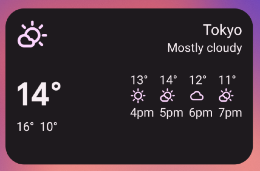
Information widgets typically display crucial information elements and track how that information changes over time. Examples of information widgets are weather widgets, clock widgets, or sports score tracking widgets. Tapping information widgets typically launches the associated app and opens a detailed view of the widget information.
Collection widgets
Collection widgets specialize in displaying multiple elements of the same type, such as a collection of pictures from a gallery app, a collection of articles from a news app, or a collection of emails or messages from a communication app. Collection widgets can scroll vertically.
Collection widgets typically focus on the following use cases:
- Browsing the collection.
- Opening an element of the collection to its detail view in the associated app.
- Interacting with elements, such as marking them done—with support for compound buttons in Android 12 (API level 31).
Control widgets
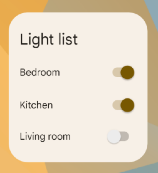
The main purpose of a control widget is to display frequently used functions so that the user can trigger them from the home screen without having to open the app. You can think of them as remote controls for an app. An example of a control widget is a home control widget that lets users turn lights in the house on or off.
Interacting with a control widget might open an associated detail view in the app. This depends on whether the control widget's function outputs any data, such as in the case of a search widget.
Hybrid widgets
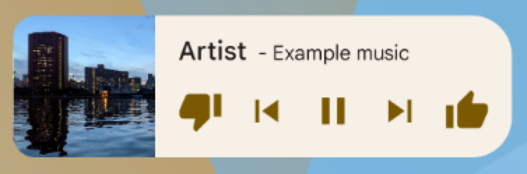
While some widgets represent one of the types in the preceding sections—information, collection, or control—many widgets are hybrids that combine elements of different types. For example, a music player widget is primarily a control widget, but it also shows the user what track is currently playing, like an information widget.
When planning your widget, design around one of the base types and add elements of other types as needed.
Integrate widgets with Google Assistant
Any type of widget can be displayed by Google Assistant in response to user voice commands. You can configure your widgets to fulfill App Actions, enabling users to receive quick answers and interactive app experiences on Assistant surfaces like Android and Android Auto. For more details on widget fulfillment for Assistant, see Integrate App Actions with Android widgets.
Widget limitations
While widgets can be understood as "mini apps," there are certain limitations that are important to understand before you design your widget.
Gestures
Because widgets live on the home screen, they have to co-exist with the navigation that is established there. This limits the gesture support that is available in a widget compared to a full-screen app. While apps might let users navigate between screens horizontally, that gesture is already taken on the home screen for the purpose of navigating between home screens.
The only gestures available for widgets are touch and vertical swipe.
Elements
Given the limitations on gestures available for widgets, some UI building blocks that rely on restricted gestures are not available for widgets. For a complete list of supported building blocks and more information on layout restrictions, see Create the widget layout and Provide flexible widget layouts.
Design guidelines
Widget content
Widgets are a great way to attract a user to your app by "advertising" new and interesting content that is available in your app.
Just like teasers on the front page of a newspaper, widgets consolidate and concentrate an app's information and provide a connection to richer detail within the app. You might say the widget is the information "snack" while the app is the "meal." Make sure your app shows more detail about an information item than what the widget displays.
Widget navigation
In addition to the pure information content, consider making your widget provide navigation links to frequently used areas of your app. This lets users complete tasks more quickly and extends the functional reach of the app to the home screen.
Good candidates for navigation links on widgets are:
Generative functions: these are the functions that let the user create new content for an app, such as creating a new document or a new message.
Open the app at the top level: tapping an information element usually navigates the user to a lower-level detail screen. Providing access to the top level of your application offers more navigation flexibility and can replace a dedicated app shortcut that users otherwise use to navigate to the app from the home screen. Using your application icon for this functionality can also provide your widget with a clear identity if the data you're displaying is ambiguous.
Widget resizing
Touching & holding a resizable widget and then releasing it puts the widget into resize mode. Users can use the drag handles or the widget corners to set their preferred size.
Resizing lets users adjust the height and width of a widget within the constraints of the home screen placement grid. You can decide whether your widget is freely resizable or constrained to horizontal or vertical size changes. You don't have to support resizing if your widget is inherently fixed-size.
Letting users resize widgets has important benefits:
- They can fine-tune how much information they want to see on each widget.
- They can better influence the layout of widgets and shortcuts on their home panels.
Plan a resize strategy for your widget according to the type of widget you're creating. List- or grid-based collection widgets are usually straightforward, because resizing the widget expands or contracts the vertical scrolling area. Regardless of the widget's size, the user can still scroll all information elements into view.
Information widgets require more hands-on planning, because they aren't scrollable and all content has to fit within a given size. You must dynamically adjust your widget's content and layout to the size the user defines through the resize operation.
In the example that follows, the user can resize a weather widget in three steps, exposing richer information about the weather at the current location as the widget grows.
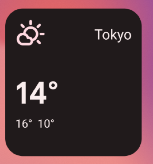
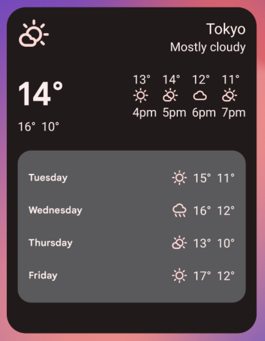
For each widget size, determine how much of your app's information is displayed. For smaller sizes, concentrate on essential information, and then add contextual information as the widget grows horizontally and vertically.
Layout considerations
It's tempting to lay out your widgets according to the dimensions of the placement grid of a device that you develop with. This can be a useful initial approximation, but keep the following points in mind:
- Planning your widget resizing strategy across "size buckets" rather than variable grid dimensions gives you the most reliable results.
- The number, size, and spacing of cells can vary widely from device to device. Hence, it is very important that your widget is flexible and can accommodate more or less space than anticipated.
- As the user resizes a widget, the system responds with a dp size range in which your widget can redraw itself.
- Starting in Android 12, you can provide more refined size
attributes and more flexible layouts. This includes:
- Specifying widget size constraints. For example, you can specify the target size for your widget—in grid cells—as well as the maximum possible size.
- Providing responsive layouts, which change depending on the size of the widget.
- Providing exact-size layouts, which let the launcher respond with size options for portrait and landscape mode, for phones, or with four sizes for foldables.
- Using updated guidance and new APIs to determine proper sizes for your widget.
Widget configuration by users
Sometimes, the user needs to set up the widget before it can become useful. Think of an email widget where the user needs to select the mail folder before the inbox can be displayed or a static photo widget where the user has to assign a picture from the gallery to be displayed. Android widgets display their configuration choices right after the user drops the widget onto a home screen.
Widget design checklist
- Focus on small portions of glanceable information on your widget. Expand on the information in your app.
- Choose the right widget type for your purpose.
- Plan how the content for your widget adapts to different sizes.
- Make your widget layout independent of orientation and device by making sure the layout can stretch and contract.
- Consider whether your widget needs any additional configuration.