
앱에 정적 이미지를 표시해야 하는 경우 Drawable 클래스와 서브클래스를 사용하여 도형을 그리고
이미지 Drawable는 애플리케이션의
그리는 것입니다. 다양한 서브클래스는 특정 이미지에 도움이 됨
이를 확장하여 자체 드로어블 객체를 정의할 수 있음
고유한 방식으로 동작합니다.
클래스 생성자를 사용하는 방법 이외에 다음 두 방법을 사용하여 Drawable을 정의하고 인스턴스화할 수 있습니다.
- 프로젝트에 저장된 이미지 리소스(비트맵 파일)를 확장합니다.
- 드로어블 속성을 정의하는 XML 리소스를 확장합니다.
참고: 대신 일련의 집합으로 이미지를 정의하는 벡터 드로어블을 사용할 수도 있습니다. 점, 선, 곡선은 물론 관련 색상 정보도 포함되어 있습니다. 그러면 벡터 드로어블이 품질을 저해하지 않고 다양한 크기로 조정할 수 있어야 합니다 자세한 내용은 벡터 드로어블 개요를 참조하세요.
리소스 이미지에서 드로어블 만들기
앱에서 이미지 파일을 참조하여 앱에 그래픽을 추가할 수 있습니다. 프로젝트 리소스에 액세스할 수 있습니다 지원되는 파일 형식은 PNG (권장), JPG (허용), 및 GIF (권장하지 않음) 앱 아이콘, 로고 및 기타 그래픽(예: 이 기법에 잘 맞습니다.
이미지 리소스를 사용하려면 파일을 res/drawable/에 추가합니다.
. 프로젝트에서 이미지를 참조한 후
리소스를 삭제할 수 있습니다. 어느 쪽이든 간에 이는
리소스 ID: 파일 형식 확장자가 없는 파일 이름입니다. 대상
예를 들어 my_image.png를 my_image로 참조합니다.
참고:
res/drawable/ 디렉터리는 다음과 같이 자동으로 최적화될 수 있습니다.
빌드 중 aapt 도구에 의한 무손실 이미지 압축
프로세스입니다 예를 들어 256가지를 초과하는 색상이 필요하지 않은 트루 컬러 PNG여야 합니다.
색상 팔레트를 사용하여 8비트 PNG로 변환할 수 있습니다. 이렇게 하면
더 적은 메모리를 필요로 하는
데이터 세트입니다 따라서 이미지 바이너리는
빌드 시 변경될 수 있습니다. 만약
이미지를 비트맵으로 변환하려면 이미지를 비트스트림으로
res/raw/ 폴더를 사용합니다. 여기서 aapt 도구는
수정할 수 있습니다
다음 코드 스니펫은 다음을 사용하는 ImageView를 빌드하는 방법을 보여줍니다.
드로어블 리소스에서 생성된 이미지를 가져와서 레이아웃에 추가합니다.
Kotlin
private lateinit var constraintLayout: ConstraintLayout

override fun onCreate(savedInstanceState: Bundle?) {
    super.onCreate(savedInstanceState)

    // Instantiate an ImageView and define its properties
    val i = ImageView(this).apply {
        setImageResource(R.drawable.my_image)
        contentDescription = resources.getString(R.string.my_image_desc)

        // set the ImageView bounds to match the Drawable's dimensions
        adjustViewBounds = true
        layoutParams = ViewGroup.LayoutParams(
                ViewGroup.LayoutParams.WRAP_CONTENT,
                ViewGroup.LayoutParams.WRAP_CONTENT)
    }

    // Create a ConstraintLayout in which to add the ImageView
    constraintLayout = ConstraintLayout(this).apply {

        // Add the ImageView to the layout.
        addView(i)
    }

    // Set the layout as the content view.
    setContentView(constraintLayout)
}
자바
ConstraintLayout constraintLayout;

protected void onCreate(Bundle savedInstanceState) {
  super.onCreate(savedInstanceState);

  // Create a ConstraintLayout in which to add the ImageView
  constraintLayout = new ConstraintLayout(this);

  // Instantiate an ImageView and define its properties
  ImageView i = new ImageView(this);
  i.setImageResource(R.drawable.my_image);
  i.setContentDescription(getResources().getString(R.string.my_image_desc));

  // set the ImageView bounds to match the Drawable's dimensions
  i.setAdjustViewBounds(true);
  i.setLayoutParams(new ViewGroup.LayoutParams(
          ViewGroup.LayoutParams.WRAP_CONTENT,
          ViewGroup.LayoutParams.WRAP_CONTENT));

  // Add the ImageView to the layout and set the layout as the content view.
  constraintLayout.addView(i);
  setContentView(constraintLayout);
}
다른 경우에는 다음과 같이 이미지 리소스를 Drawable 객체로 처리할 수 있습니다.
예:
Kotlin
val myImage: Drawable = ResourcesCompat.getDrawable(context.resources, R.drawable.my_image, null)
자바
Resources res = context.getResources();
Drawable myImage = ResourcesCompat.getDrawable(res, R.drawable.my_image, null);
경고: 프로젝트의 각 고유한 리소스
얼마나 많은 다른 객체를 생성하든 하나의 상태만 유지할 수 있음
인스턴스화합니다 예를 들어 동일한 이미지 리소스에서 두 개의 Drawable 객체를 인스턴스화하고
한 객체의 속성 (예: 알파)을 변경하면
있습니다. 이미지 리소스의 여러 인스턴스를 처리할 때는 대신
Drawable 객체를 직접 변환하기 위해서는
고학년 아동
애니메이션을 사용합니다.
아래 XML 스니펫에서는 XML 레이아웃에서 ImageView에 드로어블 리소스를 추가하는 방법을 보여줍니다.
<ImageView
        android:layout_width="wrap_content"
        android:layout_height="wrap_content"
        android:src="@drawable/my_image"
        android:contentDescription="@string/my_image_desc" />
프로젝트 리소스 사용에 관한 자세한 내용은 리소스 및 애셋을 참조하세요.
참고: 이미지 리소스를 드로어블 소스로 사용하는 경우 이미지가 다양한 픽셀 밀도에 적합한 크기인지 확인하세요. 만약 이미지가 올바르지 않으면 크기에 맞게 배율이 조정되어 드로어블에 아티팩트가 발생할 수 있습니다. 자세한 내용은 다양한 지원 픽셀 밀도를 참조하세요.
XML 리소스에서 드로어블 만들기
Drawable가 있는 경우
기존 객체에 의해 정의된 변수에 따라
XML에서 Drawable를 정의하는 것이 좋습니다. 균등
사용자와의 상호작용 중에 Drawable가 속성을 변경할 것으로 예상되는 경우
객체를 XML로 정의하는 것이 좋습니다. 객체를 정의한 후에 속성을 수정할 수 있기 때문입니다.
객체가 인스턴스화되었는지 확인합니다.
XML로 Drawable를 정의한 후에는
프로젝트의 res/drawable/ 디렉터리 다음 예는
는
TransitionDrawable
리소스이며 Drawable에서 상속됩니다.
<!-- res/drawable/expand_collapse.xml -->
<transition xmlns:android="http://schemas.android.com/apk/res/android">
    <item android:drawable="@drawable/image_expand"/>
    <item android:drawable="@drawable/image_collapse"/>
</transition>
그런 다음
Resources#getDrawable()
XML 파일의 리소스 ID를 전달합니다. 모든 문자
Drawable 서브클래스
inflate() 메서드를 지원하는 는 XML로 정의하고 인스턴스화할 수 있습니다.
파악할 수 있습니다.
XML 확장을 지원하는 각 드로어블 클래스는 특정 XML 속성을 활용함
객체 속성을 정의하는 데 도움이 됩니다. 다음 코드는
TransitionDrawable
광고 단위를
ImageView 객체:
Kotlin
val transition= ResourcesCompat.getDrawable(
        context.resources,
        R.drawable.expand_collapse,
        null
) as TransitionDrawable

val image: ImageView = findViewById(R.id.toggle_image)
image.setImageDrawable(transition)

// Description of the initial state that the drawable represents.
image.contentDescription = resources.getString(R.string.collapsed)

// Then you can call the TransitionDrawable object's methods.
transition.startTransition(1000)

// After the transition is complete, change the image's content description
// to reflect the new state.
자바
Resources res = context.getResources();
TransitionDrawable transition =
    (TransitionDrawable) ResourcesCompat.getDrawable(res, R.drawable.expand_collapse, null);

ImageView image = (ImageView) findViewById(R.id.toggle_image);
image.setImageDrawable(transition);

// Description of the initial state that the drawable represents.
image.setContentDescription(getResources().getString(R.string.collapsed));

// Then you can call the TransitionDrawable object's methods.
transition.startTransition(1000);

// After the transition is complete, change the image's content description
// to reflect the new state.
지원되는 XML 속성에 대한 자세한 내용은 를 참조하세요.
도형 드로어블
ShapeDrawable 객체가 좋은 옵션일 수 있음
2차원 그래픽을 동적으로 그리고 싶을 때 유용합니다. 다음과 같은 작업을 할 수 있습니다.
ShapeDrawable 객체에 프로그래밍 방식으로 기본 도형 그리기
앱에 필요한 스타일을 적용합니다.
ShapeDrawable은 Drawable의 서브클래스입니다. 이러한 이유로
Drawable이 예상되는 모든 위치 ShapeDrawable. 대상
예를 들어 ShapeDrawable 객체를 사용하여 배경을 설정할 수 있습니다.
뷰의 setBackgroundDrawable() 메서드에 전달하여 뷰의 상태를 되돌립니다. 또한 도형을 원하는 대로 그릴 수
앱의 레이아웃에 추가할 수 있습니다.
ShapeDrawable에는 자체 draw() 메서드가 있으므로 다음을 만들 수 있습니다.
ShapeDrawable를 그리는 View의 서브클래스
객체에 대한 onDraw() 이벤트 동안
다음 코드 예를 참고하세요.
Kotlin
class CustomDrawableView(context: Context) : View(context) {
    private val drawable: ShapeDrawable = run {
        val x = 10
        val y = 10
        val width = 300
        val height = 50
        contentDescription = context.resources.getString(R.string.my_view_desc)

        ShapeDrawable(OvalShape()).apply {
            // If the color isn't set, the shape uses black as the default.
            paint.color = 0xff74AC23.toInt()
            // If the bounds aren't set, the shape can't be drawn.
            setBounds(x, y, x + width, y + height)
        }
    }

    override fun onDraw(canvas: Canvas) {
        drawable.draw(canvas)
    }
}
자바
public class CustomDrawableView extends View {
  private ShapeDrawable drawable;

  public CustomDrawableView(Context context) {
    super(context);

    int x = 10;
    int y = 10;
    int width = 300;
    int height = 50;
    setContentDescription(context.getResources().getString(
            R.string.my_view_desc));

    drawable = new ShapeDrawable(new OvalShape());
    // If the color isn't set, the shape uses black as the default.
    drawable.getPaint().setColor(0xff74AC23);
    // If the bounds aren't set, the shape can't be drawn.
    drawable.setBounds(x, y, x + width, y + height);
  }

  protected void onDraw(Canvas canvas) {
    drawable.draw(canvas);
  }
}
코드 샘플에서 CustomDrawableView 클래스를 사용할 수 있습니다.
다른 맞춤 보기를 사용하는 것과 같습니다. 예를 들어
다음과 같이 앱의 활동에 프로그래매틱 방식으로 추가합니다.
예:
Kotlin
private lateinit var customDrawableView: CustomDrawableView

override fun onCreate(savedInstanceState: Bundle?) {
    super.onCreate(savedInstanceState)
    customDrawableView = CustomDrawableView(this)

    setContentView(customDrawableView)
}
자바
CustomDrawableView customDrawableView;

protected void onCreate(Bundle savedInstanceState) {
  super.onCreate(savedInstanceState);
  customDrawableView = new CustomDrawableView(this);

  setContentView(customDrawableView);
}
대신 XML 레이아웃에서 맞춤 뷰를 사용하려면
CustomDrawableView 클래스는 클래스가 다음과 같은 경우 호출되는 View(Context, AttributeSet) 생성자를 재정의해야 합니다.
XML에서 팽창됩니다. 다음 예는
XML 레이아웃의 CustomDrawableView:
<com.example.shapedrawable.CustomDrawableView
        android:layout_width="fill_parent"
        android:layout_height="wrap_content"
        />
ShapeDrawable 클래스
드로어블 형식을 android.graphics.drawable 패키지 안에 포함시킴으로써,
객체의 다양한 속성을 정의할 수 있습니다. 예시
알파 투명도, 색상 필터,
색상을 지정할 수 있습니다.
XML 리소스를 사용하여 기본 드로어블 도형도 정의할 수 있습니다. 자세한 내용은 자세한 내용은 페이지를 참조하세요. 의 도형 드로어블 드로어블 리소스 유형.
NinePatch 드로어블
NinePatchDrawable 그래픽은
확장 가능한 비트맵 이미지로, 뷰의 배경으로 사용할 수 있습니다. Android의 경우
보기의 콘텐츠에 맞게 그래픽 크기를 자동으로 조정합니다.
Ninepatch 이미지 사용 예시는 표준 Android에서 사용하는 배경입니다.
버튼 - 다양한 길이의 문자열을 수용하도록 버튼이 확장되어야 합니다. 가
NinePatch 그래픽은 추가 1픽셀 테두리가 포함된 표준 PNG 이미지입니다.
9.png 확장자를 사용하여 저장해야 합니다.
프로젝트의 res/drawable/ 디렉터리
테두리를 사용하여 이미지의 확장 가능 영역 및 정적 영역을 정의합니다. 너비가 1픽셀 이상 하나 이상 그려서 늘릴 수 있는 섹션 표시 테두리 왼쪽과 상단의 검은색 선(다른 테두리 픽셀) 완전히 투명하거나 흰색이어야 함). 최대한 많은 수의 확장 가능 섹션을 보유할 수 있습니다. 사용할 수 있습니다. 늘릴 수 있는 섹션의 상대적인 크기는 동일하게 유지되므로 가장 큰 섹션이 항상 가장 큰 섹션으로 유지됩니다.
이미지의 선택적 드로어블 섹션을 정의할 수도 있습니다 (실질적으로
오른쪽에 선을 그리고 아랫면에 선을 그려서 패딩 선)를 만듭니다. 만약
View 객체는 NinePatch 그래픽을 배경으로 설정합니다.
뷰의 텍스트를 지정하면 텍스트가 확대되어 모든 텍스트가
오른쪽과 수익 (포함된 경우)에 지정된 영역만 차지합니다.
패딩 선이 포함되지 않은 경우 Android는 왼쪽과 맨 위 선을 사용하여
이 드로어블 영역을 정의합니다.
선의 차이를 명확히 하기 위해 왼쪽과 위쪽 선은 확대하기 위해 복제할 수 있는 이미지의 픽셀 이미지 맨 아래 선과 오른쪽 선은 이미지 내에서 뷰의 콘텐츠가 차지할 수 있습니다.
그림 1에서는 버튼을 정의하는 데 사용되는 NinePatch 그래픽의 예를 보여줍니다.
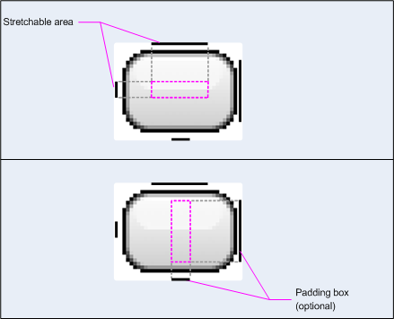
그림 1: NinePatch 그래픽의 예 버튼을 정의하는
이 NinePatch 그래픽은 왼쪽과 상단이 있는 확장 가능한 영역 하나를 정의합니다. 그리고 맨 아래 및 오른쪽 선이 있는 드로어블 영역을 찾을 수 있습니다. 위쪽 이미지에는 회색 점선은 복제된 이미지의 영역을 나타냅니다. 이미지를 늘릴 수 있습니다. 하단 이미지의 분홍색 직사각형은 뷰의 콘텐츠가 허용되는 리전입니다. 콘텐츠가 이 영역에 맞으면 이미지가 늘어나서 잘 맞춰집니다.
Draw 9-patch 도구는 WYSIWYG 그래픽을 사용하여 NinePatch 이미지를 만드는 매우 편리한 방법입니다. 있습니다 확장 가능 광고에 대해 정의한 영역이 있는 경우에도 픽셀로 인해 그리기 아티팩트가 생성될 위험이 있습니다. 복제할 수 있습니다
다음 샘플 레이아웃 XML은 NinePatch 그래픽을 추가하는 방법을 보여줍니다.
몇 개의 버튼에 추가할 수 있습니다. NinePatch 이미지는
res/drawable/my_button_background.9.png
<Button android:id="@+id/tiny"
        android:layout_width="wrap_content"
        android:layout_height="wrap_content"
        android:layout_alignParentTop="true"
        android:layout_centerInParent="true"
        android:text="Tiny"
        android:textSize="8sp"
        android:background="@drawable/my_button_background"/>

<Button android:id="@+id/big"
        android:layout_width="wrap_content"
        android:layout_height="wrap_content"
        android:layout_alignParentBottom="true"
        android:layout_centerInParent="true"
        android:text="Biiiiiiig text!"
        android:textSize="30sp"
        android:background="@drawable/my_button_background"/>
layout_width 및 layout_height
버튼을 깔끔하게 만들기 위해 속성을 wrap_content로 설정합니다.
텍스트 주위에
그림 2는 XML 및 NinePatch 이미지에서 렌더링된 두 버튼을 보여줍니다. 를 참조하세요. 버튼의 너비와 높이가 텍스트에 따라 어떻게 달라지는지 확인하세요. 배경 이미지가 이를 수용하도록 늘어납니다.
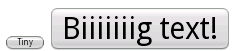
그림 2: XML을 사용하여 렌더링된 버튼 리소스 및 NinePatch 그래픽
맞춤 드로어블
맞춤형 그림을 만들려면 Drawable 클래스(또는 서브클래스)를 확장하여 만들 수 있습니다.
가장 중요한 구현 메서드는 draw(Canvas)입니다.
왜냐하면 이 클래스는 API를 제공하는 데 사용해야 하는 Canvas 객체를 제공하기 때문입니다.
확인할 수 있습니다.
다음 코드는 Drawable의 간단한 서브클래스를 보여줍니다.
원을 그리는 함수입니다.
Kotlin
class MyDrawable : Drawable() {
    private val redPaint: Paint = Paint().apply { setARGB(255, 255, 0, 0) }

    override fun draw(canvas: Canvas) {
        // Get the drawable's bounds
        val width: Int = bounds.width()
        val height: Int = bounds.height()
        val radius: Float = Math.min(width, height).toFloat() / 2f

        // Draw a red circle in the center
        canvas.drawCircle((width / 2).toFloat(), (height / 2).toFloat(), radius, redPaint)
    }

    override fun setAlpha(alpha: Int) {
        // This method is required
    }

    override fun setColorFilter(colorFilter: ColorFilter?) {
        // This method is required
    }

    override fun getOpacity(): Int =
        // Must be PixelFormat.UNKNOWN, TRANSLUCENT, TRANSPARENT, or OPAQUE
        PixelFormat.OPAQUE
}
자바
public class MyDrawable extends Drawable {
    private final Paint redPaint;

    public MyDrawable() {
        // Set up color and text size
        redPaint = new Paint();
        redPaint.setARGB(255, 255, 0, 0);
    }

    @Override
    public void draw(Canvas canvas) {
        // Get the drawable's bounds
        int width = getBounds().width();
        int height = getBounds().height();
        float radius = Math.min(width, height) / 2;

        // Draw a red circle in the center
        canvas.drawCircle(width/2, height/2, radius, redPaint);
    }

    @Override
    public void setAlpha(int alpha) {
        // This method is required
    }

    @Override
    public void setColorFilter(ColorFilter colorFilter) {
        // This method is required
    }

    @Override
    public int getOpacity() {
        // Must be PixelFormat.UNKNOWN, TRANSLUCENT, TRANSPARENT, or OPAQUE
        return PixelFormat.OPAQUE;
    }
}
그런 다음 원하는 위치에 드로어블을 추가할 수 있습니다.
ImageView는 다음과 같습니다.
Kotlin
val myDrawing = MyDrawable()
val image: ImageView = findViewById(R.id.imageView)
image.setImageDrawable(myDrawing)
image.contentDescription = resources.getString(R.string.my_image_desc)
자바
MyDrawable mydrawing = new MyDrawable();
ImageView image = findViewById(R.id.imageView);
image.setImageDrawable(mydrawing);
image.setContentDescription(getResources().getString(R.string.my_image_desc));
Android 7.0 (API 수준 24) 이상에서는 맞춤 드로어블의 인스턴스도 정의할 수 있습니다. 사용하여 XML을 사용합니다.
- 완전한 클래스 이름을 XML 요소 이름으로 사용합니다. 이 접근 방식에서는 커스텀
드로어블 클래스는 공개 최상위 클래스여야 합니다.
<com.myapp.MyDrawable xmlns:android="http://schemas.android.com/apk/res/android"
    android:color="#ffff0000" />
drawable를 XML 태그 이름으로 사용하고 정규화된 클래스 지정 클래스 속성의 이름을 찾습니다. 이 접근 방식은 공개 최상위 클래스 및 공개 정적 내부 클래스:<drawable xmlns:android="http://schemas.android.com/apk/res/android" class="com.myapp.MyTopLevelClass$MyDrawable" android:color="#ffff0000" />
드로어블에 색조 추가
Android 5.0 (API 수준 21) 이상에서는
사용할 수 있습니다. 색상으로 확인되는 색상 리소스 또는 테마 속성으로 색조를 조정할 수 있습니다.
리소스 (예: ?android:attr/colorPrimary) 일반적으로 이러한 확장 소재는
한 번만 설정하면 테마에 맞게 자동으로 색상을 지정할 수 있습니다.
BitmapDrawable, NinePatchDrawable 또는 VectorDrawable에 색조를 적용할 수 있습니다.
객체를 setTint() 메서드로 사용하면 됩니다. 다음과 같은 작업을 할 수 있습니다.
또한 android:tint 및
android:tintMode 속성
이미지의 주요 색상 추출
Android 지원 라이브러리에는 이미지에서 주요 색상을 추출하는 데 사용할 수 있는 Palette 클래스가 포함되어 있습니다.
색상에 액세스하도록 드로어블을 Bitmap으로 로드하여 Palette에 전달할 수 있습니다.
자세한 내용은 색상 선택
Palette API