The Emoji Picker is a UI solution that offers a modern look and feel, up-to-date emoji, and ease of use. Users can browse and select emoji and their variants or choose from their recently-used emoji.
With this library, apps from a variety of sources can provide an inclusive and unified emoji experience to their users without developers having to build and maintain their own emoji picker from scratch.
Features
The Emoji Picker has the following features.
Up-to-date emoji
Newly-released emoji are selectively included in the Emoji Picker. The Emoji Picker library is compatible across multiple Android versions and devices.
Sticky variants
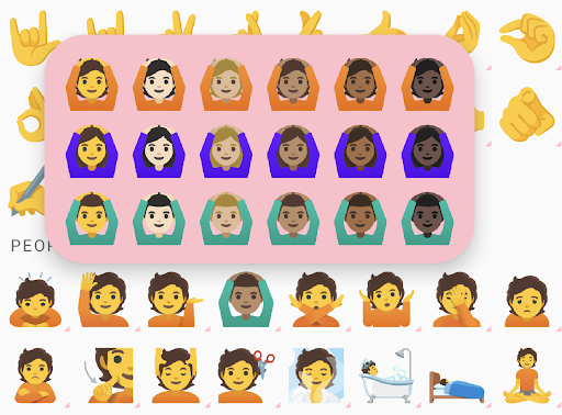
Long-press an emoji to display a menu of variants, such as different genders or skin tones. The variant you choose is saved in the Emoji Picker, and the last selected variant is used in the main panel.
With this feature, users can send their preferred emoji variants with one tap.
Recent emoji
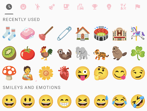
The RecentEmojiProvider is responsible for providing emoji in the
Recently Used category. The library has a default recent emoji provider
that satisfies the most common use case:
- All selected emoji are saved per-app in shared preferences.
- The picker displays at most three rows of selected emoji, deduped, in reverse chronological order.
If this default behavior is sufficient, then you don't need to use
setRecentEmojiProvider().
You might need to customize the provider behavior, however. Here are some common scenarios:
- You want to store different selected emoji per user account.
- You want to use data storage other than shared preferences.
- You want to display recent emoji sorted by frequency.
You can then implement the RecentEmojiProvider interface and set it using
setRecentEmojiProvider().
Direction selector
Starting with Emoji 15.1, the Emoji Picker supports bidirectional emoji. Users can tap on the bidirectional switcher to toggle between left- and right-facing versions of emoji.
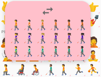
Figure 4. Bidirectional emoji facing left.
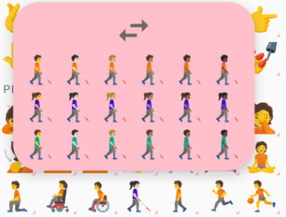
Figure 5. Bidirectional emoji facing right.
Multi-person emoji selector
Users can touch and hold emoji couples to reveal multi-person emoji selections.
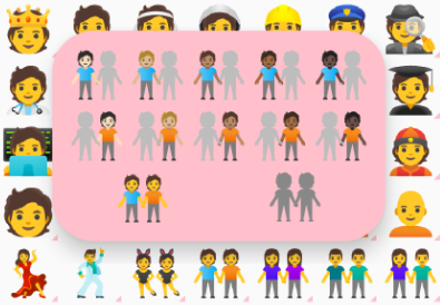
Figure 6. Touch and hold an emoji couple to reveal multi-person emoji selections.
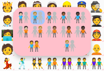
Figure 7. Select a left-half emoji person.
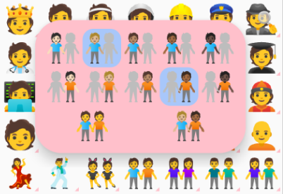
Figure 8. Select a right-half emoji person.
When the user selects the left- or right-half emoji person of an emoji couple, the selector displays a preview on the bottom-right, as shown in figures 7 and 8. After selecting both halves of the emoji couple, users can select the preview to compose the custom emoji couple.
Compatibility with EmojiCompat
If enabled, an EmojiCompat instance is used in the Emoji Picker to render as
many emoji as possible. The Emoji Picker doesn't require EmojiCompat, however.
Prerequisites
Your app must target Android 5.0 (API level 21) or higher.
Use the library
Import
androidx.emoji2:emojipicker:$versionin your app'sbuild.gradlefile.dependencies { implementation "androidx.emoji2:emojipicker:$version" }Inflate the Emoji Picker view, and optionally set
emojiGridRowsandemojiGridColumns.- The default number of
emojiGridColumnsis 9. - Row count is calculated based on the parent view height and the value of
emojiGridColumns. - Use a float value for
emojiGridRowsto indicate that the user can scroll for more emoji.
<androidx.emoji2.emojipicker.EmojiPickerView
    android:id="@+id/emoji_picker"
    android:layout_width="match_parent"
    android:layout_height="match_parent"
    app:emojiGridColumns="9" />
val emojiPickerView = EmojiPickerView(context).apply { emojiGridColumns = 15 layoutParams = ViewGroup.LayoutParams( ViewGroup.LayoutParams.MATCH_PARENT, ViewGroup.LayoutParams.MATCH_PARENT ) } findViewById<ViewGroup>(R.id.emoji_picker_layout).addView(emojiPickerView)- The default number of
Use
setOnEmojiPickedListener()to append the selected emoji to a view. For example, to append to anEditText, do the following:emojiPickerView.setOnEmojiPickedListener { findViewById<EditText>(R.id.edit_text).append(it.emoji) }Optionally set
RecentEmojiProvider, see sample app for an example implementation.Optionally customize styles. Create your own style to override common theme attributes and apply the style to the
EmojiPickerView. For example, overridingcolorControlNormalchanges the category icon color.<style name="CustomStyle" > <item name="colorControlNormal">#FFC0CB</item> </style> <androidx.emoji2.emojipicker.EmojiPickerView android:id="@+id/emoji_picker" android:layout_width="match_parent" android:layout_height="match_parent" android:theme="@style/CustomStyle" app:emojiGridColumns="9" />
Sample App
The Emoji Picker sample app demonstrates basic use cases along with the following additional scenarios:
- Layout recalculation when
emojiGridRowsoremojiGridColumnsare reset. - An overridden recent emoji provider that sorts by frequency.
- Additional style customization.
