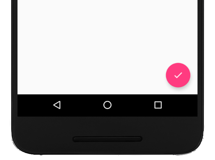
A floating action button (FAB) is a circular button that triggers the primary
action in your app's UI. This document shows how to add a FAB to your layout,
customize some of its appearance, and respond to button taps.
To learn more about how to design a FAB for your app according to the Material
Design Guidelines, see Material Design
FAB
.
Figure 1. A floating action button (FAB).
Add the floating action button to your layout
The following code shows how the
FloatingActionButton
appears in your layout file:
You can configure other FAB properties using XML attributes or corresponding
methods, such as the following:
The size of the FAB, using the app:fabSize attribute or the
setSize()
method
The ripple color of the FAB, using the app:rippleColor attribute or the
setRippleColor()
method
The FAB icon, using the android:src attribute or the
setImageDrawable()
method
Respond to button taps
You can then apply an
View.OnClickListener to
handle FAB taps. For example, the following code displays a
Snackbar when
the user taps the FAB:
Kotlin
valfab:View=findViewById(R.id.fab)fab.setOnClickListener{view->Snackbar.make(view,"Here's a Snackbar",Snackbar.LENGTH_LONG).setAction("Action",null).show()}
Java
FloatingActionButtonfab=findViewById(R.id.fab);fab.setOnClickListener(newView.OnClickListener(){@OverridepublicvoidonClick(Viewview){Snackbar.make(view,"Here's a Snackbar",Snackbar.LENGTH_LONG).setAction("Action",null).show();}});
For more information about the capabilities of the FAB, see the API reference
for the
FloatingActionButton.
Content and code samples on this page are subject to the licenses described in the Content License. Java and OpenJDK are trademarks or registered trademarks of Oracle and/or its affiliates.
Last updated 2025-08-26 UTC.
[[["Easy to understand","easyToUnderstand","thumb-up"],["Solved my problem","solvedMyProblem","thumb-up"],["Other","otherUp","thumb-up"]],[["Missing the information I need","missingTheInformationINeed","thumb-down"],["Too complicated / too many steps","tooComplicatedTooManySteps","thumb-down"],["Out of date","outOfDate","thumb-down"],["Samples / code issue","samplesCodeIssue","thumb-down"],["Other","otherDown","thumb-down"]],["Last updated 2025-08-26 UTC."],[],[],null,["Try the Compose way \nJetpack Compose is the recommended UI toolkit for Android. Learn how to add components in Compose. \n[Floating Action Button →](/develop/ui/compose/components/fab) \n\n\u003cbr /\u003e\n\nA floating action button (FAB) is a circular button that triggers the primary\naction in your app's UI. This document shows how to add a FAB to your layout,\ncustomize some of its appearance, and respond to button taps.\n\nTo learn more about how to design a FAB for your app according to the Material\nDesign Guidelines, see [Material Design\nFAB](https://m3.material.io/components/floating-action-button/overview)\n.\n**Figure 1.** A floating action button (FAB).\n\nAdd the floating action button to your layout\n\nThe following code shows how the\n[`FloatingActionButton`](/reference/com/google/android/material/floatingactionbutton/FloatingActionButton)\nappears in your layout file: \n\n```xml\n\u003ccom.google.android.material.floatingactionbutton.FloatingActionButton\n android:id=\"@+id/fab\"\n android:layout_width=\"wrap_content\"\n android:layout_height=\"wrap_content\"\n android:layout_gravity=\"end|bottom\"\n android:src=\"@drawable/ic_my_icon\"\n android:contentDescription=\"@string/submit\"\n android:layout_margin=\"16dp\" /\u003e\n```\n\nBy default, a FAB is colored by the `colorAccent` attribute, which you can\n[customize with the theme's color\npalette](/guide/topics/ui/look-and-feel/themes#ColorPalette).\n\nYou can configure other FAB properties using XML attributes or corresponding\nmethods, such as the following:\n\n- The size of the FAB, using the `app:fabSize` attribute or the [`setSize()`](/reference/com/google/android/material/floatingactionbutton/FloatingActionButton#setSize(int)) method\n- The ripple color of the FAB, using the `app:rippleColor` attribute or the [`setRippleColor()`](/reference/com/google/android/material/floatingactionbutton/FloatingActionButton#setRippleColor(int)) method\n- The FAB icon, using the `android:src` attribute or the [`setImageDrawable()`](/reference/android/widget/ImageView#setImageDrawable(android.graphics.drawable.Drawable)) method\n\nRespond to button taps\n\nYou can then apply an\n[`View.OnClickListener`](/reference/android/view/View.OnClickListener) to\nhandle FAB taps. For example, the following code displays a\n[`Snackbar`](/reference/com/google/android/material/snackbar/Snackbar) when\nthe user taps the FAB: \n\nKotlin \n\n```kotlin\nval fab: View = findViewById(R.id.fab)\nfab.setOnClickListener { view -\u003e\n Snackbar.make(view, \"Here's a Snackbar\", Snackbar.LENGTH_LONG)\n .setAction(\"Action\", null)\n .show()\n}\n```\n\nJava \n\n```java\nFloatingActionButton fab = findViewById(R.id.fab);\nfab.setOnClickListener(new View.OnClickListener() {\n @Override\n public void onClick(View view) {\n Snackbar.make(view, \"Here's a Snackbar\", Snackbar.LENGTH_LONG)\n .setAction(\"Action\", null).show();\n }\n});\n```\n\nFor more information about the capabilities of the FAB, see the API reference\nfor the\n[`FloatingActionButton`](/reference/com/google/android/material/floatingactionbutton/FloatingActionButton)."]]