
يتألف الزر من نص أو رمز أو كليهما، ويشير إلى الإجراء الذي يتم تنفيذه عندما ينقر المستخدم عليه.
يمكنك إنشاء زر في تنسيقك بإحدى الطرق الثلاث التالية، استنادًا إلى ما إذا كنت تريد زرًا يتضمّن نصًا أو رمزًا أو كليهما:
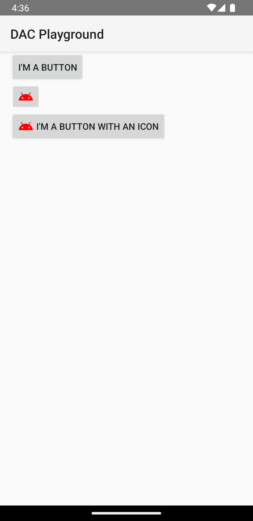
  <LinearLayout xmlns:android="http://schemas.android.com/apk/res/android"
      xmlns:app="http://schemas.android.com/apk/res-auto"
      android:layout_width="match_parent"
      android:layout_height="match_parent"
      android:paddingLeft="16dp"
      android:paddingRight="16dp"
      android:orientation="vertical" >

      <Button
          android:id="@+id/supabutton"
          android:layout_width="wrap_content"
          android:layout_height="wrap_content"
          android:text="I'm a button" />

      <ImageButton
          android:layout_width="wrap_content"
          android:layout_height="wrap_content"
          android:contentDescription="A tiny Android icon"
          android:src="@drawable/baseline_android_24"
          app:tint="#ff0000" />

      <Button
          android:layout_width="wrap_content"
          android:layout_height="wrap_content"
          android:drawableStart="@drawable/baseline_android_24"
          android:drawablePadding="4dp"
          android:drawableTint="#ff0000"
          android:text="I'm a button with an icon" />
  </LinearLayout>
ينشئ الرمز السابق عنصرًا مشابهًا لما يلي:
الردّ على أحداث النقر
عندما ينقر المستخدم على زر، يتلقّى عنصر Button حدثًا عند النقر.
للإعلان عن معالج الأحداث برمجيًا، أنشئ عنصر
View.OnClickListener
وعيّنه للزر من خلال استدعاء
setOnClickListener(View.OnClickListener),
كما في المثال التالي:
Kotlin
findViewById<Button>(R.id.supabutton)
  .setOnClickListener {
      Log.d("BUTTONS", "User tapped the Supabutton")
  }
Java
Button button = (Button) findViewById(R.id.supabutton);
button.setOnClickListener(new View.OnClickListener() {
    public void onClick(View v) {
      Log.d("BUTTONS", "User tapped the Supabutton");
    }
});
تنسيق الزر
يختلف مظهر الزر، أي صورة الخلفية والخط، بين الأجهزة، لأنّ الأجهزة التي تصنّعها شركات مختلفة غالبًا ما تتضمّن أنماطًا تلقائية مختلفة لعناصر التحكّم في الإدخال.
لتخصيص أزرار فردية بخلفية مختلفة، حدِّد السمة android:background باستخدام مورد قابل للرسم أو مورد ألوان. بدلاً من ذلك، يمكنك تطبيق نمط على الزر، ما يعمل بطريقة مشابهة لأنماط HTML لتحديد خصائص أنماط متعددة، مثل الخلفية والخط والحجم. لمزيد من المعلومات عن تطبيق الأنماط، اطّلِع على المقالة
الأنماط والسمات.
زر بلا حدود
أحد التصاميم التي يمكن أن تكون مفيدة هو الزر "بلا حدود". تشبه الأزرار بلا حدود الأزرار الأساسية باستثناء أنّها لا تتضمّن حدودًا أو خلفية، ولكنها لا تزال تغيّر مظهرها خلال حالات مختلفة، مثل النقر عليها.
لإنشاء زر بلا حدود، طبِّق النمط borderlessButtonStyle على الزر، كما في المثال التالي:
<Button
  android:id="@+id/supabutton"
  style="?android:attr/borderlessButtonStyle"
  android:layout_width="wrap_content"
  android:layout_height="wrap_content"
  android:text="I'm a button" />
خلفية مخصّصة
إذا أردت إعادة تحديد مظهر الزر تمامًا، يمكنك تحديد خلفية مخصّصة. بدلاً من توفير صورة نقطية أو لون بسيط، يجب أن تكون الخلفية مورد قائمة حالات يغيّر مظهره استنادًا إلى الحالة الحالية للزر.
يمكنك تحديد قائمة الحالات في ملف XML يحدّد ثلاث صور أو ألوان لاستخدامها في حالات الزر المختلفة.
لإنشاء عنصر قابل للرسم في قائمة الحالات لخلفية الزر، اتّبِع الخطوات التالية:
- أنشئ ثلاث صور نقطية لخلفية الزر تمثّل حالات الزر التلقائية وحالات النقر والتركيز حالات الزر. لضمان ملاءمة الصور للأزرار بأحجام مختلفة، أنشئ الصور النقطية كصور نقطية من تسعة أجزاء.
- ضَع الصور النقطية في دليل
res/drawable/الخاص بمشروعك. امنح كل صورة نقطية اسمًا يعكس حالة الزر التي تمثّلها، مثلbutton_default.9.pngوbutton_pressed.9.pngوbutton_focused.9.png. - أنشئ ملف XML جديدًا في دليل
res/drawable/. امنحه اسمًا مثلbutton_custom.xml. أدرِج رمز XML مشابهًا لما يلي:<?xml version="1.0" encoding="utf-8"?> <selector xmlns:android="http://schemas.android.com/apk/res/android"> <item android:drawable="@drawable/button_pressed" android:state_pressed="true" /> <item android:drawable="@drawable/button_focused" android:state_focused="true" /> <item android:drawable="@drawable/button_default" /> </selector>
يحدّد هذا الرمز موردًا واحدًا قابلاً للرسم يغيّر صورته استنادًا إلى الحالة الحالية لـ الزر.
- يحدّد العنصر الأول
<item>الصورة النقطية التي سيتم استخدامها عند النقر على الزر (تفعيله). - يحدّد العنصر الثاني
<item>الصورة النقطية التي سيتم استخدامها عندما يكون الزر في حالة التركيز، مثلاً عندما يتم تمييز الزر باستخدام كرة التتبّع أو لوحة الاتجاهات. - يحدّد العنصر الثالث
<item>الصورة النقطية التي سيتم استخدامها عندما يكون الزر في الحالة التلقائية ، أي لم يتم النقر عليه أو التركيز عليه.
يمثّل ملف XML هذا موردًا واحدًا قابلاً للرسم. عندما يشير إليه
Buttonلخلفيته، تتغيّر الصورة المعروضة استنادًا إلى حالة الزر. - يحدّد العنصر الأول
- طبِّق ملف XML القابل للرسم كخلفية للزر:
<Button
    android:id="@+id/button_send"
    android:layout_width="wrap_content"
    android:layout_height="wrap_content"
    android:text="@string/button_send"
    android:onClick="sendMessage"
    android:background="@drawable/button_custom"  />
لمزيد من المعلومات عن بنية XML هذه، بما في ذلك كيفية تحديد زر تم إيقافه أو تم التمرير فوقه أو في حالة أخرى، اطّلِع على StateListDrawable.