
יותר מ-300 מיליון מכשירים עם מסך גדול מבוססי-Android נמצאים בשימוש היום, כולל טאבלטים, מכשירים מתקפלים, מכשירי ChromeOS, מסכים ברכב וטלוויזיות, ומספר המכשירים האלה ממשיך לגדול. כדי לספק חוויית משתמש אופטימלית במספר ההולך וגדל של מכשירים עם מסך גדול ובמגוון שלהם, וגם בטלפונים רגילים, כדאי ליצור אפליקציות מותאמות.
מהן אפליקציות אדפטיביות?
הפריסות של אפליקציות דינמיות משתנות בהתאם לשינויים בתצוגת האפליקציה, בעיקר לגודל חלון האפליקציה. אבל אפליקציות אדפטיביות גם מתאימות את עצמן לשינויים במצב של מכשירים מתקפלים, כמו מצב שולחן או מצב ספר, ולשינויים בצפיפות המסך ובגודל הגופן.
במקום רק למתוח או לכווץ את רכיבי ממשק המשתמש בתגובה לגדלים שונים של חלונות, אפליקציות אדפטיביות מחליפות רכיבי פריסה ומציגות או מסתירות תוכן. לדוגמה, בטלפונים רגילים, אפליקציה מותאמת יכולה להציג סרגל ניווט תחתון, אבל במסכים גדולים היא יכולה להציג פס ניווט. במסכים גדולים, אפליקציות מותאמות מציגות יותר תוכן, כמו פריסת רשימה ופרטים בשני חלונות. במסכים קטנים, הן מציגות פחות תוכן, או את הרשימה או את הפרטים.
בעבר, אפליקציות פעלו בדרך כלל במסך מלא. כיום, אפליקציות פועלות במצב ריבוי חלונות בגדלים שונים, ללא קשר לגודל המסך של המכשיר. המשתמשים יכולים לשנות את גודל החלון בכל שלב. לכן, גם בסוג מכשיר יחיד, האפליקציות צריכות להיות מותאמות.
אפליקציות אדפטיביות נראות טוב ופועלות בצורה חלקה בכל מכשיר ובכל הגדרה.
למה כדאי ליצור ממשקי משתמש מותאמים?
המשתמשים מצפים שהאפליקציה שלכם תפעל בצורה חלקה בכל המכשירים שלהם ותספק יכולות משופרות במסכים גדולים. המשתמשים מבצעים כמה משימות במקביל במצב מרובה חלונות כדי לשפר את חוויית השימוש באפליקציה ולהגדיל את הפרודוקטיביות.
אפליקציות שמוגבלות לריבוי משימות בטלפונים רגילים לא נהנות מבסיס משתמשים מתרחב עם אפשרויות מגוונות.
Google Play
Google Play מספק אוספים והמלצות של אפליקציות שמותאמות לטאבלטים ולמכשירים מתקפלים, וכך מאפשר למשתמשים לגלות אפליקציות באיכות גבוהה.
ב-Play, אפליקציות ומשחקים שעברו אופטימיזציה למסכים גדולים מקבלים דירוג גבוה יותר מאפליקציות שלא עברו אופטימיזציה. הדירוג ב-Play מבוסס על ההנחיות בנוגע לאיכות האפליקציות במסכים גדולים. דירוג גבוה יותר משפר את יכולת הגילוי של האפליקציה, כי משתמשים שמשתמשים בכמה מכשירים יכולים לראות בטלפונים שלהם דירוגים וביקורות שספציפיים למסכים גדולים.
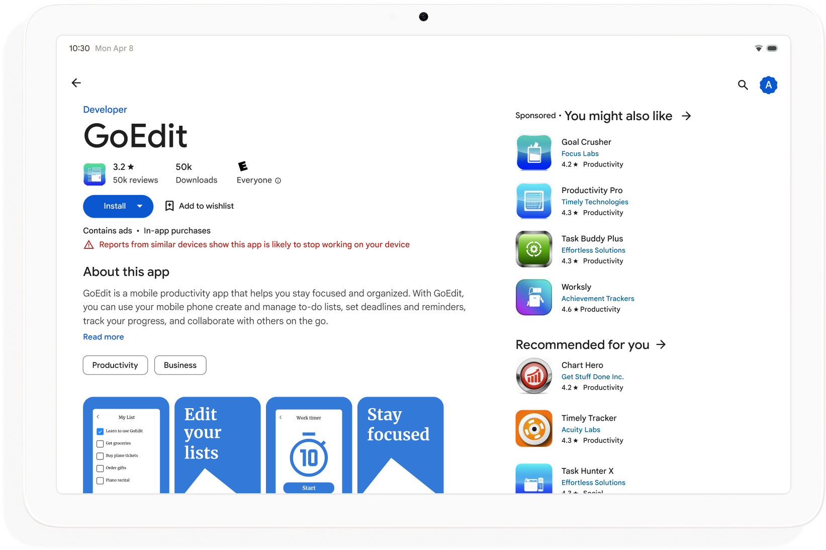
באפליקציות שלא עומדות בתקני האיכות של חנות Play למסכים גדולים, מוצגת אזהרה בדף הפרטים של האפליקציה. האזהרה מיידעת את המשתמשים שהאפליקציה לא תפעל בצורה תקינה במכשירים עם מסך גדול.
כדאי לפתח אפליקציות אדפטיביות כדי להגדיל את יכולת הגילוי שלהן ב-Google Play ולמקסם את מספר המכשירים שאפשר להוריד אליהם את האפליקציה.
איך מתחילים
חשוב לחשוב על עיצוב מותאם בכל שלבי פיתוח האפליקציה, החל משלב התכנון ועד לשלב הפריסה. לעדכן מעצבים גרפיים לגבי עיצוב רספונסיבי. אם תתכננו את האפליקציה כך שתהיה אדפטיבית, תוכלו ליצור אפליקציה שקל לנהל, להרחיב ולהכין אותה לגורמי צורה ולמצבי חלון עתידיים.
כדי ליצור אפליקציה מותאמת שתומכת בכל הגדלים והתצורות של המסכים, צריך לבצע את הפעולות הבאות:
- שימוש במחלקות של גודל חלון כדי לקבל החלטות לגבי פריסה
- פיתוח באמצעות ספריית Compose Material 3 Adaptive
- תמיכה בקלט שאינו מגע
- בדיקה בכל סוגי המכשירים
גדלים של חלונות
מידות חלון האפליקציה יכולות להיות שונות במכשירים שונים – או באותו מכשיר במקרה של מכשירים מתקפלים – גם כשהאפליקציה במסך מלא. כיווני מכשיר שונים יוצרים יחסי גובה-רוחב שונים. במצב ריבוי חלונות, הגודל, יחס הגובה-רוחב והכיוון של חלון האפליקציה יכולים להיות שונים מאלה של מסך המכשיר.
אפליקציות מותאמות מפשטות ומכלילות את הבעיה של קביעה וניהול של גודל החלון, יחס הגובה-רוחב והכיוון, על ידי התייחסות רק לחלון האפליקציה בזמן עיבוד הפריסות, וזה עובד גם כשהחלון של האפליקציה הוא המסך המלא.
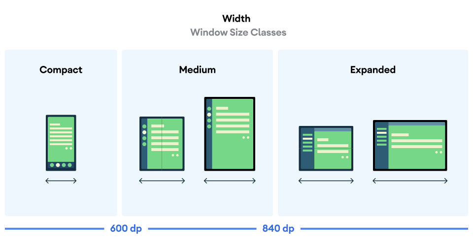
סיווגים של גודל החלון מסווגים את חלונות האפליקציה כקומפקטיים, בינוניים או מורחבים על סמך הרוחב או הגובה של החלון.
כדי לחשב את WindowSizeClass של האפליקציה, צריך להשתמש בפונקציה ברמה העליונה currentWindowAdaptiveInfo() של ספריית Compose Material 3 Adaptive. הפונקציה מחזירה מופע של WindowAdaptiveInfo, שמכיל את windowSizeClass. האפליקציה מקבלת עדכונים בכל פעם שמשתנה סיווג גודל החלון:
val windowSizeClass = currentWindowAdaptiveInfo().windowSizeClass
חלוניות תוכן
פריסת הפעילות נקראת לפעמים מסך. לדוגמה, לאפליקציה יכולים להיות מסך בית, מסך רשימה ומסך פרטי פריט. המינוח מרמז שכל פעילות ממלאת את מסך המכשיר.
עם זאת, במסכים של מכשירים שגדולים מספיק כדי לתמוך ברוחב המורחב של גודל החלון, אפשר לראות כמה מסכים של פעילויות בו-זמנית. חלונית הוא מונח מדויק יותר לתצוגות תוכן של פעילויות ספציפיות.
הגדרות של גודל חלון מאפשרות לכם לקבוע כמה חלוניות תוכן יוצגו בפריסות מרובות חלוניות, כמו שמוסבר בMaterial Design.
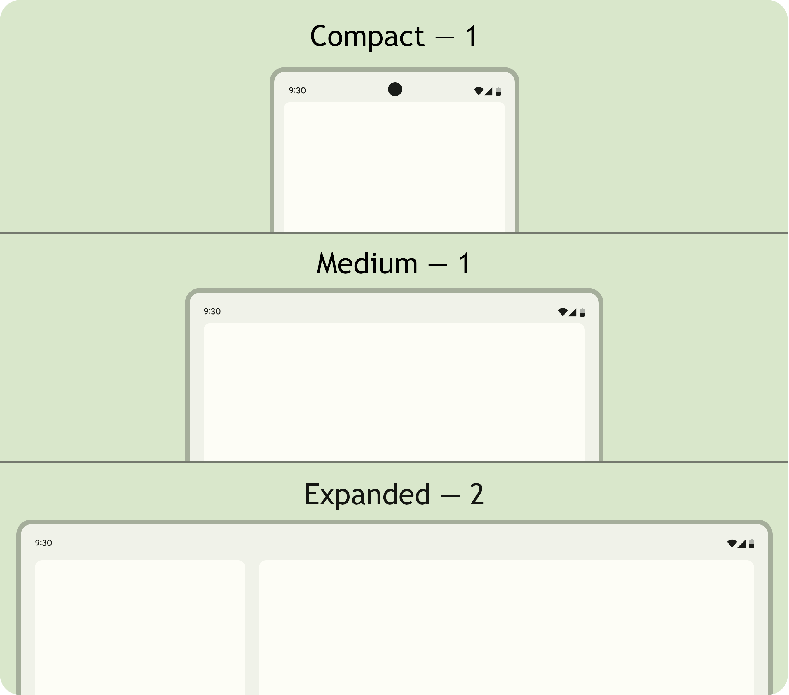
אפשר לנווט בין החלוניות. בחלונות בגודל קומפקטי ובינוני, האפליקציות מוצגות בחלונית אחת, ולכן הניווט לכל יעד מציג חלונית אחת.
בחלון מורחב, אפליקציות יכולות להציג תוכן קשור בכמה חלוניות, כמו פריסת רשימה עם פרטים. הניווט לאחת מהחלוניות מציג את הפריסה של שתי החלוניות. אם גודל החלון משתנה ל'קומפקטי' או ל'בינוני', באפליקציות דינמיות מוצג רק חלונית אחת, יעד הניווט, כלומר הרשימה או הפרטים.
|
|
|
Compose Material 3 Adaptive
Jetpack Compose היא גישה מודרנית ודקלרטיבית לפיתוח אפליקציות מותאמות אישית, בלי הצורך בשכפול ובלי הנטל של תחזוקה של כמה קובצי פריסה.
ספריית Compose Material 3 Adaptive מכילה רכיבי Composable שמנהלים את הדברים הבאים: מחלקות גודל חלון, רכיבי ניווט, פריסות מרובות חלוניות, מצבי קיפול ומיקום ציר. לדוגמה:
NavigationSuiteScaffold: מעבר אוטומטי בין סרגל הניווט לבין פס הניווט בהתאם לסיווג הגודל של חלון האפליקציה ולמצב המכשיר.ListDetailPaneScaffold: הטמעה של פריסת רשימה ופירוט קנונית.הפריסה מותאמת לגודל חלון האפליקציה. מציג רשימה ופרטים של פריט ברשימה בחלונות צדדיים בכיתת גודל חלון מורחבת, אבל רק את הרשימה או את הפרטים בכיתות גודל חלון קומפקטיות ובינוניות.
SupportingPaneScaffold: הטמעה של פריסת חלונית קנונית תומכת.מציג את חלונית התוכן הראשית וחלונית תומכת בגודל חלון מורחב, אבל רק את חלונית התוכן הראשית בגודל חלון קומפקטי ובינוני.
ספריית Compose Material 3 Adaptive היא תלות מרכזית בפיתוח אפליקציות דינמיות.
הגדרה והמשכיות
אפליקציות אדפטיביות שומרות על המשכיות במהלך שינויים בהגדרות.
שינוי בתצורה מתרחש כשמשנים את הגודל של חלון האפליקציה, כשמשנים את המצב של מכשיר מתקפל, או כשמשנים את צפיפות המסך או את הגופן.
כברירת מחדל, שינויים בהגדרות יוצרים מחדש את פעילות האפליקציה, וכל מצב הפעילות אובד. כדי לשמור על רציפות, אפליקציות אדפטיביות שומרות את המצב בשיטה onSaveInstanceState() של הפעילות או ב-ViewModel.
יציבה
אפליקציות אדפטיביות מגיבות לשינויים במצב של מכשירים מתקפלים. תנוחות כוללות תנוחת שולחן ותנוחת ספר.
ממשק WindowInfoTracker ב-Jetpack WindowManager מאפשר לכם לקבל רשימה של אובייקטים מסוג DisplayFeature עבור המכשיר. בין התכונות של המסך יש את FoldingFeature.State, שמציינת אם המכשיר פתוח לגמרי או חצי פתוח.
ספריית Compose Material 3 Adaptive מספקת את הפונקציה currentWindowAdaptiveInfo() ברמה העליונה, שמחזירה מופע של WindowAdaptiveInfo שמכיל windowPosture.
קלט שאינו מגע
משתמשים מחברים לעיתים קרובות מקלדות חיצוניות, משטחי מגע, עכברים ועטים אלקטרוניים למכשירים עם מסך גדול. המכשירים ההיקפיים משפרים את הפרודוקטיביות של המשתמשים, את הדיוק של הקלט, את הביטוי האישי ואת הנגישות. ברוב מכשירי ChromeOS יש מקלדות ומשטחי מגע מובנים.
אפליקציות אדפטיביות תומכות במכשירי קלט חיצוניים, אבל מסגרת Android מבצעת חלק גדול מהעבודה בשבילכם:
Jetpack Compose 1.7 ואילך: ניווט באמצעות מקש Tab במקלדת, וגלילה, בחירה ולחיצה בעכבר או במשטח מגע נתמכים כברירת מחדל.
ספריית Jetpack
androidx.compose.material3: מאפשרת למשתמשים לכתוב לכל רכיבTextFieldבאמצעות עט סטיילוס.כלי העזר למקשי הקיצור: מאפשר למשתמשים לגלות את מקשי הקיצור של פלטפורמת Android ושל האפליקציות. כדי לפרסם את מקשי הקיצור של האפליקציה בכלי העזר למקשי הקיצור, צריך לשנות את קריאת החזרה (callback) של החלון
onProvideKeyboardShortcuts().
כדי לתמוך באופן מלא בגורמי צורה בכל הגדלים, אפליקציות אדפטיביות תומכות בהזנה של כל הסוגים.
איך בודקים אפליקציות דינמיות
בודקים גדלים שונים של מסכים וחלונות ותצורות שונות של מכשירים. כדי לבדוק את פריסות האפליקציה, אפשר להשתמש בצילומי מסך בצד המארח ובתצוגות מקדימות של יצירת הודעות. הפעלת האפליקציה באמולטורים של Android Studio ובמכשירי Android מרוחקים שמתארחים במרכזי הנתונים של Google.
הנחיות איכות לאפליקציות למסכים גדולים
הנחיות האיכות לאפליקציות למסכים גדולים עוזרות לכם לוודא שהאפליקציה האדפטיבית שלכם פועלת בצורה טובה בטאבלטים, במכשירים מתקפלים ובמכשירי ChromeOS. ההנחיות כוללות בדיקות שמאפשרות לאמת את תכונות האפליקציה עבור תהליכי משתמש קריטיים. למרות שההנחיות מתמקדות במסכים גדולים, הן תואמות לכל גודלי המסכים.
מערכים מרובים של הגדרות אישיות
בממשק DeviceConfigurationOverride ב-Compose 1.7 ומעלה, אפשר לשנות היבטים שונים של הגדרת המכשיר. ה-API מדמה הגדרות שונות של מכשירים באופן מותאם ללוקליזציה, לכל תוכן שניתן להרכבה שרוצים לבדוק. לדוגמה, אתם יכולים לבדוק כמה גדלים שרירותיים של ממשק משתמש בהרצה אחת של חבילת מקרים לבדיקה במכשיר אחד או באמולטור אחד.
בעזרת פונקציית ההרחבה DeviceConfigurationOverride.then(), אתם יכולים לבדוק כמה פרמטרים של תצורה בו-זמנית, כמו גודל הגופן, המקום, העיצוב וגודל הפריסה.
צילומי מסך בצד המארח
בדיקות צילומי מסך בצד המארח הן דרך מהירה וניתנת להרחבה לאימות המראה החזותי של פריסות האפליקציה. אפשר להשתמש בצילומי מסך בצד המארח כדי לבדוק את ממשק המשתמש במגוון גדלים של מסכים.
מידע נוסף זמין במאמר בנושא בדיקת צילומי מסך של טיוטות.
יצירת תצוגות מקדימות
תצוגות מקדימות של Compose מאפשרות לכם לבדוק את ממשק המשתמש של האפליקציה בתצוגת העיצוב של Android Studio. תצוגות מקדימות משתמשות בהערות, כמו @PreviewScreenSizes, @PreviewFontScale ו-@PreviewLightDark, כדי לאפשר לכם לראות תוכן שאפשר להרכיב בתצורות שונות. אפשר אפילו ליצור אינטראקציה עם התצוגות המקדימות.
ב-Android Studio יש גם הדגשה בתצוגות המקדימות של בעיות נפוצות שקשורות לשימושיות, כמו לחצנים או שדות טקסט רחבים מדי.
מידע נוסף זמין במאמר תצוגה מקדימה של ממשק המשתמש באמצעות תצוגות מקדימות שניתנות להרכבה.
אמולטורים
ב-Android Studio יש מגוון אמולטורים לבדיקת גדלים שונים של פריסות:
- אמולטור שניתן לשינוי גודל: מדמה טלפון, טאבלט או מכשיר מתקפל ומאפשר לעבור ביניהם תוך כדי תנועה
- אמולטור Pixel Fold: אמולטור של טלפון מתקפל עם מסך גדול מדגם Pixel Fold
- אמולטור Pixel Tablet: מדמה את מכשיר המסך הגדול Pixel Tablet
- אמולטור למחשב: מאפשר לבדוק שינוי גודל ומיקום של חלונות, ריחוף העכבר ומקשי קיצור
סטרימינג למכשיר שמחובר לרשת אחרת
מתחברים באופן מאובטח למכשירי Android מרוחקים שמארחים במרכזי נתונים של Google ומריצים את האפליקציה במכשירי Pixel ו-Samsung החדשים ביותר. להתקין אפליקציות ולנפות באגים, להריץ פקודות ADB, לסובב מכשירים ולקפל אותם כדי לוודא שהאפליקציה פועלת בצורה טובה במגוון מכשירים אמיתיים.
הזרמת מכשיר שמחובר לרשת אחרת משולבת ב-Android Studio. למידע נוסף, אפשר לעיין במאמר הזרמת נתונים ממכשירי Android באמצעות Firebase.
מקורות מידע נוספים
- מצגת I/O: פיתוח אפליקציות מותאמות ל-Android