คอมโพเนนต์ Dialog จะแสดงข้อความกล่องโต้ตอบหรือขอให้ผู้ใช้ป้อนข้อมูลจากผู้ใช้ในเลเยอร์เหนือเนื้อหาหลักของแอป ซึ่งจะสร้างประสบการณ์ UI ที่ขัดจังหวะเพื่อดึงดูดความสนใจของผู้ใช้
กรณีการใช้งานกล่องโต้ตอบมีดังนี้
- ยืนยันการดำเนินการของผู้ใช้ เช่น เมื่อลบไฟล์
- ขอข้อมูลจากผู้ใช้ เช่น ในแอปรายการสิ่งที่ต้องทำ
- แสดงรายการตัวเลือกให้ผู้ใช้เลือก เช่น การเลือกประเทศในการตั้งค่าโปรไฟล์

กล่องโต้ตอบการแจ้งเตือน
คอมโพสได้ AlertDialog มี API ที่สะดวกสำหรับการสร้างกล่องโต้ตอบที่มีธีม Material Design
AlertDialog มีพารามิเตอร์เฉพาะสำหรับการจัดการองค์ประกอบบางอย่างของกล่องโต้ตอบ ซึ่งมีดังนี้
title: ข้อความที่ปรากฏที่ด้านบนของกล่องโต้ตอบtext: ข้อความที่ปรากฏตรงกลางกล่องโต้ตอบicon: กราฟิกที่ปรากฏที่ด้านบนของกล่องโต้ตอบonDismissRequest: ฟังก์ชันที่เรียกใช้เมื่อผู้ใช้ปิดกล่องโต้ตอบ เช่น โดยการแตะนอกกล่องโต้ตอบdismissButton: คอมโพสได้ที่ทำหน้าที่เป็นปุ่มปิดconfirmButton: คอมโพสได้ที่ทำหน้าที่เป็นปุ่มยืนยัน
ตัวอย่างต่อไปนี้ใช้ปุ่ม 2 ปุ่มในกล่องโต้ตอบการแจ้งเตือน ปุ่มหนึ่งสำหรับปิดกล่องโต้ตอบ และอีกปุ่มหนึ่งสำหรับยืนยันคำขอ
@Composable fun AlertDialogExample( onDismissRequest: () -> Unit, onConfirmation: () -> Unit, dialogTitle: String, dialogText: String, icon: ImageVector, ) { AlertDialog( icon = { Icon(icon, contentDescription = "Example Icon") }, title = { Text(text = dialogTitle) }, text = { Text(text = dialogText) }, onDismissRequest = { onDismissRequest() }, confirmButton = { TextButton( onClick = { onConfirmation() } ) { Text("Confirm") } }, dismissButton = { TextButton( onClick = { onDismissRequest() } ) { Text("Dismiss") } } ) }
การใช้งานนี้หมายถึงคอมโพสได้หลักที่ส่งอาร์กิวเมนต์ไปยังคอมโพสได้ย่อยในลักษณะนี้
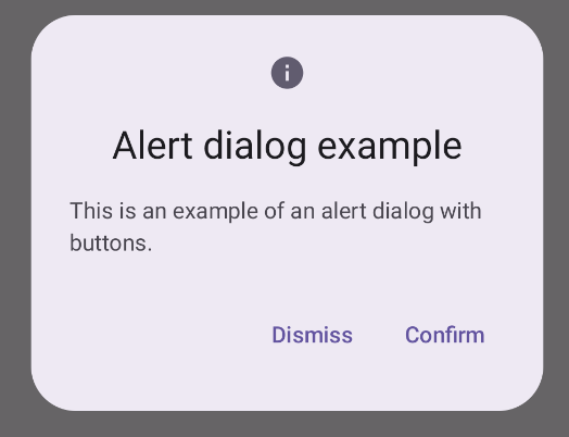
@Composable fun DialogExamples() { // ... val openAlertDialog = remember { mutableStateOf(false) } // ... when { // ... openAlertDialog.value -> { AlertDialogExample( onDismissRequest = { openAlertDialog.value = false }, onConfirmation = { openAlertDialog.value = false println("Confirmation registered") // Add logic here to handle confirmation. }, dialogTitle = "Alert dialog example", dialogText = "This is an example of an alert dialog with buttons.", icon = Icons.Default.Info ) } } } }
การใช้งานนี้จะปรากฏดังนี้
คอมโพสได้ Dialog
Dialog เป็นคอมโพสได้พื้นฐานที่ไม่มีการจัดรูปแบบหรือช่องที่กำหนดไว้ล่วงหน้าสำหรับเนื้อหา โดยเป็นคอนเทนเนอร์ที่ค่อนข้างตรงไปตรงมาซึ่งคุณควรป้อนข้อมูลด้วยคอนเทนเนอร์ เช่น Card พารามิเตอร์หลักบางส่วนของกล่องโต้ตอบมีดังนี้
onDismissRequest: แลมบ์ดาที่เรียกใช้เมื่อผู้ใช้ปิดกล่องโต้ตอบproperties: อินสแตนซ์ของDialogPropertiesที่มี ขอบเขตเพิ่มเติมสำหรับการปรับแต่ง
ตัวอย่างพื้นฐาน
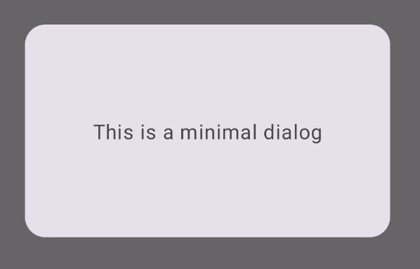
ตัวอย่างต่อไปนี้เป็นการใช้งานคอมโพสได้ Dialog แบบพื้นฐาน โปรดทราบว่าตัวอย่างนี้ใช้ Card เป็นคอนเทนเนอร์รอง หากไม่มี Card คอมโพเนนต์ Text จะปรากฏขึ้นเพียงลำพังเหนือเนื้อหาหลักของแอป
@Composable fun MinimalDialog(onDismissRequest: () -> Unit) { Dialog(onDismissRequest = { onDismissRequest() }) { Card( modifier = Modifier .fillMaxWidth() .height(200.dp) .padding(16.dp), shape = RoundedCornerShape(16.dp), ) { Text( text = "This is a minimal dialog", modifier = Modifier .fillMaxSize() .wrapContentSize(Alignment.Center), textAlign = TextAlign.Center, ) } } }
การใช้งานนี้จะปรากฏดังนี้ โปรดทราบว่าเมื่อกล่องโต้ตอบเปิดอยู่ เนื้อหาหลักของแอปที่อยู่ด้านล่างจะปรากฏเป็นสีเข้มและเป็นสีเทา
ตัวอย่างขั้นสูง
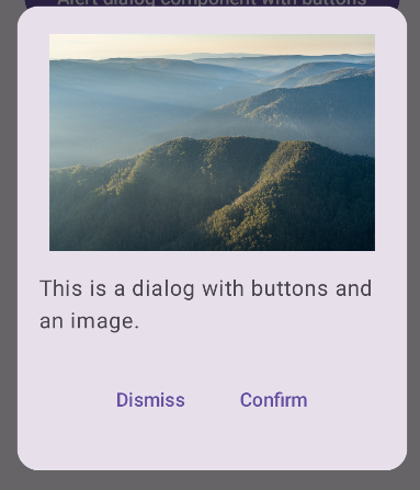
ตัวอย่างต่อไปนี้เป็นการใช้งานคอมโพสได้ Dialog ที่ซับซ้อนมากขึ้น ในกรณีนี้ คอมโพเนนต์จะใช้การอินเทอร์เฟซที่คล้ายกับตัวอย่าง AlertDialog ก่อนหน้าด้วยตนเอง
@Composable fun DialogWithImage( onDismissRequest: () -> Unit, onConfirmation: () -> Unit, painter: Painter, imageDescription: String, ) { Dialog(onDismissRequest = { onDismissRequest() }) { // Draw a rectangle shape with rounded corners inside the dialog Card( modifier = Modifier .fillMaxWidth() .height(375.dp) .padding(16.dp), shape = RoundedCornerShape(16.dp), ) { Column( modifier = Modifier .fillMaxSize(), verticalArrangement = Arrangement.Center, horizontalAlignment = Alignment.CenterHorizontally, ) { Image( painter = painter, contentDescription = imageDescription, contentScale = ContentScale.Fit, modifier = Modifier .height(160.dp) ) Text( text = "This is a dialog with buttons and an image.", modifier = Modifier.padding(16.dp), ) Row( modifier = Modifier .fillMaxWidth(), horizontalArrangement = Arrangement.Center, ) { TextButton( onClick = { onDismissRequest() }, modifier = Modifier.padding(8.dp), ) { Text("Dismiss") } TextButton( onClick = { onConfirmation() }, modifier = Modifier.padding(8.dp), ) { Text("Confirm") } } } } } }
การใช้งานนี้จะปรากฏดังนี้