
共有要素の遷移は、コンテンツが共通しているコンポーザブル間をシームレスに遷移する方法です。ナビゲーションによく使用され、ユーザーが画面間を移動する際に、異なる画面を視覚的に接続できます。
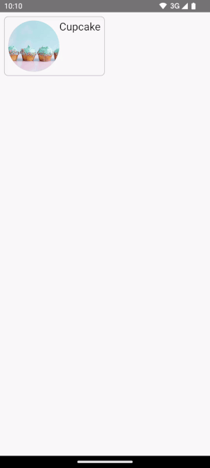
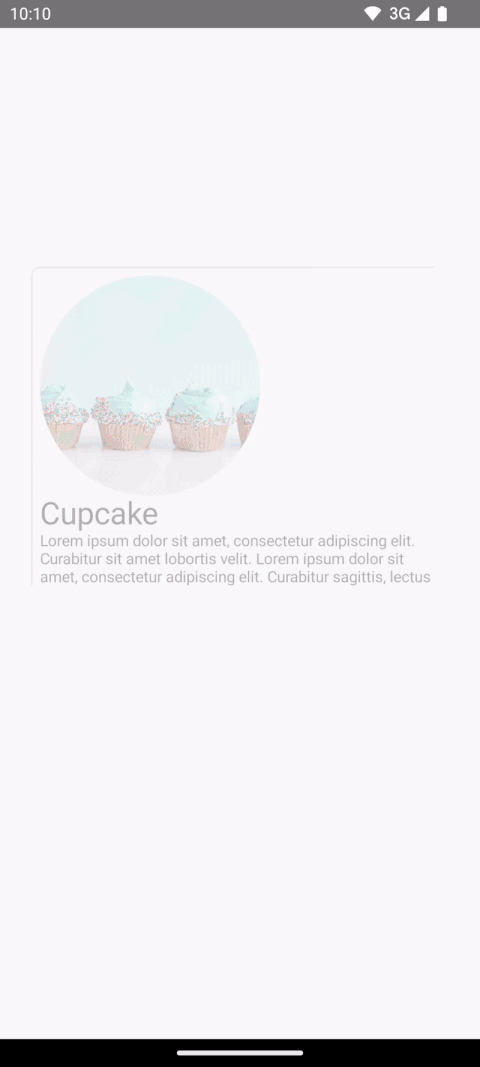
たとえば、次の動画では、スナックの画像とタイトルがリスティングページから詳細ページに共有されています。
Compose には、共有要素の作成に役立つ高レベル API がいくつかあります。
SharedTransitionLayout: 共有要素の遷移を実装するために必要な最も外側のレイアウト。SharedTransitionScopeを提供します。共有要素の修飾子を使用するには、コンポーザブルがSharedTransitionScope内にある必要があります。Modifier.sharedElement(): 別のコンポーザブルと一致させる必要があるコンポーザブルをSharedTransitionScopeに通知する修飾子。Modifier.sharedBounds(): 遷移が行われる場所のコンテナの境界として、このコンポーザブルの境界を使用する必要があることをSharedTransitionScopeに通知する修飾子。sharedElement()とは対照的に、sharedBounds()は視覚的に異なるコンテンツ用に設計されています。
Compose で共有要素を作成する際の重要なコンセプトは、オーバーレイとクリッピングとの連携方法です。この重要なトピックについて詳しくは、クリッピングと オーバーレイ のセクションをご覧ください。
基本的な使用方法
このセクションでは、小さい「リスト」アイテムから大きい詳細アイテムに遷移する次の遷移を作成します。
Modifier.sharedElement() を使用する最適な方法は、
AnimatedContent、AnimatedVisibility、または NavHost と組み合わせて使用することです。これにより、
コンポーザブル間の遷移が自動的に管理されます。
開始点は、共有要素を追加する前に MainContent と DetailsContent のコンポーザブルを持つ既存の基本的な AnimatedContent です。
AnimatedContent の開始。共有要素を 2 つのレイアウト間でアニメーション化するには、
AnimatedContentコンポーザブルをSharedTransitionLayoutで囲みます。 のスコープは、SharedTransitionLayoutとAnimatedContentに渡されます 。MainContentDetailsContentvar showDetails by remember { mutableStateOf(false) } SharedTransitionLayout { AnimatedContent( showDetails, label = "basic_transition" ) { targetState -> if (!targetState) { MainContent( onShowDetails = { showDetails = true }, animatedVisibilityScope = this@AnimatedContent, sharedTransitionScope = this@SharedTransitionLayout ) } else { DetailsContent( onBack = { showDetails = false }, animatedVisibilityScope = this@AnimatedContent, sharedTransitionScope = this@SharedTransitionLayout ) } } }
一致する 2 つのコンポーザブルのコンポーザブル修飾子チェーンに
Modifier.sharedElement()を追加します。SharedContentStateオブジェクトを作成し、rememberSharedContentState()で記憶します。SharedContentStateオブジェクトは、共有される要素を決定する一意のキーを保存します。コンテンツを識別する一意のキーを指定し、記憶するアイテムにrememberSharedContentState()を使用します。AnimatedContentScopeは修飾子に渡され、アニメーションの調整に使用されます。@Composable private fun MainContent( onShowDetails: () -> Unit, modifier: Modifier = Modifier, sharedTransitionScope: SharedTransitionScope, animatedVisibilityScope: AnimatedVisibilityScope ) { Row( // ... ) { with(sharedTransitionScope) { Image( painter = painterResource(id = R.drawable.cupcake), contentDescription = "Cupcake", modifier = Modifier .sharedElement( rememberSharedContentState(key = "image"), animatedVisibilityScope = animatedVisibilityScope ) .size(100.dp) .clip(CircleShape), contentScale = ContentScale.Crop ) // ... } } } @Composable private fun DetailsContent( modifier: Modifier = Modifier, onBack: () -> Unit, sharedTransitionScope: SharedTransitionScope, animatedVisibilityScope: AnimatedVisibilityScope ) { Column( // ... ) { with(sharedTransitionScope) { Image( painter = painterResource(id = R.drawable.cupcake), contentDescription = "Cupcake", modifier = Modifier .sharedElement( rememberSharedContentState(key = "image"), animatedVisibilityScope = animatedVisibilityScope ) .size(200.dp) .clip(CircleShape), contentScale = ContentScale.Crop ) // ... } } }
共有要素の一致が発生したかどうかに関する情報を取得するには、rememberSharedContentState() を変数に抽出し、isMatchFound をクエリします。
これにより、次の自動アニメーションが生成されます。
コンテナ全体の背景色とサイズは、デフォルトの AnimatedContent 設定を使用しています。
共有境界と共有要素
Modifier.sharedBounds() は Modifier.sharedElement() と同様です。
ただし、修飾子は次の点で異なります。
sharedBounds()は、視覚的に異なるが、状態間で同じ領域を共有する必要があるコンテンツ用です。一方、sharedElement()はコンテンツが同じであることを想定しています。sharedBounds()を使用すると、画面に出入りするコンテンツは 2 つの状態間の遷移中に表示されます。一方、sharedElement()を使用すると、ターゲット コンテンツのみが変換境界でレンダリングされます。Modifier.sharedBounds()には、AnimatedContentと同様に、コンテンツの遷移方法を指定するためのenterパラメータとexitパラメータがあります。sharedBounds()の最も一般的なユースケースは コンテナ変換 パターンですが、sharedElement()のユースケースの例はヒーロー遷移です。Textコンポーザブルを使用する場合は、イタリック体と太字の切り替えや色の変更など、フォントの変更をサポートするためにsharedBounds()が推奨されます。
前の例では、2 つの異なるシナリオで Row と Column に Modifier.sharedBounds() を追加すると、2 つの境界を共有して遷移アニメーションを実行し、互いに拡大できるようになります。
@Composable private fun MainContent( onShowDetails: () -> Unit, modifier: Modifier = Modifier, sharedTransitionScope: SharedTransitionScope, animatedVisibilityScope: AnimatedVisibilityScope ) { with(sharedTransitionScope) { Row( modifier = Modifier .padding(8.dp) .sharedBounds( rememberSharedContentState(key = "bounds"), animatedVisibilityScope = animatedVisibilityScope, enter = fadeIn(), exit = fadeOut(), resizeMode = SharedTransitionScope.ResizeMode.scaleToBounds() ) // ... ) { // ... } } } @Composable private fun DetailsContent( modifier: Modifier = Modifier, onBack: () -> Unit, sharedTransitionScope: SharedTransitionScope, animatedVisibilityScope: AnimatedVisibilityScope ) { with(sharedTransitionScope) { Column( modifier = Modifier .padding(top = 200.dp, start = 16.dp, end = 16.dp) .sharedBounds( rememberSharedContentState(key = "bounds"), animatedVisibilityScope = animatedVisibilityScope, enter = fadeIn(), exit = fadeOut(), resizeMode = SharedTransitionScope.ResizeMode.scaleToBounds() ) // ... ) { // ... } } }
スコープについて理解する
Modifier.sharedElement() を使用するには、コンポーザブルが SharedTransitionScope 内にある必要があります。SharedTransitionLayout コンポーザブルは SharedTransitionScope を提供します。共有する要素を含む UI 階層の最上位に配置してください。
通常、コンポーザブルは AnimatedVisibilityScope 内にも配置する必要があります。これは通常、AnimatedContent
を使用してコンポーズ可能な関数を切り替える場合、AnimatedVisibilityを直接使用する場合、または
によってNavHostコンポーズ可能な関数によって提供されます(可視性を
手動で管理する場合を除く)。複数のスコープを使用するには、必要なスコープを
CompositionLocalに保存し、Kotlin でコンテキスト レシーバーを使用するか、
スコープをパラメータとして関数に渡します。
CompositionLocals は、追跡するスコープが複数ある場合や、階層が深くネストされている場合に使用します。CompositionLocal を使用すると、保存して使用するスコープを正確に選択できます。一方、コンテキスト レシーバーを使用すると、階層内の他のレイアウトが提供されたスコープを誤ってオーバーライドする可能性があります。
たとえば、ネストされた AnimatedContent が複数ある場合、スコープがオーバーライドされる可能性があります。
val LocalNavAnimatedVisibilityScope = compositionLocalOf<AnimatedVisibilityScope?> { null } val LocalSharedTransitionScope = compositionLocalOf<SharedTransitionScope?> { null } @Composable private fun SharedElementScope_CompositionLocal() { // An example of how to use composition locals to pass around the shared transition scope, far down your UI tree. // ... SharedTransitionLayout { CompositionLocalProvider( LocalSharedTransitionScope provides this ) { // This could also be your top-level NavHost as this provides an AnimatedContentScope AnimatedContent(state, label = "Top level AnimatedContent") { targetState -> CompositionLocalProvider(LocalNavAnimatedVisibilityScope provides this) { // Now we can access the scopes in any nested composables as follows: val sharedTransitionScope = LocalSharedTransitionScope.current ?: throw IllegalStateException("No SharedElementScope found") val animatedVisibilityScope = LocalNavAnimatedVisibilityScope.current ?: throw IllegalStateException("No AnimatedVisibility found") } // ... } } } }
また、階層が深くネストされていない場合は、スコープをパラメータとして渡すこともできます。
@Composable fun MainContent( animatedVisibilityScope: AnimatedVisibilityScope, sharedTransitionScope: SharedTransitionScope ) { } @Composable fun Details( animatedVisibilityScope: AnimatedVisibilityScope, sharedTransitionScope: SharedTransitionScope ) { }
AnimatedVisibility を使用した共有要素
前の例では、AnimatedContent で共有要素を使用する方法を示しましたが、共有要素は AnimatedVisibility でも機能します。
たとえば、この Lazy Grid の例では、各要素が AnimatedVisibility でラップされています。アイテムをクリックすると、コンテンツが UI からダイアログのようなコンポーネントに引き出されるような視覚効果が得られます。
var selectedSnack by remember { mutableStateOf<Snack?>(null) } SharedTransitionLayout(modifier = Modifier.fillMaxSize()) { LazyColumn( // ... ) { items(listSnacks) { snack -> AnimatedVisibility( visible = snack != selectedSnack, enter = fadeIn() + scaleIn(), exit = fadeOut() + scaleOut(), modifier = Modifier.animateItem() ) { Box( modifier = Modifier .sharedBounds( sharedContentState = rememberSharedContentState(key = "${snack.name}-bounds"), // Using the scope provided by AnimatedVisibility animatedVisibilityScope = this, clipInOverlayDuringTransition = OverlayClip(shapeForSharedElement) ) .background(Color.White, shapeForSharedElement) .clip(shapeForSharedElement) ) { SnackContents( snack = snack, modifier = Modifier.sharedElement( sharedContentState = rememberSharedContentState(key = snack.name), animatedVisibilityScope = this@AnimatedVisibility ), onClick = { selectedSnack = snack } ) } } } } // Contains matching AnimatedContent with sharedBounds modifiers. SnackEditDetails( snack = selectedSnack, onConfirmClick = { selectedSnack = null } ) }
AnimatedVisibility を使用した共有要素。修飾子の順序
Modifier.sharedElement() と Modifier.sharedBounds() では、order of your
modifier chain matters,
as with the rest of Compose. サイズに影響する修飾子を誤って配置すると、共有要素の一致中に予期しない視覚的なジャンプが発生する可能性があります。
たとえば、2 つの共有要素の異なる位置にパディング修飾子を配置すると、アニメーションに視覚的な違いが生じます。
var selectFirst by remember { mutableStateOf(true) } val key = remember { Any() } SharedTransitionLayout( Modifier .fillMaxSize() .padding(10.dp) .clickable { selectFirst = !selectFirst } ) { AnimatedContent(targetState = selectFirst, label = "AnimatedContent") { targetState -> if (targetState) { Box( Modifier .padding(12.dp) .sharedBounds( rememberSharedContentState(key = key), animatedVisibilityScope = this@AnimatedContent ) .border(2.dp, Color.Red) ) { Text( "Hello", fontSize = 20.sp ) } } else { Box( Modifier .offset(180.dp, 180.dp) .sharedBounds( rememberSharedContentState( key = key, ), animatedVisibilityScope = this@AnimatedContent ) .border(2.dp, Color.Red) // This padding is placed after sharedBounds, but it doesn't match the // other shared elements modifier order, resulting in visual jumps .padding(12.dp) ) { Text( "Hello", fontSize = 36.sp ) } } } }
一致した境界 |
一致しない境界: 共有要素のアニメーションが、誤った境界に合わせてサイズを変更する必要があるため、少しずれて表示されます。 |
|---|---|
共有要素の修飾子の前に 使用される修飾子は、共有要素の修飾子に制約を提供します。この制約は、初期境界とターゲット境界、および境界アニメーションを導出するために使用されます。
共有要素の修飾子の後に 使用される修飾子は、前の制約を使用して子のターゲット サイズを測定して計算します。共有要素の修飾子は、一連のアニメーション化された制約を作成して、子を初期サイズからターゲット サイズに徐々に変換します。
アニメーションに resizeMode = ScaleToBounds() を使用する場合、またはコンポーザブルで Modifier.skipToLookaheadSize() を使用する場合は、例外です。この場合、Compose はターゲット制約を使用して子をレイアウトし、レイアウト サイズ自体を変更するのではなく、スケール ファクタを使用してアニメーションを実行します。
一意のキー
複雑な共有要素を扱う場合は、文字列ではないキーを作成することをおすすめします。文字列は一致しにくい場合があります。一致させるには、各キーが一意である必要があります。たとえば、Jetsnack には次の共有要素があります。
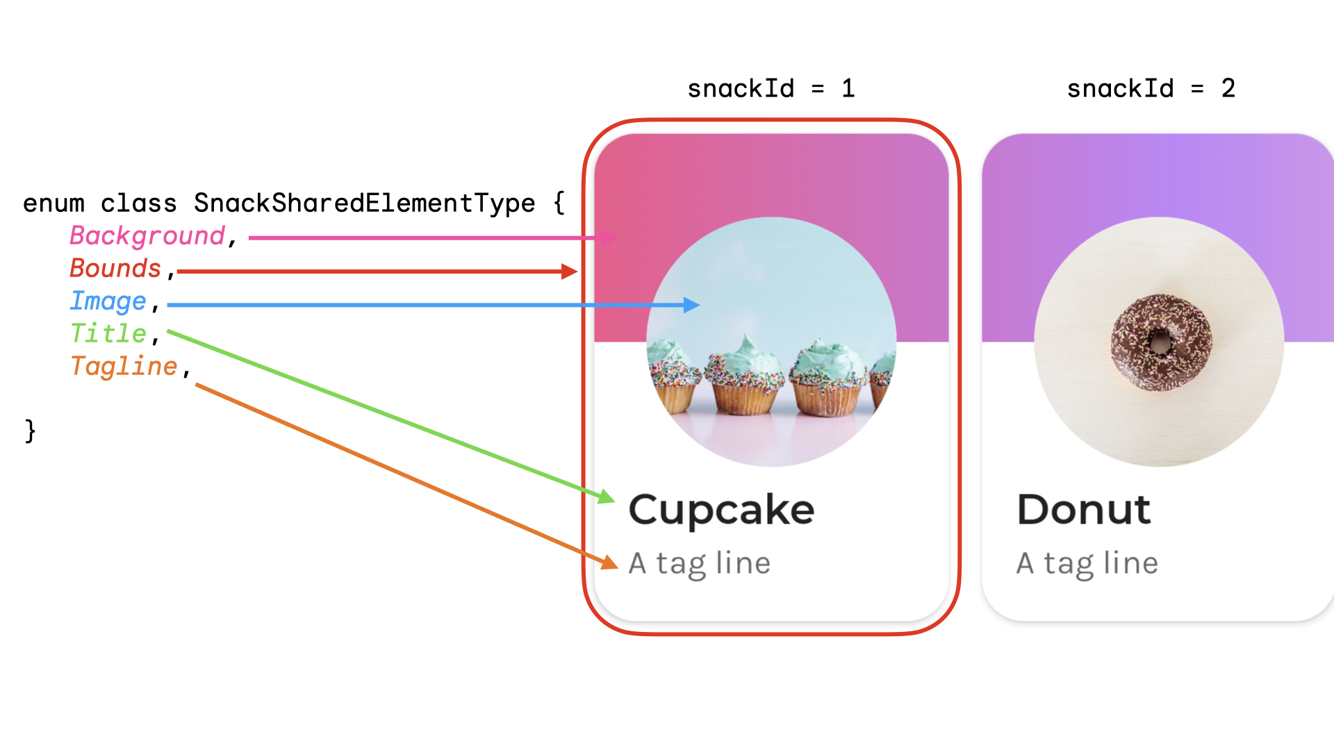
共有要素のタイプを表す列挙型を作成できます。この例では、スナックカード全体が、ホーム画面の複数の異なる場所(「人気」セクションや「おすすめ」セクションなど)に表示されることもあります。共有される共有要素の snackId、origin(「人気」 / 「おすすめ」)、type を持つキーを作成できます。
data class SnackSharedElementKey( val snackId: Long, val origin: String, val type: SnackSharedElementType ) enum class SnackSharedElementType { Bounds, Image, Title, Tagline, Background } @Composable fun SharedElementUniqueKey() { // ... Box( modifier = Modifier .sharedElement( rememberSharedContentState( key = SnackSharedElementKey( snackId = 1, origin = "latest", type = SnackSharedElementType.Image ) ), animatedVisibilityScope = this@AnimatedVisibility ) ) // ... }
データクラスは hashCode() と equals() を実装しているため、キーとして推奨されます。
共有要素の可視性を手動で管理する
AnimatedVisibility や AnimatedContent を使用しない場合は、共有要素の可視性を自分で管理できます。Modifier.sharedElementWithCallerManagedVisibility() を使用して、アイテムを表示するかどうかを決定する独自の条件を指定します。
var selectFirst by remember { mutableStateOf(true) } val key = remember { Any() } SharedTransitionLayout( Modifier .fillMaxSize() .padding(10.dp) .clickable { selectFirst = !selectFirst } ) { Box( Modifier .sharedElementWithCallerManagedVisibility( rememberSharedContentState(key = key), !selectFirst ) .background(Color.Red) .size(100.dp) ) { Text(if (!selectFirst) "false" else "true", color = Color.White) } Box( Modifier .offset(180.dp, 180.dp) .sharedElementWithCallerManagedVisibility( rememberSharedContentState( key = key, ), selectFirst ) .alpha(0.5f) .background(Color.Blue) .size(180.dp) ) { Text(if (selectFirst) "false" else "true", color = Color.White) } }
現在の制限
これらの API にはいくつかの制限があります。特に次の点に注意してください。
- View と Compose の相互運用はサポートされていません。これには、
DialogやModalBottomSheetなど、AndroidViewをラップするコンポーザブルが含まれます。 - 次の自動アニメーションはサポートされていません。
- 共有画像コンポーザブル:
ContentScaleはデフォルトではアニメーション化されません。設定された終了ContentScaleにスナップします。
- シェイプのクリッピング - シェイプ間の自動 アニメーションは組み込みでサポートされていません。たとえば、アイテムの遷移時に正方形から 円にアニメーション化するなどです。
- サポートされていない場合は、
sharedElement()の代わりにModifier.sharedBounds()を使用し、アイテムにModifier.animateEnterExit()を追加します。
- 共有画像コンポーザブル: