반응형 및 적응형 디자인
컬렉션을 사용해 정리하기
내 환경설정을 기준으로 콘텐츠를 저장하고 분류하세요.

늘어나는 화면 크기를 수용하기 위해 ProtoLayout Material 레이아웃 템플릿 및 Figma 디자인 레이아웃에 반응형 동작을 통합하여 슬롯이 자동으로 조정되도록 했습니다. 기본적으로 슬롯은 사용 가능한 너비를 채우도록 설계되었습니다. 여백은 백분율로 설정되며 화면 하단과 상단의 슬롯에 추가 내부 여백이 추가되어 화면이 커질 때 화면 곡선의 변동을 고려합니다.
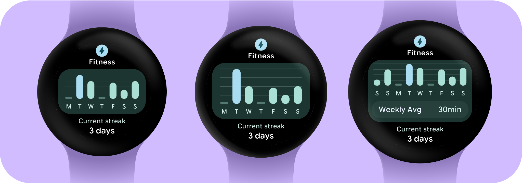
더 큰 화면 크기와 추가 공간을 최대한 활용하려면 추가 화면 공간을 활용하여 사용자가 추가 정보나 옵션에 액세스할 수 있도록 허용하여 더 많은 가치를 제공해 보세요. 이러한 레이아웃을 구현하려면 내장된 반응형 동작 외에도 추가 맞춤설정이 필요합니다. 이를 위해서는 브레이크포인트 뒤에 레이아웃에 더 유용한 콘텐츠를 추가하면 됩니다. 권장 중단점은 225dp 화면 크기로 설정됩니다.
필수 용어
반응형 디자인: 최적의 사용자 환경을 위해 레이아웃이 버튼, 텍스트 필드, 대화상자와 같은 요소의 형식을 동적으로 지정하고 배치하는 디자인 접근 방식입니다. 반응형 디자인 관행을 활용하여 대형 화면에서 사용자에게 추가 가치를 자동으로 제공합니다. 한눈에 더 많은 텍스트를 표시하거나, 화면에 더 많은 작업을 표시하거나, 더 크고 접근하기 쉬운 탭 타겟을 제공하는 등 반응형 관행은 대형 화면 사용자에게 향상된 환경을 제공합니다.
적응형 디자인: 알려진 사용자, 기기 또는 환경 조건에 따라 인터페이스가 변경되는 디자인 접근 방식입니다. Material의 적응형 디자인에는 레이아웃 및 구성요소 적응이 포함됩니다.
반응형 및 최적화된 디자인 빌드
디자인 레이아웃이 더 큰 화면 크기에 맞게 조정되도록 레이아웃 및 구성요소의 동작이 업데이트되어 비율 기반 여백 및 패딩을 비롯한 반응형 동작이 기본적으로 제공됩니다.
ProtoLayout 템플릿을 사용하는 경우 ProtoLayout API 및 베타 출시 노트를 통해 이러한 업데이트를 자동으로 상속할 수 있으며 화면 크기 브레이크포인트 후에 콘텐츠 또는 구성요소를 추가한 레이아웃만 제공하면 됩니다. 대형 화면 크기를 활용하는 방법에 관한 전체 안내 및 권장사항은 카드 가이드를 참고하세요. 카드의 화면 높이는 고정되어 있으므로 원치 않는 잘림이 발생하지 않도록 제한된 화면 공간을 최대화하도록 패딩을 조정했습니다.
이 페이지에 나와 있는 콘텐츠와 코드 샘플에는 콘텐츠 라이선스에서 설명하는 라이선스가 적용됩니다. 자바 및 OpenJDK는 Oracle 및 Oracle 계열사의 상표 또는 등록 상표입니다.
최종 업데이트: 2025-07-27(UTC)
[[["이해하기 쉬움","easyToUnderstand","thumb-up"],["문제가 해결됨","solvedMyProblem","thumb-up"],["기타","otherUp","thumb-up"]],[["필요한 정보가 없음","missingTheInformationINeed","thumb-down"],["너무 복잡함/단계 수가 너무 많음","tooComplicatedTooManySteps","thumb-down"],["오래됨","outOfDate","thumb-down"],["번역 문제","translationIssue","thumb-down"],["샘플/코드 문제","samplesCodeIssue","thumb-down"],["기타","otherDown","thumb-down"]],["최종 업데이트: 2025-07-27(UTC)"],[],[],null,["# Responsive and adaptive design\n\nTo accommodate the increasing screen size, we've incorporated responsive behavior into the [ProtoLayout Material layout templates](https://developer.android.com/reference/kotlin/androidx/wear/protolayout/material3/package-summary#(androidx.wear.protolayout.material3.MaterialScope).primaryLayout(kotlin.Function1,kotlin.Function1,kotlin.Function1,kotlin.Function1,androidx.wear.protolayout.ModifiersBuilders.Clickable,androidx.wear.protolayout.material3.PrimaryLayoutMargins)) and Figma design layouts, allowing the slots to automatically adapt. In essence, slots are designed to fill the available width. Our margins are set as percentages, with additional inner margins added to slots at the bottom and top of the screen, accounting for fluctuations in the curve of the screen as it enlarges.\n\nTo maximize the larger screen size and additional space, consider utilizing the extra screen space to provide more value by allowing users to access additional information or options. Achieving these layouts requires additional customization beyond the built-in responsive behavior. This can be accomplished by adding more helpful content to the layout after the breakpoint. It's important to note that the recommended breakpoint is set at the 225dp screen size.\n\nEssential terms\n---------------\n\n**Responsive design:** A design approach in which layouts dynamically format and position elements such as buttons, text fields, and dialogs for an optimal user experience. Automatically offer users additional value on larger screens by utilizing responsive design practices. Whether it's more text visible at a glance, more actions on screen, or larger, more accessible tap targets, responsive practices provide an enhanced experience for users of large screens.\n\n**Adaptive design:** A design approach in which the interface changes based on known user, device, or environmental conditions. Adaptive design in Material includes layout and component adaptations.\n\nBuilding responsive and optimized designs\n-----------------------------------------\n\nTo ensure your design layouts adapt to larger screen sizes, we have updated the behavior of our layouts and components to have built-in responsive behavior, including percentage-based margins and padding.\nIf you are using our ProtoLayout templates, you can inherit these updates automatically through the [ProtoLayout API](/design/ui/wear/guides/surfaces/tiles/reference/kotlin/androidx/wear/protolayout/material3/package-summary) and the [beta release notes](https://developer.android.com/jetpack/androidx/releases/wear-protolayout#1.3.0-beta02), and only need to supply layouts where you have added additional content or components after a screen size breakpoint. For full guidance and recommendations on how to take advantage of a larger screen size, view our [Tiles guidance](/design/ui/wear/guides/surfaces/tiles/wear/guides/surfaces/tiles). Tiles have a fixed screen height, so we've adjusted the padding to maximize the limited screen real estate without creating unwanted clipping."]]