글꼴
컬렉션을 사용해 정리하기
내 환경설정을 기준으로 콘텐츠를 저장하고 분류하세요.
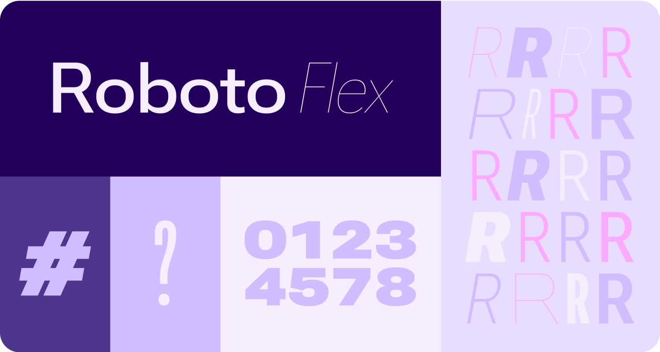
Roboto의 모든 인스턴스를 Roboto Flex로 바꿉니다. 시계 및 Material 3 Expressive 디자인 언어에 최적화된 기준 서체 스케일을 조정합니다.
가변 축, 가변 너비, 두께를 사용하여 대형 디스플레이 및 제목 텍스트의 스타일을 지정하여 스타일을 개선하고 작은 크기의 경우 더 많은 유용성과 가독성을 제공합니다.
Roboto Flex
Roboto Flex는 앱의 사용 사례에 맞는 가변 축 세트를 제공합니다.
조절 가능한 축
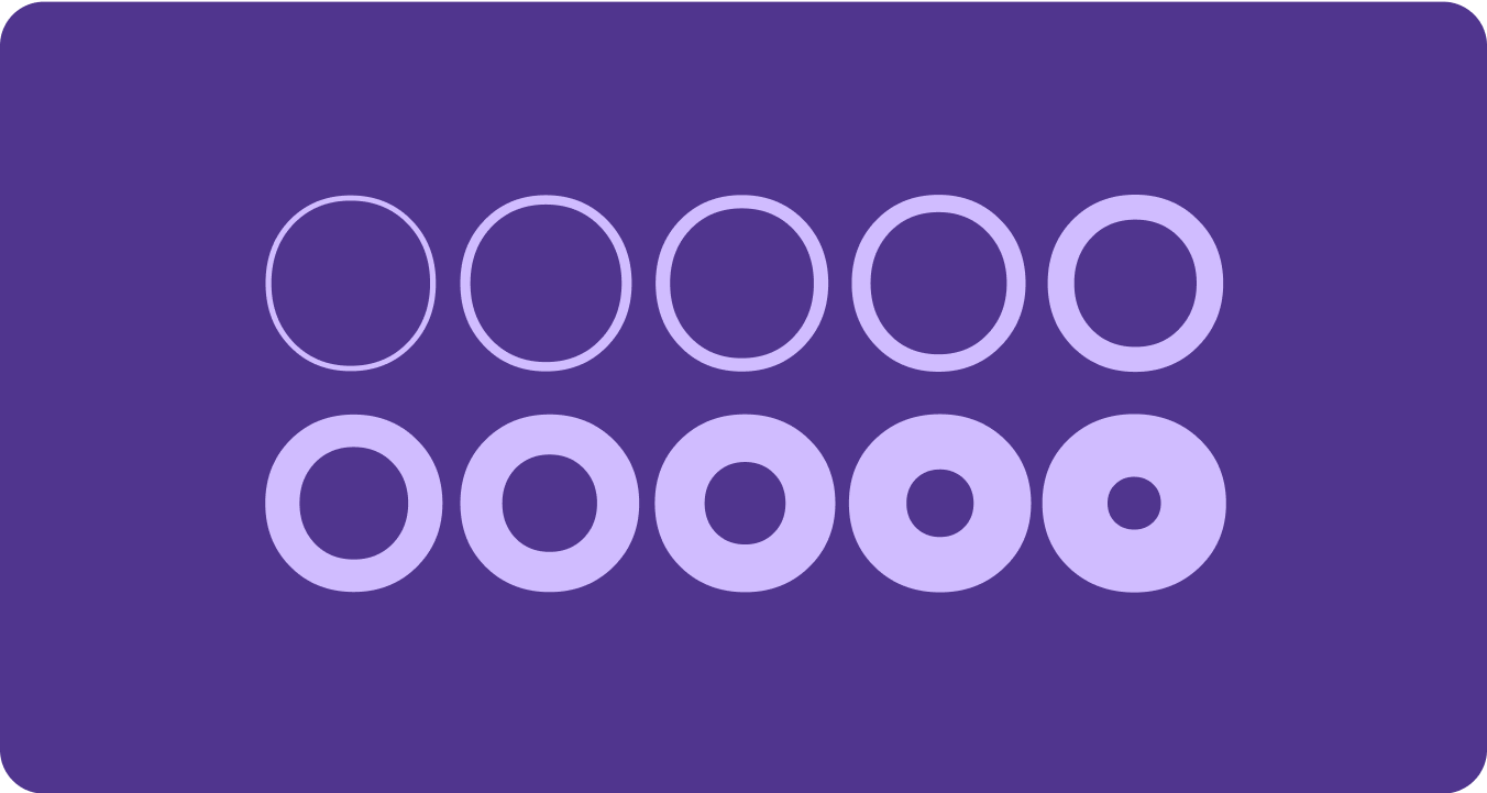
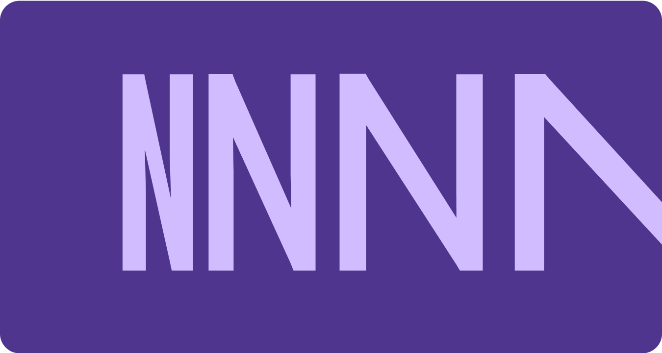
가변 글꼴에는 표현을 위한 다양한 가변 글꼴 속성이 있을 수 있지만 제품 디자인에 가장 적합한 두 가지 맞춤설정 가능한 스타일 속성 (또는 축)인 두께와 너비가 있습니다.
체중
두께는 특정 글꼴에서 서체의 획의 전체 두께를 정의하는 기본 속성입니다. 가장 일반적인 두께는 일반과 굵은 체이지만 두께는 매우 가벼운 것부터 매우 무거운 것까지 다양한 범위를 포함할 수 있습니다. 서체가 가변인 경우 완전하고 연속적인 획 두께 범위를 제공하므로 가중치 수는 사실상 무제한입니다.
주의사항
warning
주의
본문 텍스트에 너무 가벼운 굵기의 글꼴을 사용하지 않도록 주의하세요.
해상도가 낮은 디스플레이는 특히 작은 서체와 같은 섬세한 서체를 표시하는 데 어려움을 겪을 수 있습니다. 디스플레이 서체와 같이 큰 글꼴 크기에는 더 연한 두께를 사용합니다.
warning
주의
반대로 작은 크기에서 과도한 두께는 가독성에 영향을 줄 수 있습니다. 서체가 너무 두꺼우면 읽기 어려울 수 있습니다.
너비
너비는 서체의 문자가 가로 공간에 얼마나 차지하는지를 나타냅니다. 너비가 좁으면 줄당 더 많은 문자를 표시할 수 있지만 너비가 넓으면 더 개성 있는 스타일을 표현할 수 있습니다.
주의사항
check_circle
권장사항
너비를 줄이면 이름이나 긴 숫자와 같이 작은 크기에 더 많은 문자를 표시할 수 있습니다.
cancel
금지사항
더 넓은 스타일은 더 많은 공간을 차지하므로 앱 페이지 헤더와 같이 공간이 제한된 영역에는 사용하지 마세요.
이 페이지에 나와 있는 콘텐츠와 코드 샘플에는 콘텐츠 라이선스에서 설명하는 라이선스가 적용됩니다. 자바 및 OpenJDK는 Oracle 및 Oracle 계열사의 상표 또는 등록 상표입니다.
최종 업데이트: 2025-07-27(UTC)
[[["이해하기 쉬움","easyToUnderstand","thumb-up"],["문제가 해결됨","solvedMyProblem","thumb-up"],["기타","otherUp","thumb-up"]],[["필요한 정보가 없음","missingTheInformationINeed","thumb-down"],["너무 복잡함/단계 수가 너무 많음","tooComplicatedTooManySteps","thumb-down"],["오래됨","outOfDate","thumb-down"],["번역 문제","translationIssue","thumb-down"],["샘플/코드 문제","samplesCodeIssue","thumb-down"],["기타","otherDown","thumb-down"]],["최종 업데이트: 2025-07-27(UTC)"],[],[],null,["# Fonts\n\nReplace all instances of Roboto with Roboto Flex. Tailor a baseline type scale\nthat is optimized for the watch and the Material 3 Expressive design language.\n\nUsing variable axis, variable width and weight to curate how we style big\ndisplay and title text to elevate style and bring more utility and legibility\nfor smaller sizes.\n\nRoboto Flex\n-----------\n\n\nRoboto Flex offers a set of variable axis that serves your app's use cases. \n\n\u003cbr /\u003e\n\nAdjustable axes\n---------------\n\nWhile variable fonts can have a multitude of variable font attributes for\nexpression, there are two customizable stylistic attributes (or axes) that are\nmost applicable for product design: weight and width.\n\n### Weight\n\n\n[Weight](https://fonts.google.com/knowledge/choosing_type/exploring_typefaces_with_multiple_weights_or_grades) is the primary attribute that defines the overall thickness of a\ntypeface's strokes in any given font. The most common weights are regular and\nbold, but weights can cover extremes from the very light to the very heavy. If\nthe typeface is variable, it provides a full, continuous range of stroke\nthicknesses, making the number of weights effectively unlimited. \n\n\u003cbr /\u003e\n\n#### Things to remember\n\nwarning\n\n### Caution\n\nBe careful of using too light a weight type for body text.\nLower resolution displays can struggle with delicate, especially small\ntypography. Use lighter weights at larger font sizes, such as display\ntype. \nwarning\n\n### Caution\n\nConversely, excessive weight at smaller sizes may affect\nlegibility. Too thick a type may be difficult to read.\n\n### Width\n\n\n[Width](https://fonts.google.com/knowledge/glossary/width) is the result of how much horizontal space is taken up by a\ntypeface's characters. A narrow width allows more characters to fit per line\nwhile a wider width may offer more personality. \n\n\u003cbr /\u003e\n\n#### Things to remember\n\ncheck_circle\n\n### Do\n\nA thinner width can allow for more characters to fit at\nsmall sizes, such as name or a long number. \ncancel\n\n### Don't\n\nSince wider styles take up more space, avoid using them for\nareas with limited space, such as in the app page header."]]