Wear Material Theming은 Wear Material Design을 체계적으로 맞춤설정하여 브랜드에 반영하는 기능입니다. 색상 및 서체와 같은 UI 측면을 변경하기 시작하면 Wear Material 테마 설정 도구를 통해 사용자 환경 전체에 디자인 비전이 적용됩니다. 이 도구를 사용하면 맞춤설정이 가능한 모든 속성에 특정 값을 부여하여 디자인 워크플로와 코드 워크플로 간에 쉽게 전환할 수 있습니다. 속성값을 맞춤설정하면 제품의 Wear Material Theme이 생성됩니다.
Wear Material Theming 사용
Wear Material Theming은 테마 맞춤설정, 모의 디자인에 적용, 코드에서 사용이라는 세 가지 주요 작업으로 구성됩니다.
Wear Material Design에는 있는 그대로 사용할 수 있는 기본 테마가 함께 제공됩니다. 기본 테마를 맞춤설정하여 제품에 맞는 Material을 제작할 수 있습니다.
실제 테마 설정
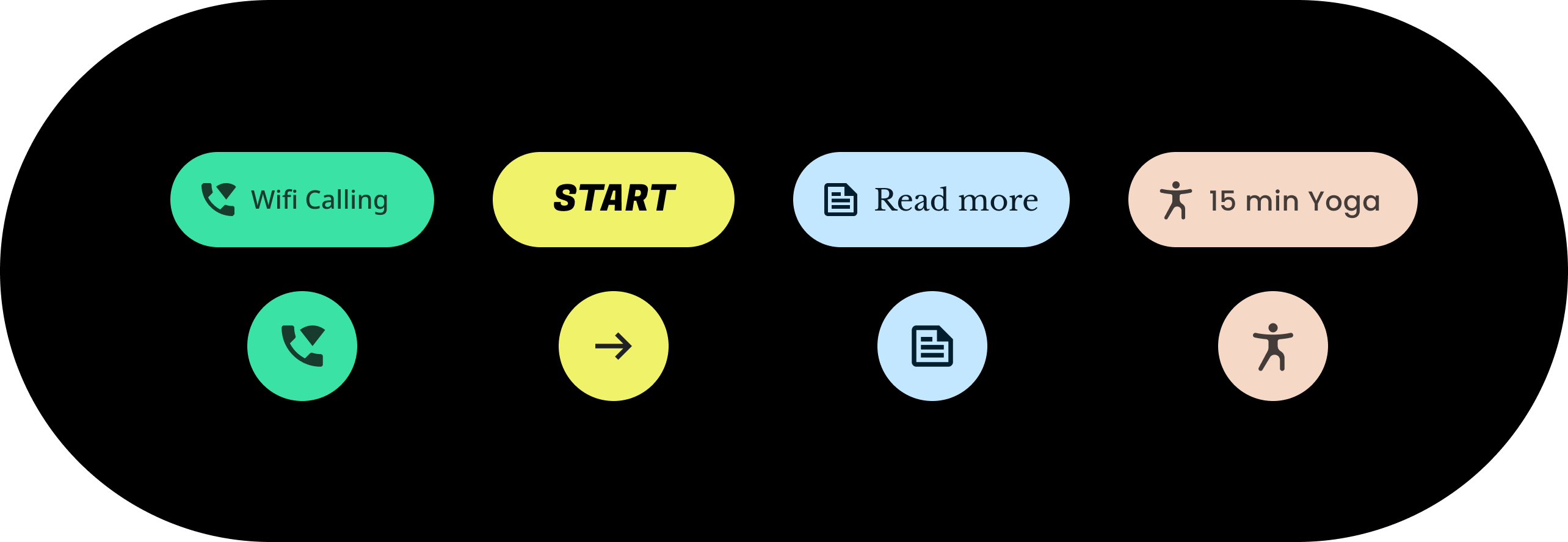
테마 설정은 칩과 같은 개별 구성요소를 비롯한 전체 UI에 영향을 줍니다. 다음 예는 칩 구성요소의 기본값을 맞춤설정하는 방법을 보여줍니다.
포함된 칩에는 특정 색상, 모양, 서체 모음의 값이 할당됩니다. 앱 스타일에 맞게 기본값을 조정하세요.
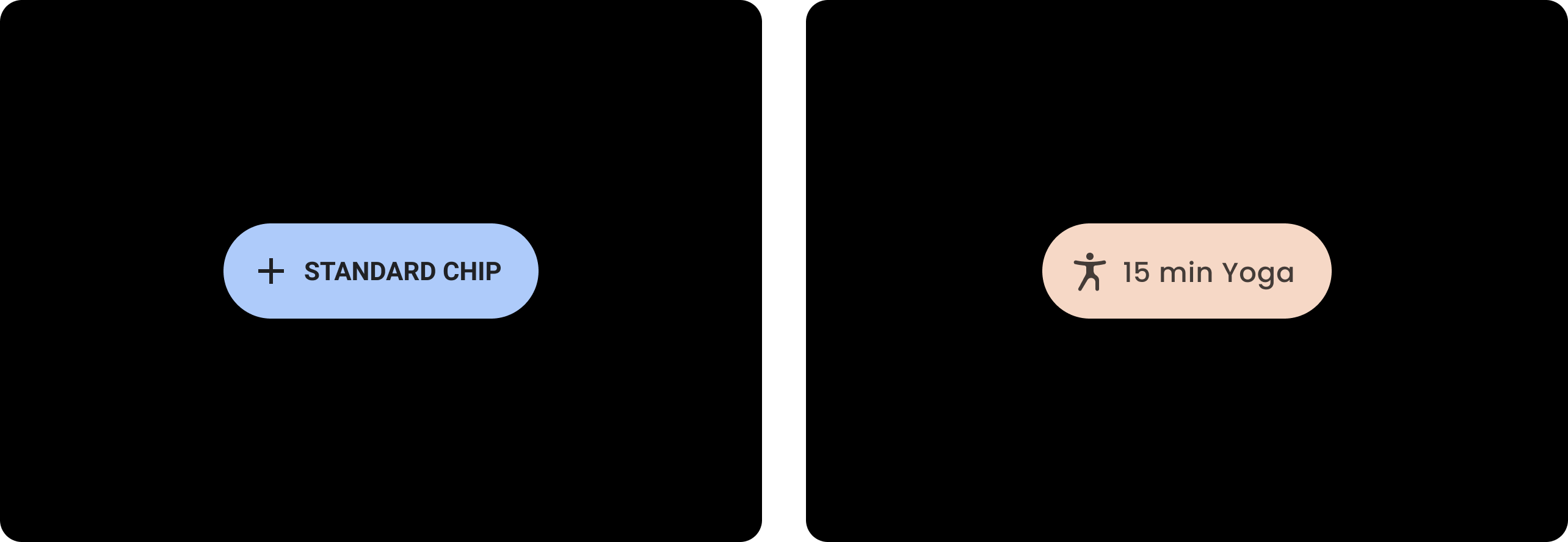
| 전
기본 스타일이 적용된 기준 Wear Material 칩 |
후
맞춤설정된 Wear Material 칩 |
색상
색상 시스템은 구성요소, 텍스트, 아이콘, 표면에 맞춤 색상 설정을 지원합니다. 다음과 같이 13가지 카테고리의 테마 색상을 설정할 수 있습니다.
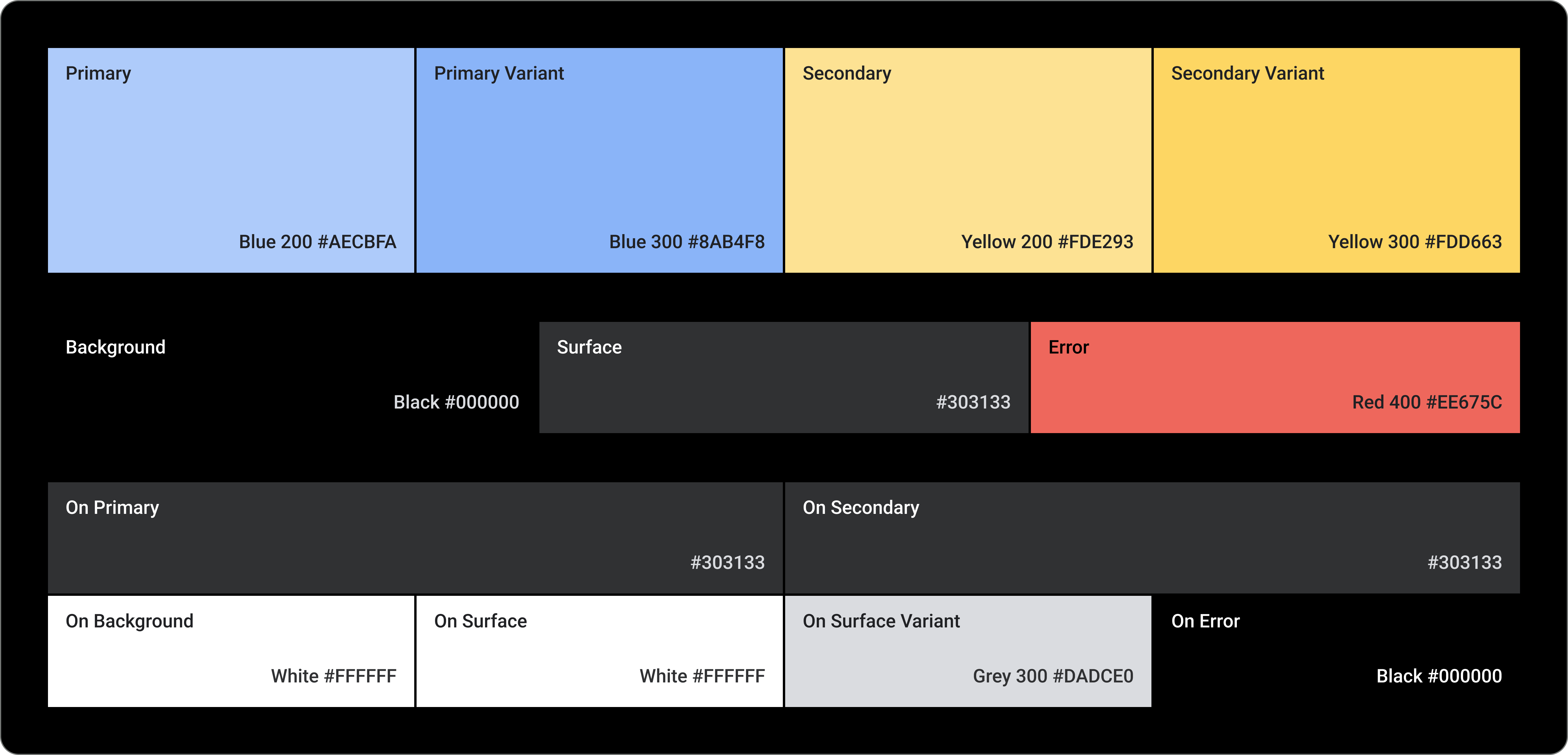
기본
기본 변형
보조
보조 변형
배경
노출 영역
오류
기본(대비)
보조(대비)
배경(대비)
표면(대비)
표면 변형(대비)
오류(대비)
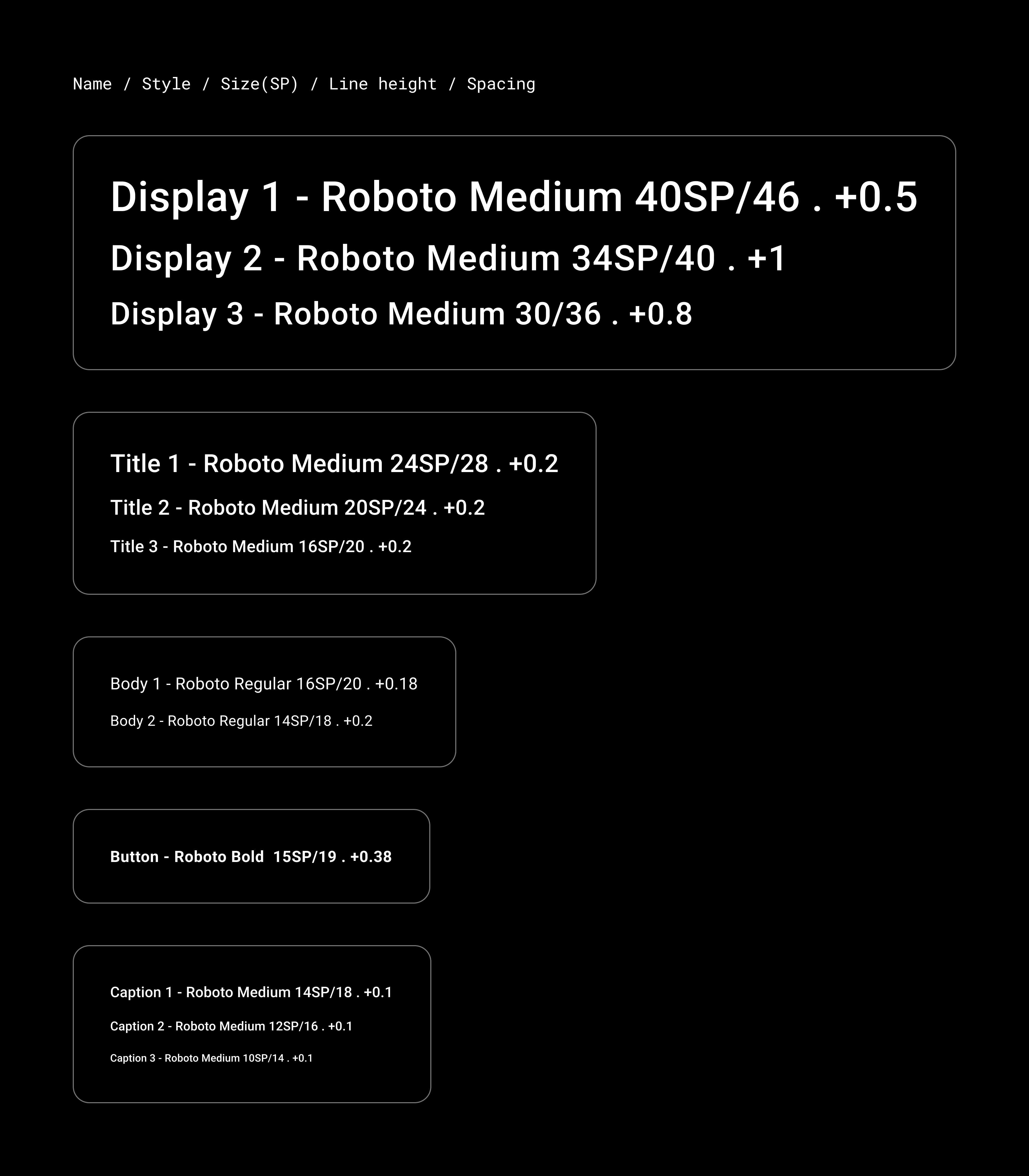
서체
서체 시스템은 함께 글꼴 크기를 형성하는 11개의 카테고리를 지원합니다. 이 서체 크기는 본문에서 버튼 텍스트까지 화면에 표시되는 다양한 서체 스타일과 크기를 결정합니다.
서체 속성은 서체 모음, 글꼴, 대소문자, 크기, 자간에 따라 맞춤설정할 수 있는 값으로 제어됩니다.