Wear OS용 Material 3 Expressive는 색상 역할에 서로 다른 색조, 채도, 색조 값을 할당하여 시각적 계층 구조를 설정하여 대담한 강조 색상을 중성 표면 색상과 효과적으로 구분합니다. 시스템에 기본, 보조, 3차 강조 역할이 포함되어 있어 표현 가능성을 향상할 뿐만 아니라 고유한 색상 선택을 통해 시각적 계층 구조를 더 세부적으로 제어할 수 있습니다. 이러한 의도적인 색상 사용은 테마 설정 시에도 시계 UI 내에서 일관되고 응집된 느낌을 보장합니다.
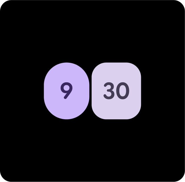
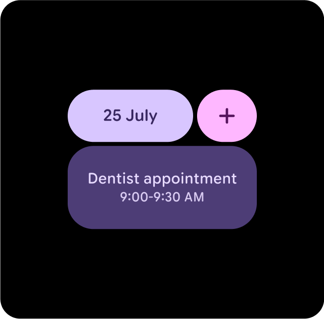
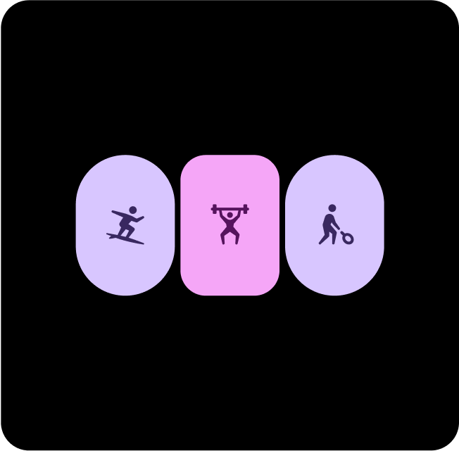
다양한 테마에서 다양한 레이아웃, 구성요소, UI를 사용하지만 적절한 색상 대비를 유지하는 예시
색상 페어링 및 레이어링
시각적 접근성을 유지하려면 의도한 쌍 색상 토큰에만 색상을 적용합니다. 색상을 부적절하게 조합하면 특히 동적 색상을 통해 색상이 조정되는 경우 시각적 접근성에 필요한 대비가 손상될 수 있습니다.
색상을 올바르게 페어링하고 레이어링
적절한 시각적 효과와 접근성을 보장하려면 올바른 토큰을 올바른 위치에 매핑해야 합니다. 색상 매핑이 잘못되면 의도치 않은 시각적 효과가 나타나고 접근성이 저하될 수 있습니다.
check_circle
권장사항
올바른 시각적 효과와 접근성을 보장하기 위해 색상 역할을 올바르게 페어링하고 레이어링합니다.
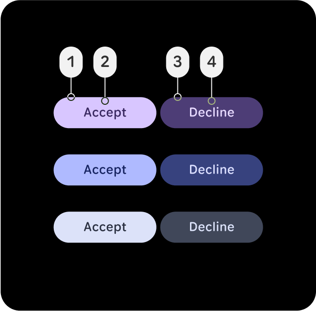
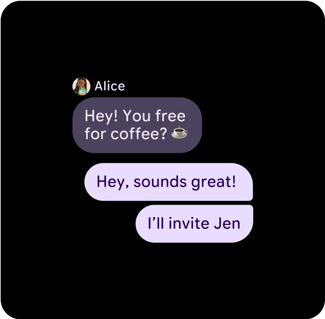
이 예시에서 (1) primary에 (2) on-primary가 있거나 (3) primary-container에 (4) on-primary 컨테이너가 있는 버튼은 대비 수준이 변경되더라도 읽기 쉬우며 대비율이 7:1 이상인 AAA 등급입니다.
cancel
금지사항
잘못된 색상 매핑은 의도하지 않은 시각적 효과를 일으키고 접근성을 저해할 수 있습니다.
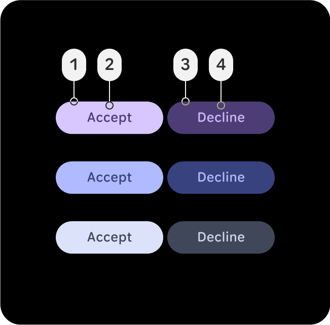
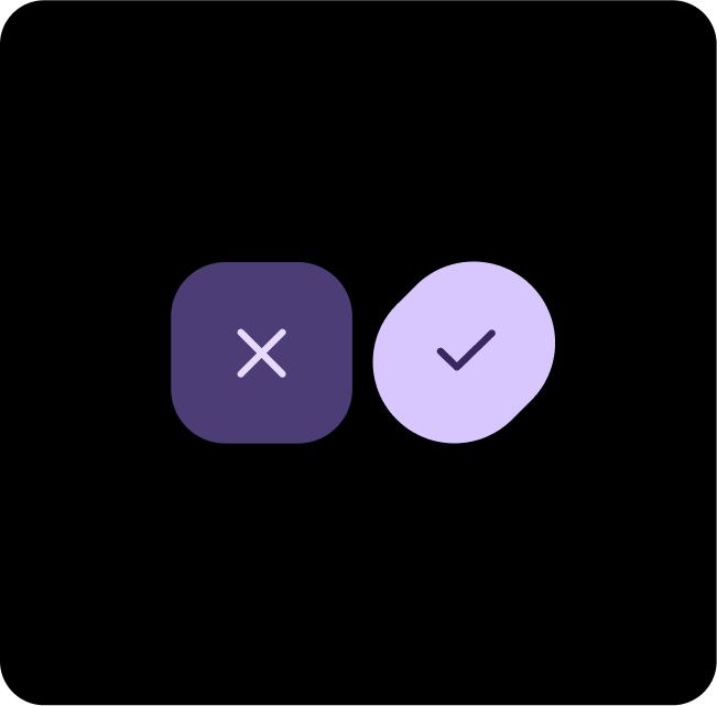
이 예시에서 (1) primary에 (2) primary-container가 있거나 (3) primary-container에 (4) primary-dim가 있는 버튼은 대비 수준이 바뀌면서 읽을 수 없게 되며 일반 텍스트의 최소 대비율 7:1을 따르지 않습니다. 이러한 대비 수준은 기본, 보조, 3차 역할에 적용됩니다.
추천 색상 조합
기본 + 기본 Dim
기본 작업에는 Primary를, 보조 항목에는 Primary-Dim을 사용하세요. 이렇게 하면 깊이가 생기면서도 기본 작업이 눈에 띄게 됩니다.
Primary-Dim + Tertiary
Primary-Dim을 사용하여 중요한 요소를 강조 표시하고 Tertiary를 사용하여 탭 응답과 같은 눈에 띄는 피드백을 제공합니다.
Primary + Secondary-Container
눈에 덜 띄는 콘텐츠에는 Secondary-Container를 사용하고, 눈에 띄고 주의를 끌 수 있도록 주요 요소에는 Primary를 적용합니다.
Primary + Primary-Container
기본 작업에는 Primary를, 보조 또는 보완 항목에는 Primary-Container를 사용하세요. 이렇게 하면 기본 작업이 눈에 띄면서도 깊이감을 줄 수 있습니다.
Primary-Dim + Tertiary-Dim
Primary-Dim을 사용하여 중요한 요소를 강조 표시하고 Tertiary-Dim을 사용하여 목표 달성 등 눈에 띄는 의견을 제공합니다.
3차 + 1차 + 2차 컨테이너
기본 작업이 무엇인지 명확하지 않은 경우 기본 작업에는 Tertiary와 Primary를 조합하고 보조 작업에는 Secondary-Container를 사용하세요.
보조 + Primary-Container
Primary-Dim과 Secondary는 동일하게 중요한 두 가지 옵션이나 컨테이너를 표시하면서도 두 옵션 사이에 대비를 유지하려는 경우에 사용합니다.
Primary + Tertiary + Primary-Container
기본 작업이 무엇인지 명확하지 않은 경우 기본 작업에는 Tertiary와 Primary를 조합하고 보조 작업에는 Primary-Container를 사용하세요.
Primary + Tertiary-Dim
기본 작업에는 Primary를, 보조 항목에는 Primary Dim을 사용하세요. 이렇게 하면 깊이감을 더하는 동시에 기본 액션이 눈에 띄게 됩니다.
이 페이지에 나와 있는 콘텐츠와 코드 샘플에는 콘텐츠 라이선스에서 설명하는 라이선스가 적용됩니다. 자바 및 OpenJDK는 Oracle 및 Oracle 계열사의 상표 또는 등록 상표입니다.
최종 업데이트: 2025-07-27(UTC)
[[["이해하기 쉬움","easyToUnderstand","thumb-up"],["문제가 해결됨","solvedMyProblem","thumb-up"],["기타","otherUp","thumb-up"]],[["필요한 정보가 없음","missingTheInformationINeed","thumb-down"],["너무 복잡함/단계 수가 너무 많음","tooComplicatedTooManySteps","thumb-down"],["오래됨","outOfDate","thumb-down"],["번역 문제","translationIssue","thumb-down"],["샘플/코드 문제","samplesCodeIssue","thumb-down"],["기타","otherDown","thumb-down"]],["최종 업데이트: 2025-07-27(UTC)"],[],[],null,["# Apply color\n\nMaterial 3 Expressive for Wear OS establishes visual hierarchy by assigning\ndifferent hue, chroma, and tone values to its color roles, effectively\ndistinguishing bold accent colors from neutral surface colors. The system's\ninclusion of primary, secondary, and tertiary accent roles not only enhances\nexpressive possibilities but also offers more granular control over visual\nhierarchy through distinct color choices. This intentional use of color ensures\na consistent and cohesive feel within the Watch UI, even with theming.\nExample of different layouts, components and UIs in various themes, but\nstill maintaining adequate color contrast.\n\nPair and layer colors\n---------------------\n\nTo maintain visual accessibility, apply colors only in the intended pairs color\ntokens. Combining colors improperly may break contrast necessary for visual\naccessibility, particularly when colors are adjusted through dynamic color.\n\n### Pair and layer colors correctly\n\nIn order to ensure proper visuals and accessibility, make sure you are mapping\nthe correct token to its correct position. An improper color mapping can lead to\nunintended visuals and break accessibility. \ncheck_circle\n\n### Do\n\n**Pair and layer color roles correctly to ensure proper\nvisuals and accessibility.**\n\nIn this example, buttons with (2)\n**on-primary** on (1) **primary** or (4) **on-primary** -container\non (3) **primary-container** stay legible as the contrast level changes\nand have an AAA rating with a contrast ratio of 7:1 or more. \ncancel\n\n### Don't\n\n**Improper color mappings can lead to unintended visuals\nand break accessibility.**\n\nIn this example, buttons with (2)\n**primary-container** on (1) **primary** or (4) **primary-dim** on\n(3) **primary-container** become illegible as contrast levels shift and\ndon't follow the 7:1 contrast ratio minimum for normal text. These contrast\nlevels apply to primary, secondary and tertiary roles.\n\n### Recommended color pairings\n\n\n**Primary + Primary Dim**\n\nUse Primary for main actions, and Primary-Dim for complementary items. This\ncreates depth while ensuring the primary action stands out. \n\n**Primary-Dim + Tertiary**\n\nUse Primary-Dim to highlight important elements and Tertiary to provide standout\nfeedback, such as tap responses. \n\n**Primary + Secondary-Container**\n\nUse Secondary-Container for less prominent content, while Primary is applied to\nkey elements to ensure they stand out and grab attention.\n\n\u003cbr /\u003e\n\n\n**Primary + Primary-Container**\n\nUse Primary for main actions, and Primary-Container for complementary or\nsecondary items. This creates depth while ensuring the primary action stands\nout. \n\n**Primary-Dim + Tertiary-Dim**\n\nUse Primary-Dim to highlight important elements and Tertiary-Dim to provide\nstandout feedback, such as a goal being met. \n\n**Tertiary + Primary + Secondary-Container**\n\nWhen it's not clear what the main action is, use a combination of Tertiary and\nPrimary for a main actions and Secondary-Container for a complementary actions.\n\n\u003cbr /\u003e\n\n\n**Secondary + Primary-Container**\n\nUse Primary-Dim and Secondary when you want to show two equally as important\noptions or containers, but still have contrast between the two. \n\n**Primary + Tertiary + Primary-Container**\n\nWhen it's not clear what the main action is, use a combination of Tertiary and\nPrimary for a main actions and Primary-Container for a complementary actions. \n\n**Primary + Tertiary-Dim**\n\nUse Primary for main actions and Primary Dim for complementary items. This\ncreates depth while helping the primary action to stand out.\n\n\u003cbr /\u003e"]]