Responsive and optimized
Stay organized with collections
Save and categorize content based on your preferences.

Apps that are responsive and optimized utilize responsive layouts that
automatically adapt to different screen sizes, offering some additional value to
users and providing a productive, engaging user experience.
Add value through responsive design
Responsive layouts dynamically format and position elements such as buttons,
text fields, and dialogs for an optimal user experience. Automatically offer
users of your app additional value on larger screens by utilizing responsive
design practices. Whether it's more text visible at a glance, more actions on
screen, or larger, more accessible tap targets, responsive practices provide an
enhanced experience for users of larger screens.

Build responsive apps and tiles for Wear OS
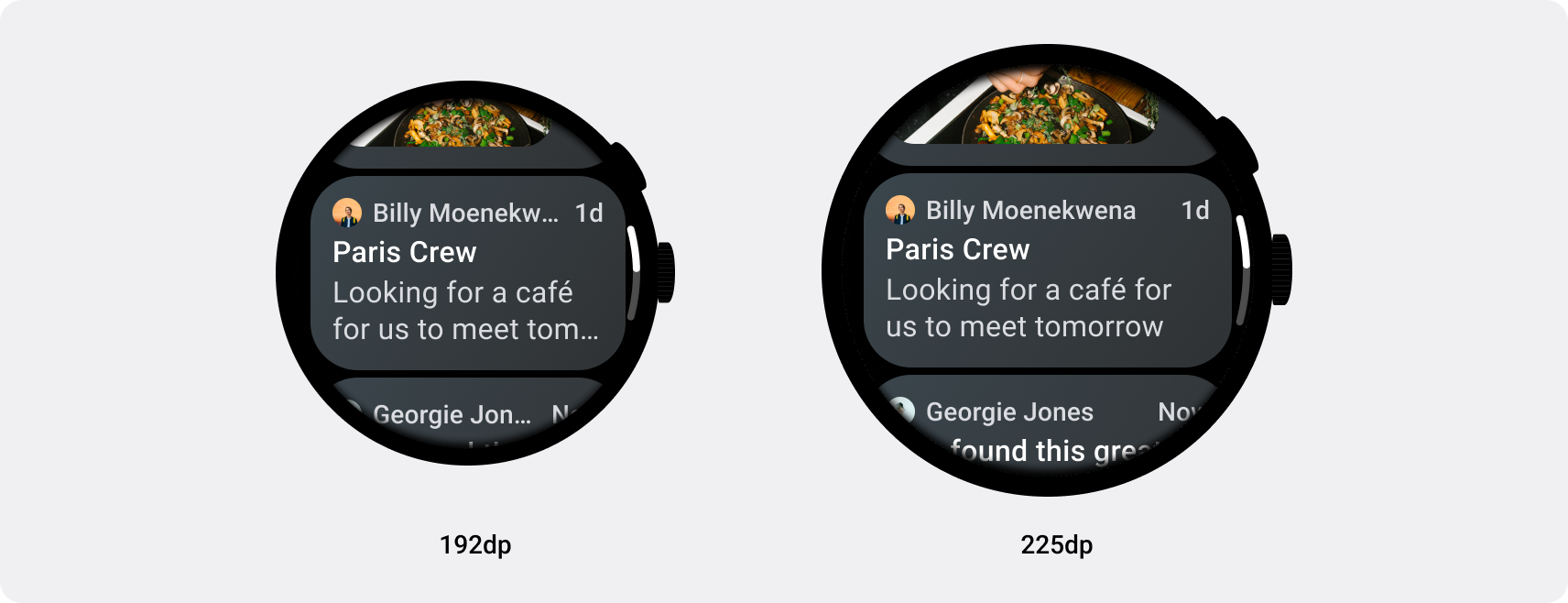
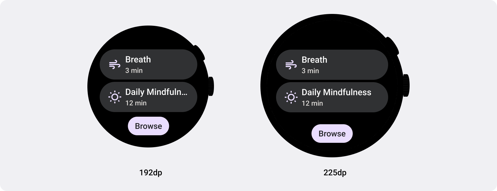
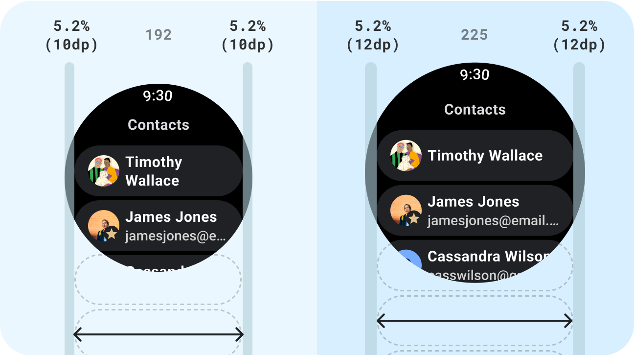
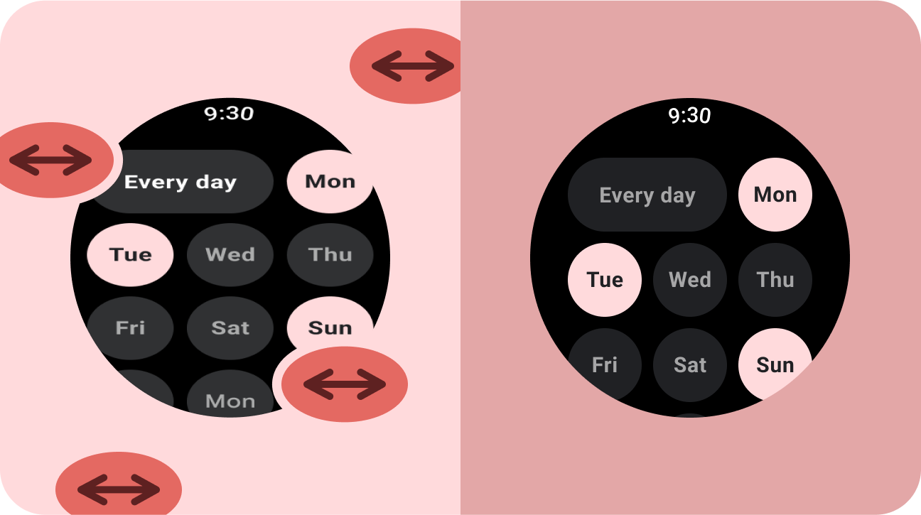
Responsive UIs stretch and change to make the best possible use of all available
screen space, no matter what size screen they're rendered on. When designing
responsive layouts on a round screen, scrolling and non-scrolling views each
have unique requirements to maintain UI element scaling, as well as preserve a
balanced layout and composition. For scrolling views, use percentages to
define all top, bottom, and side margins to avoid clipping and provide
proportional scaling of elements. For non-scrolling views, use percentages
and vertical constraints for all margins. That way, the main content in the
middle can stretch to fill the available area.
See the Compose and Tiles implementation guidance for responsive
layouts.
check_circle
Do
- Use standard components which are designed for
adaptation.
- Utilize adaptive layouts which adapt smoothly across
screen sizes.
cancel
Don't
- Stretch UI elements (text fields, buttons, dialogs)
to fill extra space.
- Increase the sizes of fonts (unless they're
serving a primarily graphic purpose).
Next step: adaptive and differentiated
Apps that are adaptive and differentiated create a user experience that
isn't possible on devices with smaller screens.
Get started
Content and code samples on this page are subject to the licenses described in the Content License. Java and OpenJDK are trademarks or registered trademarks of Oracle and/or its affiliates.
Last updated 2025-05-20 UTC.
[[["Easy to understand","easyToUnderstand","thumb-up"],["Solved my problem","solvedMyProblem","thumb-up"],["Other","otherUp","thumb-up"]],[["Missing the information I need","missingTheInformationINeed","thumb-down"],["Too complicated / too many steps","tooComplicatedTooManySteps","thumb-down"],["Out of date","outOfDate","thumb-down"],["Samples / code issue","samplesCodeIssue","thumb-down"],["Other","otherDown","thumb-down"]],["Last updated 2025-05-20 UTC."],[],[],null,["# Responsive and optimized\n\nApps that are **responsive and optimized** utilize responsive layouts that\nautomatically adapt to different screen sizes, offering some additional value to\nusers and providing a productive, engaging user experience.\n\nAdd value through responsive design\n-----------------------------------\n\nResponsive layouts dynamically format and position elements such as buttons,\ntext fields, and dialogs for an optimal user experience. Automatically offer\nusers of your app additional value on larger screens by utilizing responsive\ndesign practices. Whether it's more text visible at a glance, more actions on\nscreen, or larger, more accessible tap targets, responsive practices provide an\nenhanced experience for users of larger screens.\n\n\nBuild responsive apps and tiles for Wear OS\n-------------------------------------------\n\nResponsive UIs stretch and change to make the best possible use of all available\nscreen space, no matter what size screen they're rendered on. When designing\nresponsive layouts on a round screen, scrolling and non-scrolling views each\nhave unique requirements to maintain UI element scaling, as well as preserve a\nbalanced layout and composition. For [scrolling views](/design/ui/wear/guides/foundations/canonical-adaptive-layouts#scrolling), use percentages to\ndefine all top, bottom, and side margins to avoid clipping and provide\nproportional scaling of elements. For [non-scrolling views](/design/ui/wear/guides/foundations/canonical-adaptive-layouts#non-scrolling), use percentages\nand vertical constraints for all margins. That way, the main content in the\nmiddle can stretch to fill the available area.\n\nSee the [Compose](/training/wearables/compose/screen-size#responsive-layouts) and [Tiles](/training/wearables/tiles/screen-size#responsive-layouts) implementation guidance for responsive\nlayouts. \ncheck_circle\n\n### Do\n\n- Use standard components which are designed for adaptation.\n- Utilize adaptive layouts which adapt smoothly across screen sizes. \ncancel\n\n### Don't\n\n- Stretch UI elements (text fields, buttons, dialogs) to fill extra space.\n- Increase the sizes of fonts (unless they're serving a primarily graphic purpose).\n\nNext step: adaptive and differentiated\n--------------------------------------\n\nApps that are **adaptive and differentiated** create a user experience that\nisn't possible on devices with smaller screens.\n\n[Get started](/design/ui/wear/guides/foundations/larger-screens-differentiated)"]]