
선택 도구는 사용자가 특정 데이터를 선택하고 설정하는 데 도움이 됩니다.
선택 도구
선택 도구는 사용자가 제한된 수의 항목 중에서 선택할 수 있도록 하는 데 사용해야 합니다.
기본적으로 항목은 양방향으로 무한 반복됩니다. 목록의 순서가 중요하거나 빠른 스와이프로 사용자가 첫 번째 요소와 마지막 요소에 도달할 수 있도록 하려면 이 동작을 사용 중지하는 것이 좋습니다.
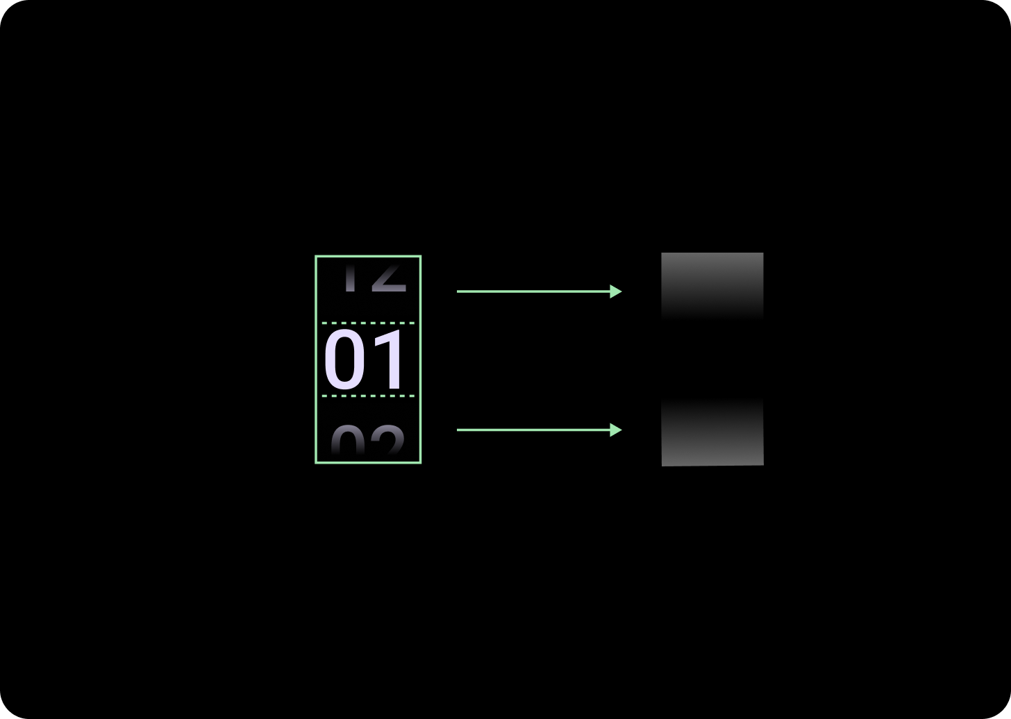
분석
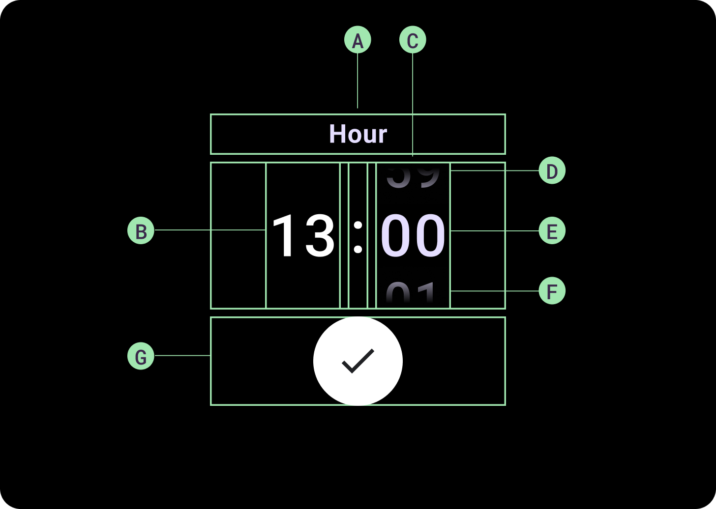
분석
A. 비활성 열
B. 콜론 시점
C. 선택 도구 열
D. 인기 콘텐츠
E. 중간 콘텐츠
F. 하단 콘텐츠
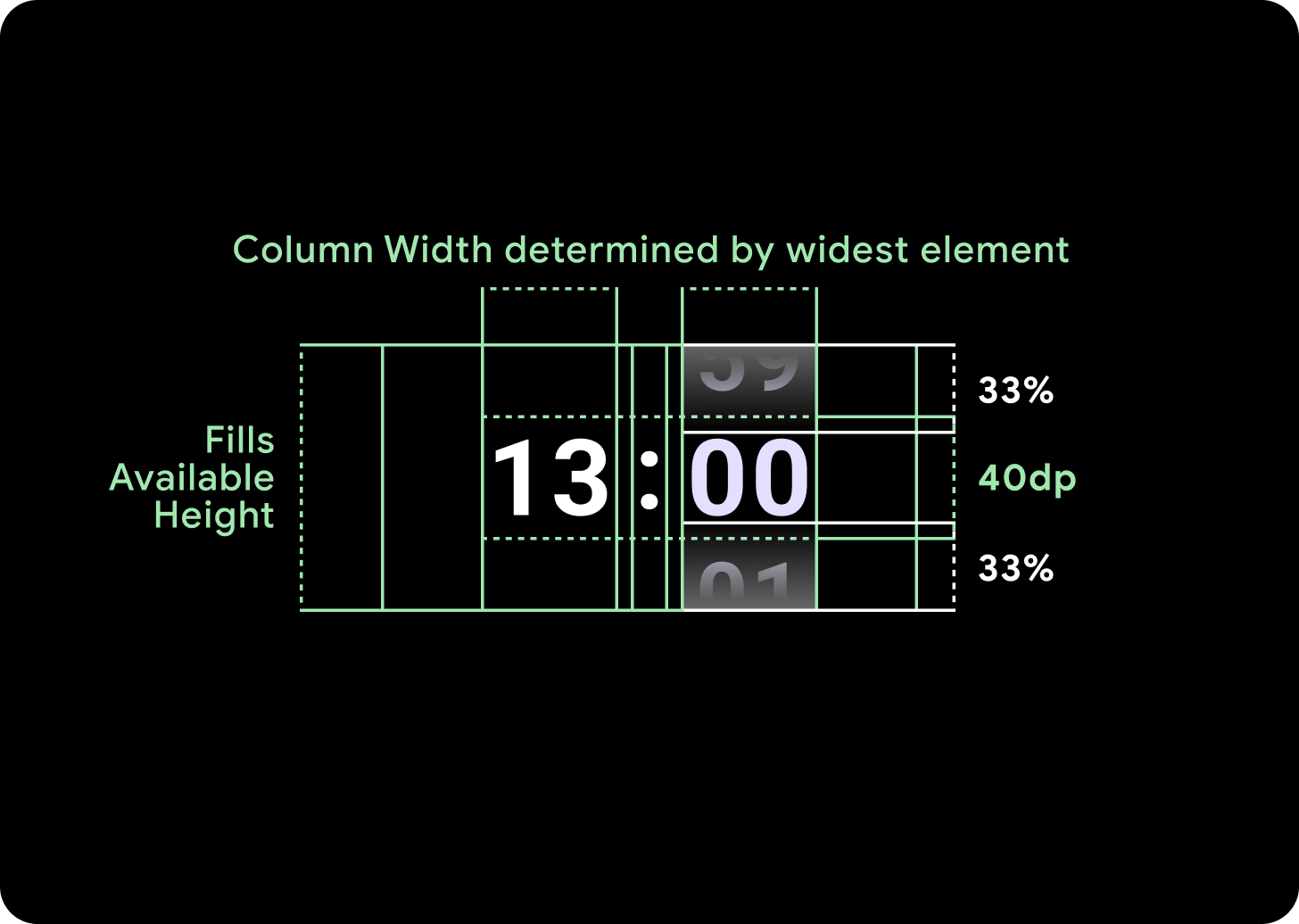
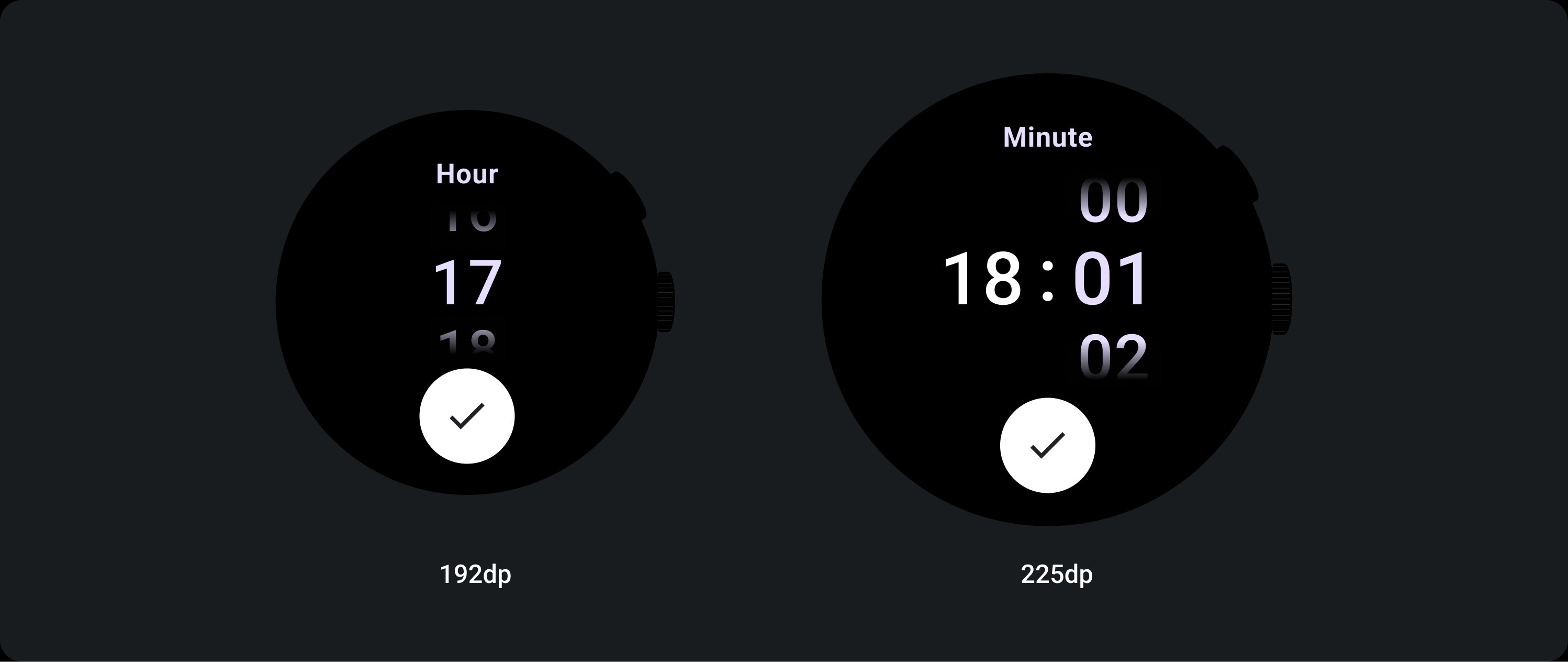
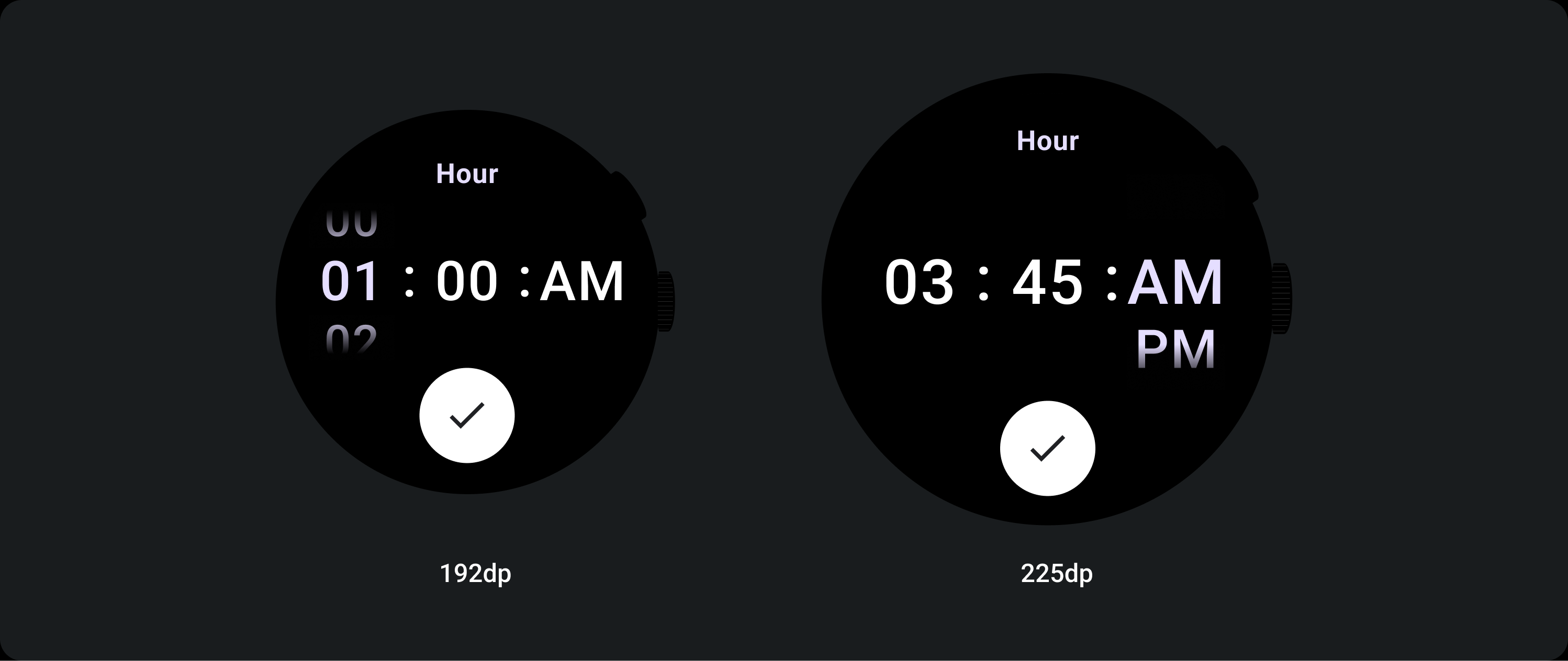
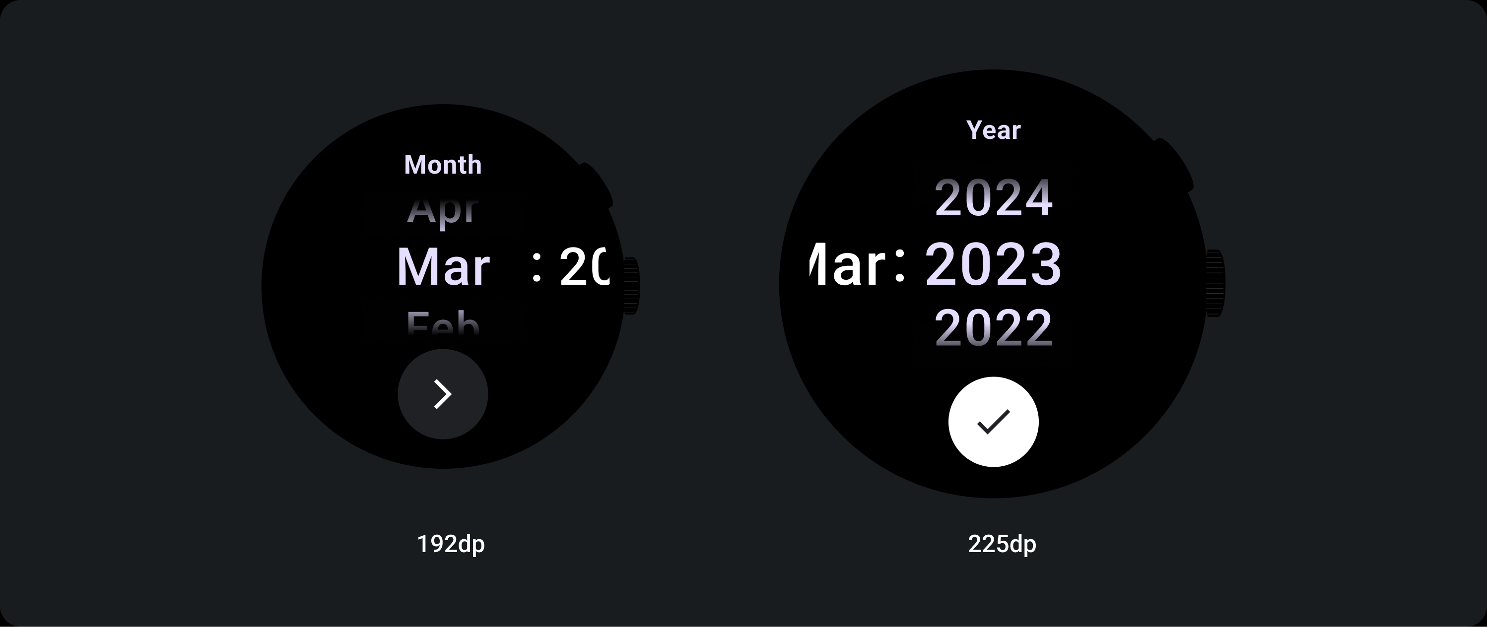
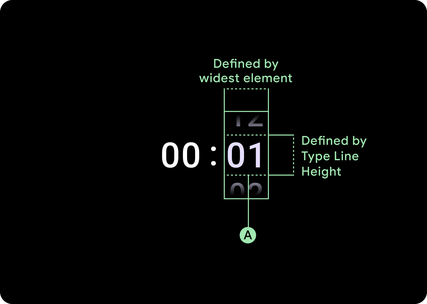
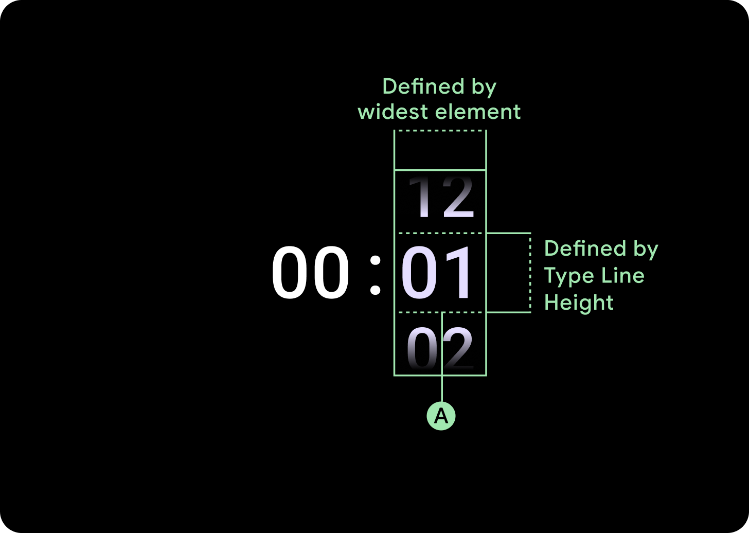
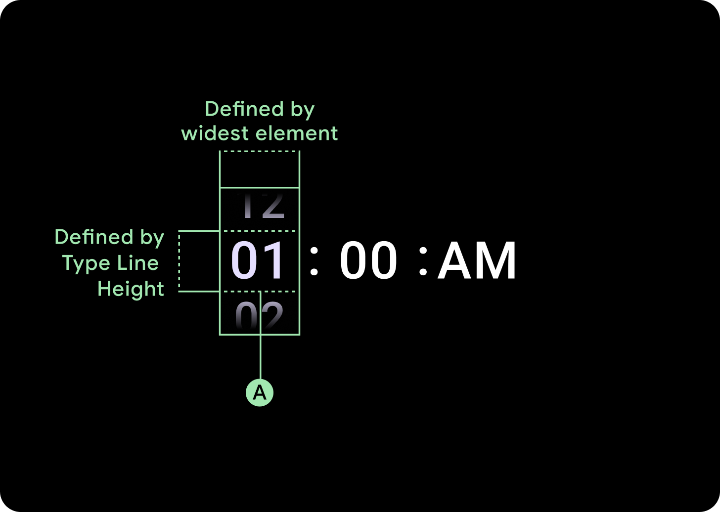
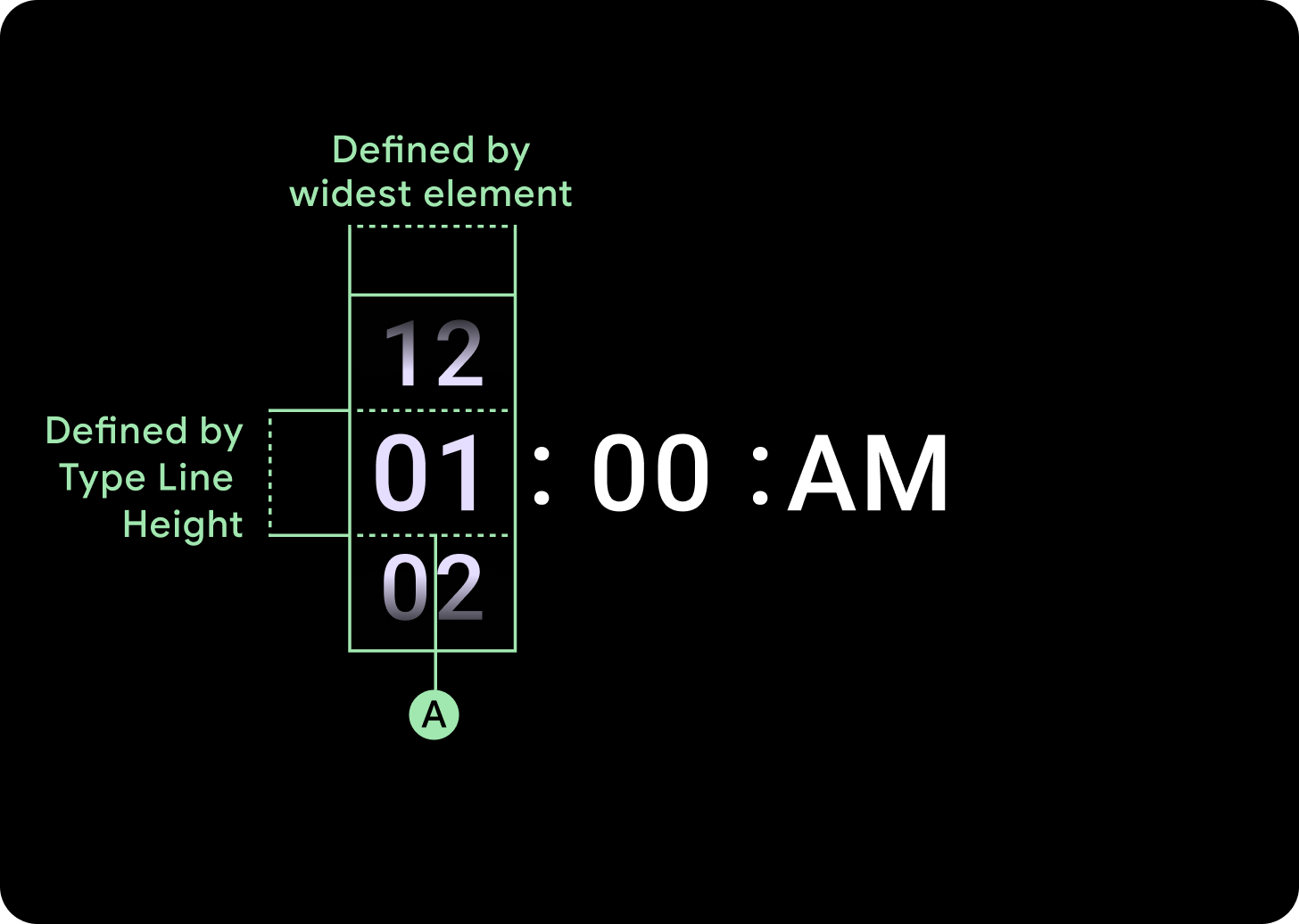
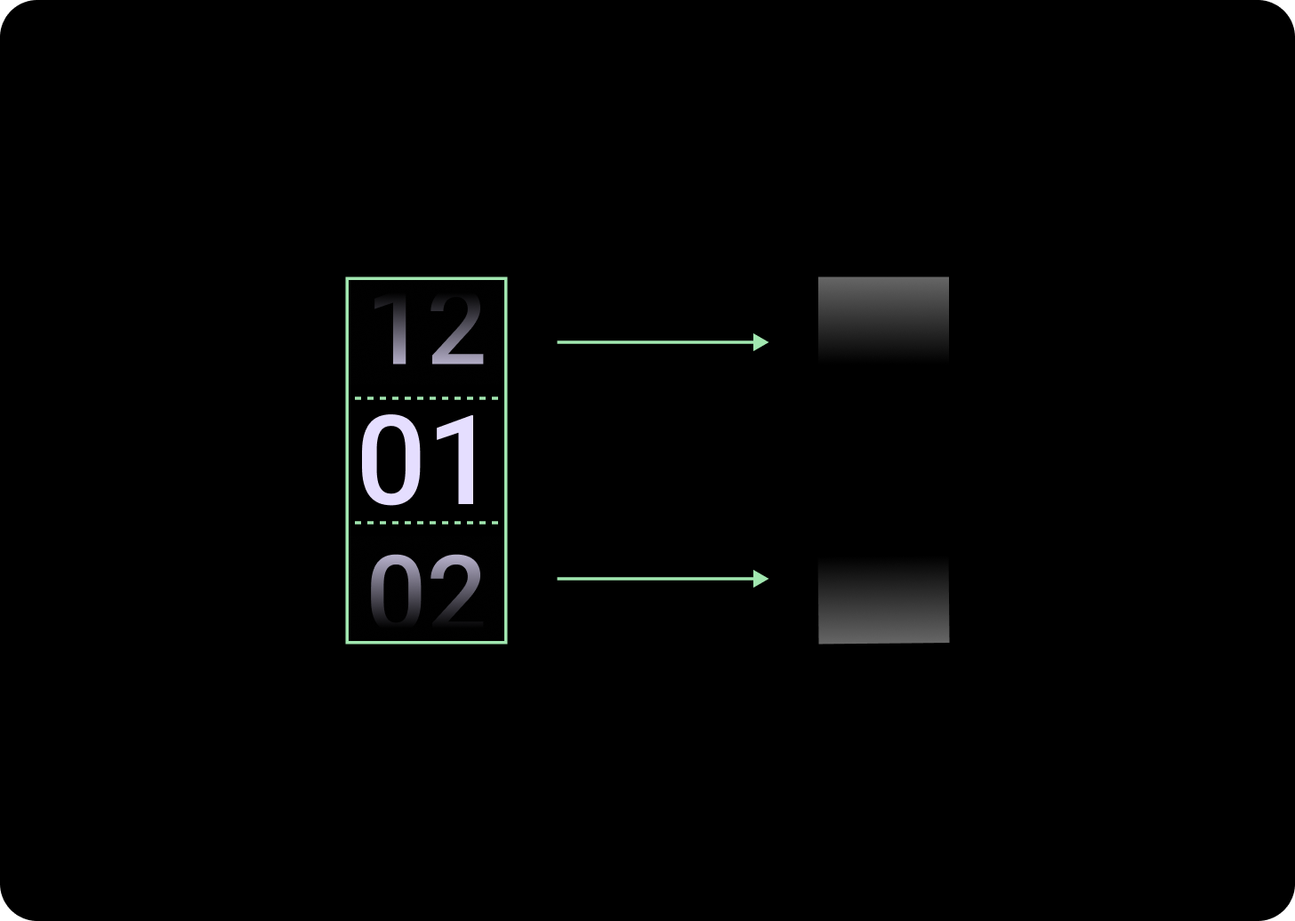
너비 및 높이
선택 도구 그룹이 사용 가능한 높이와 너비를 채웁니다. 선택 도구 열에는 4가지 레이아웃 옵션이 있습니다. 각 레이아웃은 가운데에 배치되며 사용 가능한 높이를 채웁니다. 열 너비는 글꼴에 필요한 자릿수를 수용하는 데 필요한 너비로 정의됩니다. 날짜 선택 도구는 예외로, 가로로 화면을 채우고 가장자리에서 블러 처리됩니다.
예를 들어 숫자는 '00'의 너비를 계산한 다음 너비를 설정합니다. 텍스트 필드의 경우(예: 월 필드) 'MMM'(라틴 알파벳에서 가장 넓은 문자)의 너비로 계산됩니다. 따라서 너비와 높이 (사용된 서체의 줄 높이)는 사용된 서체의 영향을 받습니다.
선택 도구 항목의 크기는 브레이크포인트에 따라 다릅니다.
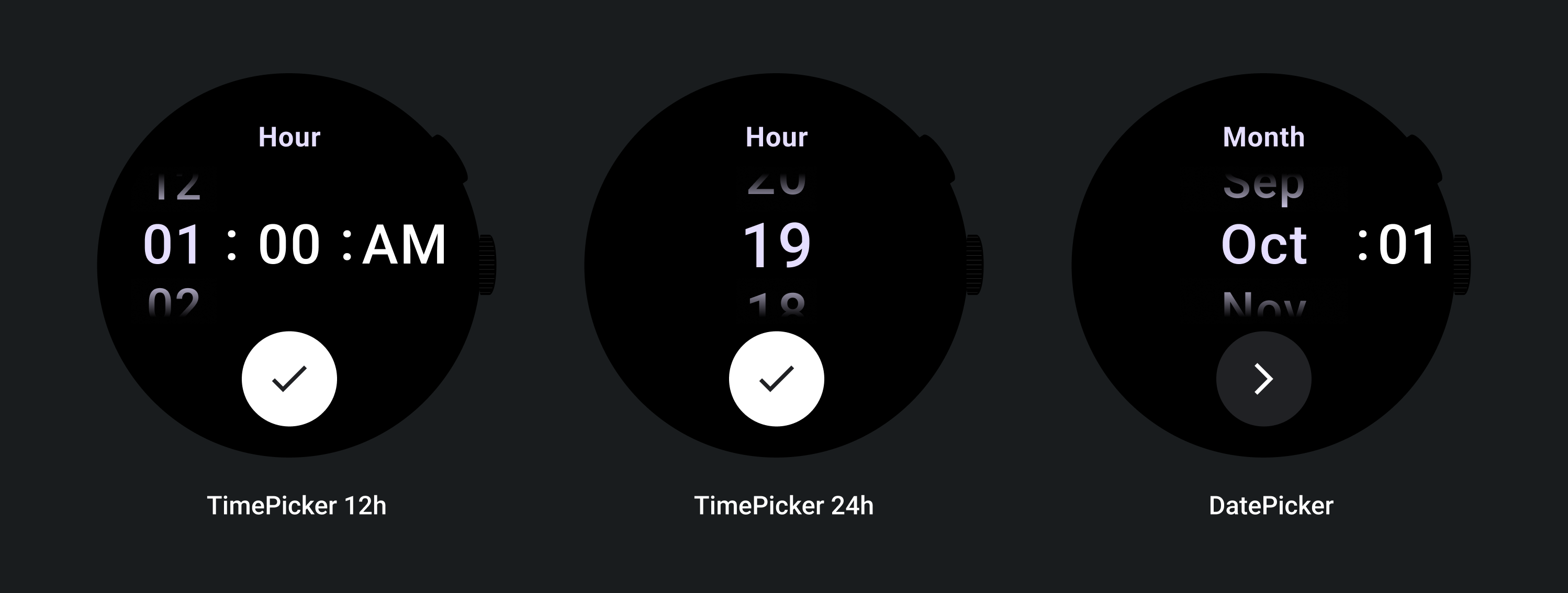
사용
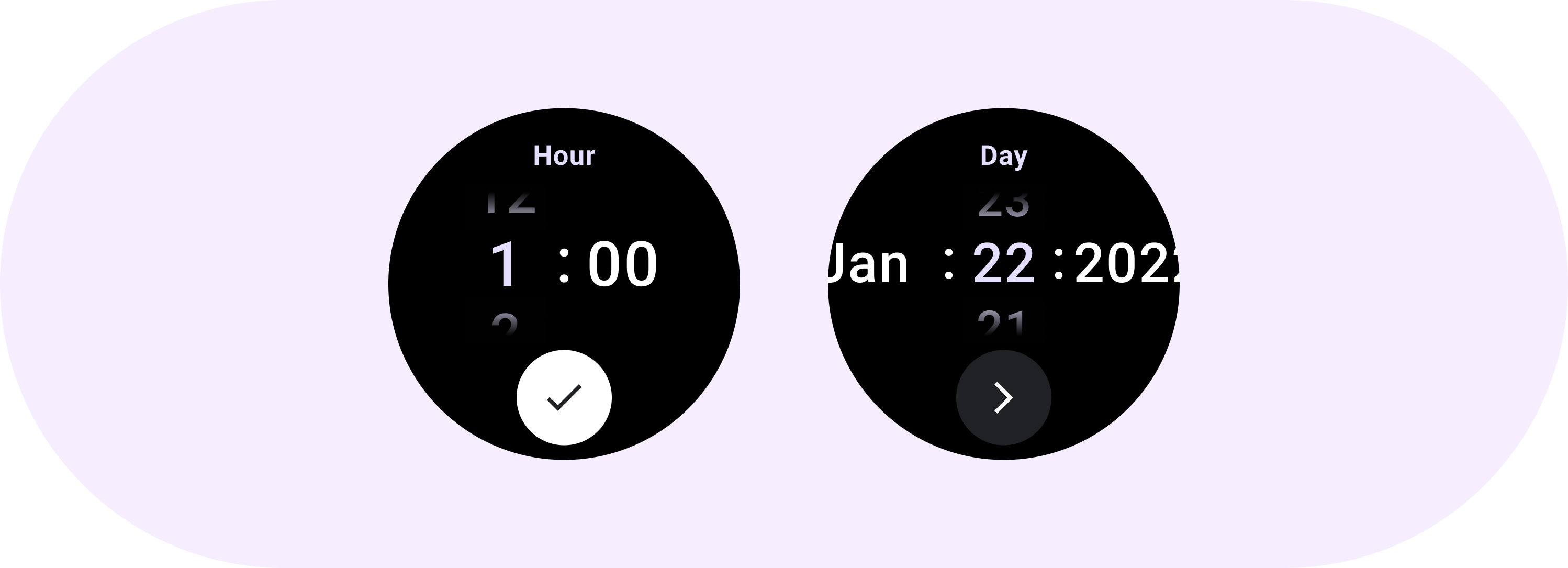
날짜 및 시간 선택 도구의 다음 예를 참고하세요.
사전 빌드된 날짜 및 시간 선택 도구 구현은 GitHub의 Horologist 라이브러리를 참고하세요.
사용자가 여러 선택 도구에서 여러 부분으로 구성된 값을 선택하는 유사한 환경을 만들려면 내장된 PickerGroup 구성요소를 사용하세요. 이 객체는 포커스 코디네이터 객체를 사용하여 올바른 선택 도구 요소에 포커스를 할당합니다.
적응형 레이아웃
TimePicker 24H
TimePicker 12H
날짜 선택 도구
대응하는 동작
텍스트 크기 증가
225+ 브레이크포인트를 지나면 선택 도구 요소의 글꼴 크기가 변경됩니다. 지연 스크롤 열 내의 상단 및 하단 사본은 중간 사본과 마찬가지로 (A)를 조정합니다. 다음은 몇 가지 예입니다.
2열 레이아웃
225dp 단위 아래 브레이크포인트
글꼴: 디스플레이 2
225dp 중단점 초과
글꼴: 디스플레이 1
3열 레이아웃
225dp 단위 아래 브레이크포인트
글꼴: 디스플레이 3
225dp 중단점 이상
글꼴: 디스플레이 2
그라데이션 크기 증가
선택 도구 열의 그라데이션은 사용 가능한 공간에 따라 높이가 정의됩니다. 상단 그라데이션과 하단 그라데이션은 모두 사용 가능한 높이의 3분의 1 (33%)로 설정됩니다. 즉, 사용 가능한 각 화면 크기에서 그라데이션이 비례하여 조정됩니다. 열 레이아웃과 무관하게 표시됩니다.
225dp 단위 아래 브레이크포인트
크기: 열 높이의 33%
225dp 중단점 이상
크기: 열 높이의 33%
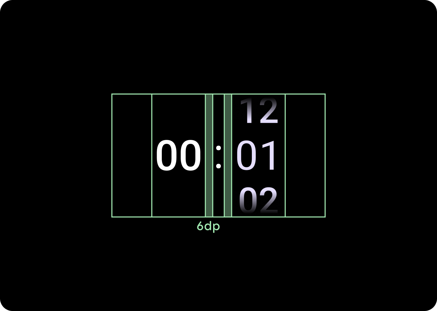
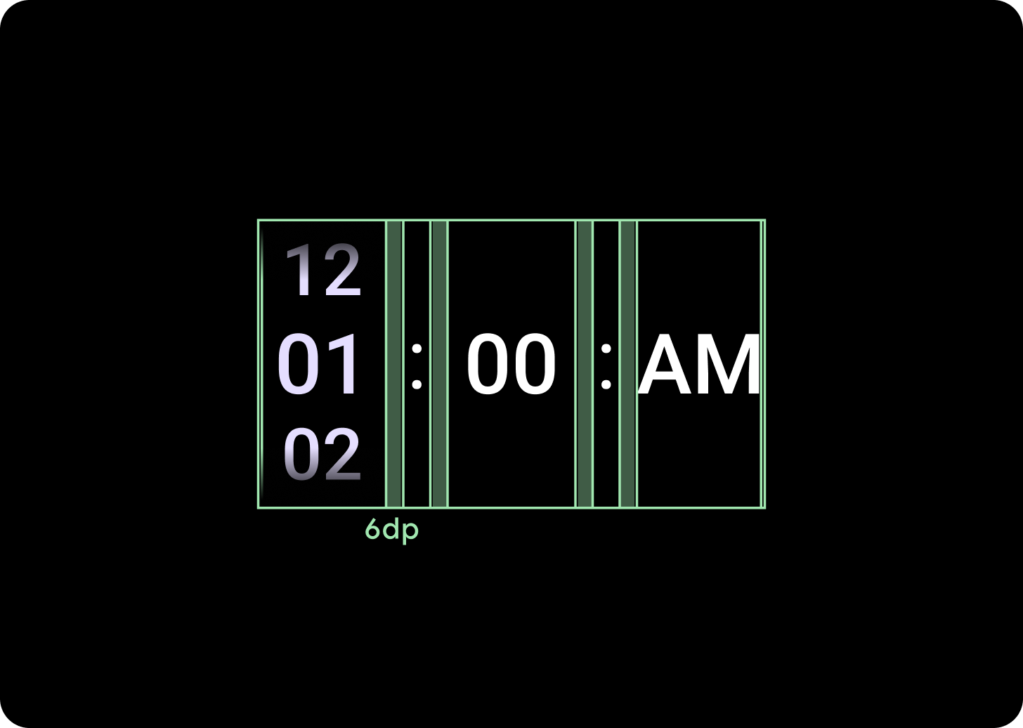
열 간격 늘리기
열 간격은 225+ 중단점 이후 2dp 또는 4dp에서 시작하여 6dp로 늘어납니다. 선택한 레이아웃(2열 또는 3열 레이아웃)에 따라 다릅니다.
2열 레이아웃
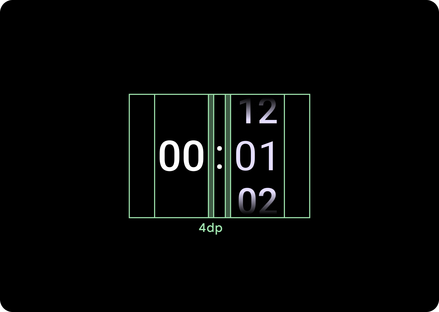
225dp 단위 아래 브레이크포인트
4dp 열 간격
225dp 중단점 이상
6dp 열 간격
3열 레이아웃
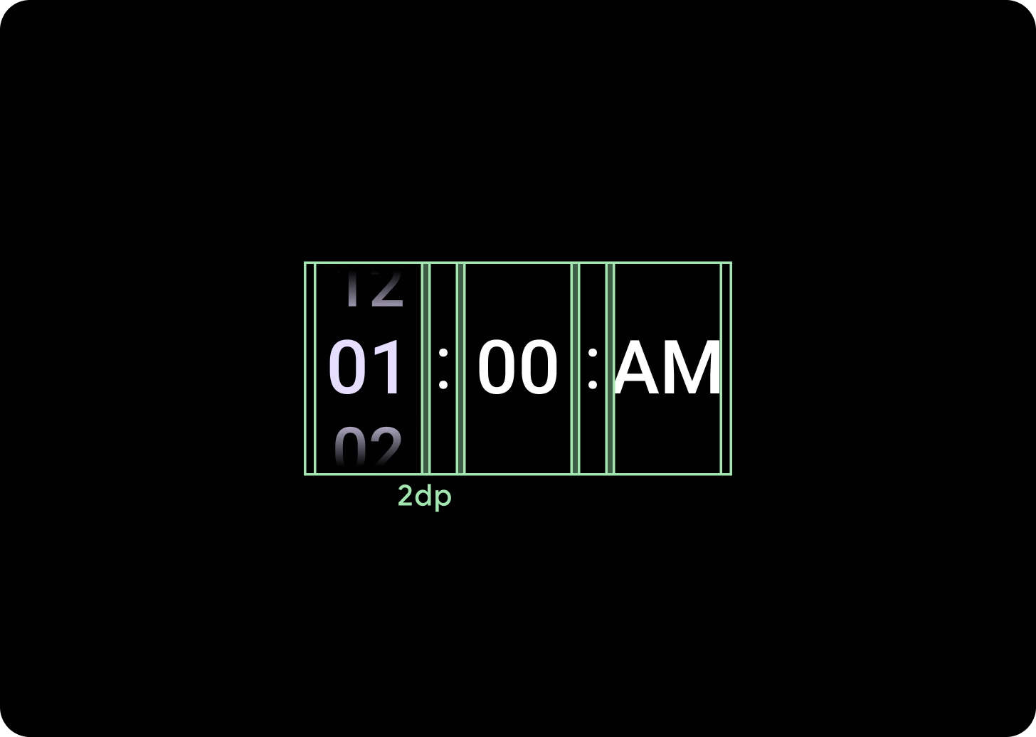
225dp 단위 아래 브레이크포인트
2dp 열 간격
225dp 중단점 이상
6dp 열 간격