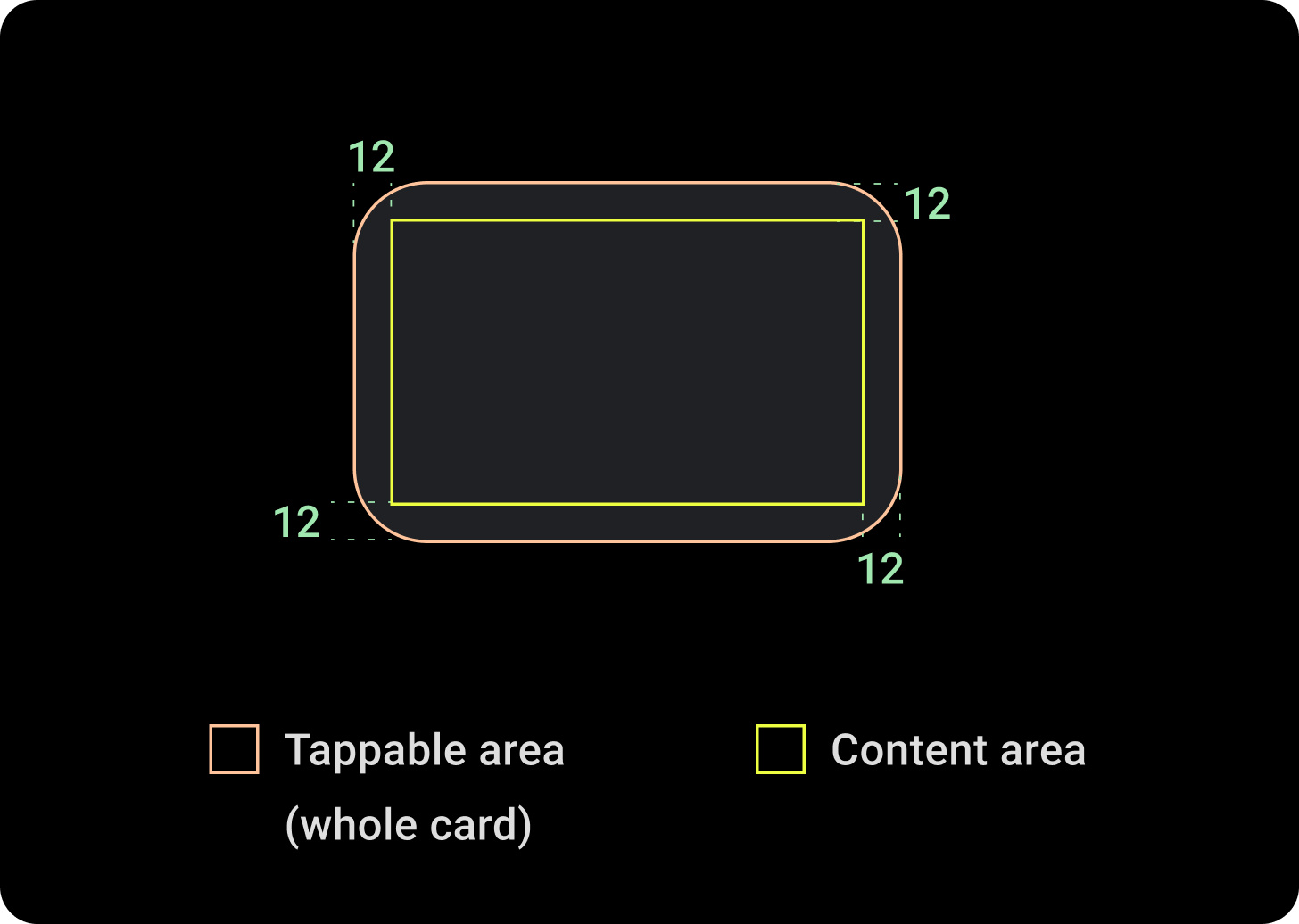
The Card component contains content and actions about a single subject.
Anatomy

A card component only has a single slot. Cards can contain icons, images or labels, are customizable.
By default, cards are rectangular with rounded corners and a gradient background. Set the maximum height of your card to 60% to ensure that it's fully displayed on the screen because circular displays can clip up to 20% of the top and bottom of the screen.

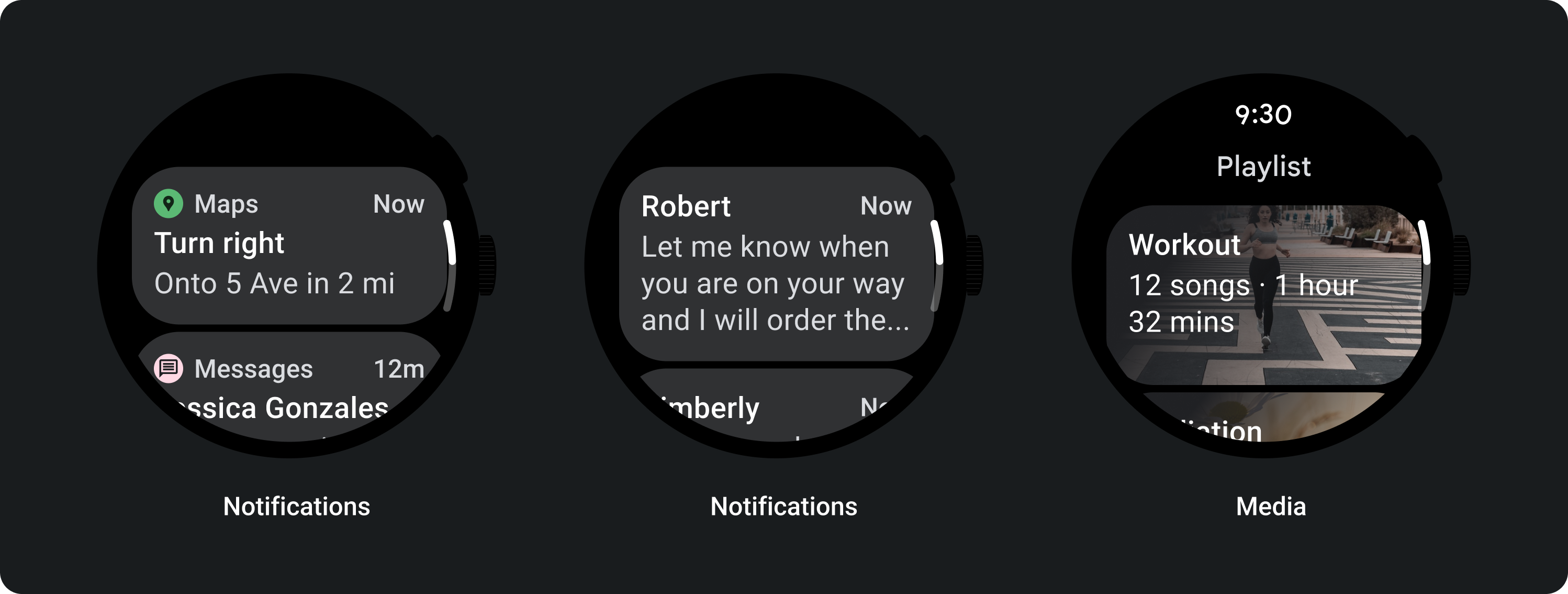
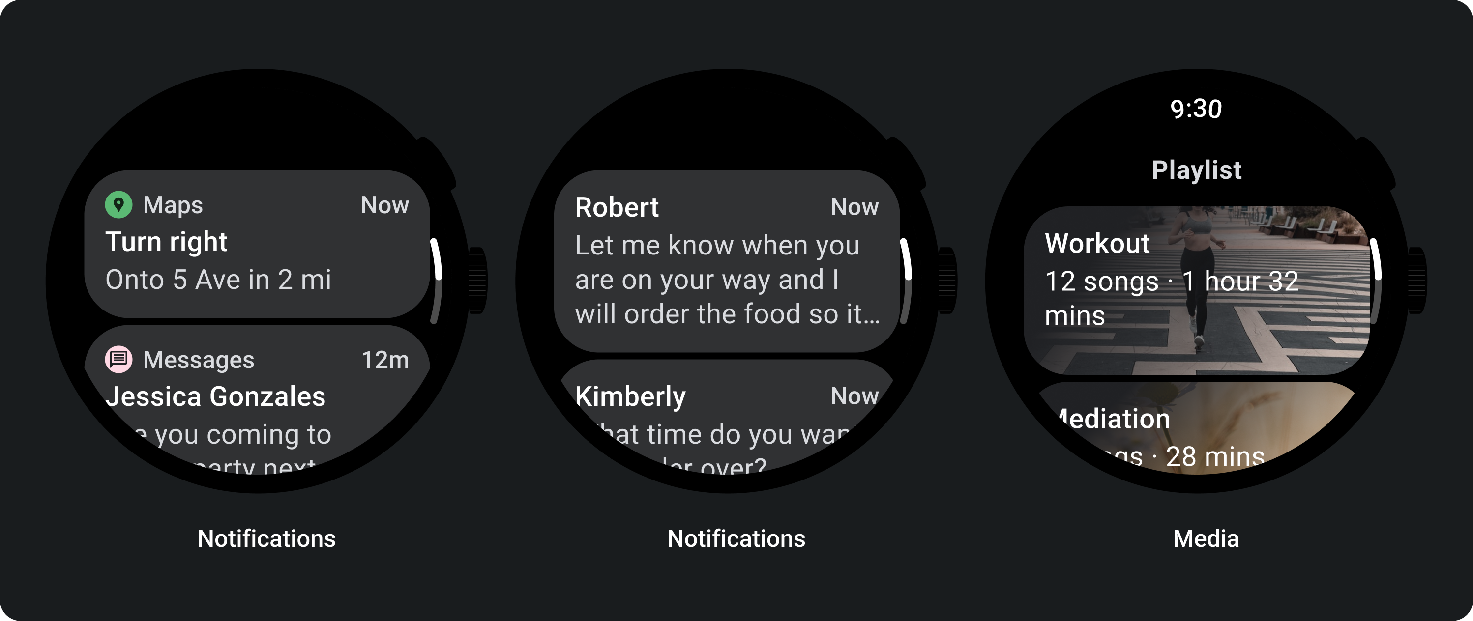
Title Card
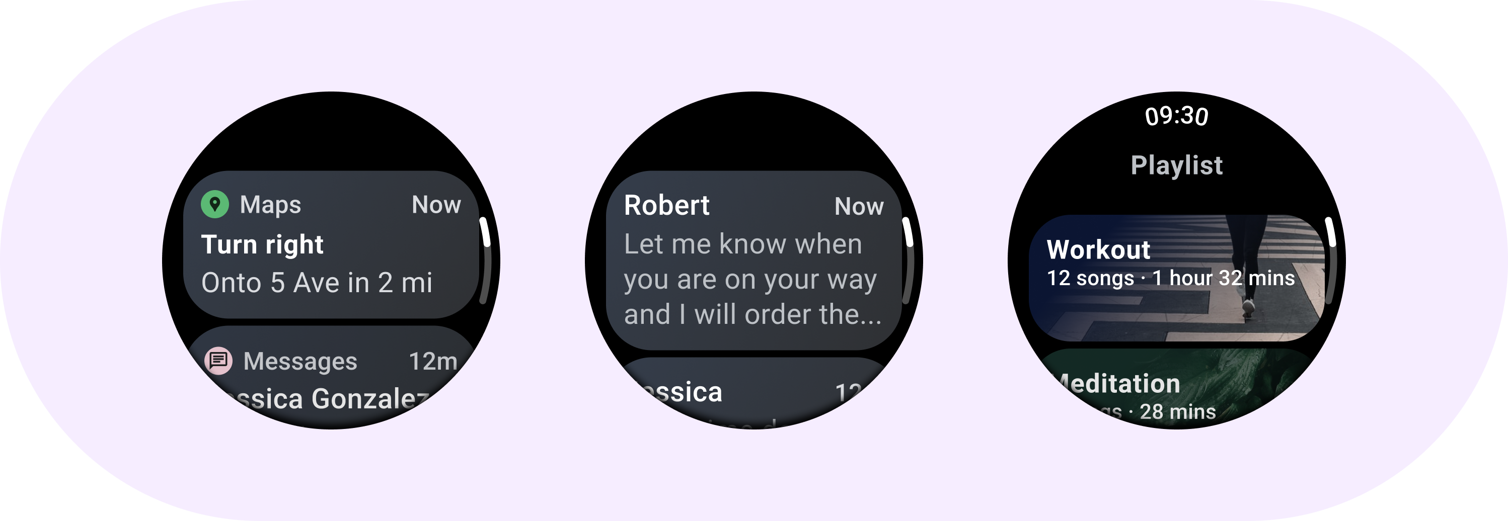
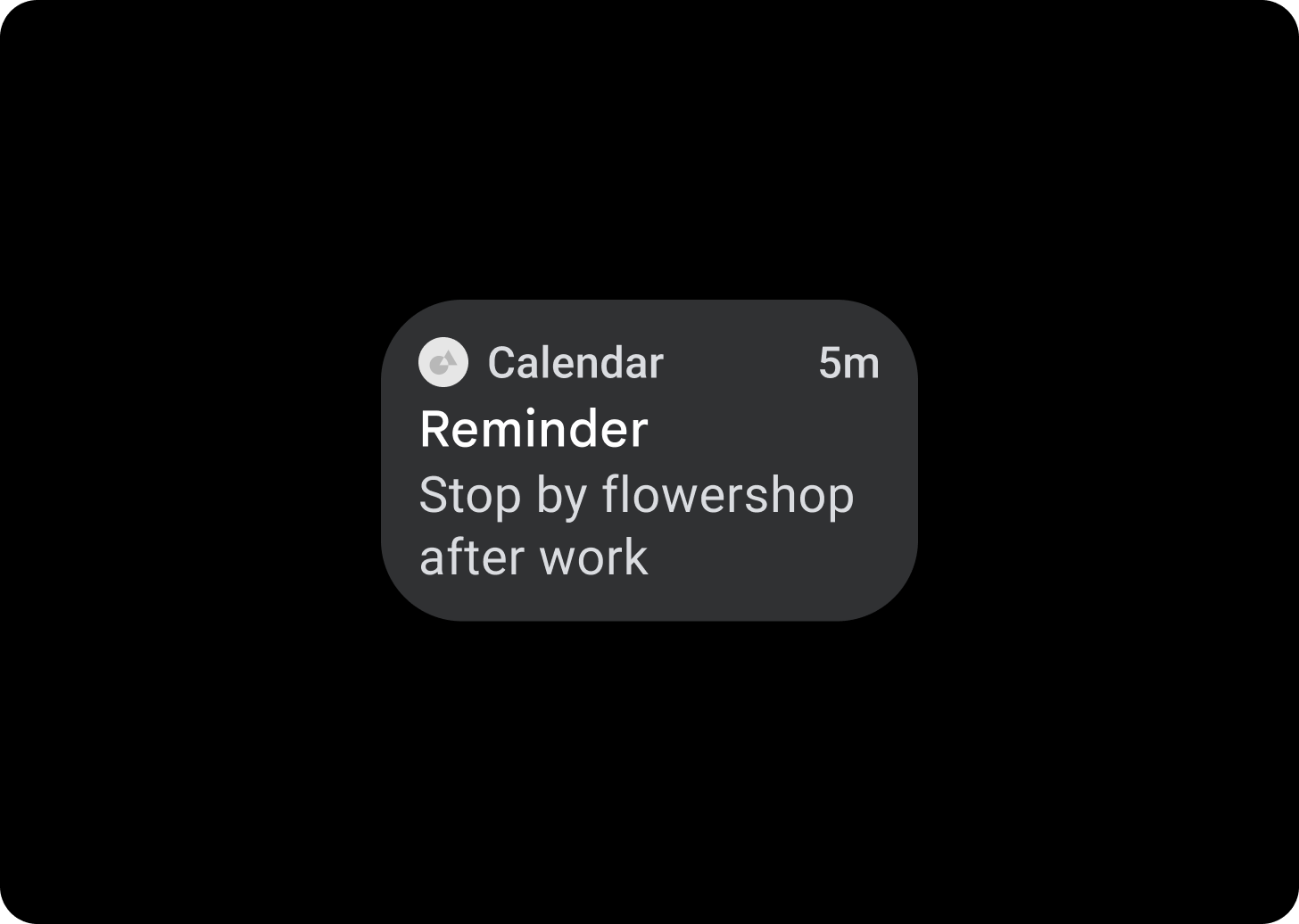
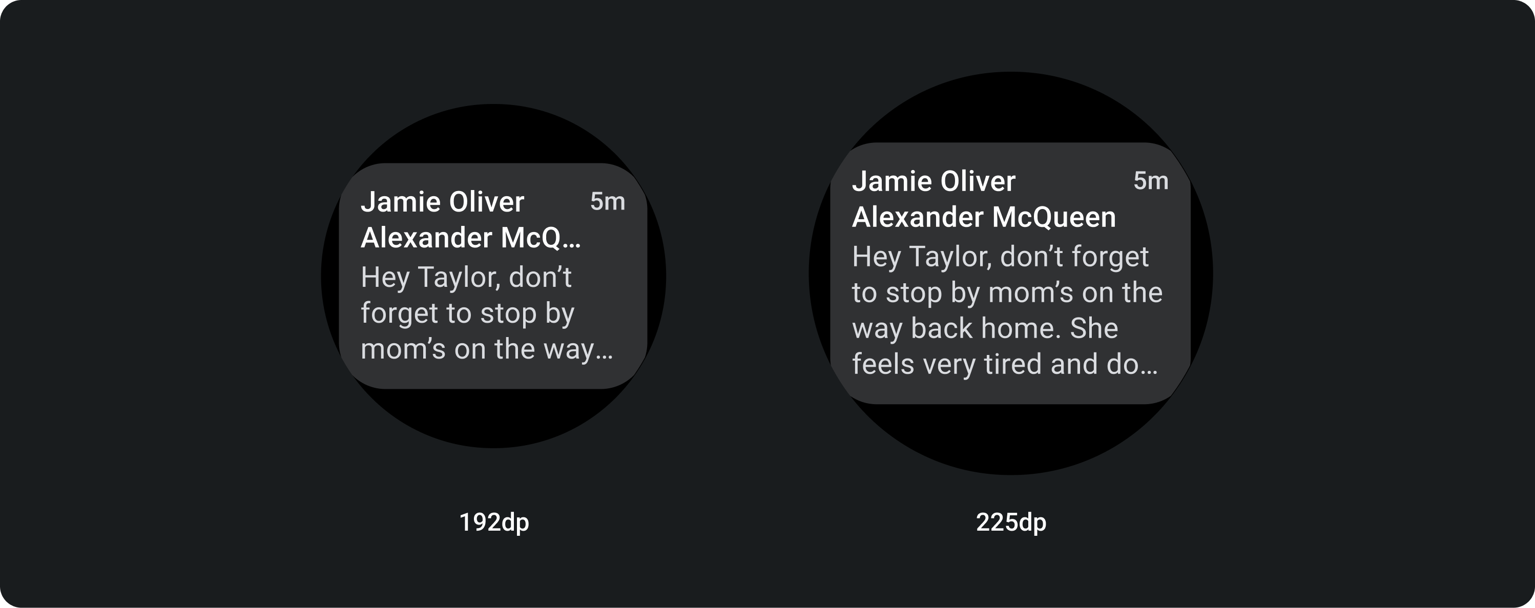
Use Title cards to show information within an application, such as a message. Title cards have a three-slot layout which includes a title, an optional time field, and the relevant content, which is either an image or text.
App Card
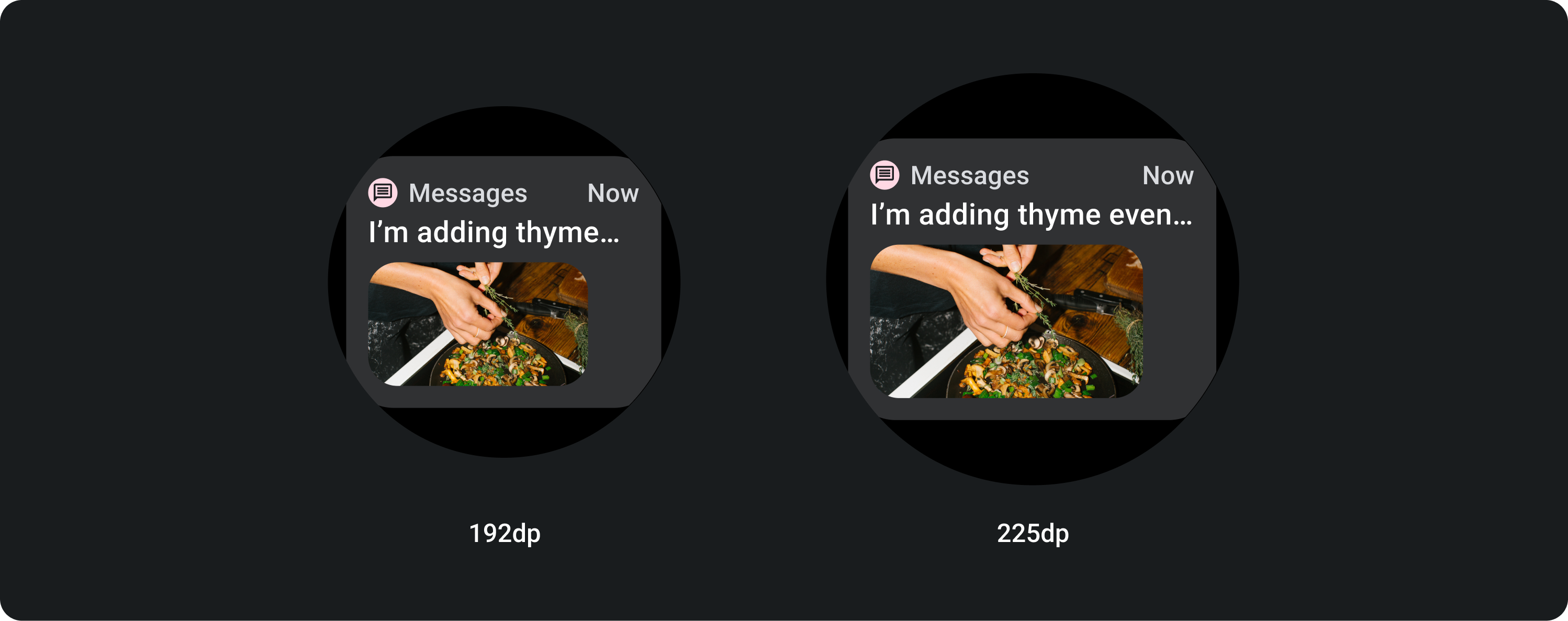
Use App cards to show interactive elements from multiple applications. App cards have a five-slot layout that includes an application icon, the application name, the time that the activity occurred, a title of some sort and the relevant content, which is either an image or text.
Cards gradient
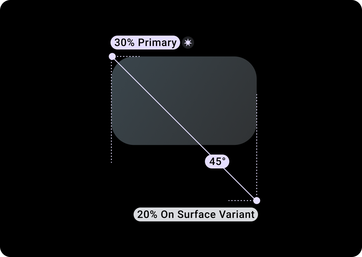
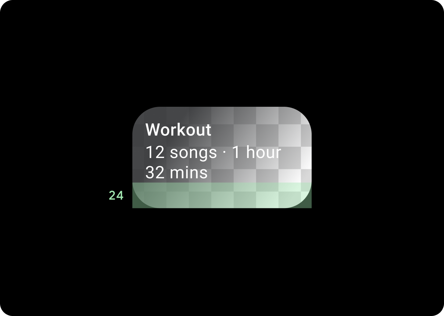
Card Gradient
Top/Left + 68dp padding from Left = 100% Surface
Bottom/Right = 0% Surface
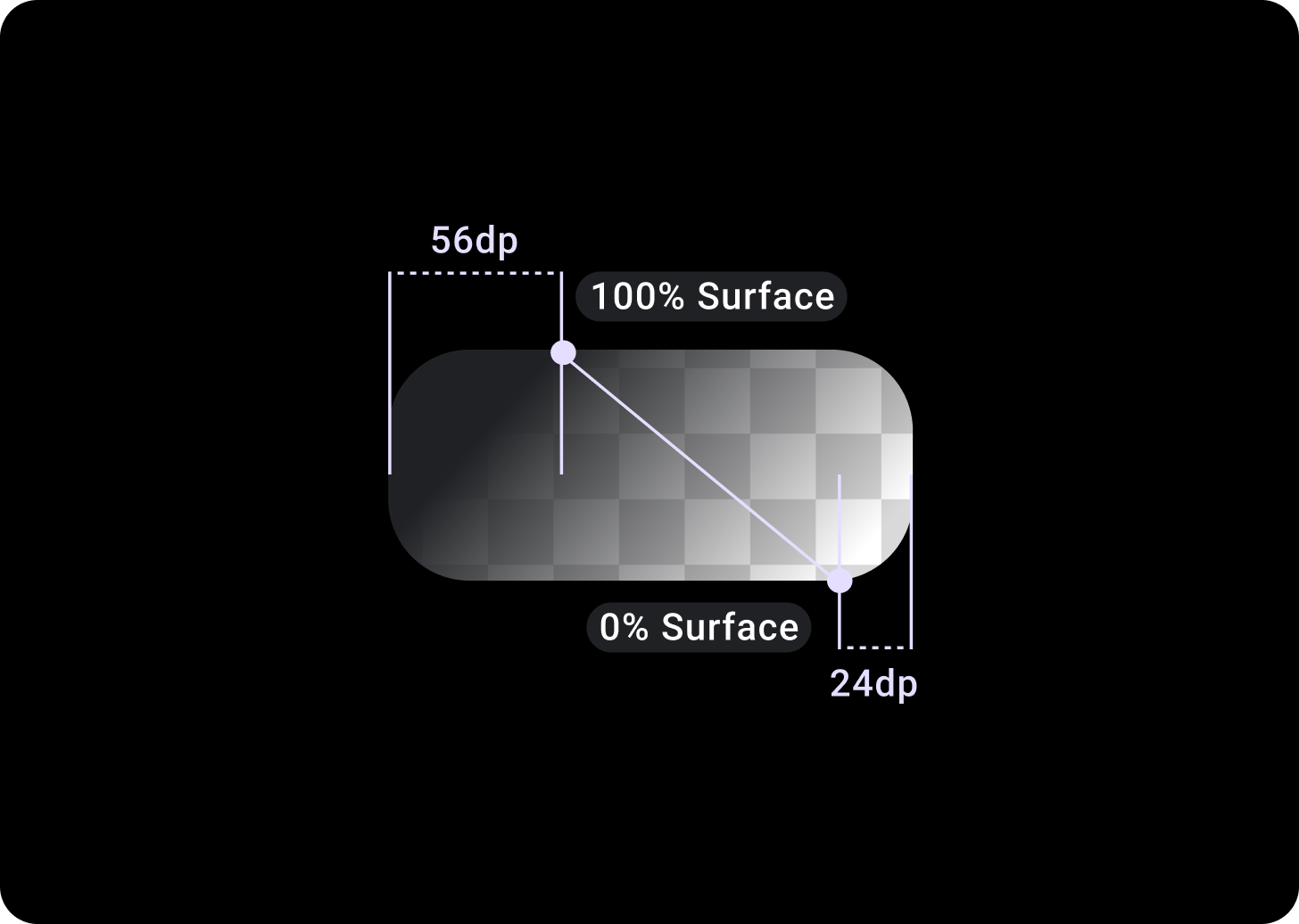
Image Card Overlay
Top/Left + 56 dp padding from T/L = 100% Surface
Bottom/Right + 24 dp padding from B/R = 0% Surface
(Gradient overlays on a image background)
Sizes
Card width
Cards default to the maximum width of the container.
Card height is flexible. It is determined by the components' content.
On round watch faces, cards that are taller than 60% of the height of the screens are clipped.
Usage
Adaptive layouts
TitleCard
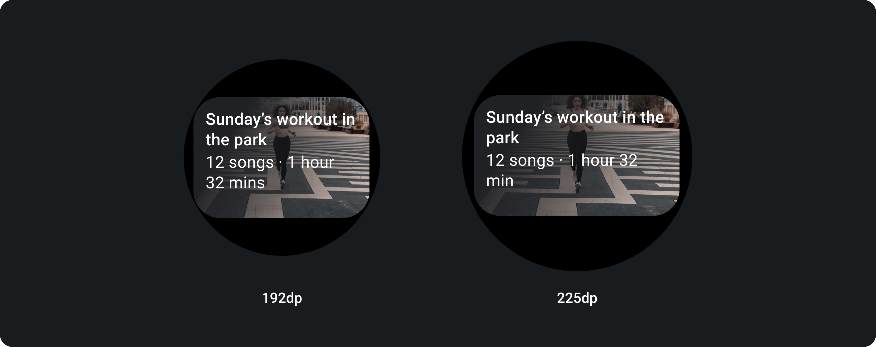
On larger screens we allow an extra line of text for body copy. And in order to display more of the image, add an enlarged 24 dp padding at the bottom.
TitleCard with in-line image (replacing the body copy slot)
On larger screens, the image doesn't change its aspect ratio and has the padding on the right in order to not make the height of the card too big.
Cards with additional customization
Card with an image background
In order to achieve this layout you will need customization.
Image cards display content relating to a single topic with a background image. Image cards can also display standalone images.
It is recommended that the bottom padding is increased to 24 dp in order to display more of the background image without text over it.