텍스트 자르기 및 콘텐츠 잘림 방지
컬렉션을 사용해 정리하기
내 환경설정을 기준으로 콘텐츠를 저장하고 분류하세요.
스마트시계는 휴대기기보다 화면 크기가 작으므로 사용자가 액세스할 수 있고 사용 가능한 화면 공간을 효율적으로 사용하는 방식으로 요소를 정렬하고 표시하는 것이 중요합니다. 항목이 화면에 맞도록 Material 가이드라인에 지정된 대로 패딩과 여백을 올바르게 사용합니다.
디자인이 화면에 맞더라도 사용자가 다음 중 하나를 실행하면 인터페이스 요소가 잘리거나 잘릴 수 있습니다.
- 표시 언어를 변경합니다.
- 텍스트 크기를 변경합니다.
- 텍스트 굵게 표시 시스템 설정을 사용 설정합니다.
이러한 고려사항을 염두에 두고 디자인을 테스트하여 다양한 사용자 환경에 맞게 원활하게 조정되는지 확인해야 합니다.
상호작용 요소가 완전히 표시되도록 유지
인터페이스에 상호작용 요소가 포함된 경우, 특히 이러한 요소가 페이지 가장자리에 배치된 경우 사용자가 이러한 요소를 완전히 스크롤하여 볼 수 있는지 확인합니다. 앱에서 Horologist 라이브러리를 사용한다면 responsive()
레이아웃 팩토리를 사용하세요. 아니면 스페이서를 사용하고 ScalingLazyColumn
객체의 상단과 하단에 여백을 추가하여 첫 번째 및 마지막 목록 항목이 항상 잘리지 않도록 합니다.
밀집형 레이아웃에는 카드 대신 칩 사용
더 밀도가 높은 레이아웃이 필요하면 카드 대신 CompactChip
를 사용하세요. 카드의 노출 영역 영역이 넓으면 텍스트 잘림 및 콘텐츠 클리핑을 방지하기가 훨씬 더 어렵습니다.
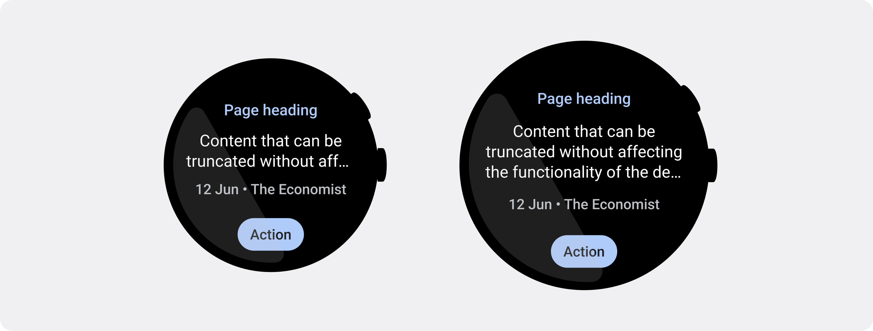
잘림 및 잘림 시 화면 크기 효과 고려하기
Wear OS 기기의 화면 크기에 따라 추가 텍스트와 버튼을 표시할 공간이 더 작거나 커집니다.
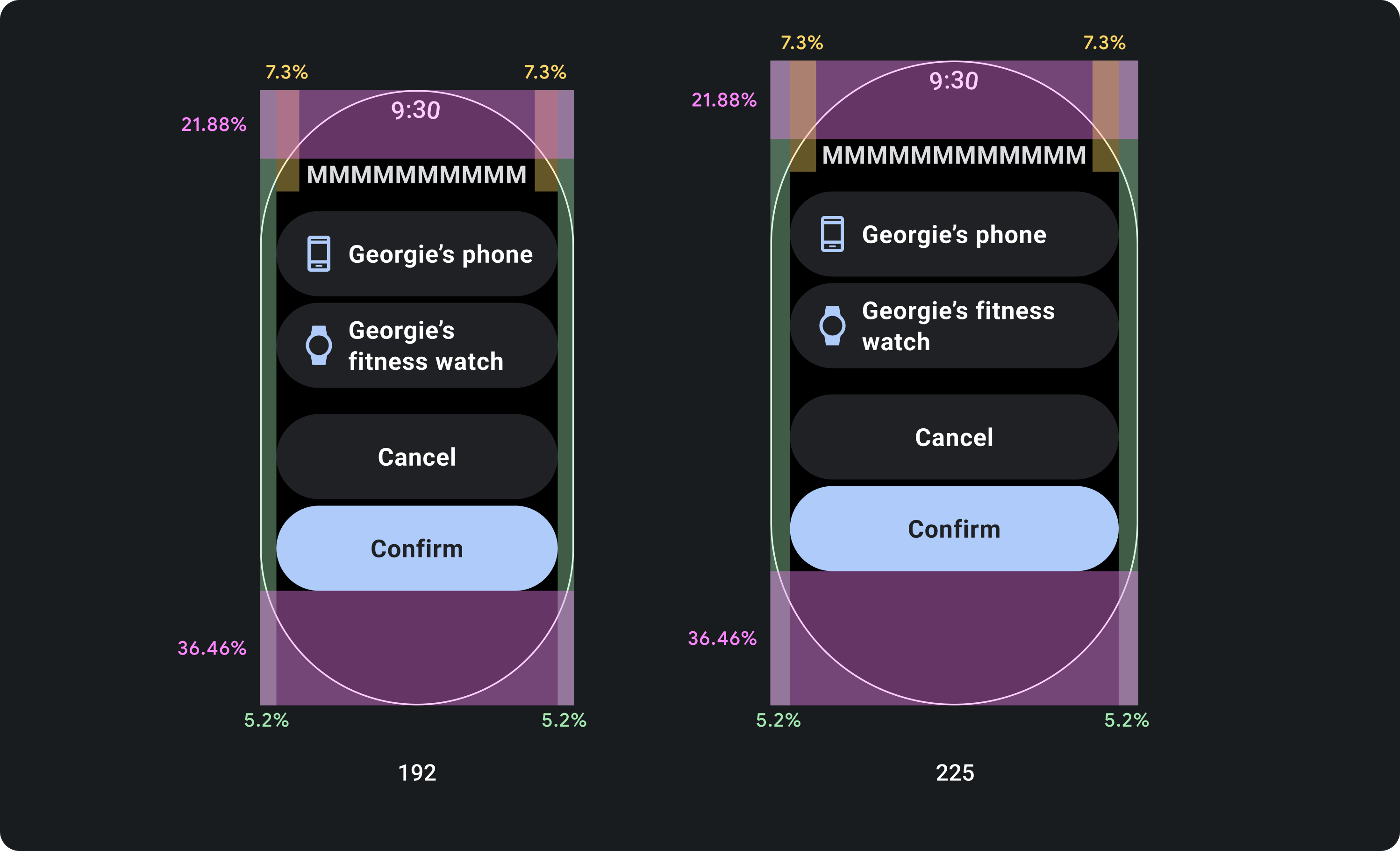
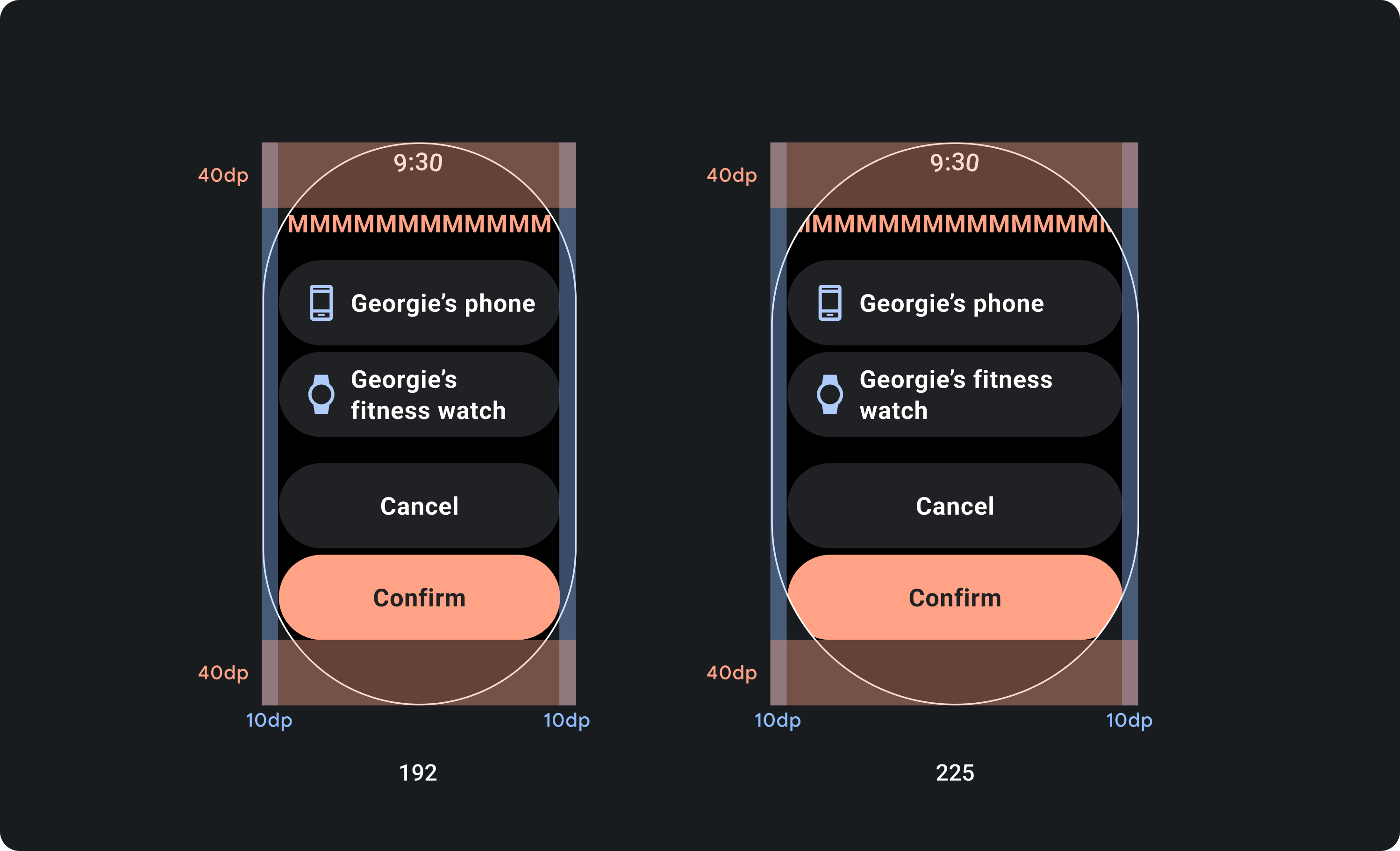
고정 마진이 아닌 비율 마진을 고려한 디자인
Wear OS 기기의 화면 크기에 맞게 조정되는 콘텐츠를 만들려면 각 여백의 크기가 화면 크기를 기준으로 하는 비율 여백을 적용하세요. 항목이 화면의 상단이나 하단에 배치되는 경우 추가 내부 패딩을 적용하여 화면의 곡선 가장자리에서 콘텐츠 잘림을 최소화합니다. 반대로 콘텐츠 그룹이 한 화면에 맞을 만큼 작으면 상단과 하단의 공간이 증가합니다.

check_circle
의견을 제시하지
구성요소는 화면 크기에 따라 크기가 조정되도록 비율 여백을 준수해야 합니다. 이렇게 하면 화면의 콘텐츠가 항상 사용 가능한 공간을 채우고 화면 가장자리에서 잘리지 않습니다.

cancel
부적절한 예
작은 화면에서 텍스트가 잘리고 디자인 기능에 영향을 미칠 수 있는 가능성을 고려하지 않고 텍스트에 사용할 수 있는 최대 공간을 사용하지 마세요.
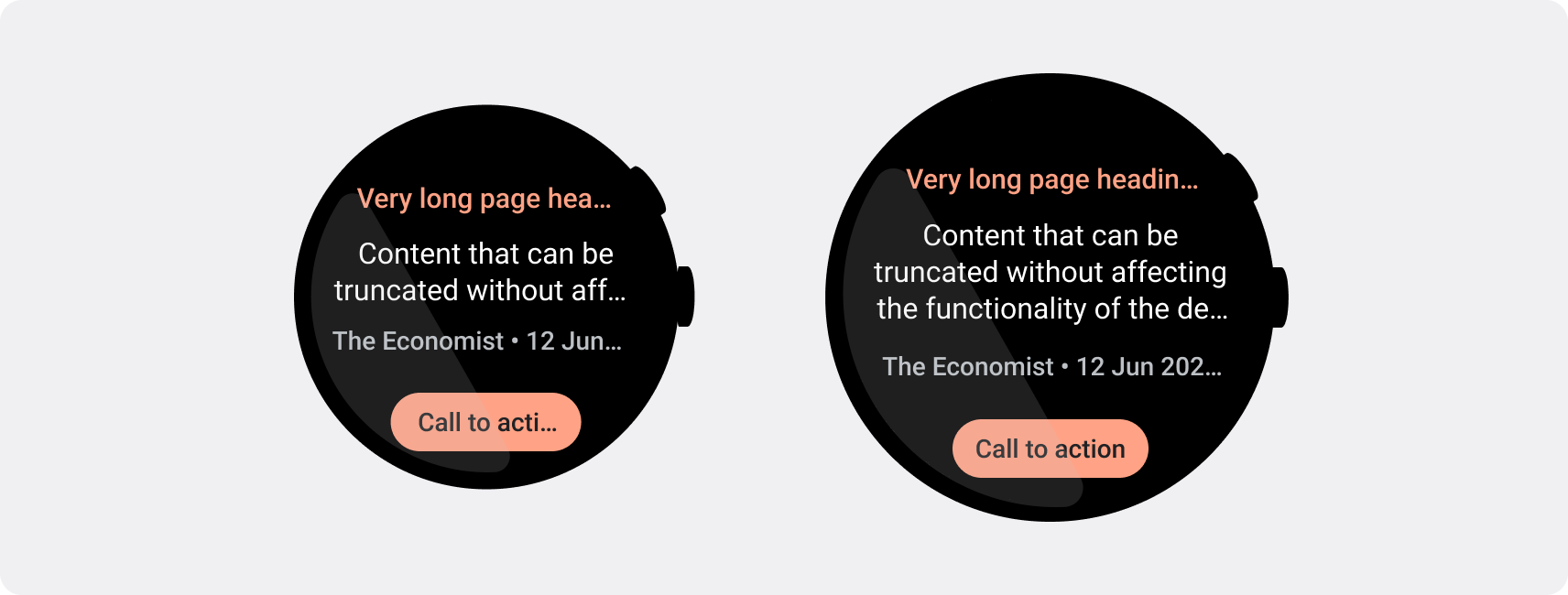
작은 화면에 필요한 글자 수 제한을 적용하세요.
대부분의 경우 큰 화면에서는 잘리기 전에 텍스트와 콘텐츠가 더 많이 표시될 수 있습니다.
더 많은 가로 공간을 사용할 수 있더라도 항상 가장 작은 화면 크기에 맞게 디자인하여 여러 기기에서 일관된 환경을 만들 수 있습니다.
예를 들어 버튼은 큰 화면에서 잘리기 전에 더 많은 문자를 위한 공간이 있을 수 있지만, 사용자 환경에 중요한 클릭 유도 문구인 경우 작은 기기의 화면에 잘리지 않고 완전히 표시될 수 있을 정도로 짧은 텍스트를 사용하세요.
또는 카드에 서버에서 가져온 텍스트와 같은 가변 콘텐츠가 표시되는 경우 작은 화면에서는 이 텍스트가 잘릴 가능성을 계획하세요.

check_circle
의견을 제시하지
클릭 유도 문구 버튼과 같이 디자인 기능에 영향을 미치는 텍스트는 가장 작은 화면을 염두에 두고 디자인되었습니다. 대형 화면의 추가 공간에는 중단점 뒤에 추가 텍스트 줄이 표시될 수 있습니다. 텍스트 줄 수는 구성요소와 컨텍스트에 따라 다릅니다.

cancel
부적절한 예
작은 화면에서 텍스트가 잘려서 디자인 기능에 영향을 줄 수 있다는 점을 고려하지 않고 큰 화면에서 사용할 수 있는 최대 공간을 사용하는 텍스트를 쓰지 마세요.
이 페이지에 나와 있는 콘텐츠와 코드 샘플에는 콘텐츠 라이선스에서 설명하는 라이선스가 적용됩니다. 자바 및 OpenJDK는 Oracle 및 Oracle 계열사의 상표 또는 등록 상표입니다.
최종 업데이트: 2025-07-27(UTC)
[[["이해하기 쉬움","easyToUnderstand","thumb-up"],["문제가 해결됨","solvedMyProblem","thumb-up"],["기타","otherUp","thumb-up"]],[["필요한 정보가 없음","missingTheInformationINeed","thumb-down"],["너무 복잡함/단계 수가 너무 많음","tooComplicatedTooManySteps","thumb-down"],["오래됨","outOfDate","thumb-down"],["번역 문제","translationIssue","thumb-down"],["샘플/코드 문제","samplesCodeIssue","thumb-down"],["기타","otherDown","thumb-down"]],["최종 업데이트: 2025-07-27(UTC)"],[],[],null,["# Prevent text truncation and content clipping\n\nSmartwatches have smaller screen sizes than handheld devices, so it's critical\nto arrange and display elements in a manner that users can access and that\nefficiently uses the available screen space. To help your items fit the screen,\nuse the correct amount of padding and margins as specified by the\n[Material guidelines](https://m3.material.io/foundations/layout/understanding-layout/spacing).\n\nEven when your design fits the screen, elements of your interface may be\ntruncated or clipped when the user does one of the following:\n\n- Changes the display language.\n- Changes the text size.\n- Enables the **Bold text** system setting.\n\nIt's crucial to test your designs with these considerations in mind to ensure\nthey adapt seamlessly to different user environments.\n\nKeep interactive elements fully visible\n---------------------------------------\n\nIf your interface includes interactive elements, check that users can scroll\nthese elements fully into view, especially if these elements are placed at the\nedges of a page. If your app uses the [Horologist](https://github.com/google/horologist) library, use the\n[`responsive()` layout factory](https://github.com/google/horologist/blob/main/docs/compose-layout.md). Otherwise, use spacers and add margins to\nthe top and bottom of a [`ScalingLazyColumn`](/reference/kotlin/androidx/wear/compose/foundation/lazy/package-summary#ScalingLazyColumn%28androidx.compose.ui.Modifier,androidx.wear.compose.foundation.lazy.ScalingLazyListState,androidx.compose.foundation.layout.PaddingValues,kotlin.Boolean,androidx.compose.foundation.layout.Arrangement.Vertical,androidx.compose.ui.Alignment.Horizontal,androidx.compose.foundation.gestures.FlingBehavior,kotlin.Boolean,androidx.wear.compose.foundation.lazy.ScalingParams,androidx.wear.compose.foundation.lazy.ScalingLazyListAnchorType,androidx.wear.compose.foundation.lazy.AutoCenteringParams,kotlin.Function1%29) object to prevent the first and\nlast list items from always being clipped.\n\nUse chips instead of cards for dense layouts\n--------------------------------------------\n\nIf you need a denser layout, use [`CompactChip`](/reference/kotlin/androidx/wear/compose/material/package-summary#CompactChip(kotlin.Function0,androidx.compose.ui.Modifier,kotlin.Function1,kotlin.Function1,androidx.wear.compose.material.ChipColors,kotlin.Boolean,androidx.compose.foundation.interaction.MutableInteractionSource,androidx.compose.foundation.layout.PaddingValues,androidx.compose.ui.graphics.Shape,androidx.wear.compose.material.ChipBorder)) instead of cards. The larger\nsurface area of cards makes it much more difficult to prevent text truncation\nand content clipping.\n\nConsider screen size effects on truncation and clipping\n-------------------------------------------------------\n\nDepending on the Wear OS device's screen size, you have a smaller or larger\nspace for additional text and buttons to be visible:\n\n### Design for percentage margins, not fixed margins\n\nTo create content that adapts responsively to the Wear OS device's screen size,\napply percentage margins, where the size of each margin is relative to the\nscreen size. In cases where items sit on the top or bottom of the screen, apply\nadditional inner padding to minimize content clipping from the screen's curved\nedge. In contrast, the space at the top and bottom increases when a group of\ncontent is small enough to fit on one screen.\n\ncheck_circle\n\n### Do\n\nComponents must adhere to the percentage margins so that their size scales with the screen's size. This way, the content of your screen always fills the space available and isn't cropped by the screen's edges.\n\ncancel\n\n### Don't\n\nDon't use the maximum space available for text without considering how it may truncate on smaller screens and affect the functionality of your design.\n\n### Use the character limits required by smaller screens\n\nIn most cases, larger screens can show more text and content before truncation.\nEven though more horizontal space might be available, however, always design for\nthe smallest screen size to create a consistent experience across devices.\n\nFor example, a button may have space for more characters on a larger screen\nbefore truncation, but if it's an important call to action that is vital to the\nuser experience, then use text that's short enough to appear entirely, without\ntruncating, on a small device's screen.\n\nAlternatively, if the tile shows variable content, such as text fetched from a\nserver, plan for the possibility that this text is truncated on smaller screens.\n\ncheck_circle\n\n### Do\n\nText which affects the functionality of your design, like call-to-action buttons, is designed with the smallest screen in mind. The additional space on larger screens can show additional lines of text after the breakpoint. The number of lines of text depends on the component and context.\n\ncancel\n\n### Don't\n\nDon't write text that consumes the maximum space available on a larger screen without considering how it may appear truncated on smaller screens and affect the functionality of your design."]]