Google uses AI technology to translate content into your preferred language. AI translations can contain errors.
Tier 2: 반응형 및 최적화됨
컬렉션을 사용해 정리하기
내 환경설정을 기준으로 콘텐츠를 저장하고 분류하세요.
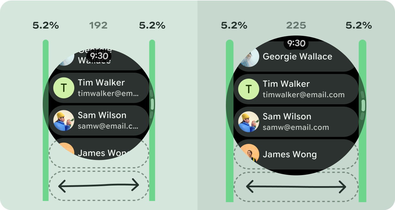
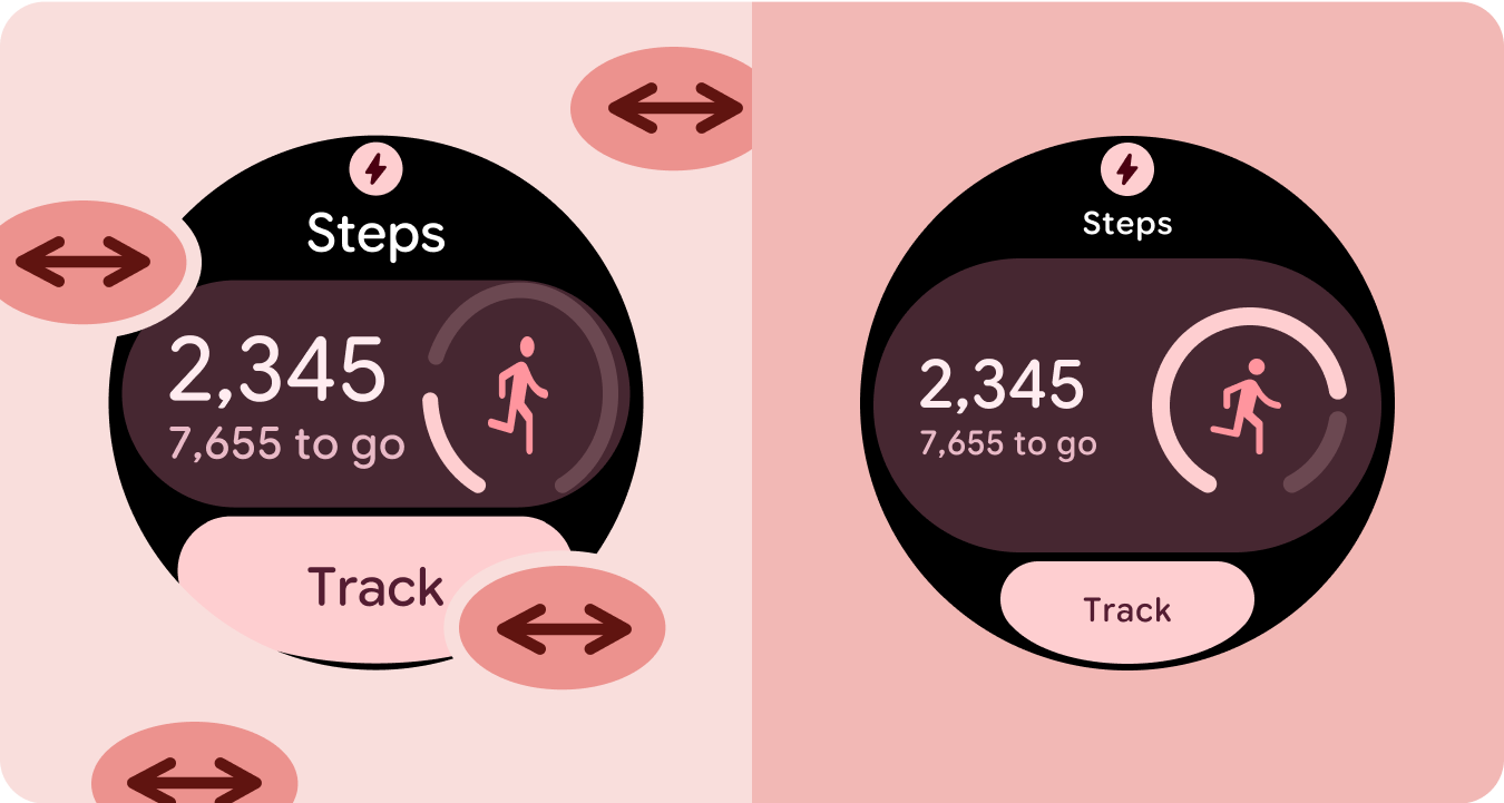
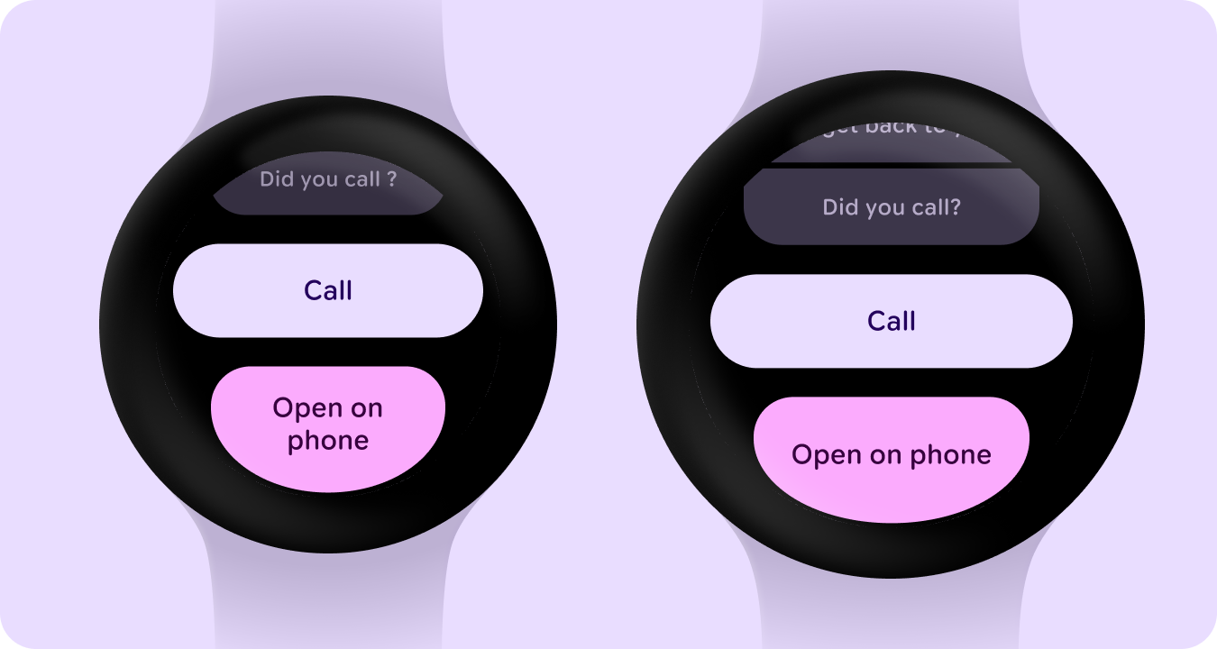
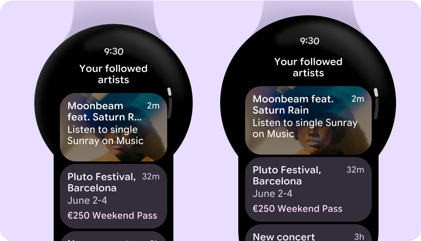
반응형 레이아웃을 사용하고 다양한 화면 크기에 자동으로 적응하는 앱은 사용자에게 추가적인 가치를 제공하고 더 생산적이고 매력적인 사용자 환경을 제공합니다.
반응형 레이아웃은 최적의 사용자 환경을 위해 버튼, 텍스트 필드, 대화상자와 같은 요소의 형식을 동적으로 지정하고 배치합니다. 반응형 디자인 관행을 활용하여 대형 화면에서 앱 사용자에게 추가 가치를 자동으로 제공하세요. 한눈에 보이는 텍스트가 많아지든, 화면에 표시되는 작업이 많아지든, 더 크고 접근성이 좋은 탭 타겟이든, 반응형 관행은 큰 화면 사용자에게 향상된 환경을 제공합니다.
반응형 디자인을 통해 가치 추가
check_circle
권장사항
- 반응형 및 적응형 동작이 내장된 M3 Compose 구성요소 라이브러리를 사용합니다.
- 화면 크기에 따라 사용 가능한 공간을 자동으로 부드럽게 채우는 반응형 레이아웃을 활용합니다.
cancel
금지사항
- 텍스트 필드, 버튼, 대화상자 등 UI 요소를 늘려 추가 공간을 채웁니다.
- 주로 그래픽 목적으로 사용되지 않는 한 글꼴 크기를 늘립니다.
예
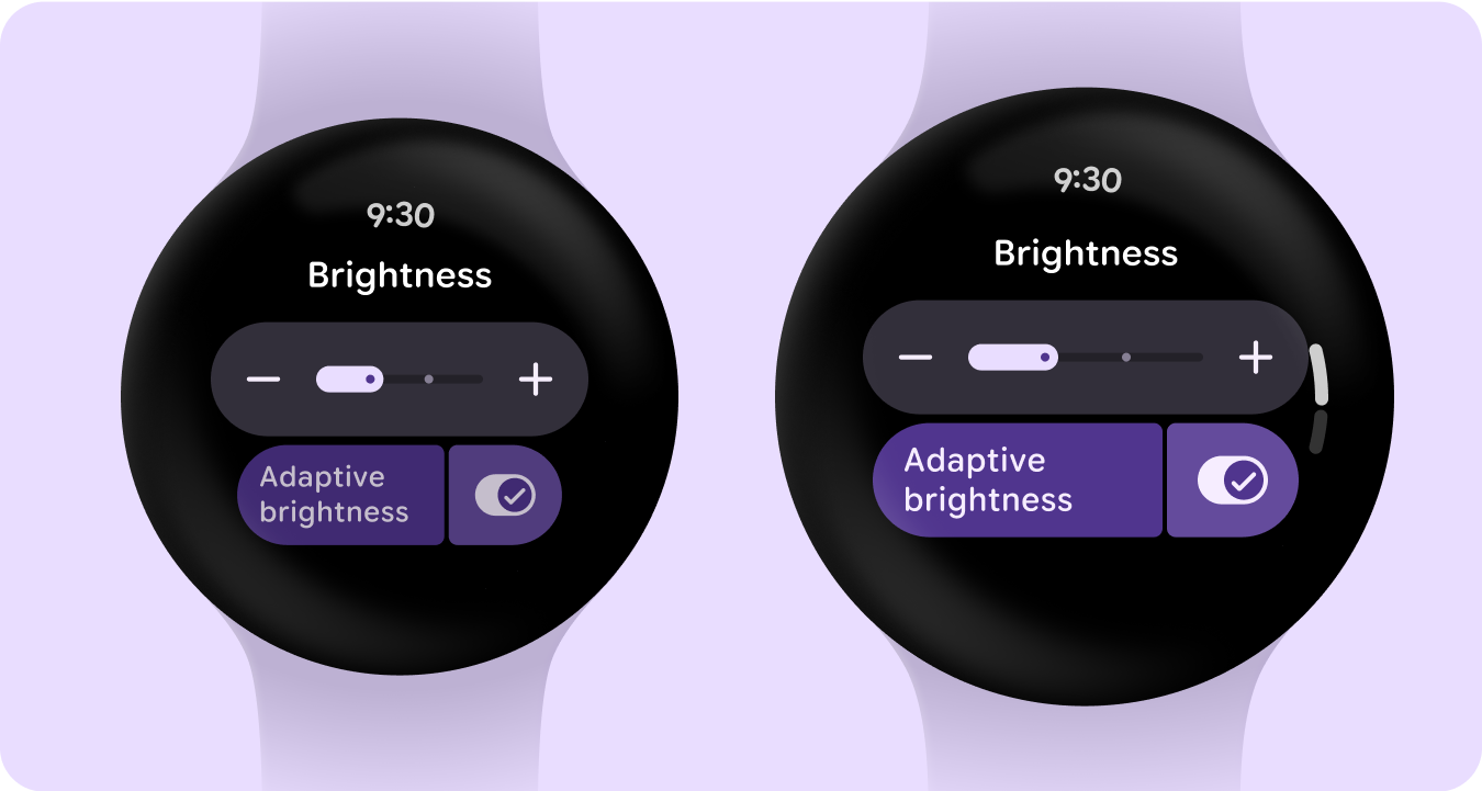
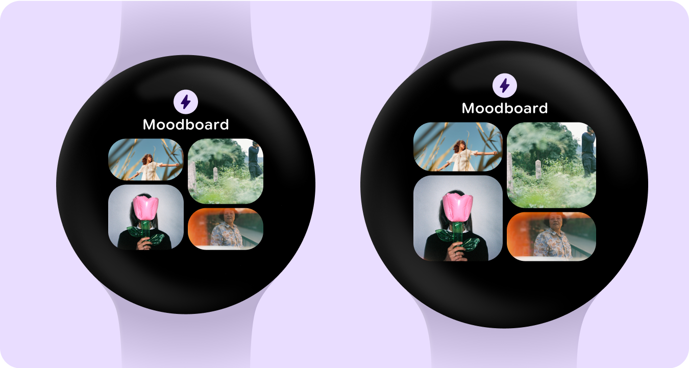
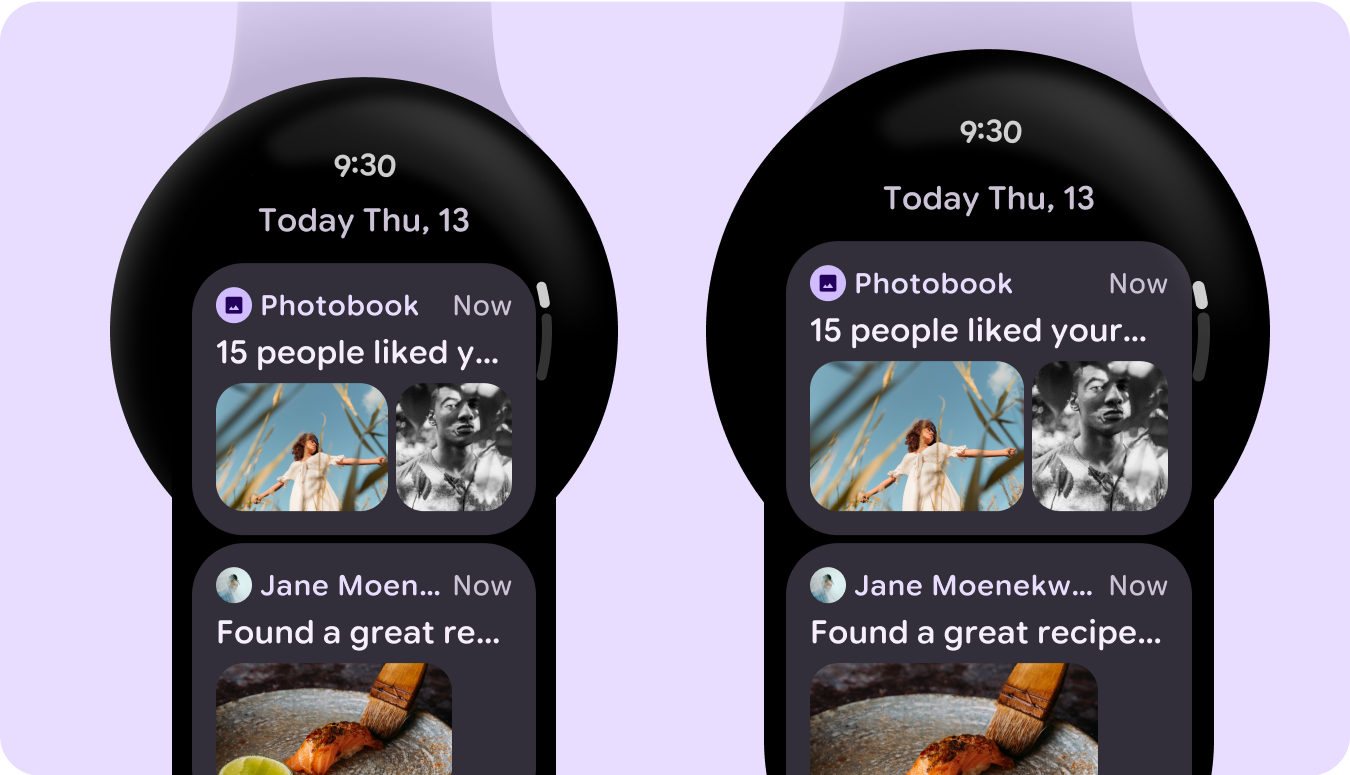
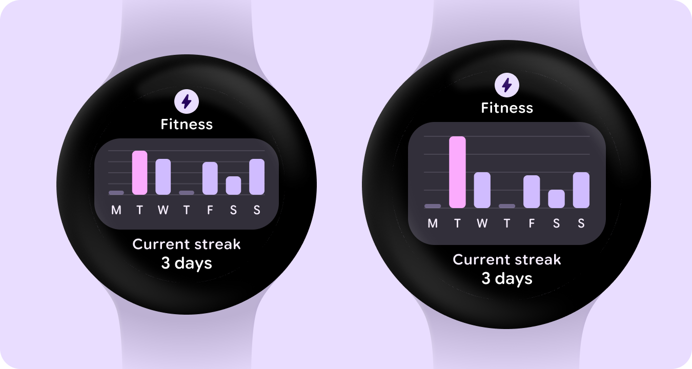
다음 이미지는 반응형으로 최적화된 앱의 예를 보여줍니다.
이 페이지에 나와 있는 콘텐츠와 코드 샘플에는 콘텐츠 라이선스에서 설명하는 라이선스가 적용됩니다. 자바 및 OpenJDK는 Oracle 및 Oracle 계열사의 상표 또는 등록 상표입니다.
최종 업데이트: 2025-07-27(UTC)
[[["이해하기 쉬움","easyToUnderstand","thumb-up"],["문제가 해결됨","solvedMyProblem","thumb-up"],["기타","otherUp","thumb-up"]],[["필요한 정보가 없음","missingTheInformationINeed","thumb-down"],["너무 복잡함/단계 수가 너무 많음","tooComplicatedTooManySteps","thumb-down"],["오래됨","outOfDate","thumb-down"],["번역 문제","translationIssue","thumb-down"],["샘플/코드 문제","samplesCodeIssue","thumb-down"],["기타","otherDown","thumb-down"]],["최종 업데이트: 2025-07-27(UTC)"],[],[]]