
카드를 통해 사용자는 작업을 완료하는 데 필요한 정보와 작업에 쉽게 액세스할 수 있습니다. 사용자는 시계 화면에서 스와이프하여 피트니스 목표 달성 현황을 확인하고 날씨를 알아보는 등 다양한 작업을 할 수 있습니다. 카드를 사용하여 앱을 시작하거나 필수 작업을 빠르게 실행할 수도 있습니다.
반응형 및 최적화된 디자인 빌드
디자인 레이아웃을 더 큰 화면 크기에 맞게 조정할 수 있도록 백분율 기반 여백 및 패딩을 비롯한 반응형 동작이 내장되도록 레이아웃 및 구성요소의 동작을 업데이트했습니다.
ProtoLayout 템플릿을 사용하는 경우 Wear ProtoLayout Jetpack 라이브러리의 최신 베타 출시를 통해 이러한 업데이트를 자동으로 상속할 수 있습니다. 또한 화면 크기 중단점 후에 추가 콘텐츠 또는 구성요소를 추가한 레이아웃만 제공하면 됩니다. 더 큰 화면 크기를 활용하는 방법에 관한 전체 가이드 및 권장사항은 카드 가이드를 참고하세요. 카드의 화면 높이는 고정되어 있으므로 원치 않는 클리핑이 발생하지 않도록 제한된 화면 공간을 최대한 활용하도록 패딩을 조정했습니다.
구성요소가 사용 가능한 너비를 채우는지 확인
모든 구성요소는 반응형으로 빌드해야 합니다. 높이와 너비를 'expand'로 설정하면 사용 가능한 공간을 채웁니다. 둥근 화면으로 인해 콘텐츠가 잘리지 않도록 필요한 여백을 포함합니다.
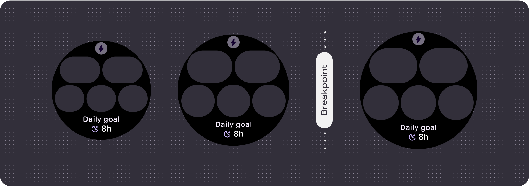
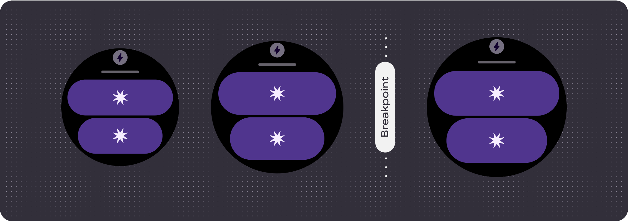
적응형 및 차별화된 디자인 빌드
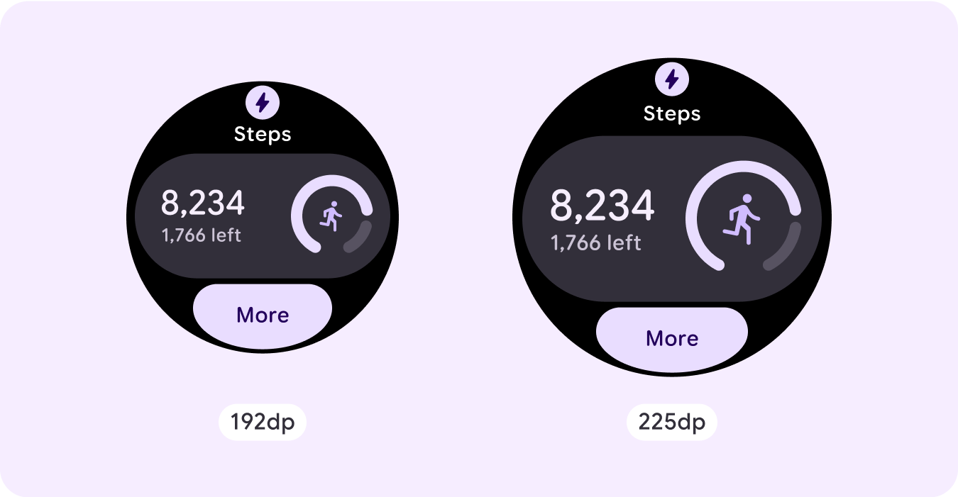
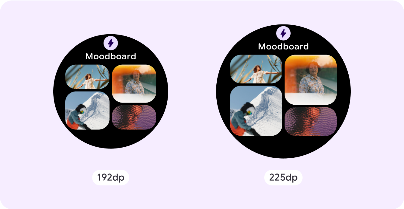
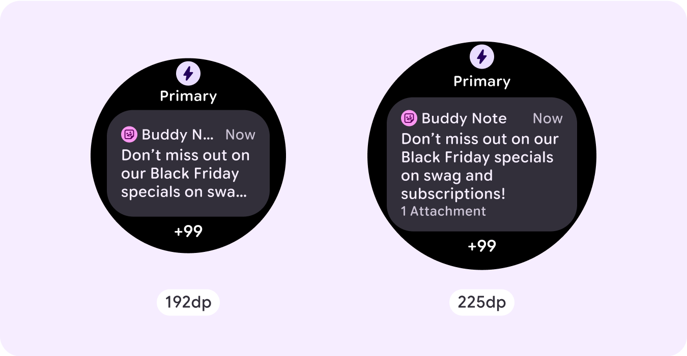
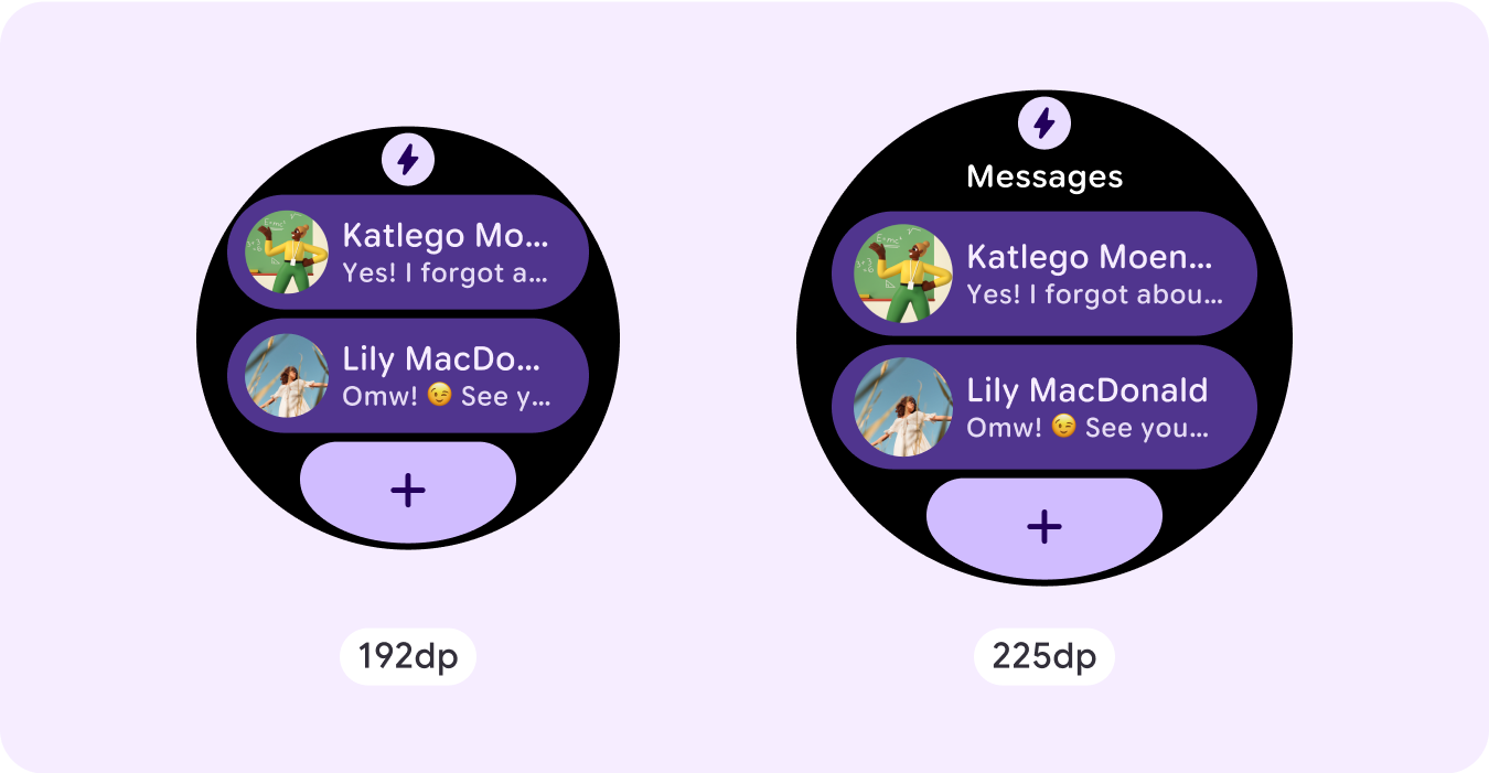
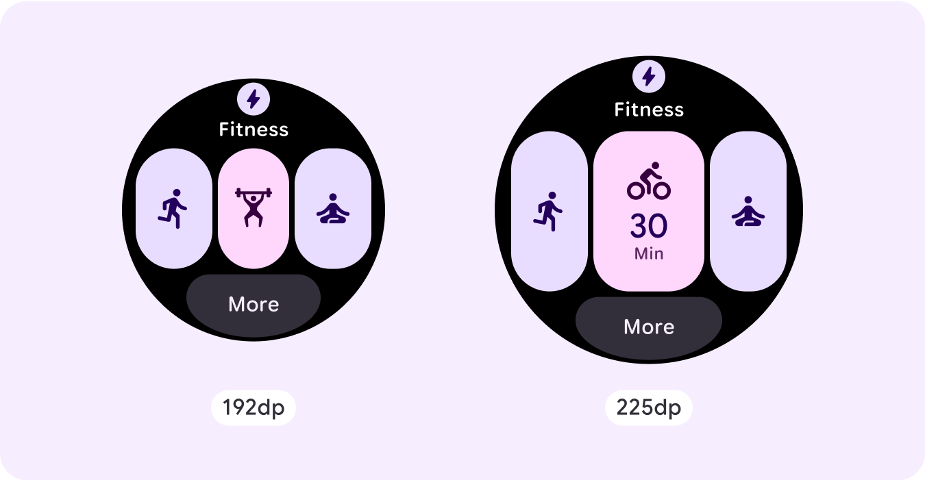
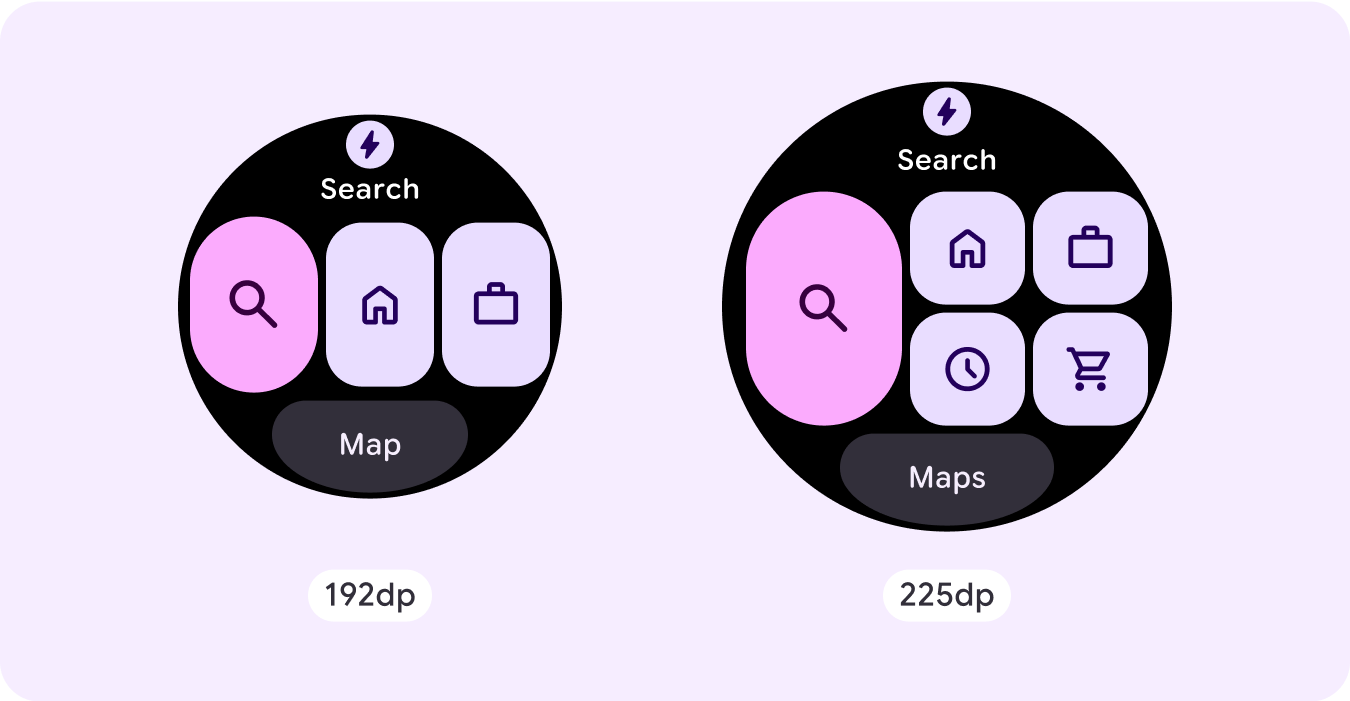
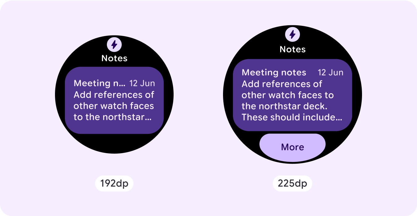
더 큰 화면 크기의 추가 공간을 최대한 활용하려면 225dp에 크기 중단점을 추가하세요. 이 중단점을 사용하면 추가 콘텐츠를 표시하거나, 버튼 또는 데이터를 더 포함하거나, 더 큰 화면에 더 적합하도록 레이아웃을 변경할 수 있습니다.
이렇게 하려면 각 중단점에 다른 디자인이 필요합니다. 더 큰 화면 디자인(225dp 이상)에는 다음과 같은 추가 요소가 포함될 수 있습니다.
이전에 숨겨진 제목 슬롯 표시
이는 중단점 전에 두 개의 행이 있는 레이아웃에서 권장되며, 여기서 48dp의 최소 탭 대상을 보장하기 위해 제목 슬롯을 삭제해야 합니다.
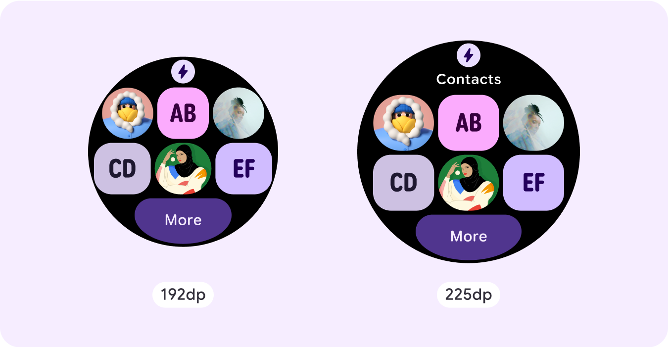
기존 구성요소의 크기 늘리기 또는 상태 변경
이렇게 하면 세부정보를 더 표시하거나 콘텐츠를 더 쉽게 볼 수 있습니다.
현재 레이아웃 내에 구성요소 슬롯 추가
구성요소를 추가하면 레이아웃에서 더 많은 옵션 또는 추가 세부정보를 제공합니다. 하지만 콘텐츠를 계속 쉽게 볼 수 있어야 합니다.
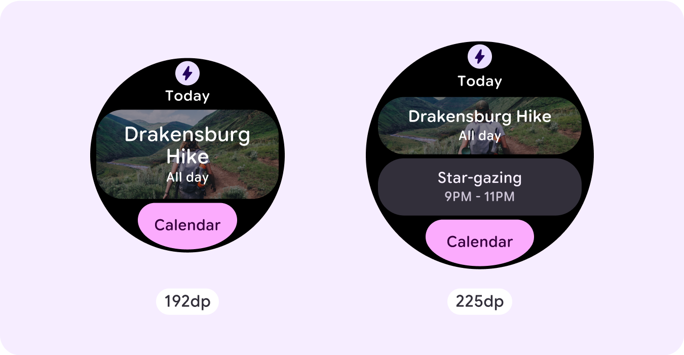

하단에 콘텐츠 더 추가
경우에 따라 기본 슬롯 내에 구성요소를 추가하는 대신 하단 섹션에 작업 버튼 또는 콘텐츠를 추가하는 것이 더 적합합니다.
주의: 더 큰 디스플레이 크기에는 절대 더 작은 디스플레이 크기보다 적은 정보가 표시되어서는 안 됩니다. 이는 중단점에 추가된 맞춤 동작과 특히 관련이 있습니다.
일반적인 예는 구성요소 또는 텍스트 크기가 중단점을 지나 증가하여 더 큰 화면에 더 적게 표시되는 경우입니다. 화면은 크기가 증가함에 따라 항상 더 많은 값을 표시해야 합니다.
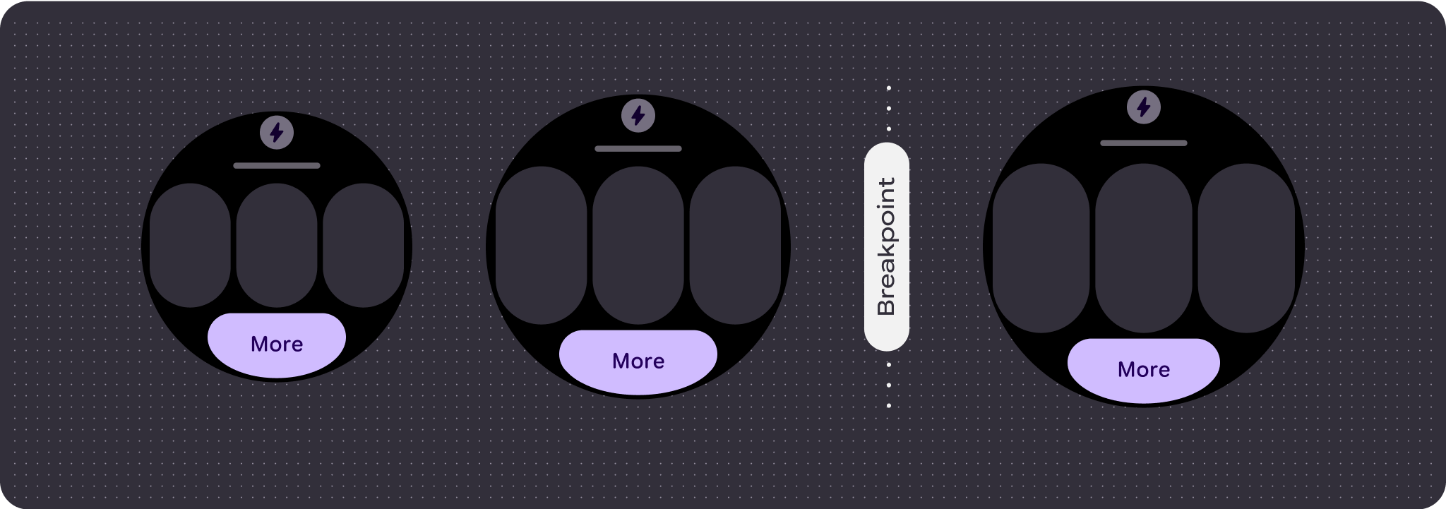
반응형 및 적응형 동작
반응형 및 적응형 동작은 레이아웃의 세 개 슬롯 (섹션)에 따라 다릅니다.
앱 아이콘 및 제목 슬롯
시스템에서 제공하는 앱 아이콘에는 동작 변경사항이 없습니다. 제목 슬롯은 더 넓은 화면 크기에 자동으로 적응하여 추가 문자를 표시합니다. 화면 크기가 증가할 때 클리핑을 방지하기 위해 상단 섹션에 비례 (백분율) 내부 여백이 있습니다.
기본 슬롯 (구성요소)
기본 슬롯 내의 모든 구성요소는 더 넓은 화면 크기에 자동으로 적응하도록 너비와 높이를 'expand'로 설정해야 합니다. 화면 크기가 증가할 때 클리핑을 방지하기 위해 기본 슬롯 섹션과 경우에 따라 이 슬롯 내의 각 행에 비례 (백분율) 내부 여백이 있습니다. 모서리 반지름과 레이아웃을 함께 사용하는 경우 기본 슬롯에 더 큰 여백이 필요할 수 있습니다.
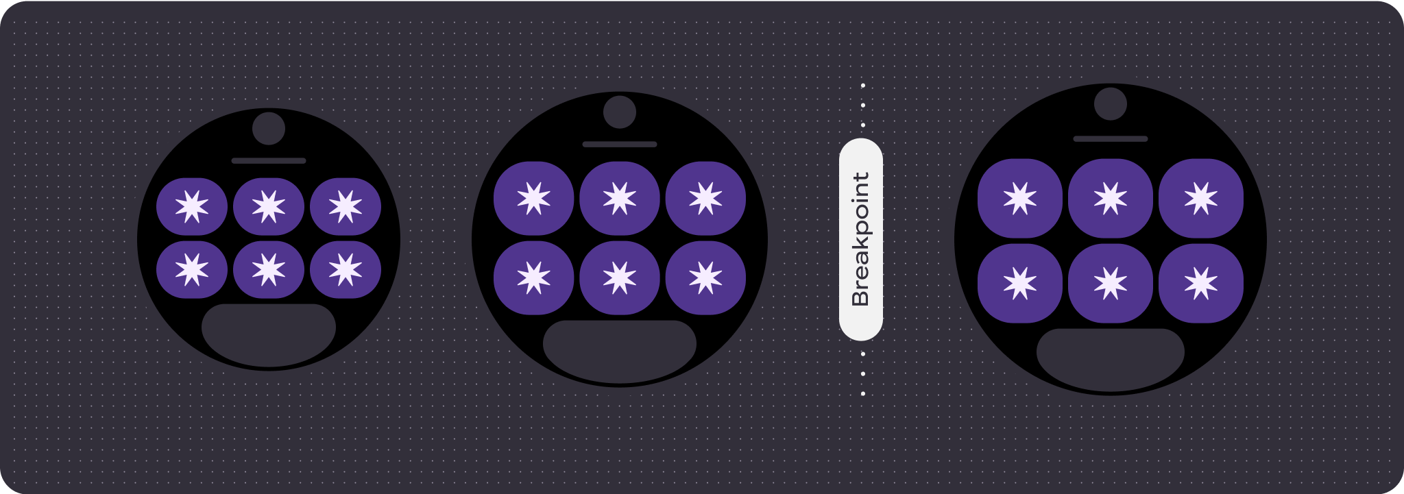
하단 슬롯
하단 버튼 또는 텍스트에는 동작 변경사항이 없지만 버튼과 텍스트 상자의 너비는 더 넓은 화면 크기에 자동으로 적응하고 문자를 얻습니다. 화면 크기가 증가할 때 클리핑을 방지하기 위해 하단 슬롯에 비례 (백분율) 내부 여백이 있습니다. 하단 슬롯이 없으면 기본 여백이 자동으로 추가됩니다.
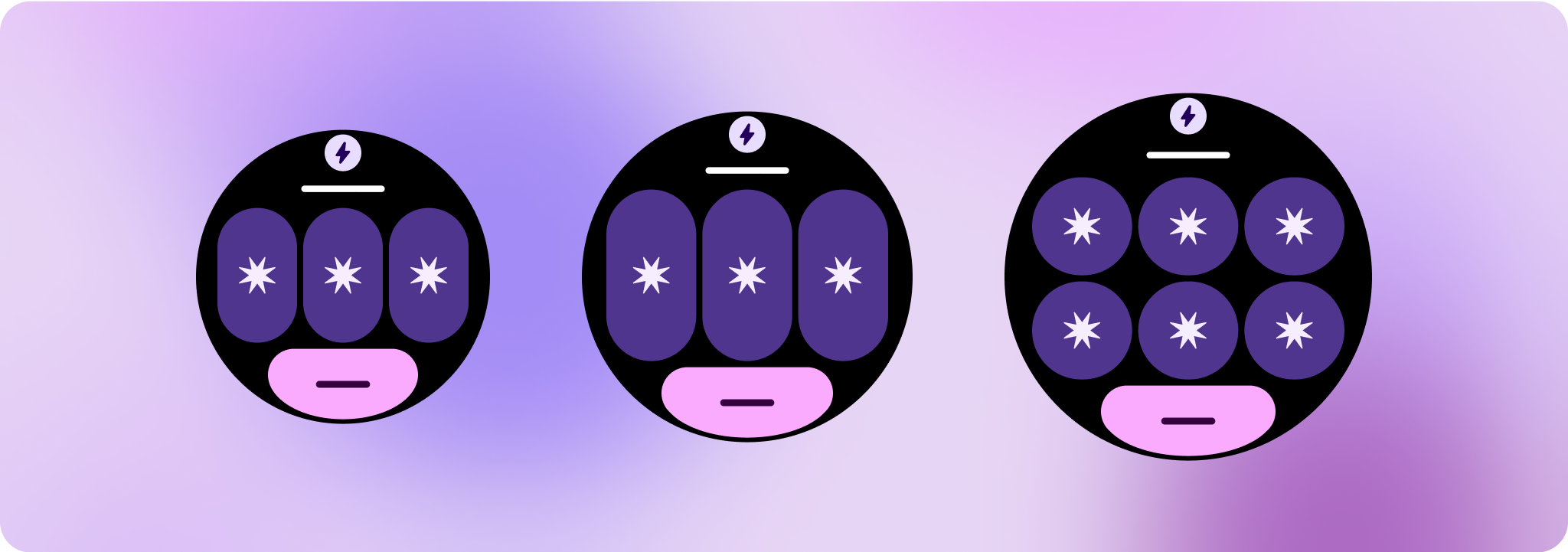
차별화된 환경 만들기
60개 이상의 순열이 내장된 완전히 맞춤설정 가능한 레이아웃을 사용하면 사실상 무한한 맞춤설정이 가능합니다. 카드는 슬롯 기반 시스템을 기반으로 빌드되므로 표준 레이아웃의 슬롯을 콘텐츠 또는 구성요소로 대체하고 구성요소를 다양한 변형 및 색상 조합 중 하나로 설정할 수 있습니다. 이 경우 반응형 동작을 유지하고 Google의 디자인 권장사항을 따르세요.
이러한 맞춤설정은 제한되어야 하며 카드 템플릿에서 벗어나서는 안 됩니다. 이는 사용자가 Wear OS 기기에서 카드 캐러셀을 스크롤할 때 일관성을 유지하기 위한 것입니다.